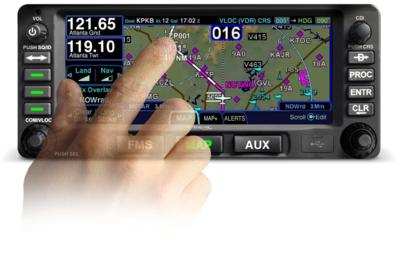
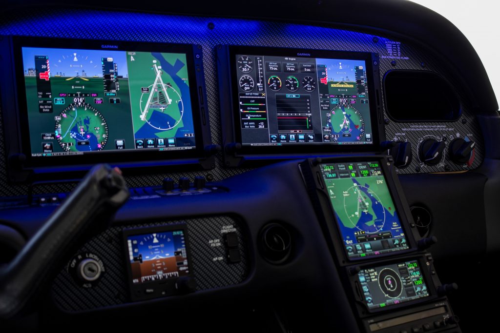
Avidyne’s plug and play replacement for the Garmin 430, the Avidyne IFD 440, finally received certification from the FAA last week. The touch screen GPS unit is being marketed as a simple swap out for the Garmin 430. This release follows up Avidyne’s release last year of the IFD 540, also a plug and play replacement, but for the Garmin 530.
The features and touch screen of the GPS units sound quite nifty, but it will be hard for Avidyne to compete with the GTN 750 and 650 from Garmin. The unit prices for the IFD 540 and 440 will be less (and installation is simpler), but we will see how the company does.
The STC allows for installation in 1,000 makes and models of aircraft, according to the company, so there are a lot of possibilities for installs.
In conjunction, Avidyne also released a new version of it’s software for both GPS units. According to Avidyne, this will unlock multiple features that enhances the capabilities of both units.
To read more on the IFD 440 and it’s bigger brother, the IFD 540, check out Avidyne’s website.
On March 30th, Texas Governor Greg Abbott issued an Executive Order mandating that all travelers (including Texas air travelers operating or traveling in private aircraft) from the following designated areas were to self-quarantine for 14 days (or the extent of their stay in Texas, whichever was shorter) upon entering the State:
California
Louisiana
Washington State
Atlanta, Georgia
Chicago, Illinois
Detroit, Michigan
Miami, Florida
If you traveled to Texas by air from any of the above designated areas, you are required to fill out the Arrivals from Areas Designated for Mandatory Self-Quarantine Form. Failure to do so could lead to a $1,000 fine or 180 days in jail, or both. For private aircraft owners/operators, put your Tail Number in for Flight Number and “Private” for Airline.
Aircraft owners, stay away from the designated areas listed above and you won’t have any worries. A lot of you reading this are from Texas, so make Louisiana a fly over state for now and don’t make any landings in Cajun country.
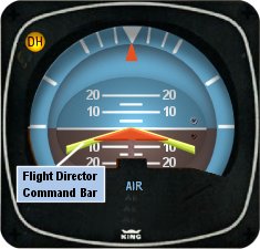
I’ve noticed that a lot of general aviation pilots tend to ignore the flight director on the attitude indicator. A lot of pilots don’t even know what it’s there for or how to use it. Talk to any airline pilot, though, and he or she will tell you how important the flight director actually is.
In most high performance airplanes, the flight director comes on when the autopilot comes on. Essentially, the autopilot is following the flight director, which tells the autopilot where to go. The flight director can also be used with the autopilot off, when hand flying an approach, for example. By turning the flight director on, it will show you where you need to fly to stay on course and on glide slope.
The flight director is most often controlled by the autopilot controller. The same buttons you use to put the autopilot in heading mode also tells the flight director to follow the heading bug when the autopilot is off. When you move the heading bug (or change course on the GPS, depending on which mode you have selected), the flight director will show you when you need to turn and when you need to stop turning. It directs your flight attitude, hence the name.
I recently discovered it’s a great backup when you have some instruments on the fritz. I went on a long flight in a steam gauge Piper Malibu and the attitude indicator started reading erratically. While flying straight and level, it would randomly indicate that I was in a 10 degree bank to the right, swing back and show wings level, then show a 3 degree turn left. This went on for a while. We were in VMC conditions, so legality wasn’t a problem, but it was kind of disorienting.
After a little while of this, the autopilot started acting up. It would start oscillating the pitch up and down, making it seem like we were going through a moguls course in the air. I ended up turning the autopilot off and hand flying the airplane.
This led to a conundrum, since my attitude indicator was unreliable. I could definitely look outside, since it was VMC, seeing when I was level and when I wasn’t. That would create a higher workload for me, which on a long flight like I was on, would lead to an increase in fatigue. The solution? The flight director!
I turned the autopilot off, but I left the flight director up. It wasn’t referencing the bank angle that the attitude indicator was showing since the KFC 150 goes off of the turn coordinator. So, if I just followed the attitude indicator, I could just keep scanning the instruments and relieve a little bit of my workload.
It actually worked really well. By just following the flight director, I was able to stay on course and on altitude with only minor attitude adjustments whenever we hit turbulence.
So, if you’re attitude indicator and autopilot decide to stop working on you, then bring up the flight director, push the same buttons you would if you were using the autopilot, and it works as a great backup.
There have been lots of changes in all parts of our lives with the coming of COVID-19. All of our lives have been affected in one way or another. We hope and pray that none of your families have been directly affected by the illness.
A lot of us have been living under Shelter in Place orders for several weeks now, only going out for groceries and making sure to keep our distance from people. We have to take a different mindset when we go out now. Even meeting new people is different since we can’t shake hands.
Flying has been an afterthought for a lot of pilots. There have been multiple ATC facilities where controllers have been afflicted with the virus and have had to shut down for hours or days. Airspace can change pretty quickly, going from what we all know as normal, to an ATC-ZERO scenario. This was the case for New York Center several times over the last two weeks.
There was some uncertainty regarding flight training under the shelter in place orders and Texas Top Aviation has been asked several questions about it over the last week. Yesterday, the Flight School Association of North America (FSANA) announced that flight instruction was indeed an essential business.
In an article on GeneralAviationNews.com, the website quoted a memorandum of understanding written by attorney George Winton on March 24th. Winton was a senior attorney for the FAA and U.S. Department of Justice, and now operates The Aviation Law Firm in Annapolis, Maryland.
“This memorandum affirms the statement that…flight training would be included as a critical infrastructure activity. Those engaged in the provision of and receipt of flight training who work to provide enhanced compliance with CDC recommendations for limiting potential COVID-19 exposure and spread would be considered exempt from travel limitations imposed by local authorities.”
Winton’s memo was sent to the Department of Homeland Security’s Cybersecurity and Infrastructure Security Agency (CISA). In the memo, Winton stated:
“CISA listed Other Community-Based Government Operations And Essential Functions as follows: Workers who support necessary credentialing, vetting and licensing operations for transportation workers.”
“The aviation sub-sector stakeholders involved with operation of recreational aircraft and flight schools, who employ Essential Critical Infrastructure Workers from the Transportation Sector, support necessary credentialing, vetting and licensing operations for transportation workers seeking pilot certification by the Federal Aviation Administration. Since CISA intended to be overly inclusive to reflect the diversity of industries, the aviation mode stakeholders understand that essential employees involved with the operation of recreational aircraft and flight schools continue to be identified as Essential Critical Infrastructure Workers from the Transportation Sector. Accordingly, the aviation sub-sector stakeholders who employ Essential Critical Infrastructure Workers from the Transportation Sector will continue to operate recreational aircraft and flight schools, appropriately modified to account for CDC workforce and customer protection guidance, based upon the CISA memorandum dated March 19, 2020.”
Based on the above guidance, Texas Top Aviation will continue to operate flight training in all of it’s normal capacities, while maintaining vigilance concerning sanitation, cleanliness, and health. Our company will keep it’s customer’s up to date on instructor health and wellness and won’t hesitate to cancel if there is any kind of health concern. We ask our customers to do the same.
If you are scheduled to train with Texas Top Aviation, please don’t hesitate to contact us with any questions or concerns you might have.
To read the entire memo from George Winton, you can find it here.
Concerning the 2020 Texas Top Aviation Santa Fe Golf Fly In scheduled for June 5th-7th, that event is currently being re-scheduled for September 2020. Dates will be announced by the end of April. We look forward to seeing you in Santa Fe in September!
11 years ago, in April of 2009, the Avidyne Corporation unveiled the much bally-hooed Release 9, or R9 as it is commonly known, as a hardware replacement for the Avidyne EX5000 Entegra system in Cirrus Aircraft. The Entegra system was way outdated by that point. Even though Avidyne was the first company to put together a glass PFD in a single engine piston airplane, the company had quickly fallen behind Garmin in keeping up with the ever changing technology landscape.
Rewind to 2008. Cirrus had been going strong with the Avidyne Entegra since the SR20 and SR22 went to full glass in 2003 (a PFD and an MFD; prior to that, Cirrus aircraft only had an MFD with steam gauges and a Sandel Electronic HSI). Cessna, on the other hand, vaulted past the Avidyne Entegra and went straight to the Garmin G1000 in it’s aircraft, starting in 2004 with the 182 G1000 and 2005 with the 172 G1000. Beechcraft and Columbia went to the G1000 (Columbia started with the Avidyne as well) in 2005.
Garmin’s technology in 2007 was so much better than Avidyne’s technology that Cirrus decided to switch. I’m sure there were many promises made by Avidyne to Cirrus about what Avidyne was working on (the R9), but the G1000 was out there, available, and being used in a lot of different airplanes with very good results.
So, in 2008, Cirrus made the switch from the Avidyne Entegra to the Garmin G1000, dubbing it the Cirrus Perspective by Garmin avionics package. Avidyne finally got the R9 to market in 2009, but by that time, Piper was the only airplane manufacturer left putting factory Avidyne panels in their airplanes, and they switched to G1000 later that year.
The R9 is a fabulous product. It’s fully integrated, has great graphics, has fully redundant displays, a QWERTY keypad (which, by the way, Garmin didn’t do for another 8 years), and a lot of other neat features. There’s a bit of a learning curve, but it’s a really good product for what it is.
Avidyne, though, was late to the game with their technology. By the time it debuted in 2009, all the GA aircraft manufacturers had long since switched to the Garmin G1000 and weren’t looking back. That left Avidyne with the retrofit market for the many different Avidyne Entegra Cirrus aircraft out there. The only problem was, the retrofit was $80,000 ($95,000 if you wanted to throw in the DFC 100 Autopilot, which is a must have) and not many owners were up for paying that much money, then or now.
To sum up our brief history lesson, Avidyne knew the Entegra needed to go, but couldn’t get the R9 out quickly enough to convince anyone to stick with Avidyne products. The retrofit market didn’t amount to many sales, so Avidyne doesn’t even make the R9 anymore.
As a side note, I really, really like the Avidyne R9 and am sad that it didn’t make it into more airplanes.
So, when the Avidyne Entegra starts to have issues, what’s an owner to do? Keep reading!
There is Hope
There are thousands of Cirrus aircraft out there flying with the Avidyne Entegra instrumentation, which is basically 20 year old technology (I’ve had a computer engineer tell me the programming in an Entegra is Windows 98 tech). These things are going to start having problems at some point (many already have), but what solution do owners have that is cost effective and get’s them new technology?
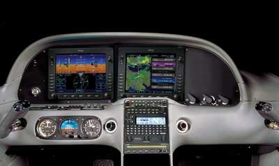
Remember that little company named Garmin? Well, they have come through again. Announced this summer, the Garmin G500 TXi is now certified as a replacement in the Cirrus Avidyne Entegra equipped aircraft. This means pulling out both the PFD and MFD and replacing them with the G500 TXi on both sides. Engine data is also displayed on the G500TXi MFD, including the percent power and TIT indications, if equipped.
Cirrus SR22 Equipped with Dual G500 TXi Screens and Dual Garmin GTN 650Xi GPS Units
The cost for the panel? Two 10.6″ G500 TXi’s run about $16,000 apiece for the units, not including labor. $32,000 for a brand new panel isn’t terrible. Plus, the G500 TXi’s work with the DFC90 autopilot if the Cirrus is already equipped with it. If not, the Garmin GFC 500 autopilot is now approved for the Cirrus at a relatively low price of $7,000, including the servos.
Still have the original Garmin 430s in your Cirrus? Upgraded to the Avidyne IFD 540/440 stack? Put in dual GTN 650Xi’s? Put in a GTN 750Xi? All are compatible with the G500 TXi panel.
Want to upgrade everything? It does get kind of pricey at that point, but for just equipment, the cost for a complete panel conversion is somewhere in the area of $65,000 plus labor, still below what the R9 cost, but not cheap either. That would include 2 G500 TXi’s, 2 GTN 650Xi’s, a GFC 500 Autopilot, and all the engine monitoring equipment that the G500 TXi would need.
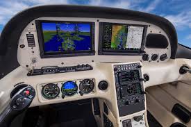
Cirrus SR22 Equipped with Dual G500 TXi Screens, a GTN 750Xi, and a GTN 650Xi
Thankfully, some new technology has finally come to the Generation 1-3 Cirrus. Oh, and by the way, your steam gauge Cirrus is fully upgradable as well.
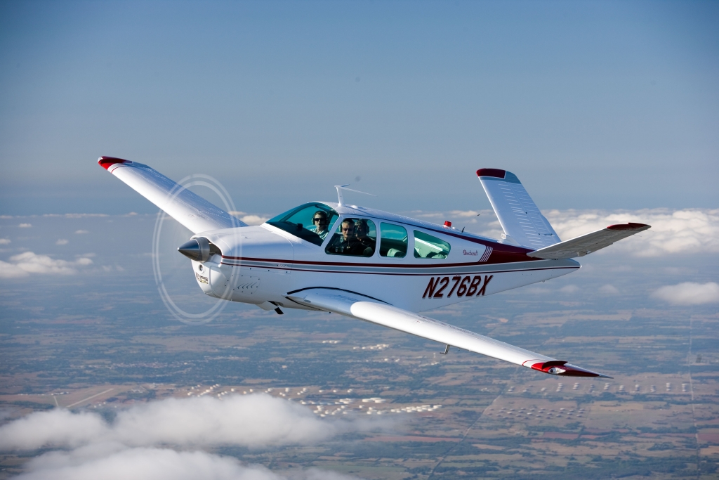
If you walk up to any Beechcraft Bonanza sitting on the ramp at an airport and ask the owner, “How do you like your Bonanza?” be prepared to stand there and listen for 15-20 minutes while he brags about his airplane.
The thing about Beechcraft Bonanza owners is that they are almost a part of a cult. They will tell you up and down why the Bonanza is the best airplane out there. They’ll tell you why all the others don’t even come close. They’ll tell you about the payload, the six seats, the variety of configurations you can select from, the ability to land pretty much anywhere. By the time you walk away, you will probably be convinced to buy one yourself.
Bonanza’s are great airplanes. For those of you new to the single engine piston market, a good comparison for a Beechcraft Bonanza would be a Suburban. Not the flashiest ride out there, but extremely capable, comfortable, and family conscious. If you’re hauling a load, you’ll take a Bonanza over a Cirrus or Mooney any day. Have six people? No problem!
One of the best things about a Beechcraft Bonanza is the variety of designs. Four seats, six seats, long range tanks, tip tanks, turbo charged, normally aspirated, steam gauge, G1000, Aspen or G500 retrofitted, dual yoke, single yoke, leather, cloth, and a variety of different colors out there on the market make finding a Bonanza that fits your need pretty easy.
When it comes to picking out an airplane, the first question is always the mission. If you’re thinking about a Beechcraft Bonanza, you’ve already determined you need something with a good useful load. Do you need four seats or six? Depends on how often you’ll be carrying someone or how new of an airplane you want. Older Bonanzas have four seats, but a lot have had significant updating. Newer A36 and B36 Bonanzas have six seats, but are going to cost you more.
Do you need a turbo charged Bonanza? If you’re in a high elevation area or expect to visit the mountains a lot, then absolutely. If you want a better cruise speed and don’t mind a little less useful load, then go for it. If you’re more concerned about being able to load it up and you aren’t going to cross the Rockies often, then normally aspirated is what you want. You’re probably looking at about 160-170 KTAS with the normally aspirated whereas you get between 180-190 KTAS at altitude with the turbo.
Do you need tip tanks? Tip tanks have two advantages. One is the most obvious: you get to carry more fuel, therefore you get to go farther without having to stop (or when you stop for the bathroom, you don’t have to fill up with gas). The other advantage is you get a bump up in useful load. I talked to a Beechcraft Bonanza owner a few weeks ago who had tip tanks on his. He told me max gross on his Bonanza was 3,800 pounds and was eligible for an upgrade of up to 4,000 pounds and all it took was paper work for the STC. That’s quite a bit of load!
Are Bonanzas hard to fly? When moving up from a typical 172 or Cherokee that most people learn to fly in, it does take some adjustment. But, with good Bonanza training from a qualified Bonanza training instructor, then the transition is no problem. There are tons of resources out there to aid all future and present Bonanza owners in their foray into the Bonanza nation. With the American Bonanza Society and Bonanza Pilot Training, there is no lack of training, thoughts and opinions.
In need of an airplane that can pretty much do whatever you need? Then a Bonanza may be right for you.
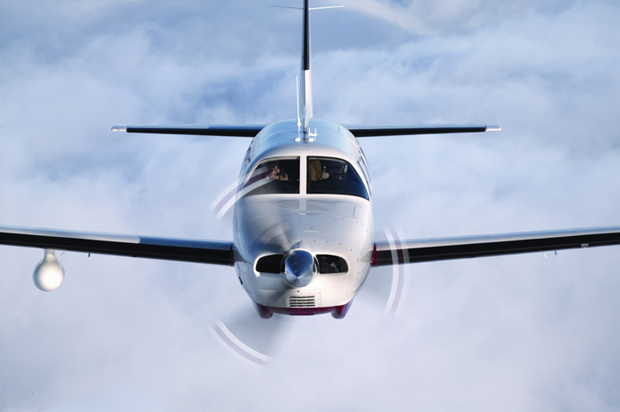
It’s winter time, which means it’s time to use those Piper PA46 de-ice boots a little more often. Most of us know the winter flying rules, don’t stay in ice, get rid of frost, etc. However, most of us aren’t as familiar with how to maintain those Piper PA46 de-ice boots. The do need some TLC every couple of months to keep them in tip top shape.
Below is the recommendation from Goodrich (the maker of the boots) on what to use to clean and polish the boots and how often to do it.
Steps 1-3 below are your twice a year items to make your Piper PA46 de-ice boots last through the lifetime of the aircraft.
Step 1-ShineMaster Prep
ShineMaster Prep strips all the dirt, grime, grease, oil, silicone products and old ShineMaster on the Piper PA46 de-ice boots to prep them for Step 2.
AgeMaster is your second step the in the Piper PA46 de-ice boot preservation and protectant process. AgeMaster is a rubber preservative that protects against weathering, ozone, and ultraviolet rays.
Make the first application when your de-ice boots are 6 months old, then re-apply every 150 hours (or twice a year) after that.
Step 3 in the Piper PA46 de-ice boot care is ShineMaster. As the name implies, ShineMaster shine’s the boots up after getting rid of all the old gunk & grime with ShineMaster Prep and after AgeMaster is applied. 2-3 coats should be sufficient.
During icing season, Goodrich recommends ICEX II. ICEX II is an ice inhibitor that should be applied every 50 hours during ice season. This will help prevent ice from sticking to the Piper PA46 de-ice boots. ICEX II can be found here.
Finally, for general cleaning of the boots after each flight, utilize Goodrich Aerospace Cleaner to debug, then follow up with Goodrich Aerospace Protectant. Goodrich claims their Protectant will resist dust, soiling, and staining. There may be less bugs to clean each time!
With just a few hours a couple times a year spent working on the Piper PA46 de-ice boots, owners will never have to worry about the hefty price tag of boot replacement!