Breathing…It’s The Difference in Engine Performance

The PT6 engine that’s found on the Jetprop and Meridian is designated a -21, -34,-35, or a -42A.  The Continental engine on a Malibu is either a TSIO 520 or a 550.  What’s the difference? Why should I care? Most pilots don’t understand the difference, but it’s pretty easy to understand…and it’s all about breathing.

Whether a piston or a turbine, the engine has a ratio of fuel/air that works best.  For a piston model, we can make adjustments to this ratio by adjusting the mixture.  In climb we use a richer ratio to help cool the engine, and in cruise we lean the mixture to save fuel since we don’t need the extra fuel for cooling (due to higher speeds which cools the engine). In the turbine, the ratio is set and there’s nothing that can be done about it…except climb to a higher altitude.  But, more about that in a second..let’s go back to the piston discussion…

Piston: A Continental 520 engine and the 550 engine are flown exactly the same.  On takeoff, both will develop 310HP (38″MP with the 520, 35.5″MP with the 550).  So, why would a pilot want a 550 in his airplane as opposed to a 520?  The answer is breathing.

A 520 is named appropriately because the engine displaces 520 cubic inches of air with each complete cycle of all 6 cylinders.  To determine the displacement, just figure the bore (diameter of the cylinder) and the Stroke (how far the piston travels in the cylinder) and plug the numbers into this formula:

CID = Bore X Bore X 0.8754 X Stroke X # of Cyl.

Here’s the bore and stroke of the Continental 520 and 550 engine:

TSIO 520:  Bore = 5.25″ and Stroke = 4″
TSIO 550: Bore = 5.25″ and Stroke = 4.25″

So, you can see the two engines are exactly the same except the 550 has a little longer stroke, and therefore displaces a little more air.  Said another way…it the sucks the air into the engine a little better.

So, with this knowledge, the ability for the engine to breathe becomes a little more clear.  Both a 520 and a 550 will perform exactly the same until the point that a 520 simply cannot suck enough air and begins to develop less MP as a result.  For most 520 engines, this will happen somewhere around 18,000 ft.  But, it is dependent upon a myriad of factors including: health of the engine, altitude, temperature, and atmospheric pressure. When the 520 hits this point, the throttle can be full-forward, but the engine will not develop full MP, but some number that is less.  I’ve seen a max MP at FL250 in a 520 Malibu to be about 31″MP.  So, you can probably guess that the rate of climb will correspondingly suffer as the engine develops less MP.  How do we fix this problem?  Enter the 550…
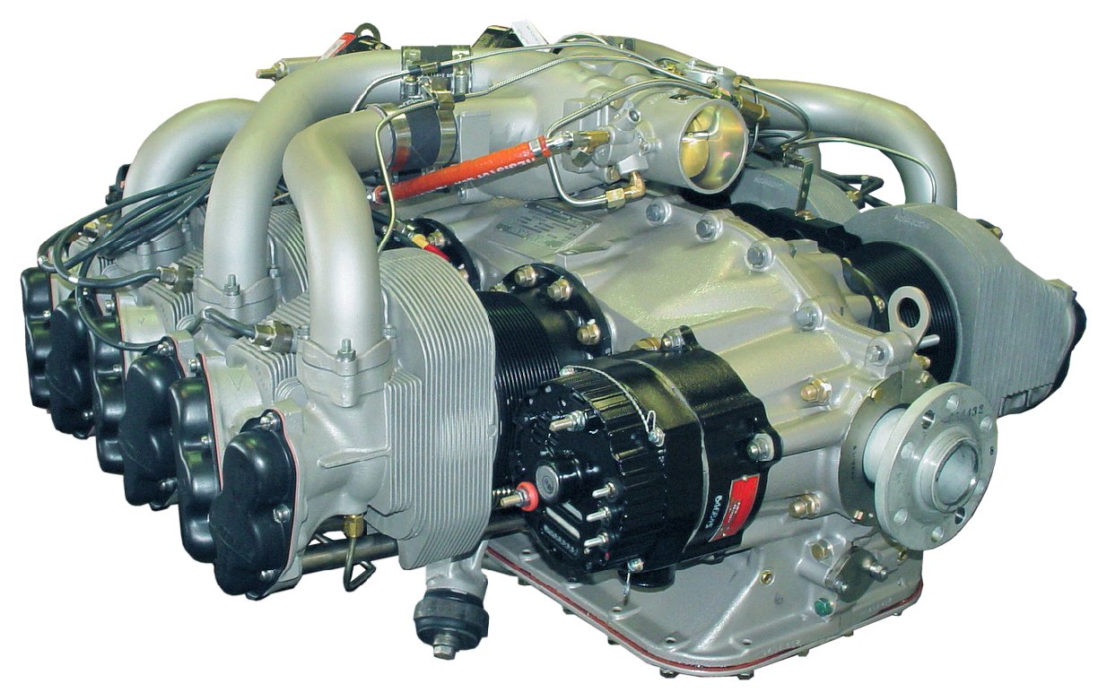
Since the 550 displaces more air, the engine will maintain max MP to a higher altitude.  When the 520 begins to develop less power at about FL180, the 550 engine will be able to continue to maintain 35″ at a higher altitude.  Make no mistake…the 550 will also hit an altitude where is cannot develop 35″MP, but this altitude will probably be nearly FL220.  So, the 550-powered Malibu will reach cruising altitude faster than the 520.

But, at cruise both engines are pulled back to 30″MP.  So, either engine will deliver the same cruise speed because they are both able to develop 30″MP at any altitude.  Does it really matter if you’ve got a 520 or a 550 engine?  Answer: not much.  Both are excellent engines and both will deliver the airplane to the destination, but if the chosen altitude is above FL180, the 550-powered airframe will probably arrive a few minutes earlier.  Which would I want if I were purchasing an airplane?  It’s not a big enough deal, IMHO.  I’d select the best airframe/engine/prop combination and not put much weight into the 520 vs. the 550.

Turbine world: So, how about the -21, -34/35, and -42A compare?  Here, there’s  big difference, but it’s still all about the breathing.  A -21, -34/35, and -42A are all derivatives of the famous PT6 family of engines, and all are designed to be 1000+SHP engines de-rated to fit the airframe.  For instance, the -42A engine is 750SHP when mounted on a King Air 200, but the same engine is derated to 500SHP when mounted on the Meridian.  Ditto with the -21 and -34/35 engines…all are de-rated.  So what’s the difference? Breathing…

At the lower altitudes all will develop their maximum rated SHP, meaning they will all develop maximum torque.  And, down low there’s plenty of air to breathe so the engine has no problem developing that torque at a low ITT.  But, as altitude is gained, the engine must suck more air to develop the same torque, and the ITT goes up.  At some point in the climb (depending upon altitude, temperature, pressure, and IAS) the engine will not be able to produce max torque without exceeding Max ITT.  At this point, the engine cannot breathe any more (suck in anymore air), and the power (torque) developed falls off.  With the -21 engine, the power falls off quite dramatically because the engine simply cannot breathe well.  It is a smaller engine and more air cannot be forced into the compressor section.  For the rest of the climb the engine is “ITT limited” and the performance will suffer.

The -34/35 engine is a little bigger and will develop maximum power (torque) to a higher altitude.  And, when the torque does drop off (as altitude is increased), the rate of decrease is less because it can breathe easier due to it’s larger size.  Guess what? The -42A will beat out the others and develop max torque to an even higher altitude.  With this decrease  in torque available also comes a welcome friend…less fuel burn.  Altitude is the friend of any turbine pilot, and he/she will climb to the highest altitude possible to save on fuel.

The end result is the -21 powered Jetprop will cruise at 238 KTAS (in the summer) with a fuel burn of only 28gph.  The -34 will have higher torque than the -21 and will develop more SHP and will have a higher cruise (260 KTAS in the summer) with a correspondingly higher fuel burn (32gph).  The -42A will be breathing easily at higher altitudes, and will develop the most torque, but with a fuel flow of 39gph.  The Meridian (with the -42A) will not out-perform the -34/35 Jetprop in cruise purely because the Meridian is much heavier.

Just remember…fuel flow in a turbine is always commensurate with its ability to breathe and a turbine’s ability to breathe is a function of the engine’s ability to breathe.

With this knowledge…let’s check your understanding.  Answer this question: Will a Jetprop cruise faster in the summer or winter?  Remember, cold air is more dense than warm air, and an engine will develop power according to it’s ability to suck in air.  More air available, more power available.  Answer: Winter.

A good analogy: I’m a Cross-fitter (meaning I do crossfit workouts a lot).  In the gym we have various workouts that test a person’s ability to perform.  Guess who usually does the best?  Right…the guy who can breathe the best.  A person is nothing more than an engine…we intake air and combine it fuel and burn it to develop energy.  In Crossfit, the person with the biggest engine (muscles that can develop power) that can sustain power (good aerobic capability) will win almost every time.  The only variables then are genetics (how well-made is the engine), flexibility (you’ve got to be able to get into the position), and skills (there are more efficient movements).  A good Crossfitter will work hard on mobility, skill, and try to increase the bodies ability to increase capacity through a tough workout.

To get maximum performance, the pilot cannot change the engines skill or mobility (at  least not without an engine change!), but a thorough understanding of the how the engine breathes will help him/her use the power that is available to the fullest.

Joe Casey’s aviation story began in 1990 with his first flight near Nacogdoches, TX in a Cessna 172. From lift-off, Joe knew he would have a lifetime passion flying just about anything that will leave the ground…He was completely hooked.

Along with being an FAA Designated Pilot Examiner (DPE), Joe is an ATP/CFI-AHMG and Commercial Rotorcraft/Glider Pilot in the civilian world and also a UH-60/AH-64 Pilot-in-Command/Instructor/Examiner Pilot in the US Army Reserves.  His passion for the last 19 years, however, has been the PA-46 Malibu/Mirage/Matrix/Jetprop/Meridian. Has has amassed over 6,500 hours in various PA-46 airframes and believe it to be one of the finest flying machines available for the serious cross-country pilot with an eye for efficiency.

Now, Joe has flown more than 12,200 hours in just about every imaginable environment. Whether providing initial/recurrent training in the PA-46’s, TBM’s, instructing in NVG’s in a UH-60 Blackhawk, flying the King Air series of airplanes, giving tailwheel endorsements, or taking kids flying for the first time, he simply loves flying machines and the people who fly them.


Similar Posts

  • FltPlan Go

    I am an iPad user, but I have an Android phone.  I had been using a junky aviation weather app that just gave meters and TAFs, but seemed to have been programmed in a foreign language (un-decoded TAFs notwithstanding).  I wanted something more robust, but didn’t see the need to pay for a Garmin Pilot subscription since Foreflight on my iPad was my main EFB (Electronic Flight Bag) I use in the airplane.

    When I upgraded my phone, I decided I had to find something better.  I have a WIFI only iPad, so I utilize my phone to take quick glances at weather reports or when I want to see the radar without having to tether my iPad to my phone.  The app I had wasn’t cutting it.

    That’s when I found FltPlan Go.  We are all familiar with FltPlan.com.  It’s what a lot of corporate pilots use to file flight plans.  I’ve used it some, but there is a large amount of data it needs to set up an airplane. Since I already have all the airplanes I need in Foreflight, I don’t use it that much since I didn’t want to do the setup.  It is rather handy as it spits out flight logs and has a lot of pre-loaded performance numbers for different makes and models.

    FltPlan Go

    FltPlan Go is FltPlan.com‘s app.  It is very user friendly, easy to use, and, most importantly, free!  You can get METARs, TAFs, NOTAMs, Airport Diagrams, approach plates, full weather reports for airports including radar, maps, and a whole lot more.  As far as I can tell, it is a full fledged EFB.  I haven’t really scratched the surface on all the features in using mine, but it is quite robust from the little bit of poking around I’ve done.

    I’m still a Foreflight guy, but if you want something else or you have an Android phone and don’t want to pay for Garmin Pilot or WingXPro, check out FltPlan Go.  It’s a winner.

    I am an iPad user, but I have an Android phone.  I had been using a junky aviation weather app that just gave meters and TAFs, but seemed to have been programmed in a foreign language (un-decoded TAFs notwithstanding).  I wanted something more robust, but didn’t see the need to pay for a Garmin Pilot…

  • Jeppesen vs. Aeroservices Charts

    Many people ask, which set of charts is better? Should I use the FAA Aeroservices charts on Foreflight or pay extra for the Jeppesen charts? Since you have to pay for Jeppesen, they are probably better, right?

    I am not here to say which one is better as a chart preference is just that, a preference for one over the other or for certain features. After a while, muscle memory and routine take over and you probably wont even notice the difference.

    History

    In 1934, Elroy Jeppesen began making his own charts and sold them to other pilots. His little company grew into the giant Boeing chart company we know today. Jeppesen charts are used internationally and therefore include information that might otherwise seem common knowledge, like transition altitudes. The key is, you cannot get FAA Aeroservices charts for international destinations. Jeppesen is the only option for outside the US.

    National Aerospace Charting Office (NACO), or the new(er) name “Aeroservices” or FAA chart, whatever you decide to call them, are United States government issued charts. In addition to civilian use, Aeroservices charts are used by the military so there will be some terminology that does not apply to civilians. The best part about FAA Aeroservices charts are… they’re free!

    If you are in the middle of a transition or trying to decide which charts to use, you have come to the right place. Here are a few key differences.

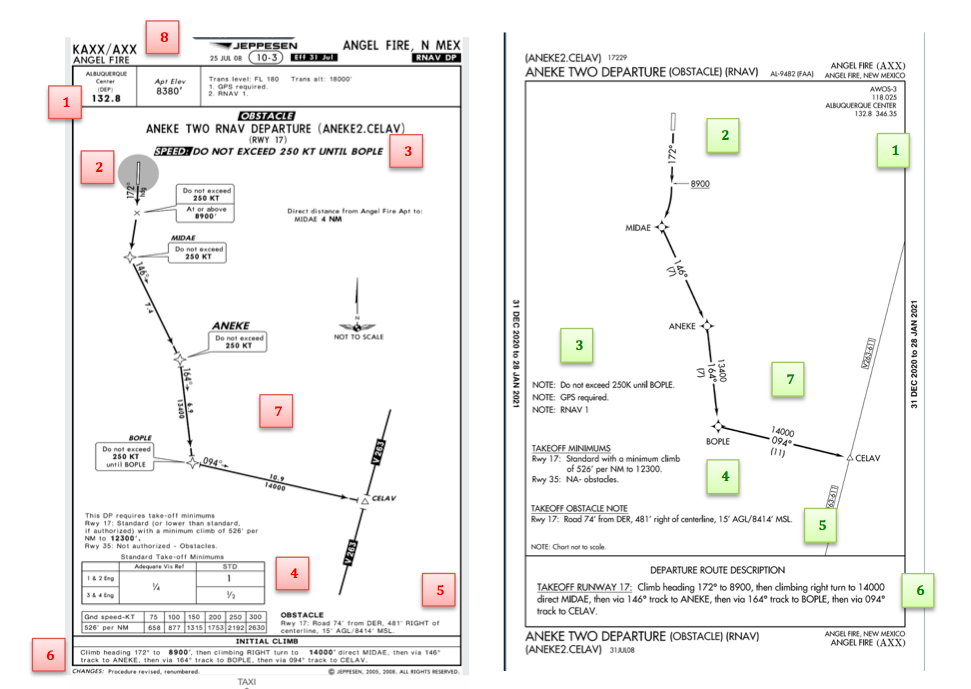
    Obstacle Departure Procedure Chart
    KAXX (Angel Fire, New Mexico) ODP

    1. Frequencies: FAA Chart provides the AWOS so you have all departure frequencies in once place.
    2. Airport: Jeppesen highlight the airport, which is a nice feature so you can easily see the flow from the airport.
    3. Notes and Remarks: Jeppesen bolds the speed restriction all over the chart so you won’t miss it. All other requirements are in the top right corner. Note the transition altitude 18,000′. Since Jeppesen is used internationally, it is published on the chart since other countries have different transition altitudes. It takes up a chunk of chart real estate, but it’s clear, easy to read, and always in the same place. The FAA charts post all the requirements and restrictions as notes off to the side. Since it’s in the same space as the chart graphic, it’s easy for the eyes to catch while studying the plate.
    4. Take off Minimums: NOT APPLICABLE for PART 91 – however, it’s wise for all pilots to look and abide by them. Jeppesen displays the standard take off minimums table, as well as the rate of climb table, which is nice to have all in one place. The FAA chart gives the non standard information but you need to know/look up the rest in the Digital Terminal Procedures Supplemental document. (Hint: It’s in the Documents section of Foreflight)
    5. Take Off Obstacles: About the same on both charts
    6. Route Description: Similar on both charts, but larger font and clearer description on the FAA chart. When there are different routes from different runways, the FAA chart layout is really helpful.
    7. Graphic Layout: Jeppesen and FAA use the same graphics for all their different charts and plates which makes it easy to read once you are familiar with the respective charts. FAA charts are easy to read and distractions are kept to a minimum. Jeppesen charts make things bold and enlarge pertinent information so you won’t miss it.
    8. Airport altitude: This is only on the Jeppesen chart (the FAA chart doesn’t include it), but it is very helpful for situational awareness. As you brief the arrival altitudes, I think it’s important to have an idea what AGL you are at.

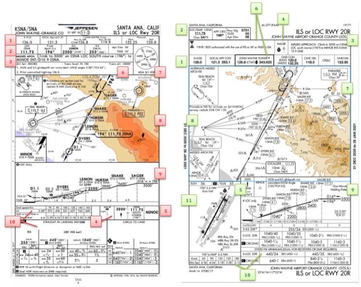
    Approach Charts

    One thing pilots love about Jeppesen approach charts is the clear set up for an approach brief. The top section is created as a “briefing strip” starting with the frequencies, then navigation frequencies, minimums, airport elevation and the missed approach. It’s very natural and user friendly.

    FAA charts have a slightly bigger picture of the approach planview, but the profile view and minimums section can get a bit cluttered. It can feel a little discontinuous when briefing the approach to bounce all over the page. However, some pilots really like the small airport diagram in the corner, which I find really helpful for situational awareness (particularly for students learning circle approaches). Non- standard alternate and takeoff minimums are also clearly noted, but unfortunately we must hunt elsewhere to find them. The Jeppesen alternate minimums and takeoff minimums will both be on the airport diagram

    1. Frequencies: Getting weather and tuning radios is easy on the Jeppesen charts – just follow the briefing strip. The frequency section on the FAA charts is still easy to read, but closer to the center of the page. It’s split up from the nav frequencies and other important briefing information.
      a. FAA charts are created by the government and have military specific information, which are the odd looking frequencies and channels on the chart.
    2. Approach Navigation: On a Jeppesen chart, you will continue to the next line to verify your frequency, course and set minimums (assuming you are straight in on the ILS). On the FAA chart, you will then have to skip to the top of the chart to get the frequency and course, and then scan to the bottom of the page to input your minimums. However, since you could be flying a localizer approach or a circle to land, it’s a good reminder that not everyone using this approach chart will be using the same Decision Altitude (DA). The FAA chart also includes runway distance information so pilots can make determinations of approach speeds and stopping distance if the runway is wet or icy.
    3. Missed Approach – Textual
    4. Approach Lighting
    5. Missed Approach- Graphical: The missed approach information is the same on both charts. The lighting information is key for determining a missed approach and is next to the missed approach text on the FAA chart. It’s found next to the missed approach graphic on the Jeppesen chart. Personally, I find it easier to find and read the lighting information on the Jeppesen chart. Remember, on both charts, the placement of the PAPI on the chart indicates the physical location of the lights (left or right of the runway).
    6. Notes: Both charts have a notes box, but they use them a little differently. Once again, remember that Jeppesen charts are used internationally and include the transition altitudes and altimeter setting info. On both charts, the notes section will be where other critical information will be shared which isn’t really applicable for this airport. On the FAA chart, the tower frequency is starred to note that there are operating hours (you’ll have to check the chart supplement AF/D to find out what those hours are). There is also an L next to the frequency to indicate it is the pilot controlled lighting frequency. You will also find the note about the VGSI and the Approach Glide path next to the profile view on the FAA chart, whereas the Jeppesen chart has that note in the notes section at the top. The FAA chart also has the T and an A in black triangles to note that this airport has non- standard alternate and take off minimums. Again, those are found in separate documents when using FAA charts and on the Airport Diagram when using Jeppesen charts.
    7. Minimum Sector Altitude: Similar on both charts, but in different locations (reminder: ATC vector altitudes may be lower. It is the pilot’s responsibility for safety of flight to maintain safe obstacle clearance, so if you are ever concerned about going below the MSA – just ask ATC).
    8. Planview: Other then differences in size, visuals, and text, the information displayed on both is very similar.
    9. Profile View: Again, the displays look different and pilots will have their preference, but the information is the same.
    10. Minimums: Jeppesen charts not only note the category for each approach with its designated letter, but also displays it in knots. It is recommended that if you increase your approach speed (based on flaps or gusty winds or perhaps a faster speed for a circle to land approach) that you should use the higher category minimums. The reference guide makes that easy to look up. The other benefit of the Jeppesen charts is right the table that contains the time from the final approach fix to the missed approach point for a localizer approach, it also shows the rate of descent with the associated ground speed to maintain a 3 degree glideslope. Now there is no excuse not to set pitch and power! The minimums posted in parenthesis are for the military, but RVR in statute miles is also included.
    11. Airport diagram: Only on the FAA charts, this particular feature is particularly useful for situational awareness. The arrow pointing to the runway shows the direction the approach is arriving from so planning a circle to land is a cinch. There is also a lot of other information that can be gathered from the airport diagram for quick reference or to help a disoriented pilot: lighting, displaced thresholds, closed taxiways, and runway placement and lengths. This is easily one of the best perks of an FAA chart.

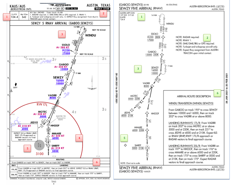
    Arrival/ Departure Charts: Sewzy 5 Arrival KAUS

    The Jeppesen lay out is very attractive and draws the pilots eye in a clear way to all the important information. The colors pop out, so the required altitudes and speeds are easy to read and remember. The chart, which is the proper scale, shows MORAs , easy to find airports (and runway layouts) and is over all easy to follow. However, the texts, while very clearly laid out, are small and difficult to read and pushed to the very edges of the chart. FAA charts are simple and fairly easy to read, but the airports are not as obvious and the flow to the airport requires a good look. The table on the Jeppesen chart is a really nice format, but the text and Notes for arrivals on the FAA chart are easy to find and much easier to read quickly.

    1. Frequency: FAA charts include the approach frequency on the arrival, which is helpful for having radios tuned. During a busy time when the controller changes your frequency, all you have to do is verify the frequency you already set, rather then totally stop what you’re doing to switch it. The Jeppesen charts add the airport elevation next to the ATIS, which really aids situational awareness.
    2. Notes: Jeppesen notes are clearly numbered and tucked away nicely in a box, but the FAA chart notes pop out in the middle of the page and are easy to skim for pertinent information.
    3. Planview: I think Jeppesen is the clear winner here- it is so easy to read, it only takes one glance to know where the primary airport is and how the arrival flows. The chart being at the proper scale offers the pilot important geographical information and over all is a clean look. Notice the small series of arrows after SMRFF on the the Jeppesen chart; those indicate the pilot should expect radar vectors. The FAA charts include those instructions in the text, but I find the visual reference on the chart helpful. The FAA charts are equally clean, with altitude and speed restrictions easy to read even if they don’t jump out. When there are multiple airports that the arrival serves, the airports are clearly marked, though, I think it would be nice to have a little more information surrounding the primary airport for better situational awareness.
    4. MSA: only on the Jeppesen chart
    5. Primary airport: The runway alignment and grey highlight on the Jeppesen chart stands out very clearly, while the FAA airports are a little more obscure.
    6. Arrival route description: The table on the Jeppesen chart is easy to follow but the text is very small and pushed to the bottom. The route description is much easier to find and read on the FAA chart.

    Airport Diagram

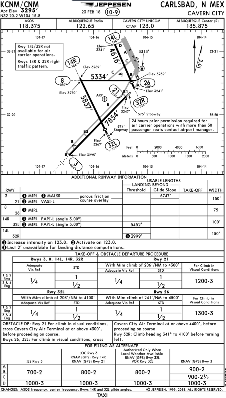
    The Jeppesen Airport Diagram page has it all: frequencies, airport diagram, runway info, take-off minimums, departure procedures and alternate minimums. It’s a one-stop shop. It makes preflight planning easy when its all at your fingertips.

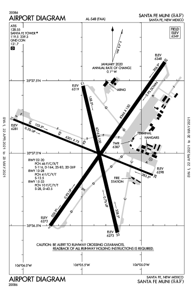
    The FAA charts usually require a little more searching for different pieces of airport information. The Airport Diagram itself is just the airport layout. Above, you will see a simple FAA Airport diagram. It’s clean and simple, perfect for a knee board print out.

    In the flight planning process, as you look at what approaches you will be using for the airport, you might see an A or T inside a triangle. Those indicate that you will need to look in the Alternate Minimum or Take off minimum documents for more information. The Takeoff Minimums document (see below) is also where you will find any obstacle departure procedures for that airport. Apps like Foreflight help you out by posting the take off minimums under the departure tab. Even though it’s a little more difficult to read, I didn’t crop out the airport information so you can see what it looks like in context.

    FAA Alternate Minimums on the Left and Takeoff Minimums and Obstacle Departure Procedures on the Right

    Many people ask, which set of charts is better? Should I use the FAA Aeroservices charts on Foreflight or pay extra for the Jeppesen charts? Since you have to pay for Jeppesen, they are probably better, right? I am not here to say which one is better as a chart preference is just that, a…

  • Cirrus Tow Bar For Sale

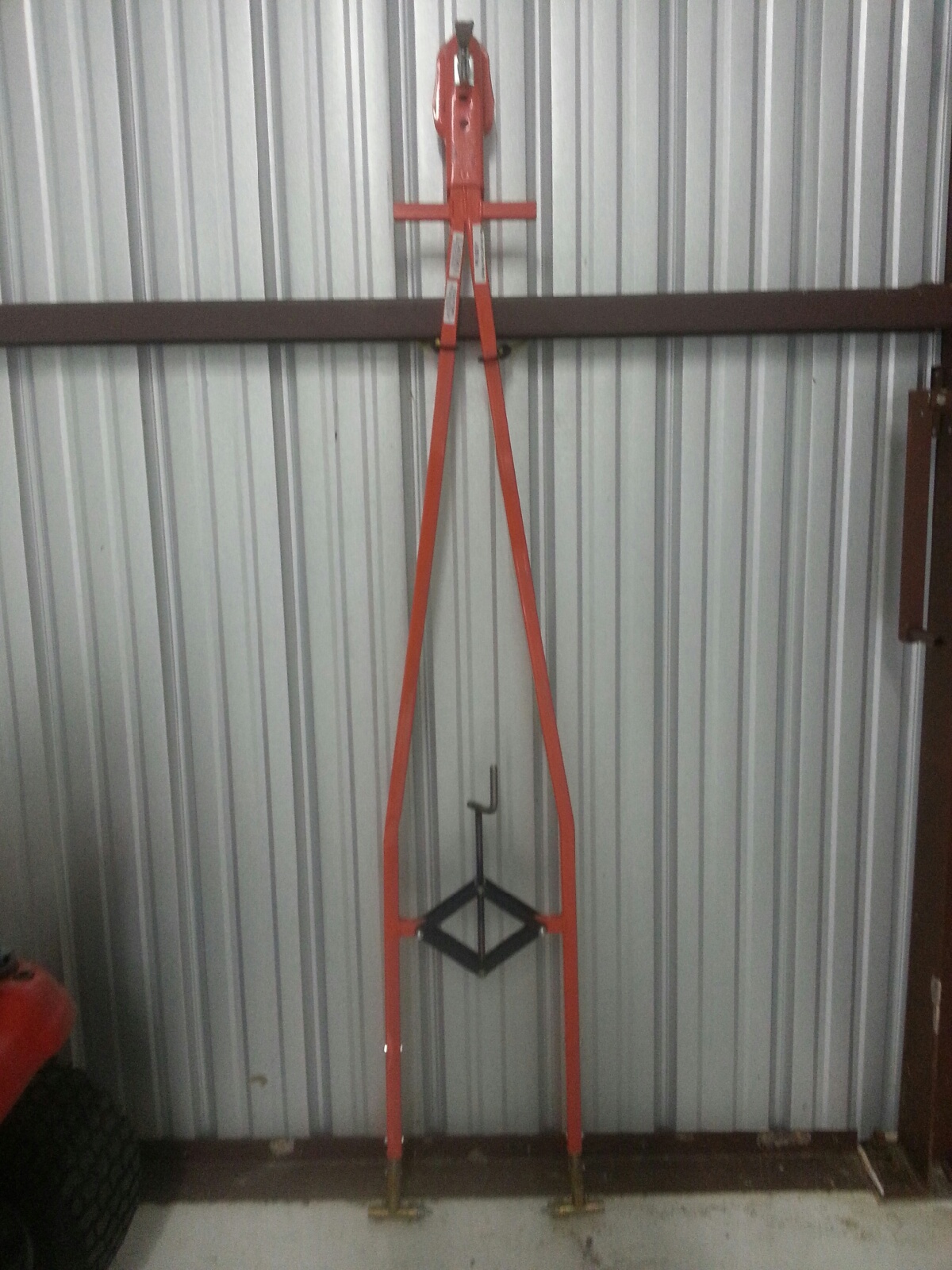
    In the market for a tow-bar?  This one is basically brand new and hasn’t been used all that much.  It has the Cirrus connections on it as well.

    For more information, contact Texas Top Aviation.

    20150906_155013

    In the market for a tow-bar?  This one is basically brand new and hasn’t been used all that much.  It has the Cirrus connections on it as well. For more information, contact Texas Top Aviation.

  • Cirrus Approach

    Earlier this year, Cirrus debuted it’s new Learning Management System (LMS), Cirrus Approach. For several years, Cirrus has led the way in online systems training while using several different platforms for it’s LMS. Cirrus Approach is the culmination of lots of sampling and tinkering, and boy, did Cirrus knock it out of the park.

    For those of you unfamiliar with the Cirrus training program, here is the quick rundown. When a pilot who has no Cirrus time buys a Cirrus aircraft, initial transition training is required to familiarize the pilot with the aircraft systems, speeds to fly, power settings, etc. The Cirrus Transition Course is a 3 day that gets a VFR pilot up to speed in the airplane. Under the Cirrus Embark program, those 3 days of training are covered by Cirrus and free to the new owner.

    If the pilot is an IFR pilot, then the 5 day Cirrus Advanced Transition Training Course is required. If the pilot has Cirrus experience, but with a different engine or avionics configuration, there are courses for that too. The Cirrus Embark program covers 3 days of training for most courses for a new Cirrus owner.

    As part of the aforementioned courses, there are systems to learn about and procedures to understand. This is where the Cirrus Approach LMS excels. Cirrus has done a great job of putting together lots of good videos (that are actually interesting but not annoying) on the airplane, systems, how to fly it, etc. for each course. It cuts down greatly on the time that the training instructor has to spend on the ground with the pilot since the pilot has already compiled knowledge through Cirrus Approach.

    Cirrus Approach is accessible online at learning.cirrusapproach.com. To get access to the courses, create an account, then select the Learning Catalog. The courses are categorized based on the type of training (Transition, Advanced Transition, Avionics Differences, Airframe & Powerplant Differences, Recurrent, and Specialty), then further broken down into the type of airplane, engine and avionics (eg. SR22T G6 Perspective+). Make sure the correct engine and avionics configuration is selected! Notice, there is a difference between the SR22T and SR22 (Turbo & Non-Turbo).

    Anyone can do the specialty courses. I would highly recommend for everyone to take the Engine Management course as well as the Icing Awareness Course for you TKS and FIKI operators. The Takeoff & Landing course is a good refresher course for a pilot who hasn’t done any training in a while.

    The Recurrent Training courses are encouraged for all Cirrus pilots. There is an IFR Refresher, a VFR Refresher, and a Skills Refresher. These are recommended to rotate through with a CSIP (Cirrus Standardized Instructor Pilot) on a yearly basis. With a little extra ground, a Flight Review and an IPC can be accomplished yearly using these courses.


    Interested in Initial or Recurrent training in your Cirrus using Cirrus Approach? Contact Texas Top Aviation today!

    Earlier this year, Cirrus debuted it’s new Learning Management System (LMS), Cirrus Approach. For several years, Cirrus has led the way in online systems training while using several different platforms for it’s LMS. Cirrus Approach is the culmination of lots of sampling and tinkering, and boy, did Cirrus knock it out of the park. For…

  • Cirrus Braking Systems: A Hot Topic

    You just bought your Cirrus SR22. You do some flying, and soon find yourself with a brake temp sticker that isn’t white anymore. You remember from your transition training that any color other than white is a no go. You now ponder…. I don’t remember getting on the brakes hard, or riding the brakes while taxiing, but sure enough they aren’t white anymore. You now start thinking that all the horrible rumors of Cirrus brakes are true. They overheat so fast!

    I would like to share some little-known facts about the Cirrus factory equipped braking system. Following the procedures below can help make the brakes last a little longer. There is also a very popular STC that allows upgraded brakes to be installed on all SR series aircraft. More to come on that.

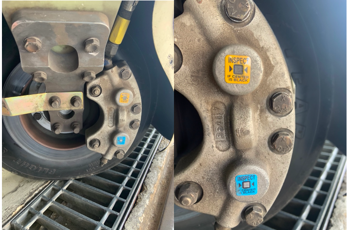
    Notice the Top Yellow sticker is far darker than the Bottom. The Yellow temperature indicator turns at 300 Degrees, while the bottom Blue indicator turns at 330 Degrees. This is an indication to the pilot that if the bottom sticker has turned colors, that the braking system has exceeded 330 degrees and is in need of servicing.

    Above is a photograph of an SR22 G1 braking system with turned brake temp stickers. The first things you may notice is that there are in fact two brake temperature stickers. We can only see the bottom blue sticker from the inspection port on the wheel pants. The other is higher on the caliper; in order to see it, the wheel pant must be removed. This isn’t common knowledge because there is no mention of this additional indicator in the POH.

    Now you may be asking yourself, what can I do to extend the service life of my factory equipped Cirrus brakes? Here are some tips. First, always taxi at 1000 RPM and use the rudder as much as you can while only tapping the brakes. This is not fool proof, since sometimes, depending on the grade, you will have no choice but to utilize brake tapping to keep the aircraft going straight. Taxiing is not typically where the brakes get overheated, though, but this is still a good practice to follow.

    What we tend to see is that the Cleveland brakes are generally overheated on landing. We always recommend to make sure your final approach speed is not excessive, land in the first 1/3 of the runway, and let the aircraft rollout to a smooth stop. What tends to happen is that the aircraft is too fast, and the pilot tries to exit at a certain taxi way, or brakes hard and continues to ride the brakes after landing during taxi. If you do your best to avoid these habits, it will serve you well.

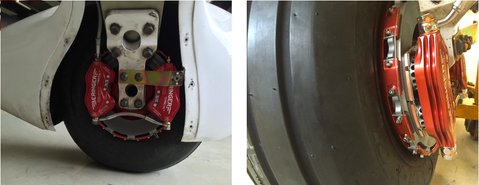
    This braking system remained unchanged all the way until the 2016 G5 Cirrus SR series. Starting in 2016, the factory equipped G5 and G6 Cirrus SR series all now come standard with a single piston hydraulic braking system from Beringer. The Cirrus Beringer brakes far exceed the braking power and durability of the old system. The new system is more robust, withstands heat better, and is is very well built. There is also an option for an upgraded dual caliper system to increase durability and stopping power. A braking system STC for the older Cirrus G1 through early G5 models was created to upgrade those airplanes to the better stopping power and cooling of the Cirrus Beringer brakes.

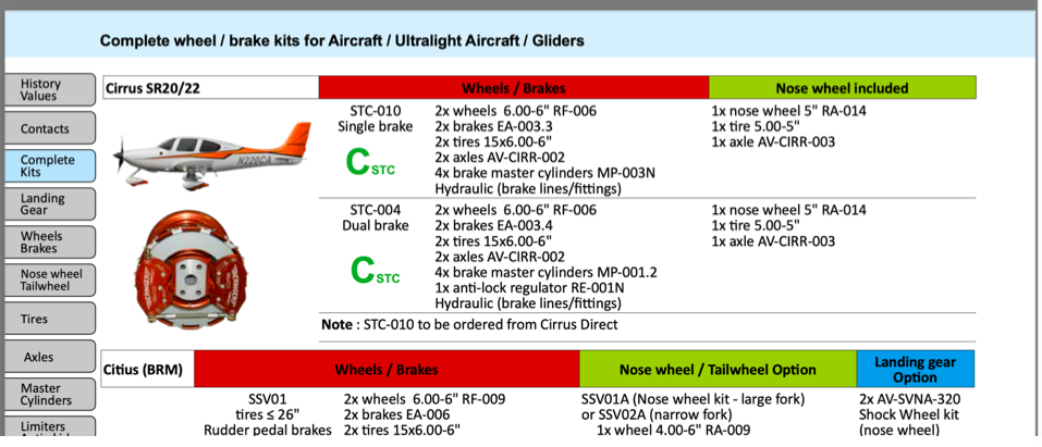
    Seen above is a page from a Beringer catalog highlighting the Cirrus SR series STC kits. Your local Cirrus service center will be able to quote prices for the kits. We have over 1000Hrs spent behind Beringer equipped Cirrus aircraft and the difference is quite apparent. The pilot has better control of the aircraft, no spongy pedal, and the confidence to get the plane stopped without possibly overheating the braking system. This, in our opinion, is one of the best upgrades you can do to your Cirrus.
    Above is what an STC upgraded braking kit from Beringer looks like, as well as the new temperature indicator for the pre/post flight inspection. Notice the black spot on the left hand picture. These brakes have been overheated.

    One other difference for a pilot to note is that once upgraded to the Cirrus Beringer brakes, there is only one temperature indicator and it changes color at a whopping 450 Degrees Fahrenheit! Needless to say, it can handle some heat! The new temperature indicator is now Orange in color and turns grey/black when overheated.

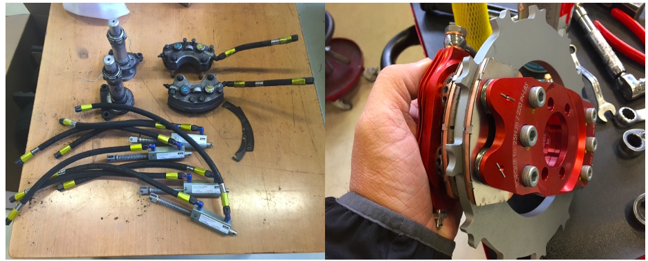
    On the left are the original Cirrus factory brakes. On the right is the caliper to the new Beringer brakes for a Cirrus.
    Dual Caliper Cirrus Beringer Brakes

    The Cirrus Beringer brakes upgrade is quite a step up in the world of slowing down. However, this doesn’t mean that they are completely issue free. There is one little-known problem with Beringer brakes that is not that big of a deal and can be fixed with relative ease.

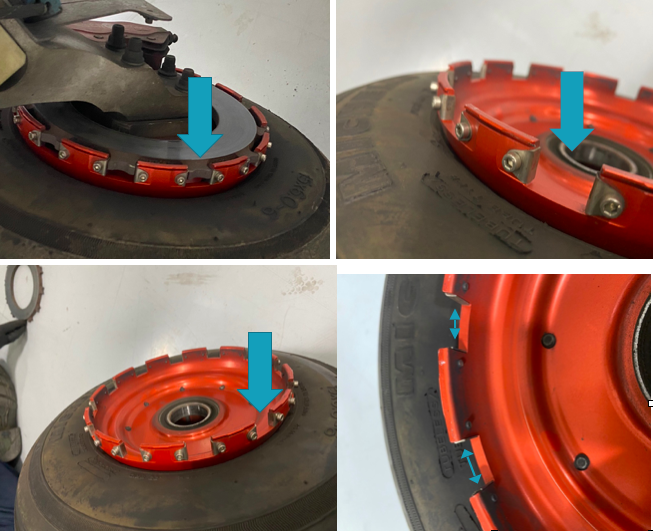
    The rotor on the Beringer braking systems is “free floating,” meaning it is not necessarily “fixed” in position when secured down to the spindle. It is “keyed” into the wheel rim with the male and female side interlocking.

    The brakes occasionally will get noisy, causing a “knocking” noise when brakes are applied. This noise is caused by the small metal tabs that tighten up the space between the wheel and the brake rotor. This is so the small tabs wear with use instead of the aluminum rim that they are fixed to. So, if your Beringers are making a knocking noise when brakes applied, this is most likely your culprit.

    These gaps above are the “keyed” position where the rotor finds home in the rim. Without these tabs that wear with use, we would be replacing the rim more often than the much cheaper replaceable tabs.

    It is highly recommended to upgrade your original Cirrus factory brakes to the new Beringer braking system. You will deal with less maintenance, less chance of a brake overheat, and less confusion on whether or not your brakes are airworthy. For more info, you can check out the Cirrus website for the single or dual caliper Beringer brakes.


    Zach Anderson is a Cirrus Standardized Instructor Pilot (CSIP) for Texas Top Aviation. Zach comes from a auto mechanic background and is very familiar with the ins and outs of maintenance. He started working for Texas Top Aviation in December 2020.

    You just bought your Cirrus SR22. You do some flying, and soon find yourself with a brake temp sticker that isn’t white anymore. You remember from your transition training that any color other than white is a no go. You now ponder…. I don’t remember getting on the brakes hard, or riding the brakes while…

  • Lightspeed Zulu 2 vs. The Bose A20

    The debate about which headset is the better product will never cease.  We do know this for sure, though, Lightspeed and Bose make the best noise canceling headsets out there.  David Clark’s offering doesn’t match up with these two.  Newcomer AKG has a light (weight-wise that is, as the headset is equipped with a pair of LED lights as well) ANR headset that the jury is still out on.  For now, Lightspeed and Bose sit atop the ANR kingdom.

    The comparison for this article will be between the Lightspeed Zulu 2 and the Bose A20 headsets, both of which I have used quite extensively in my flying career.  I am officially in the Lighspeed camp at this point and after reading my comparison below, you’ll see why.

    ANR Functionality

    Bose A20

    Between the two, the Bose A20 cancels out more noise, no argument there.  This isn’t to say that the Lightspeed Zulu 2 doesn’t.  Quite the opposite, actually.  The Lightspeed Zulu 2 does a great job of canceling the noise.  But with the A20 on in a C172, you can barely hear the engine running.  The difference before you press the power button and after is extremely noticeable.  I had one client turn to me after turning on the noise canceling function of his new A20 headset and state, “These things are awesome!”

    The other advantage Bose has is a continuation of the noise canceling.  About the only thing I don’t like about the Lightspeed is if you don’t have the headset sized just right on your head, each time you turn your head to look at something, then the suction gets broken around the ear cup and you get some ambient noise.  My glasses probably don’t help with this.  It’s not that big of a deal, you just have to readjust the size of the headset, but, since I’m a little OCD, it bugs me.  Once I get the set sized right, it’s smooth sailing.

    Comfort

    Lightspeed Zulu 2

    Far and away, the Lightspeed Zulu 2 is much more comfortable than the Bose A20.   I flew for 5 hours in the right seat with my Lightspeed set on the other day.  I switched to the left seat for the last leg and used the owner’s A20 headset since it was plugged in on that side already and I noticed quite a bit of difference.  The ear cups seemed to press against my head more.  The pad on top of my head didn’t seem to be as cushiony.  It just wasn’t overall as comfortable as the Lightspeed Zulu 2.

    Bose has made a lot of progress from their original noise canceling headsets.  Those didn’t have much of a cushion on top at all.  After about 2.5 hours, the slim ear cushions began to dig in to the side of your head.  So, the A20 has made some progress, but the Lightspeed Zulu 2 takes the cake in comfort.

    Weight Distribution

    “Wait!”  You Bose boys scream (no pun intended).  “The A20 is lighter than the Zulu 2!”  While this is true (the Zulu 2 weighs in at 15.7 oz while the A20 is only 12 oz), the way that weight is distributed makes a massive amount of difference.  The Lightspeed Zulu 2 feels lighter on top of your noggin than the A20 because the weight of the A20 is firmly planted on the top of your head in a single point.  With the Zulu 2, the weight is distributed evenly across the top of your scalp, so even though the set is heavier, it feels lighter on your head because the weight is not all concentrated on one point.

    All this adds up to why I like the Lightspeed Zulu 2 more than the Bose A20.  As for a practical example, I wore my Lightspeed Zulu 2 set for 9.1 hours one day two weeks ago.  Needless to say, it was a long day.  But, once I climbed out of the airplane, I had no pain on the top of my head and only a very little where my glasses ran along the side of my head.  Now I call that a winner.

    The debate about which headset is the better product will never cease.  We do know this for sure, though, Lightspeed and Bose make the best noise canceling headsets out there.  David Clark’s offering doesn’t match up with these two.  Newcomer AKG has a light (weight-wise that is, as the headset is equipped with a pair…

Leave a Reply

Your email address will not be published. Required fields are marked *