The Garmin GFC 700 Autopilot is an amazing machine. Fully digital and fully integrated with the Garmin G1000 glass panel, it makes a pilot’s workload a lot easier, especially in busy airspace.
I train a lot of pilots in airplanes that have the Garmin GFC 700 autopilot. The Cirrus SR22, the Columbia 350 & 400, the G36 Bonanza, and the Piper Mirage and M350 to name a few. The most common problem I see for pilots transitioning into the Garmin GFC 700 equipped aircraft is that it doesn’t act like other autopilots.
STECs and DFC 90 Autopilots function like this: you push the button for the mode you want on the autopilot controller and that turns the autopilot on.
Not so on the Garmin GFC 700. If you push the button for the mode on the GFC 700, then the flight director engages, but not the autopilot. This confuses folks a lot who move up from different autopilots because their autopilot primacy side of their brain is telling them the autopilot is on whenever they push one of the buttons on the GFC 700 controller.
Here’s an example: A pilot has just departed and is ready to turn on course. In his old airplane with an STEC 55x autopilot, the pilot pushes the direct to key to go to his first waypoint, then pushes NAV on the autopilot controller and the STEC 55x comes on and starts flying on course. Then he presses VS and ALT to initiate a climb.
With the same scenario and a Garmin GFC 700 autopilot, the same pilot (who is used to a 55x), pushes the direct to key, then pushes NAV on the autopilot controller and pushes IAS or FLC to initiate the climb. He lets go of the flight controls thinking the autopilot is engaged. The airplane starts nosing over and he starts panicking.
Why did this happen? The pilot in the second scenario never pushed the AP button on the Garmin GFC 700 so the autopilot never engaged. All he did by pressing the NAV button and IAS button was to turn the flight director on.
How to remedy this? Get in the habit of checking your scoreboard. On the top of the G1000 or Garmin Perspective PFD, there is an autopilot annunciation strip (or scoreboard as I like to call it). In the very middle of the scoreboard is an area to show if the autopilot or flight director is engaged. AP means the autopilot is on; FD means the flight director is engaged but the autopilot is not.
I teach pilots to be in the habit of checking your scoreboard each time you get done pressing buttons on the autopilot controller to ensure the Garmin GFC 700 is in the proper mode. This saves some of those panic moments when it is supposed the AP is engaged, but it’s only the FD.
The Cirrus Pilot Proficiency Program (CPPP) will be coming to the Galaxy FBO at the Lone Star Executive Airport in Conroe, TX again this year. The dates of the event will be October 14th-16th.
Wondering what the CPPP program is?
“CPPP offers a weekend event for Cirrus owners and their partners that focuses on Cirrus-specific knowledge and flying proficiency. We bring some of the most experienced flight instructors who regularly teach in all kinds of Cirrus airplanes flown for all kinds of missions. We have prepared an extensive syllabus of ground courses that complement the transition training and delve into areas of greatest need for Cirrus pilots.” (from CirrusPilots.org)
The weekend starts off with a group dinner on Friday night. The Saturday morning ground session focuses on General Aviation Safety with special focus on the Cirrus accident statistics. Normal and emergency procedures are also reviewed.
In the afternoon on Saturday, the attendees are split into two groups. The first group has a myriad of options for ground sessions covering all topics related to Cirrus aircraft and operations. The second group flies, then they switch for the second 3 hour session. Sunday brings the same split, with more courses offered and more flying.
While the Cirrus pilots are flying and learning more about their airplanes, CPPP offers a Partner in Command course for flying partners on Saturday. This allows flying partners to be more comfortable in the airplane and teaches them what to do if something were to happen to the pilot.
All in all, attending a CPPP will improve both Cirrus knowledge and Cirrus flying skills. It’s highly recommended for all Cirrus pilots.
To register for the CPPP event in Conroe, check out the CPPP website.
Throughout the whole event, I learned quite a few things both about flying and about myself. Here are some of the lessons which I have taken away from the accident:
No flight is routine: When I took off that morning I was about as relaxed as I could have been while going to fly. I was flying an airplane that I knew well, in beautiful weather, to familiar airports and even carrying passengers which I had taken on this exact trip more than a dozen times. The accident brought into startling clarity that anything can happen at any time. I had done everything right that morning (preflight, weather briefing, planning, etc) , and none of that did anything to stop the deer from jumping out onto the runway. All we can do is ensure the items we do have control over are covered and try to be prepared to deal with anything else that arises. This ties directly into my next point:
Making sure everything is correct: When you do go fly, make sure that you have all your paperwork and personal details taken care of. I can think of a few times over the course of my flying career where something wasn’t quite right with the paperwork, or perhaps I had forgotten my wallet and I was tempted to go fly anyway. “It’s 8pm on Sunday, I’m not going to get ramp checked.” Well, I can assure you that the paperwork and questionnaires which were required to be submitted to the FAA, NTSB, and Insurance companies would have uncovered any discrepancies in my logbooks, currency, or legality. It isn’t worth the risk of flying without having everything in place just in case something happens. It isn’t just a random ramp check which can get a pilot into trouble.
Ask for help: The story of my collision with a deer would have had a very different outcome if it weren’t for the help that I received from countless the people on the ground. If you’re ever in a situation where you could use a hand, don’t be afraid to ask for help. If I had simply turned around and landed back at Wings, I wouldn’t even have had any idea that my landing gear was missing! The people in the control tower, the maintenance guys, the approach controllers in Philly, the emergency responders, and many more people all played their part in orchestrating a successful outcome.
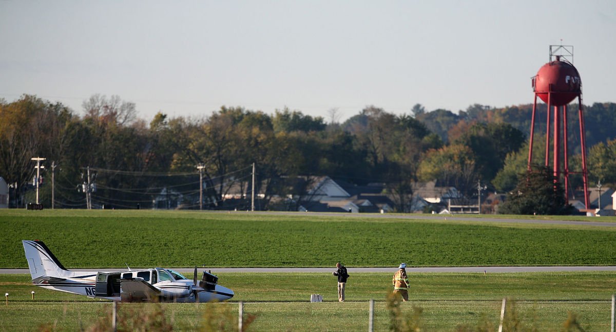
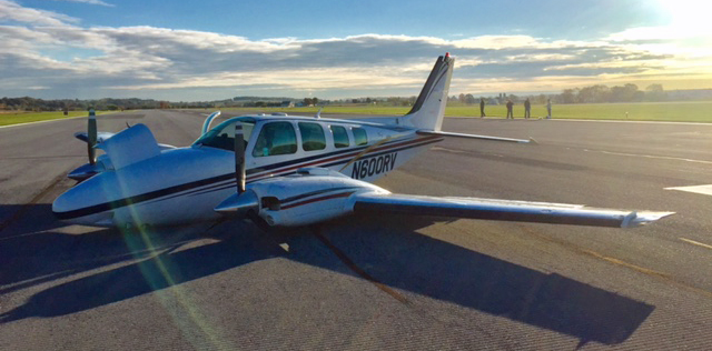
Airplane sitting on the runway after the firefighters had checked it out Photo credit: www.lancasteronline.com
Dealing with the Paperwork: I have had dealings with the FAA before, but never for an accident. I was afraid that the investigation would be a witch hunt and I would have to defend myself while someone poured over all my planning and paperwork looking for potential errors. But, my fears were totally unfounded. Although I did have to answer many phone calls, write many reports, and fill out much paperwork, the FAA, NTSB, and Insurance companies were very patient in waiting for my responses and even complimentary in how the situation played out. I really enjoyed working with all of them and appreciated their encouragement and help.
Emotional Response: After the dust had settled and the smoke had cleared, I was left standing on the side of the runway with the passengers and my boss. I offered to fly them back to Philadelphia or continue to Pittsburgh and assured our Chief Pilot that I was feeling fine and ready to fly again. Fortunately, there wasn’t a need. Over the next week or two, I noticed a change in myself. I wasn’t fine. I have never had headaches, but shortly after I landed I developed a headache that didn’t go away for days. I had trouble focusing on anything and I had trouble finding motivation to do much but sit and stare at a wall. I wasn’t sharp and I caught myself making silly mistakes in my normally routine activities. I wasn’t depressed, or sad, it was just an unwanted mental and physiological response to the stress and shock of what happened that morning in the Baron. I didn’t feel like myself for quite some time and I even found myself a little on edge whenever I lined up for takeoff on subsequent charters for while afterward. Eventually I started to feel normal again, but it was a slow process.
Feather the Props: I can’t tell you what a difference it makes when those props go from wind milling to feathered. It became clear to me that feathering a prop could make a huge difference in deciding the outcome of an emergency situation.
Good training and checklists usage: This one is pretty straight forward, but it’s worth mentioning. Good training and proficiency make all the difference when the odds are against you. Make sure that you use all your resources when your back is against the wall, and that includes the checklists. Under the stress of the flight I had forgotten to close the cowl flaps and would likely have landed with them open without the aid of the Emergency Procedures Checklist. This would have resulted in unnecessary damage to the airframe.
No need to rush: There is no denying that I had things stacked in my favor that day. I had nice weather, extra gas, daylight hours, and even the luxury of landing at my home airport. But, regardless of all those variables, there is no need to rush into anything. Ask questions, find answers and come up with a plan. Obviously not all emergencies present the pilot with the luxury of time, but use all time and resources you have to your advantage.
Polish up those procedures: The deer accident really made me want to go out and brush up on all the emergency procedures which I hadn’t performed since my last checkride. The realization that I could need any of them at any time was really hit home after I hit that deer. Additionally, make sure you know who to call if something ever does happen.
Know the systems: Familiarity with the systems on the airplane makes it easier to troubleshoot and solve issues on the fly and makes it easier to spot a problem in the first place. Knowing how systems work and what their normal indications should be helps make decisions regarding when to divert and where to land easier.
The irony isn’t lost on me that the last article that I wrote for this newsletter dealt with how to avoid making gear up landings and the high cost required to repair one. I never would have imagined when I wrote that article last fall that I would be writing one only a few months later detailing my own gear up landing.
The bottom line is that there is nothing a person can do to prepare for every situation which might arise throughout the course of a flight, and it’s also impossible to know which emergency you may have to deal with if a situation arises. All we can do is stack odds in our favor by making sure that we address the things within our control such as aircraft maintenance, careful flight planning, checking weather, and having personal minimums set in place to keep us from flying outside of our skill sets and comfort zones.
Additionally, ensuring that you are knowledgeable and proficient in your aircraft’s procedures will give you the best chance for success. When things start going wrong, keep calm, and ask for help. Work the problem instead of guessing or rushing into a less than desirable solution. No one wants to be caught in an emergency like a deer in a landing light!
Andrew Robinson is an airline pilot for Piedmont Airlines. He is a former 135 Charter Pilot and flight instructor who lives with his wife and 2 daughters in Pennsylvania. He instructs in Beechcraft Bonanzas.
Whenever I get in an airplane with a pilot for recurrent training, I can assure myself that I will mention rudder usage more than once during the flight. If it is in a tailwheel (or if the pilot is doing tailwheel training), I’m going to mention the rudder a lot. How do I know this? Because basic rudder skills are actually one of the most difficult things to master in flying.
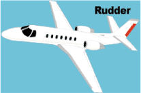
Let’s start simple. What does the rudder do? The dictionary definition is it controls the movement about the vertical axis of the airplane. If you stick a pole down through the CG of the airplane and rotate the airplane around that pole, this is the vertical axis. Looking at it another way, the rudder moves the airplane’s nose left and right. Keep this in mind as we move on.
Every pilot thinks about the rudder during the takeoff roll. Because of the torque effect, the pilot must add right rudder during the takeoff roll to stay on the runway centerline. Depending on the airplane’s horsepower, more rudder pressure is needed in higher powered airplanes. The problem usually shows up once the airplane gets in the air.
In the worst situation, after takeoff, the pilot will set both feet on the floor and completely disregard the rudder. Torque effect and now P-factor are continuing to cause the airplane to yaw left, causing the need for right rudder. With his feet on the floor, though, the pilot is allowing the airplane to yaw. It’s not terribly noticeable for him in the front seat, but the back seat passengers (especially in a six seat or larger airplane) are certainly feeling it.
One particular problem spot on the climb is the climbing left turn. In a climbing left turn, training says to add left rudder since it is a left turn (see below for the reasoning). But, since the airplane is climbing and therefore experiencing left yawing tendencies due to the aforementioned effects, the pilot needs to continue pressing the right rudder, though the pressure won’t be as much as in a straight climb. Watch the ball the next time you make a climbing left hand turn and it’ll make a believer out of you.
I find only a handful of pilots are this egregious. Most pilots have rudder problems in turns and in turbulence. We’ll tackle turns first. As we all learned when we first started flying, due to adverse yaw, a pilot must add rudder in the turn’s direction. Again, this isn’t usually where the problem shows up. During the rollout is the problem area.
Let’s take a turn to the left. The pilot rolls in, adding left rudder, arrives at his heading, then begins to roll out with the ailerons. Left adverse yaw is now being experienced and right rudder is needed to smoothly transition back to level flight. Need some visual assistance? Watch the nose the next time you make a turn. If you are working the rudder properly, the nose will pivot on one point in the horizon. If you aren’t using the rudder properly, the nose will draw a U shape on the horizon. Try making some turns without rudder, see what it looks like, then use the rudder properly. You’ll notice a big difference.
Finally, let’s talk turbulence. As we all know, turbulence in the hot summer afternoon is quite pronounced. When the airplane experiences a bump, it usually doesn’t bounce straight up in the air. There is usually some kind of rolling motion involved. As the pilot corrects this rolling motion by moving the ailerons, adverse yaw is experienced (just like rolling into and out of a turn that we talked about above), so rudder is needed. There isn’t a need to stomp on the rudder or you’ll cause the airplane to severely yaw in the other direction, but rudder pressure is needed.
Final approach is where this gets most pilots. By controlling the nose and not allowing it to move around on final by using the rudder, this will make your approaches a little more stabilized leading to a more successful landing.
Feeling lost when it comes to the rudder? Ask your instructor the next time you go fly to do some rudder exercises. Most instructors don’t emphasize these basic stick and rudder skills which leaves pilots lacking as they move on in their aviation lives. So make it a point to do some basic rudder work the next time you fly with your instructor.
On the evening of November 3rd, 2015, I was returning to my home airport of Lancaster from Pittsburgh in my company’s Aerostar, after being out on charter all day. It was dark out as I entered the traffic pattern at Lancaster. After an uneventful approach, I was cleared to land behind a Mooney. The spacing looked good as I turned final, but, as I was nearing the threshold, I started to become concerned that the Mooney wouldn’t be clear of the runway in time for me to land. At that moment, over the radio I heard an uncomfortable transmission from the Mooney pilot: “Tower, Mooney ABC has landed gear up.”
It took the tower controller a minute to grasp what was going on, and I was on about a 1-2 mile final when I was instructed to go around. Thankfully, the Mooney came to a stop in such a position that I was able to use the other intersecting runway, and was on the ground only a few minutes later. I can assure you, however, that I’ve never checked my “3 green” so many times in one traffic pattern as after that incident. Thankfully, no one was hurt, but there sure was an impressive amount of emergency equipment on the runway as I taxied back to my hangar.
In aviation, there’s a saying that goes: “There are two types of pilots. Those who have landed with their gear up, and those that will.” I don’t like that saying. The potential of a gear up landing (as a result of pilot error) is something that has always been a risk that I have worked hard to avoid. Not only is a gear up landing embarrassing; but it’s also an extremely expensive black mark on any pilot’s career.
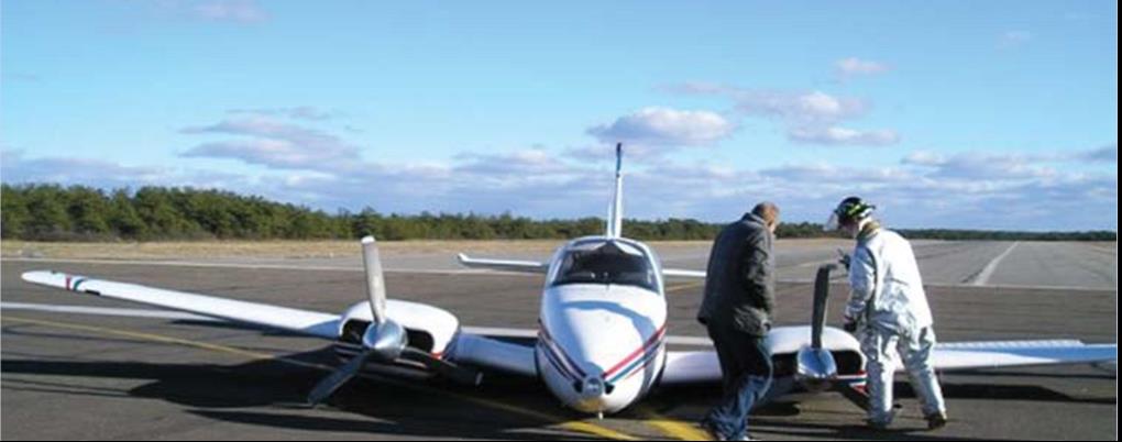
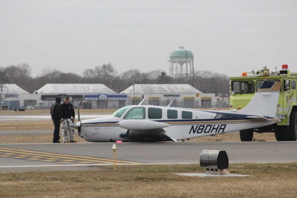
Not a good day. (Photo credit: http://www.newsday.com/long-island/suffolk/plane-lands-at-republic-with-no-wheels-1.2735131)
According to a July 2006, article in Aviation Consumer, the estimated cost of repairs following a gear up landing for an A-36 Bonanza would be about $27,000 and about 3 weeks of down time. 25 years ago, even my beloved E33 Bonanza was the victim of a gear up landing. While it was neither me nor my dad flying our airplane that day, the event stays in its history and reduces its value should the time ever come to sell it.
That incident in 1990 resulted in approximately $25,000-30,000 in repairs. The cause of the incident was classic: the pilot put the gear down at the normal time, but then had his downwind extended by tower. He brought the gear back up to fly the longer downwind, but forgot to put it back down later when he was cleared to land. Like many pilots, he had a set routine time when he normally put the gear down, and when his routine was changed, he didn’t remember to lower the gear once more.
Unfortunately, no matter what experience level one may be at, no pilot is immune to the possibility of such a mistake. The following are 5 tips that I have learned in my time flying that have helped myself and others minimize the chance of a gear-up landing occurring:
Know your aircraft systems: What are the operating perimeters on your airplane’s gear warning system? Most airplanes have a designated speed or power setting at which the gear warning horn will sound in the event that the gear isn’t down and locked. In the Aerostar that I was flying, the gear horn was supposed to come on at 15” of manifold pressure with the gear up, but in practice, it didn’t come on until much lower than that. It has since been adjusted, but at the time it was important for me to know that if I had left the gear up, the horn wouldn’t have sounded in a timely enough manner for me to go around, much less lower it prior to touchdown. Most likely it would have just added to the noise of metal on concrete as I pulled the power all the way back in the landing flare.
Don’t override gear-up warning systems: They were put there for a reason! Even if you’re out doing maneuvers and the horn is blasting in your ear for half an hour, resist the temptation to simply pull the circuit breaker or push the warning silencer to make it shut up. If a pilot disables the gear-up warning horn and then later forgets to put the gear down on landing, he or she will have a much worse headache on their hands than the one that the horn would have given them.
Use your checklists and memory items: It doesn’t matter how much a pilot knows about his or her airplane, or the procedures for it. Distractions happen. Mistakes Happen. Always consult the checklist for confirmation that you’ve accomplished all the essential tasks before landing. Additionally, if you haven’t already, work on developing call outs which you perform out loud regardless of whether you are alone in the airplane or not. Whenever I’m landing an airplane, I start with my flows, go through my GUMPS (Gas-Under carriage- mixture- props- seat belt) checks, then do the printed checklist, and finally when on short final I call out “short final, cleared to land, three green.” I’ve had several passengers tease me about doing the “three green” call out while I was flying aircraft that didn’t have retractable landing gear. But, I’d much rather be in the habit of checking every time regardless of what I’m flying than forgetting to check when it is necessary.
Use your available resources and develop healthy habits: If I have someone riding with me, I generally ask them to confirm that there are 3 green lights glowing on the instrument panel. Even if that person isn’t a pilot, they will probably enjoy the opportunity to be involved, and it’s a good way for me to stay in the habit of checking the gear lights to ensure that everything is properly down and locked. I’ve also found that intentionally leaving your hand on the gear lever until you have gear safe lights is a good idea. Forcing yourself to keep your hand on the handle until you have the all important lights obligates you to actually observe the indications instead of simply throwing the lever and moving onto something else. This way, if you only get an indication of 2 greens you’ll be aware of it right away and have more time to respond appropriately. It also helps you to learn the normal length of time it takes for the gear to extend or retract, which will be helpful to you to be aware of any abnormalities in the gear system.
Upgrade your aircraft’s gear-up warnings: There’s a variety of ways you can improve your aircraft’s ability to warn you of a potential gear-up landing. For student pilots or pilots new to complex aircraft, it could be something as simple as a red post-it note on the panel to remind you to verify the gear position prior to landing. Or, if you own an aircraft that doesn’t have an effective way to warn the pilot of a gear-up landing, consider investing in an aftermarket gear-up warning system – surely the extra price of such an upgrade is a small amount next to the cost of repairing the damage from a gear-up landing!
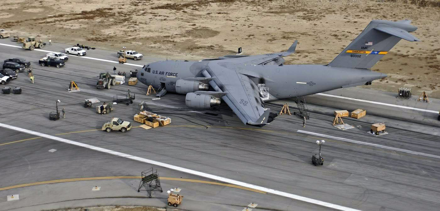
It can happen to anyone! The gear handle in this C-17 was in the “UP” position. (Photo Credit:https://theaviationist.com/2009/02/09/c-17-gear-up-landing-in-bagram-images/)
Always remember, regardless of experience, no pilot is immune to the possibility of a gear up landing. The best way to safeguard yourself is to discipline yourself in the use of flows, checklists, and call outs. Things like gear warning horns, visual reminders, and other systems are a useful back up, but they shouldn’t be relied upon to save your bacon if you don’t get the gear down at the proper time. Fortunately, in most gear up landings, the pilot and passengers are able to walk away uninjured – but that doesn’t lessen the embarrassment or financial burden of the event. So, keep your chin up, your gear down, and remember….THREE GREEN
Mooney announced last week the redesign of their current Ovation and Acclaim models. The biggest change that Mooney pilots will love is the addition of a pilot’s door, allowing the pilot to enter on the left side instead of having to crawl over the passenger seat.
Other upgrades include a keypad for easier data entry on the G1000 and an all in one, digital standby instrument that includes attitude, airspeed, and altitude.
This raises the question, will Piper and Beechcraft follow suit?
I got the privilege of going to the EAA AirVenture at Osh Kosh this year. It was my first Osh Kosh experience. I’ll be the first to tell you, walking in the gate on the first day is mildly overwhelming. There are people and stuff everywhere. Airplanes, tents selling everything from airplane parts to mattresses (I wasn’t really sure how mattresses tied to flying), vendors, colleges, and loads of people.
Photo Courtesy of William Day, copyright 2018, All Rights Reserved
After I gathered myself from my initial shock, I set out to explore all that I could. I spent most of the first morning walking around the different manufacturer’s tents, getting a gauge on all the new airplanes I could never afford and only hope to ever fly.
The short of it is, the Cessna/Textron Denali is going to be stellar once it gets completed. The Epic E1000 (if it ever gets certified) might take a large market share from TBM, though they will have an uphill climb. The Cirrus Vision Jet is very cool and should be a relatively simple step up for SR22T owners. The Pilatus Jet is huge. Finally, the Diamond DA62 would be my below 12,500 airplane and the Piper M350 would be my pressurized plane. Money being no factor, of course.
Photo Courtesy of William Day, copyright 2018, All Rights Reserved
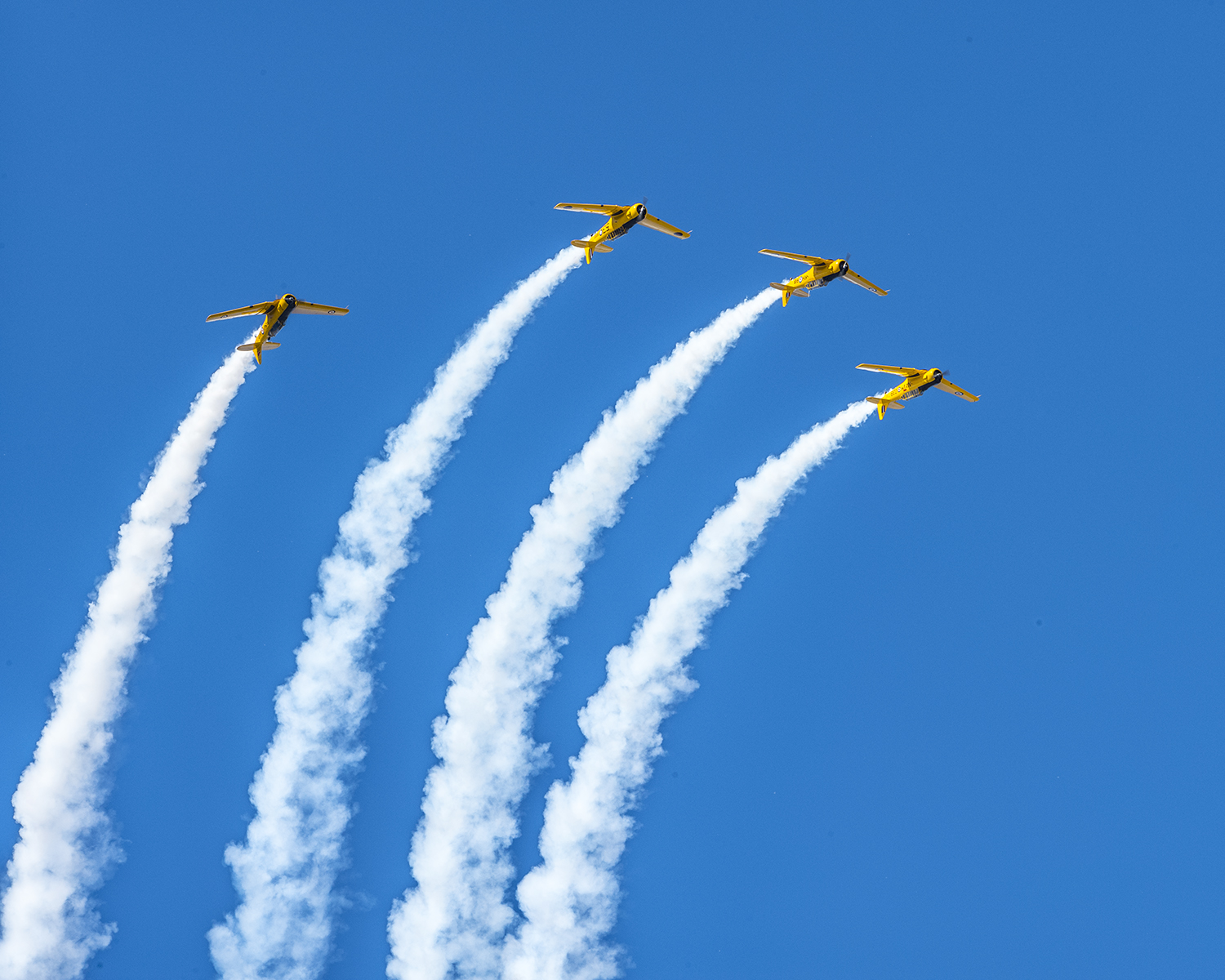
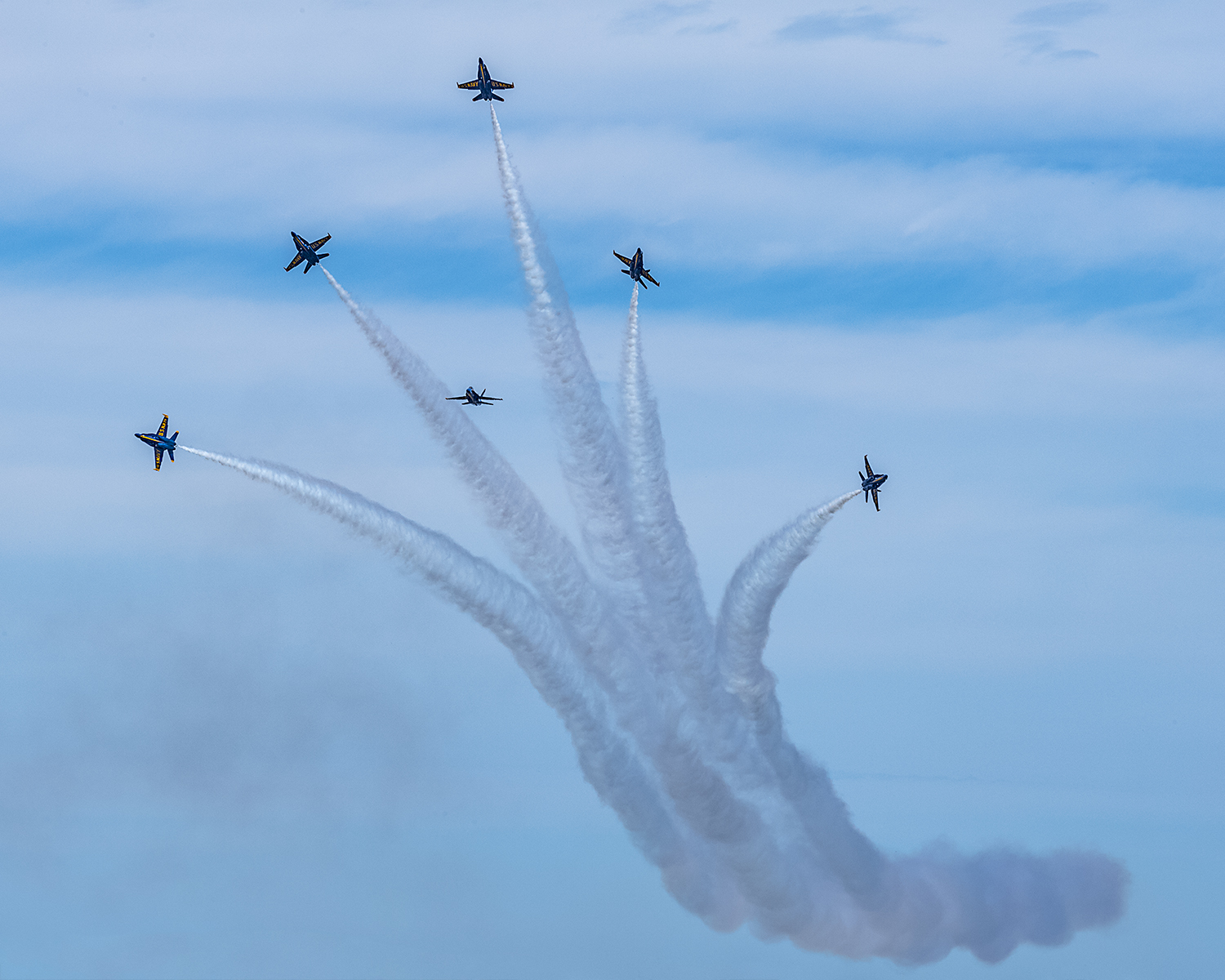
I decided to take in the entire airshow on Day 1, all 4 hours of it. Upon realizing I would be very stiff necked if I did that each day for the three days I was there, I decided on Day 2 to check out some seminars and learn something. I took a seaplane ground school course on Day 2, then listened to a NASA presentation on electric airplanes and low boom sonic jet technology (how to make supersonic passenger flight quieter).
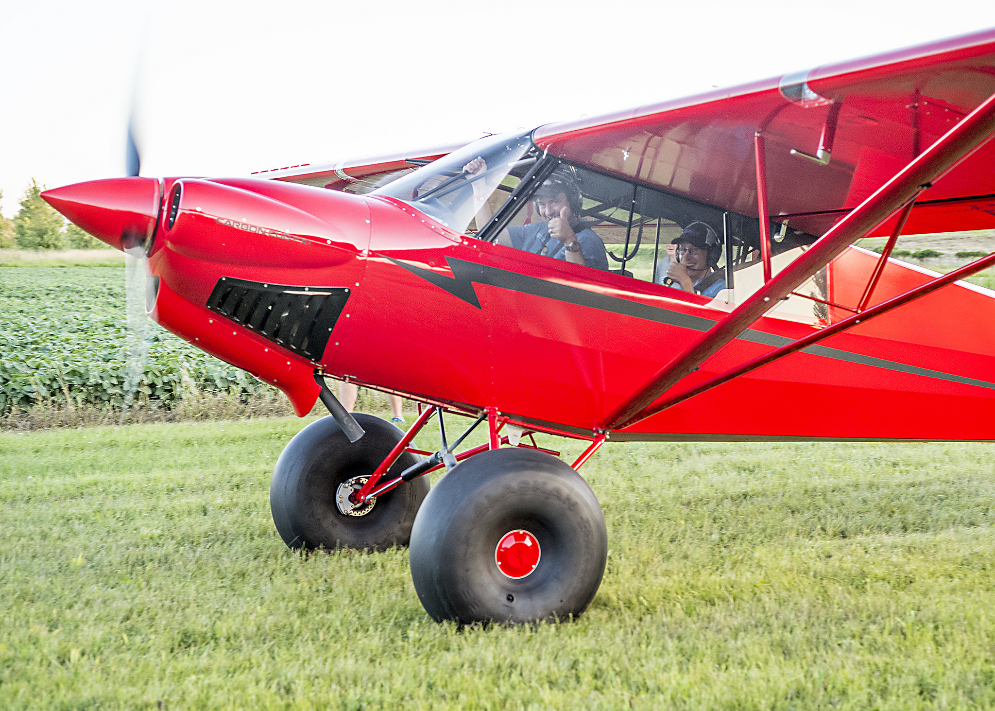
The end of Day 2 at Osh Kosh had to be the highlight. I got to hang out with Cub Crafters at the 51WI grass strip just north of the OSH Class D airspace. There was a free BBQ and I got to take a ride in a Carbon Cub. My landing from the back seat was a bit rusty, but still a very cool experience. Buzzing the BBQ area in tandem was pretty neat.
Photo Courtesy of William Day, copyright 2018, All Rights Reserved
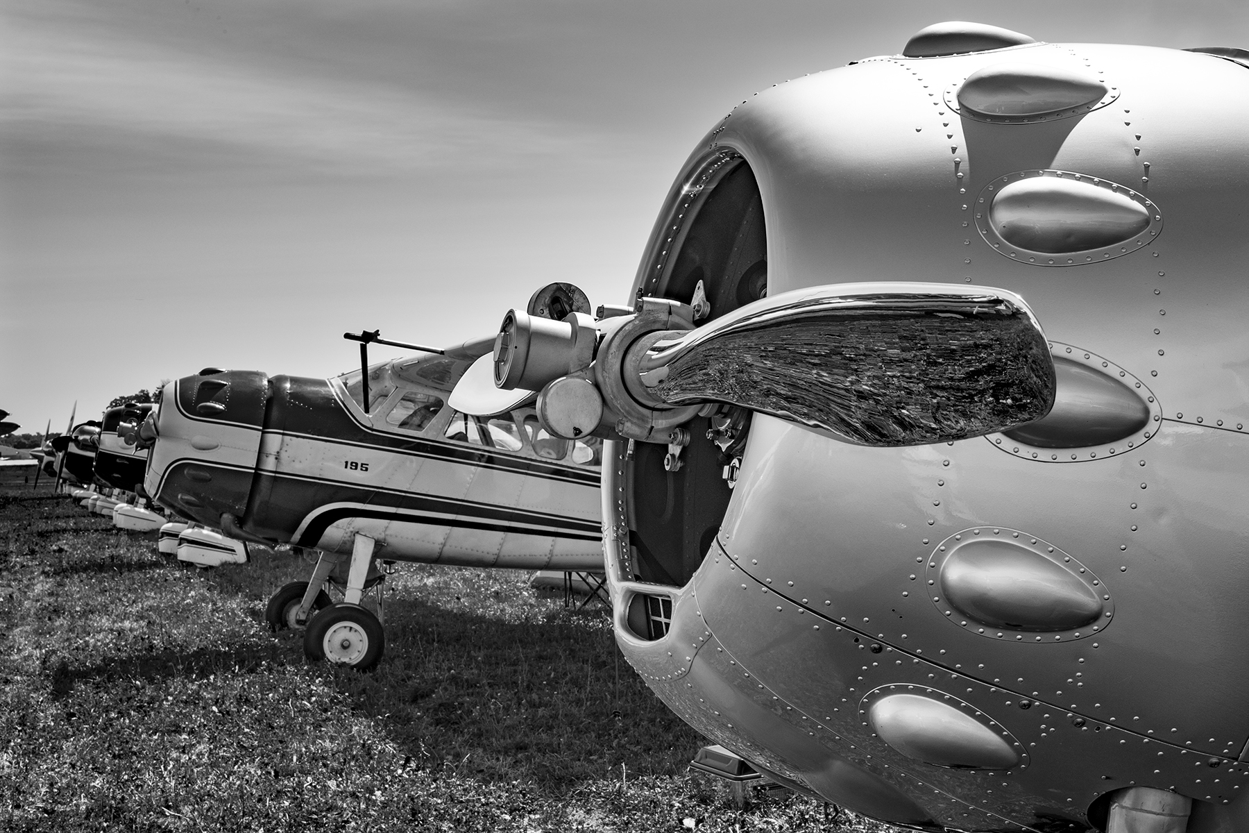
Day 3 brought some cooler temps and some clouds. We walked out to the vintage airplanes, spending the morning gawking at Cessna 195s and Wacos. Then I took the plunge to explore all the vendor hangars. My idea was to walk around and see if I can find some interesting and innovative technology. Well, after 2 of the 4 hangars, my head was spinning, so I decided to watch the rest of the airshow to let my brain drain out a bit.
Photo Courtesy of William Day, copyright 2018, All Rights Reserved
3 Days was a good amount of time to spend. I don’t think I could have stayed all week, but only a day or two wouldn’t have been worth it. I flew up with a former student in his TBM 700, which was a very nice way to travel. We landed and stayed in Green Bay (KGRB), which was super easy and low stress. Had a great tailwind on the return and made it to Houston non-stop.
A few closing observations:
The Stratos 716X Personal Jet
If Stratos Aircraft is ever able to bring this to market, it sounds awesome. 400 knots, single engine, single pilot, with 6 seats. Being a single engine jet, similar to the Cirrus Vision Jet, it’s 100 knots faster, plus with the airflow and engine technology, it doesn’t have that big V Tail in the back, thereby reducing drag. I have a feeling it would find a good market, but the certification process is a bear to get through. Just ask Epic.
The Lancair Mako
This is a legit airplane. Lots of thought was put in to the design of the Mako by the new Lancair organization in Uvalde, TX (KUVA). The airplane was extremely comfortable, capable, and pretty cool. The stick is in the center, with throttles on the side (where the stick would be in a Cirrus or Columbia). AC, full Garmin integration, and the cool factor of the nose gear retracting, but not having a gear handle. Higher useful load than a Cirrus or Columbia, it would be a great alternative (and cheaper) to one of it’s certified competitors.
Avionics
There is a lot of new avionics technology hitting the market. Dynon, beloved by experimental enthusiasts, is finding a foothold in the certified world with some neat panels. It will be an uphill battle to take on Garmin, but there is some potential in the retrofit market to offer a cheaper alternative to the Garmin TXi.
Speaking of the TXi, I played around with the 10.7″ panel at the Garmin booth. It is extremely intuitive. Garmin did a great job of making it a simple touch screen interface, easy to use, and easy to learn.
Avidyne is pushing their iPad integration with the IFD 100 iPad app. It ties via Wifi or Bluetooth to an IFD 550 or 440 navigator, giving an additional screen in the cockpit to work with. You have the ability to modify flight plans and such on the iPad and it will show up on the GPS units.
Photo Courtesy of William Day, copyright 2018, All Rights Reserved
All in all, Osh Kosh was an experience I’m glad to have finally experienced. I don’t think I would go every year like some folks, but every few years, especially when my sons are older, seems like just enough for me, but not too much.
All Photos Courtesy of William Day, copyright 2018, All Rights Reserved