Lightspeed Zulu 2 vs. The Bose A20

The debate about which headset is the better product will never cease.  We do know this for sure, though, Lightspeed and Bose make the best noise canceling headsets out there.  David Clark’s offering doesn’t match up with these two.  Newcomer AKG has a light (weight-wise that is, as the headset is equipped with a pair of LED lights as well) ANR headset that the jury is still out on.  For now, Lightspeed and Bose sit atop the ANR kingdom.

The comparison for this article will be between the Lightspeed Zulu 2 and the Bose A20 headsets, both of which I have used quite extensively in my flying career.  I am officially in the Lighspeed camp at this point and after reading my comparison below, you’ll see why.

ANR Functionality

Bose A20

Between the two, the Bose A20 cancels out more noise, no argument there.  This isn’t to say that the Lightspeed Zulu 2 doesn’t.  Quite the opposite, actually.  The Lightspeed Zulu 2 does a great job of canceling the noise.  But with the A20 on in a C172, you can barely hear the engine running.  The difference before you press the power button and after is extremely noticeable.  I had one client turn to me after turning on the noise canceling function of his new A20 headset and state, “These things are awesome!”

The other advantage Bose has is a continuation of the noise canceling.  About the only thing I don’t like about the Lightspeed is if you don’t have the headset sized just right on your head, each time you turn your head to look at something, then the suction gets broken around the ear cup and you get some ambient noise.  My glasses probably don’t help with this.  It’s not that big of a deal, you just have to readjust the size of the headset, but, since I’m a little OCD, it bugs me.  Once I get the set sized right, it’s smooth sailing.

Comfort

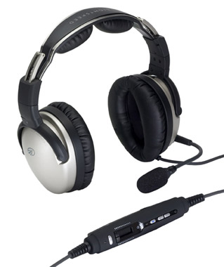
Lightspeed Zulu 2

Far and away, the Lightspeed Zulu 2 is much more comfortable than the Bose A20.   I flew for 5 hours in the right seat with my Lightspeed set on the other day.  I switched to the left seat for the last leg and used the owner’s A20 headset since it was plugged in on that side already and I noticed quite a bit of difference.  The ear cups seemed to press against my head more.  The pad on top of my head didn’t seem to be as cushiony.  It just wasn’t overall as comfortable as the Lightspeed Zulu 2.

Bose has made a lot of progress from their original noise canceling headsets.  Those didn’t have much of a cushion on top at all.  After about 2.5 hours, the slim ear cushions began to dig in to the side of your head.  So, the A20 has made some progress, but the Lightspeed Zulu 2 takes the cake in comfort.

Weight Distribution

“Wait!”  You Bose boys scream (no pun intended).  “The A20 is lighter than the Zulu 2!”  While this is true (the Zulu 2 weighs in at 15.7 oz while the A20 is only 12 oz), the way that weight is distributed makes a massive amount of difference.  The Lightspeed Zulu 2 feels lighter on top of your noggin than the A20 because the weight of the A20 is firmly planted on the top of your head in a single point.  With the Zulu 2, the weight is distributed evenly across the top of your scalp, so even though the set is heavier, it feels lighter on your head because the weight is not all concentrated on one point.

All this adds up to why I like the Lightspeed Zulu 2 more than the Bose A20.  As for a practical example, I wore my Lightspeed Zulu 2 set for 9.1 hours one day two weeks ago.  Needless to say, it was a long day.  But, once I climbed out of the airplane, I had no pain on the top of my head and only a very little where my glasses ran along the side of my head.  Now I call that a winner.

Similar Posts

  • MODAERO NextGen Aviation Festival

    Looking for something different to do this Spring Break week?

    Modaero

    Consider checking out the First Annual MODAERO NextGen Aviation Festival in Conroe, TX.  It’s a fly in event, complete with camping opportunities, at the Lone Star Executive Airport, KCXO.  The festival itself is being held right next door to the airport at the Lone Star Convention Center.

    What’s the draw, do you ask?  Not only are there going to be representatives from all the major aircraft manufacturer’s (along with tons of airplanes), there will be a multitude of speakers and live music.  There are even drone races!  The live music sets the event apart from the well known national fly in events like Osh Kosh and Sun N Fun.  It’s a different type of Festival, geared toward the younger generation of pilots.

    For more information or to register, check out MODAERO’s website.  The festival runs from Wednesday through Saturday, March 16-19.

  • Jeppesen vs. Aeroservices Charts

    Many people ask, which set of charts is better? Should I use the FAA Aeroservices charts on Foreflight or pay extra for the Jeppesen charts? Since you have to pay for Jeppesen, they are probably better, right?

    I am not here to say which one is better as a chart preference is just that, a preference for one over the other or for certain features. After a while, muscle memory and routine take over and you probably wont even notice the difference.

    History

    In 1934, Elroy Jeppesen began making his own charts and sold them to other pilots. His little company grew into the giant Boeing chart company we know today. Jeppesen charts are used internationally and therefore include information that might otherwise seem common knowledge, like transition altitudes. The key is, you cannot get FAA Aeroservices charts for international destinations. Jeppesen is the only option for outside the US.

    National Aerospace Charting Office (NACO), or the new(er) name “Aeroservices” or FAA chart, whatever you decide to call them, are United States government issued charts. In addition to civilian use, Aeroservices charts are used by the military so there will be some terminology that does not apply to civilians. The best part about FAA Aeroservices charts are… they’re free!

    If you are in the middle of a transition or trying to decide which charts to use, you have come to the right place. Here are a few key differences.

    Obstacle Departure Procedure Chart
    KAXX (Angel Fire, New Mexico) ODP

    1. Frequencies: FAA Chart provides the AWOS so you have all departure frequencies in once place.
    2. Airport: Jeppesen highlight the airport, which is a nice feature so you can easily see the flow from the airport.
    3. Notes and Remarks: Jeppesen bolds the speed restriction all over the chart so you won’t miss it. All other requirements are in the top right corner. Note the transition altitude 18,000′. Since Jeppesen is used internationally, it is published on the chart since other countries have different transition altitudes. It takes up a chunk of chart real estate, but it’s clear, easy to read, and always in the same place. The FAA charts post all the requirements and restrictions as notes off to the side. Since it’s in the same space as the chart graphic, it’s easy for the eyes to catch while studying the plate.
    4. Take off Minimums: NOT APPLICABLE for PART 91 – however, it’s wise for all pilots to look and abide by them. Jeppesen displays the standard take off minimums table, as well as the rate of climb table, which is nice to have all in one place. The FAA chart gives the non standard information but you need to know/look up the rest in the Digital Terminal Procedures Supplemental document. (Hint: It’s in the Documents section of Foreflight)
    5. Take Off Obstacles: About the same on both charts
    6. Route Description: Similar on both charts, but larger font and clearer description on the FAA chart. When there are different routes from different runways, the FAA chart layout is really helpful.
    7. Graphic Layout: Jeppesen and FAA use the same graphics for all their different charts and plates which makes it easy to read once you are familiar with the respective charts. FAA charts are easy to read and distractions are kept to a minimum. Jeppesen charts make things bold and enlarge pertinent information so you won’t miss it.
    8. Airport altitude: This is only on the Jeppesen chart (the FAA chart doesn’t include it), but it is very helpful for situational awareness. As you brief the arrival altitudes, I think it’s important to have an idea what AGL you are at.

    Approach Charts

    One thing pilots love about Jeppesen approach charts is the clear set up for an approach brief. The top section is created as a “briefing strip” starting with the frequencies, then navigation frequencies, minimums, airport elevation and the missed approach. It’s very natural and user friendly.

    FAA charts have a slightly bigger picture of the approach planview, but the profile view and minimums section can get a bit cluttered. It can feel a little discontinuous when briefing the approach to bounce all over the page. However, some pilots really like the small airport diagram in the corner, which I find really helpful for situational awareness (particularly for students learning circle approaches). Non- standard alternate and takeoff minimums are also clearly noted, but unfortunately we must hunt elsewhere to find them. The Jeppesen alternate minimums and takeoff minimums will both be on the airport diagram

    1. Frequencies: Getting weather and tuning radios is easy on the Jeppesen charts – just follow the briefing strip. The frequency section on the FAA charts is still easy to read, but closer to the center of the page. It’s split up from the nav frequencies and other important briefing information.
      a. FAA charts are created by the government and have military specific information, which are the odd looking frequencies and channels on the chart.
    2. Approach Navigation: On a Jeppesen chart, you will continue to the next line to verify your frequency, course and set minimums (assuming you are straight in on the ILS). On the FAA chart, you will then have to skip to the top of the chart to get the frequency and course, and then scan to the bottom of the page to input your minimums. However, since you could be flying a localizer approach or a circle to land, it’s a good reminder that not everyone using this approach chart will be using the same Decision Altitude (DA). The FAA chart also includes runway distance information so pilots can make determinations of approach speeds and stopping distance if the runway is wet or icy.
    3. Missed Approach – Textual
    4. Approach Lighting
    5. Missed Approach- Graphical: The missed approach information is the same on both charts. The lighting information is key for determining a missed approach and is next to the missed approach text on the FAA chart. It’s found next to the missed approach graphic on the Jeppesen chart. Personally, I find it easier to find and read the lighting information on the Jeppesen chart. Remember, on both charts, the placement of the PAPI on the chart indicates the physical location of the lights (left or right of the runway).
    6. Notes: Both charts have a notes box, but they use them a little differently. Once again, remember that Jeppesen charts are used internationally and include the transition altitudes and altimeter setting info. On both charts, the notes section will be where other critical information will be shared which isn’t really applicable for this airport. On the FAA chart, the tower frequency is starred to note that there are operating hours (you’ll have to check the chart supplement AF/D to find out what those hours are). There is also an L next to the frequency to indicate it is the pilot controlled lighting frequency. You will also find the note about the VGSI and the Approach Glide path next to the profile view on the FAA chart, whereas the Jeppesen chart has that note in the notes section at the top. The FAA chart also has the T and an A in black triangles to note that this airport has non- standard alternate and take off minimums. Again, those are found in separate documents when using FAA charts and on the Airport Diagram when using Jeppesen charts.
    7. Minimum Sector Altitude: Similar on both charts, but in different locations (reminder: ATC vector altitudes may be lower. It is the pilot’s responsibility for safety of flight to maintain safe obstacle clearance, so if you are ever concerned about going below the MSA – just ask ATC).
    8. Planview: Other then differences in size, visuals, and text, the information displayed on both is very similar.
    9. Profile View: Again, the displays look different and pilots will have their preference, but the information is the same.
    10. Minimums: Jeppesen charts not only note the category for each approach with its designated letter, but also displays it in knots. It is recommended that if you increase your approach speed (based on flaps or gusty winds or perhaps a faster speed for a circle to land approach) that you should use the higher category minimums. The reference guide makes that easy to look up. The other benefit of the Jeppesen charts is right the table that contains the time from the final approach fix to the missed approach point for a localizer approach, it also shows the rate of descent with the associated ground speed to maintain a 3 degree glideslope. Now there is no excuse not to set pitch and power! The minimums posted in parenthesis are for the military, but RVR in statute miles is also included.
    11. Airport diagram: Only on the FAA charts, this particular feature is particularly useful for situational awareness. The arrow pointing to the runway shows the direction the approach is arriving from so planning a circle to land is a cinch. There is also a lot of other information that can be gathered from the airport diagram for quick reference or to help a disoriented pilot: lighting, displaced thresholds, closed taxiways, and runway placement and lengths. This is easily one of the best perks of an FAA chart.

    Arrival/ Departure Charts: Sewzy 5 Arrival KAUS

    The Jeppesen lay out is very attractive and draws the pilots eye in a clear way to all the important information. The colors pop out, so the required altitudes and speeds are easy to read and remember. The chart, which is the proper scale, shows MORAs , easy to find airports (and runway layouts) and is over all easy to follow. However, the texts, while very clearly laid out, are small and difficult to read and pushed to the very edges of the chart. FAA charts are simple and fairly easy to read, but the airports are not as obvious and the flow to the airport requires a good look. The table on the Jeppesen chart is a really nice format, but the text and Notes for arrivals on the FAA chart are easy to find and much easier to read quickly.

    1. Frequency: FAA charts include the approach frequency on the arrival, which is helpful for having radios tuned. During a busy time when the controller changes your frequency, all you have to do is verify the frequency you already set, rather then totally stop what you’re doing to switch it. The Jeppesen charts add the airport elevation next to the ATIS, which really aids situational awareness.
    2. Notes: Jeppesen notes are clearly numbered and tucked away nicely in a box, but the FAA chart notes pop out in the middle of the page and are easy to skim for pertinent information.
    3. Planview: I think Jeppesen is the clear winner here- it is so easy to read, it only takes one glance to know where the primary airport is and how the arrival flows. The chart being at the proper scale offers the pilot important geographical information and over all is a clean look. Notice the small series of arrows after SMRFF on the the Jeppesen chart; those indicate the pilot should expect radar vectors. The FAA charts include those instructions in the text, but I find the visual reference on the chart helpful. The FAA charts are equally clean, with altitude and speed restrictions easy to read even if they don’t jump out. When there are multiple airports that the arrival serves, the airports are clearly marked, though, I think it would be nice to have a little more information surrounding the primary airport for better situational awareness.
    4. MSA: only on the Jeppesen chart
    5. Primary airport: The runway alignment and grey highlight on the Jeppesen chart stands out very clearly, while the FAA airports are a little more obscure.
    6. Arrival route description: The table on the Jeppesen chart is easy to follow but the text is very small and pushed to the bottom. The route description is much easier to find and read on the FAA chart.

    Airport Diagram

    The Jeppesen Airport Diagram page has it all: frequencies, airport diagram, runway info, take-off minimums, departure procedures and alternate minimums. It’s a one-stop shop. It makes preflight planning easy when its all at your fingertips.

    The FAA charts usually require a little more searching for different pieces of airport information. The Airport Diagram itself is just the airport layout. Above, you will see a simple FAA Airport diagram. It’s clean and simple, perfect for a knee board print out.

    In the flight planning process, as you look at what approaches you will be using for the airport, you might see an A or T inside a triangle. Those indicate that you will need to look in the Alternate Minimum or Take off minimum documents for more information. The Takeoff Minimums document (see below) is also where you will find any obstacle departure procedures for that airport. Apps like Foreflight help you out by posting the take off minimums under the departure tab. Even though it’s a little more difficult to read, I didn’t crop out the airport information so you can see what it looks like in context.

    FAA Alternate Minimums on the Left and Takeoff Minimums and Obstacle Departure Procedures on the Right
  • Pilatus Jet Nears Certification

    The Pilatus Jet, the PC-24 Super Versatile Jet, is nearing certification.  Pilatus expects the Pilatus Jet to receive European and US certification by December.  The first delivery may even take place before the end of the year.

    In developing the PC-24 Pilatus Jet, Pilatus, based in Switzerland, has taken the same approach as they did with the PC-12, their insanely successful single engine turboprop.  Versatility is the key, with their mindset being to make the PC-24 Pilatus Jet the first flying Suburban jet.  Pilatus emphasized STOL  and unimproved strip operation in their design.

    The huge cargo door so familiar on the PC-12 has been crafted into the PC-24 Pilatus Jet giving access to a massive cargo area.  According to Pilatus’ website, the jet has a takeoff distance of only 2,690 feet, which is unheard of for a a business jet.  There is seating for 11 + a pilot (yep, it’s a single pilot airplane!), so the whole family can come along.  With a max cruise of 425 knots and a range of almost 2,000 miles, it’s a get somewhere airplane.

    The price tag for a new PC-24 Pilatus Jet will be $8.9 million, which is just under what a new Phenom 300 costs.  There is a 90 order wait list, so if you get on it now, you can get one faster than a Cirrus Vision Jet!

  • Beware of the Lunch Monster

    He prowls around, preying on innocent pilots.

    He’s very sneaky, creeping unexpectedly and attacking after the propeller begins to turn.

    He’s very cunning, veiling his intentions until, BOOM, he attacks.

    Beware of the Lunch Monster!

    Whenever I am doing a full day of training (which is usually how transition training courses are planned out, in full day sessions), I always plan a lunch stop.  My metabolism has the speed of a rocket ship, so I get hungry and need some sustenance in the middle of the day.  I have a running list of airports to stop at that have good lunch spots at them or nearby, so my customers and I usually end up at one of those airports.

    Almost without fail, if a customer is having an excellent flying morning, nailing all the procedures, picking up all the techniques, and overall, flying pretty well, then eats lunch, the afternoon doesn’t go quite as well.  Doing some of the same things we did that morning, but the customer’s performance isn’t quite as good.  Most of the time, it’s just a brain lockup or landings aren’t quite as squeaky as they were in the morning.

    Part of it is fatigue after flying for 2-3 hours in the morning.  The other part is what I call the Lunch Monster.  Eating a big lunch can sap away brain power and cause a person to lose energy around 2-3pm, leading to an afternoon lull (or the Lunch Monster attacking!).

    According to Forbes.com:

    Diet contributes to energy levels too. “Eating a lunch that is too big is the most common reason for feeling sleepy in the afternoon,” says Rebecca Solomon a nutritionist at Mount Sinai Hospital in Manhattan. “All your energy goes into digesting the enormous meal.”

    The goal is to keep the body’s Cortical and Cortisone levels even since they’re the hormones released by the body in reaction to stress–they produce the fight or flight response. Their levels are elevated when you have sugar, caffeine and processed food, so you feel awake and energetic. But a few hours later, when those levels drop, you’re sluggish.

    Solomon recommends eating a meal that’s balanced with healthy fats (from olive oil or avocados, for instance) with protein and healthy carbohydrates (whole wheat bread or pasta). The portion will vary for people of different sizes, but a general rule is you should be hungry about four hours after the meal.

    Another healthy eating habit: Consume small portions of foods throughout the day, including almonds, carrots and hummus and fruit. Enjoy lunch around 1:30 or 2 p.m., just before the time you normally feel fatigued.

    Now, most of the stops on my list of restaurants don’t fit the bill of healthy fats and healthy carbohydrates (plenty of protein, though, especially the BBQ joints).  For those days, bringing along a snack like almonds or dried fruit is a great idea to munch on mid-afternoon.  Trimming down the amount eaten at lunch helps a lot too.

    So, the next time you have a long day of flying or training, beware the lunch monster and prep some good snacks when your flight instructor says you’re stopping for BBQ!

  • Free iPad Webinar

    Are you thinking of buying an iPad and going to a paperless cockpit?  Have you just recently purchased an iPad and are unsure of how to use Foreflight to it’s fullest extent?  Check out this free webinar on Monday, January 19th.  Gary Reeves, a Master CFI from California, will be hosting the 90 minute seminar, which begins at 1800 Z.  He will be able to point you in the right direction for what type of iPad to purchase, how to set up your Foreflight account, and the basics of using the App.

    You can finally get rid of those paper charts, saving clutter in the cockpit.  Just make sure you bring along a charger for those extended flight in case your battery dips low!

    To sign up for this webinar, click here.  There is no cost associated with the webinar.

  • PopSocket iPad Yoke Mount

    I was recently clued in to a really cool (and very cost efficient) iPad yoke mount.

    It’s called a PopSocket and you won’t find it on any aviation website (I have to credit Joe Casey of Casey Aviation with this nifty find).

    It’s very simple.  You take the mount (see right) and stick it to your yoke.  Then you pick one of a ton of designs from PopSocket and stick it to the back of your iPad (you can even create your own design!  B2 Bomber anyone?).

    It’s low profile, doesn’t get in the way of anything, and is easily removable.  The PopSocket mounts are $10 apiece (depending on the size of your iPad, you may want to get 2).  The PopSocket is $10, so at the most, you’ll be in $40 plus tax and shipping.  Most mounts on Sporty’s are upwards of $50 and require a lot of installation, are big and bulky, and usually require lots of juggling to get the iPad in and out of the mount.

    Give the PopSocket a try.

Leave a Reply

Your email address will not be published. Required fields are marked *