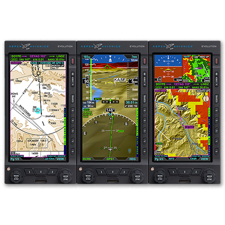
Have you looked longingly at the Aspen PFD or Garmin G500, imagining those beautiful glass panels set in your airplane? Think it’s too advanced for your flying skills? Well, think again! Hank Gibson of Texas Top Aviation will be hosting a seminar at the Redbird Skyport FBO at the San Marcos Airport (KHYI) on Thursday, September 25th at 7pm to enlighten everyone on all the different glass panel and modern GPS options out there.
No panel is too complex! No GPS is too complicated! Come hear about how you can upgrade your steam gauge airplane to a modern, glass panel cockpit that will be the envy of all your pilot buddies.
The seminar begins at 7pm in the large conference room at the Redbird Skyport. Come see this beautiful facility which hosted the AOPA Fly In this past April. There will be two drawings for free flight training in your airplane, so make sure you get your entry in once you arrive. WINGS credit will also be given.
Redbird welcomes pilots flying in for the event. If you are flying in, please show your support for Redbird by purchasing fuel!
Signup is required for the event. To sign up, please click here.
Texas Top Aviation has added a new member to our instructing team. Stephanie Mertz was hired in March 2019 and will be specializing in G1000 & Instrument instruction.
Stephanie graduated from LeTourneau University in Longview, Texas with a degree in Aeronautical Science, earning her commercial single and multi ratings while there. She began her aviation career in Ontario, California flying a Pilatus PC-12 for charter and medical trips. While operating the PC-12, she gained valuable experience flying all over the US and Mexico.
In 2013, Stephanie moved back to East Texas with her husband where she worked as a contract pilot flying a variety of Citations as well as a Falcon 10. A few years later, she became involved in her local Ninety-Nines chapter and joined their mentorship program.
After earning her CFI, CFII, and MEI, Stephanie returned to her alma mater to pass on her flying passions to college students through flight instructing. After a year of teaching at LeTourneau, she and her husband, with their first baby in tow, moved to the Austin area. Now she is instructing with Texas Top Aviation while acting as a mentor for other women working on achieving their flying dreams.
Texas Top Aviation has added a new member to our instructing team. Stephanie Mertz was hired in March 2019 and will be specializing in G1000 & Instrument instruction. Stephanie graduated from LeTourneau University in Longview, Texas with a degree in Aeronautical Science, earning her commercial single and multi ratings while there. She began her aviation…
For a VFR or an IFR pilot, an unusual attitude can be one of the most dangerous situations to get into. That is one reason so many new autopilots are being developed with a level button. The concept behind the level button is if the pilot gets into a disorienting situation, press the level button and the autopilot comes on, holding the airplane in a straight and level pitch attitude.
What about all those planes without autopilots that have a level button? That’s who this article is for.
First off, what is an unusual attitude? The Airplane Flying Handbook on page 4-17 gives the following definition: “An unusual attitude is commonly referenced as an unintended or unexpected attitude in instrument flight.” The AFH also goes on to say that an unusual attitude in training has no defined bank and pitch parameters, but “for training purposes an instructor could place the airplane in a 30 degree bank with a nose up pitch attitude of 15 degrees and ask the student to recover and that would be considered an unusual attitude….”
We now have a basis from the FAA. VFR Pilots are now saying, “Oh, instrument flight, that doesn’t apply to us.” Not so fast. The Private Pilot ACS (and before it, the PTS) has a requirement for Basic Attitude Instrument Flying, including unusual attitude recoveries. Why? Because VFR pilots still inadvertently fly into IMC conditions and can get into an unusual attitude. Plus, a private, non-instrument rated pilot has a higher chance of not recovering from an unusual attitude since he isn’t used to relying on his instruments.
At each training event I do, whether it be private pilot training, a flight review, IFR training, transition training, or pretty much any kind of recurrent training, I like to do unusual attitude recoveries with my customers. It’s one of those things that the recovery procedure wanes over time since it isn’t routinely practiced solo (for good reason!).
I see people have the most trouble with the nose high unusual attitude recoveries. Let’s start with the recovery procedure, then I’ll discuss the common errors (notice that the nose high unusual attitude recovery procedure mirrors a stall recovery). Remember, this is in IFR conditions:
Breathe
Pitch Down to a level pitch attitude on the Attitude Indicator (or lower if the stall warning horn continues to go off)
Simultaneously add full power
Roll wings level
Flaps up and recover to a level pitch attitude if not there already
The order is important, especially the breathing part. What happens if a pilot goes straight into a recovery and doesn’t pause for a second or two to absorb what’s going on is the recovery isn’t executed properly.
Our brains see the wings banked and set off all kinds of alarms to roll the wings level first before doing anything else. Adding any kind of aileron input with the nose close to the critical angle of attack is a bad idea. You are adding adverse yaw (since you probably won’t be coordinated) and load factor which increases the stall speed. Then we all know that Stall + Yaw = Spin. That’s something that is best avoided in IMC.
We have to teach our brains to ignore the bank angle until the pitch and power come in. Once the airplane is far away from the critical angle of attack, then the bank can be rolled to neutral.
Let’s look at the nose low unusual attitude recovery. The order is still important on this one too:
Breathe
Power Reduce (to idle if necessary)
Roll Wings Level
Pitch up to a level pitch attitude
Add Power back to cruise
The theory with the nose low unusual attitude is your speed is accelerating. By reducing the power first, that helps reduce the load factor experienced when the pitch is increased. Same with rolling the wings level. Neutral bank is a lower load factor than some kind of a bank angle. We are trying to prevent overspeeding the airplane. The lower the load factor, the less of a chance we have to rip the wings off.
The most important step in either recovery procedure is to breathe first, allowing the brain to process exactly what is happening. That way, the proper recovery can be executed.
For a VFR or an IFR pilot, an unusual attitude can be one of the most dangerous situations to get into. That is one reason so many new autopilots are being developed with a level button. The concept behind the level button is if the pilot gets into a disorienting situation, press the level button…
You just bought your Cirrus SR22. You do some flying, and soon find yourself with a brake temp sticker that isn’t white anymore. You remember from your transition training that any color other than white is a no go. You now ponder…. I don’t remember getting on the brakes hard, or riding the brakes while taxiing, but sure enough they aren’t white anymore. You now start thinking that all the horrible rumors of Cirrus brakes are true. They overheat so fast!
I would like to share some little-known facts about the Cirrus factory equipped braking system. Following the procedures below can help make the brakes last a little longer. There is also a very popular STC that allows upgraded brakes to be installed on all SR series aircraft. More to come on that.
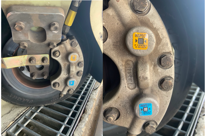
Notice the Top Yellow sticker is far darker than the Bottom. The Yellow temperature indicator turns at 300 Degrees, while the bottom Blue indicator turns at 330 Degrees. This is an indication to the pilot that if the bottom sticker has turned colors, that the braking system has exceeded 330 degrees and is in need of servicing.
Above is a photograph of an SR22 G1 braking system with turned brake temp stickers. The first things you may notice is that there are in fact two brake temperature stickers. We can only see the bottom blue sticker from the inspection port on the wheel pants. The other is higher on the caliper; in order to see it, the wheel pant must be removed. This isn’t common knowledge because there is no mention of this additional indicator in the POH.
Now you may be asking yourself, what can I do to extend the service life of my factory equipped Cirrus brakes? Here are some tips. First, always taxi at 1000 RPM and use the rudder as much as you can while only tapping the brakes. This is not fool proof, since sometimes, depending on the grade, you will have no choice but to utilize brake tapping to keep the aircraft going straight. Taxiing is not typically where the brakes get overheated, though, but this is still a good practice to follow.
What we tend to see is that the Cleveland brakes are generally overheated on landing. We always recommend to make sure your final approach speed is not excessive, land in the first 1/3 of the runway, and let the aircraft rollout to a smooth stop. What tends to happen is that the aircraft is too fast, and the pilot tries to exit at a certain taxi way, or brakes hard and continues to ride the brakes after landing during taxi. If you do your best to avoid these habits, it will serve you well.
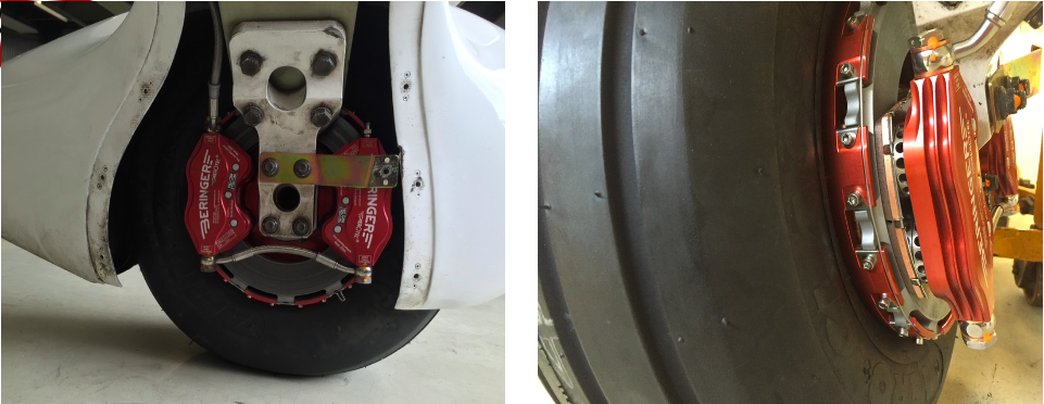
This braking system remained unchanged all the way until the 2016 G5 Cirrus SR series. Starting in 2016, the factory equipped G5 and G6 Cirrus SR series all now come standard with a single piston hydraulic braking system from Beringer. The Cirrus Beringer brakes far exceed the braking power and durability of the old system. The new system is more robust, withstands heat better, and is is very well built. There is also an option for an upgraded dual caliper system to increase durability and stopping power. A braking system STC for the older Cirrus G1 through early G5 models was created to upgrade those airplanes to the better stopping power and cooling of the Cirrus Beringer brakes.
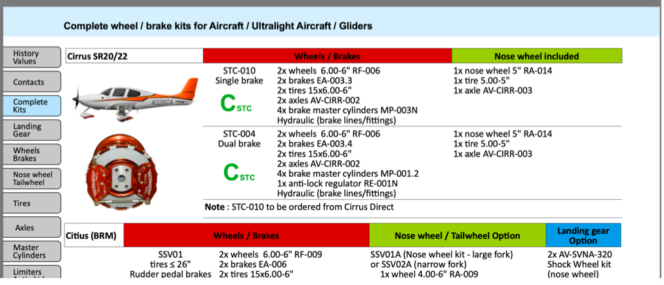
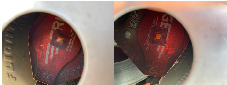
Seen above is a page from a Beringer catalog highlighting the Cirrus SR series STC kits. Your local Cirrus service center will be able to quote prices for the kits. We have over 1000Hrs spent behind Beringer equipped Cirrus aircraft and the difference is quite apparent. The pilot has better control of the aircraft, no spongy pedal, and the confidence to get the plane stopped without possibly overheating the braking system. This, in our opinion, is one of the best upgrades you can do to your Cirrus.Above is what an STC upgraded braking kit from Beringer looks like, as well as the new temperature indicator for the pre/post flight inspection. Notice the black spot on the left hand picture. These brakes have been overheated.
One other difference for a pilot to note is that once upgraded to the Cirrus Beringer brakes, there is only one temperature indicator and it changes color at a whopping 450 Degrees Fahrenheit! Needless to say, it can handle some heat! The new temperature indicator is now Orange in color and turns grey/black when overheated.
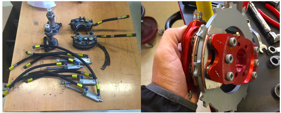
On the left are the original Cirrus factory brakes. On the right is the caliper to the new Beringer brakes for a Cirrus.Dual Caliper Cirrus Beringer Brakes
The Cirrus Beringer brakes upgrade is quite a step up in the world of slowing down. However, this doesn’t mean that they are completely issue free. There is one little-known problem with Beringer brakes that is not that big of a deal and can be fixed with relative ease.
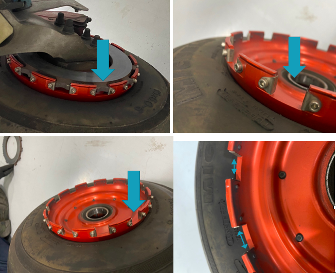
The rotor on the Beringer braking systems is “free floating,” meaning it is not necessarily “fixed” in position when secured down to the spindle. It is “keyed” into the wheel rim with the male and female side interlocking.
The brakes occasionally will get noisy, causing a “knocking” noise when brakes are applied. This noise is caused by the small metal tabs that tighten up the space between the wheel and the brake rotor. This is so the small tabs wear with use instead of the aluminum rim that they are fixed to. So, if your Beringers are making a knocking noise when brakes applied, this is most likely your culprit.
These gaps above are the “keyed” position where the rotor finds home in the rim. Without these tabs that wear with use, we would be replacing the rim more often than the much cheaper replaceable tabs.
It is highly recommended to upgrade your original Cirrus factory brakes to the new Beringer braking system. You will deal with less maintenance, less chance of a brake overheat, and less confusion on whether or not your brakes are airworthy. For more info, you can check out the Cirrus website for the single or dual caliper Beringer brakes.
Zach Anderson is a Cirrus Standardized Instructor Pilot (CSIP) for Texas Top Aviation. Zach comes from a auto mechanic background and is very familiar with the ins and outs of maintenance. He started working for Texas Top Aviation in December 2020.
You just bought your Cirrus SR22. You do some flying, and soon find yourself with a brake temp sticker that isn’t white anymore. You remember from your transition training that any color other than white is a no go. You now ponder…. I don’t remember getting on the brakes hard, or riding the brakes while…
I am an iPad user, but I have an Android phone. I had been using a junky aviation weather app that just gave meters and TAFs, but seemed to have been programmed in a foreign language (un-decoded TAFs notwithstanding). I wanted something more robust, but didn’t see the need to pay for a Garmin Pilot subscription since Foreflight on my iPad was my main EFB (Electronic Flight Bag) I use in the airplane.
When I upgraded my phone, I decided I had to find something better. I have a WIFI only iPad, so I utilize my phone to take quick glances at weather reports or when I want to see the radar without having to tether my iPad to my phone. The app I had wasn’t cutting it.
That’s when I found FltPlan Go. We are all familiar with FltPlan.com. It’s what a lot of corporate pilots use to file flight plans. I’ve used it some, but there is a large amount of data it needs to set up an airplane. Since I already have all the airplanes I need in Foreflight, I don’t use it that much since I didn’t want to do the setup. It is rather handy as it spits out flight logs and has a lot of pre-loaded performance numbers for different makes and models.
FltPlan Go is FltPlan.com‘s app. It is very user friendly, easy to use, and, most importantly, free! You can get METARs, TAFs, NOTAMs, Airport Diagrams, approach plates, full weather reports for airports including radar, maps, and a whole lot more. As far as I can tell, it is a full fledged EFB. I haven’t really scratched the surface on all the features in using mine, but it is quite robust from the little bit of poking around I’ve done.
I’m still a Foreflight guy, but if you want something else or you have an Android phone and don’t want to pay for Garmin Pilot or WingXPro, check out FltPlan Go. It’s a winner.
I am an iPad user, but I have an Android phone. I had been using a junky aviation weather app that just gave meters and TAFs, but seemed to have been programmed in a foreign language (un-decoded TAFs notwithstanding). I wanted something more robust, but didn’t see the need to pay for a Garmin Pilot…
As was the case with the Class B Airspace around Houston several months ago, the Class B Dallas airspace has been overhauled as well. These changes were implemented at the last database update on September 18th. If you’ll be flying into any of the Dallas airspace airports IFR, make sure you have current charts and your GPS databases are updated.
According to AOPA, 14 SIDs and STARs were deleted, a number of new procedures were added, and changes were made to most of the other remaining procedures. The new procedures in the Dallas airspace consist mainly of RNAV procedures for turboprops and jets, so most GA aircraft won’t be affected by those. The legacy procedures that remained in place over went changes, including new frequencies, so piston aircraft going into the Dallas airspace are still affected.
From AOPA, departures from Dallas Love (KDAL) that file their flight plan with special equipment /G in their flight plan will automatically be given an RNAV departure procedure. This does not appear to affect piston aircraft as all the new RNAV SIDs in the Dallas airspace are for turboprops or turbojets.
The reason for the changes to the Dallas airspace? Similar to the changes in Houston, these airspace changes are meant to streamline departures and arrivals in the Dallas airspace area, reduce controller workload, and give continuous descent angles for arriving high altitude traffic.
Don’t be surprised the next time you are in the Dallas airspace area if you receive a clearance that states: “Descend via the arrival.” In that case, just check the chart and aim for the appropriate altitudes at the appropriate fixes. As we move closer to the ADS-B requirement, I believe we will see more and more of these terminal procedure overhauls, so be prepared and keep those charts and databases up to date.
As was the case with the Class B Airspace around Houston several months ago, the Class B Dallas airspace has been overhauled as well. These changes were implemented at the last database update on September 18th. If you’ll be flying into any of the Dallas airspace airports IFR, make sure you have current charts and your…
I love Lightspeed headsets. They are very comfortable, durable, and reasonably priced. Plus, when you call Customer Service, you are actually talking to someone who works for the company and knows what they are talking about.
One thing to watch out for with Lightspeed headsets is the Mono vs. Stereo option. On the Zulu 3, there is a very small control panel underneath the battery compartment to change from Mono to Stereo. If you have any kind of modern audio panel, you will definitely want to do this. Here’s why.
I was flying in a Cirrus SR22 G5 last fall with a Garmin 350 Audio Panel. Everything worked fine talking to the ground and tower controllers. Once I took off and was switched to approach, everything went quiet. I could hear the approach controller, but couldn’t transmit. I thought my headset had bit the dust. There was another set in the plane that I switched to, but I thought the transmit function of mine was out.
I sent the headset back to Lightspeed for repair. The headset was still under their 5 year warranty, which is really nice! I got it back a few days later, plugged it in to another Cirrus, and still had nothing. I was getting frustrated, but then a light went on. One of my colleagues had mentioned something about mono and stereo in the Lightspeed. I popped the batteries out, flipped the switch over to stereo, and wa-la! Everything was fully operational.
If you get Lightspeed headsets, you’ll want to make sure it is set on Stereo, as they all come from the factory on Mono. If you get a PFX, there is an easy access button on the side of the battery unit to switch from Mono to Stereo.
I love Lightspeed headsets. They are very comfortable, durable, and reasonably priced. Plus, when you call Customer Service, you are actually talking to someone who works for the company and knows what they are talking about. One thing to watch out for with Lightspeed headsets is the Mono vs. Stereo option. On the Zulu 3,…