
Winter Ops

It’s summertime and the weather is hot! Over this dry, sunny season, winter flying is probably the last thing on your mind. However, now is the perfect time to start getting things in place for winter and that includes having a plan for taking care of your airplane.

Why are preparations for winter ops needed in the first place? Cold weather, especially during the engine start and warm up period, can be very damaging to your engine if precautions aren’t taken to ensure that safe temperatures exist inside the engine before you turn the key. I always thought that the biggest problem associated with cold weather was engine oil. The logic is since cold oil is thicker and less viscous as the temperature drops, it is not able to circulate quickly throughout the engine to provide proper lubrication upon starting.

While cold oil may be a factor, the introduction of multi­viscocity oils has greatly reduced that issue. The real problem is created by the different ways that various parts of the engine respond to heat. Because aluminum expands more quickly when heated than steel does, the pistons (made of aluminum) expand more quickly than the cylinders (made of steel). This can lead to scuffing on the sides of the cylinder barrel. In the same way, differential heating can reduce clearances which are designed to provide cooling oil to bearings and other vital engine parts, thereby causing damage which greatly reduces the life of the engine.

So how cold is TOO cold? Unfortunately, that is a difficult question to answer. Because there is so much variation between engines, airplanes, and environments, there really isn’t any one specific answer. An older, more worn out engine may actually be less susceptible to cold weather damage than a newer, tighter engine because its internal clearances are probably not as tight as they were a few thousand hours ago. I have heard of some people who preheat their airplanes anytime the temperature falls below about 40 degrees. For us northerners, this seems excessive. On our E33A Bonanza which has a Continental IO­520, we generally preheat the airplane when it is cold soaked in temperatures below freezing (32° F).

Here are a few of the best ways to get your machine ready for a cold weather flight:

  • Heated Hangar:­ Nothing beats a heated hangar for warming up an airplane. The warm air is evenly distributed around the engine and in the cockpit (your avionics and gyros will thank you!). The airplane will need to be in the hangar for a while in order to warm up the guts of the engine. Often, the easiest way is to have the airplane pulled in the evening before the planned departure and left overnight. Many FBOs will hangar airplanes overnight for a small fee and it is well worth the price. We almost always have our charter airplanes put into hangars overnight when on a winter trip to ensure that we don’t have any trouble when we depart the next day. This practice has the added benefit of keeping the airframe clear of any ice and snow that may accumulate before you are scheduled to leave.
  • Electric Engine Heaters­: Multi­point electronic heaters use heating pads that are placed around the engine in order to heat up the various components such as cylinders, the oil pan and crankcase. Most of these systems are designed to be activated by being plugged into a wall outlet with an extension cord. Preheating for a winter flight is as simple as going to the airport the night before and plugging it in. Two well ­known manufacturers of multi­point engine heaters are Reiff and Tanis. These systems are relatively inexpensive and can be a life saver if you regularly travel in colder climates. If an engine heater is the right choice for you, it is recommended to avoid less ­expensive models that heat only the oil pan.

 

Reiff system
Pictured above is the Reiff system. The heated bands go around the cylinder bases and the pad at the bottom of the picture heats the oil pan. Picture Courtesy of www.reiffpreheat.com


  • Covers and Blankets­: If it is especially cold or you have to preheat outside, having something to insulate the cowling and keep the wind out can be very useful. Regular blankets will work long as you can secure them in place. If you have an ongoing need for additional insulation, there are companies that make custom blankets and propeller covers to fit your airplane. If you are landing and then taking off again relatively quickly, using a few blankets and cowl plugs will work nicely to keep the engine warm while it is sitting outside. In a pinch, placing a couple of powered light bulbs in the cowling overnight with insulation on top can result in sufficient temperatures for starting the engine.
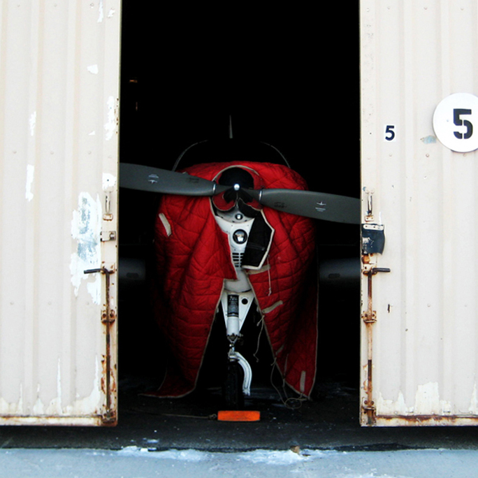
 

Bonanza Cover
Even with the multi­point electric heater, we still use a blanket while preheating to help keep everything toasty.


  • Forced Air:­ This method is used widely by FBO’s and flight schools. Hot air is produced in a portable heater and is then pumped into the engine compartment via the openings at the front or bottom of the cowling. This method has the benefit of not requiring any additional equipment to be installed on the aircraft beforehand and can be very effective provided there is adequate time for the engine to heat completely before removal.
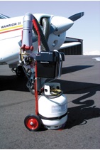
 

Forced Heat
Pictured above is a Red Dragon engine preheater. Photo courtesy of Red Dragon’s website: www.flameengineering.com


  • Winter Baffles:­ When the air temperature starts to drop into the teens and lower, you may find it difficult to keep your engine temperatures warm enough in cruise flight. The problem is that the air entering the cowling inlets is so cold that it overcools the engine. The solution is to install additional baffling in the engine inlets to reduce the amount of airflow into the cowling. These additional baffles are usually just sheets of aluminum that are cut to the correct size and are bolted in and removed quickly and easily as needed. Some pilots swear by them while others complain that they can cause uneven cooling. If you have questions about winter baffling, I’d suggest talking to your mechanic about your specific airplane.

Winter flying can be extremely rewarding. After their hands thaw from pre­flight, a pilot is often rewarded with smooth air, improved performance and outstanding views. Just don’t forget to prepare the airplane for the cold. The preparation is often as simple as plugging in an extension cord or making a phone call to the FBO. So whether you live in the north or the south, take good care of your engine so that it can keep taking good care of you.


Similar Posts

  • Flying Through Rain

    For the most part, flying through rain is a non-event. If the NexRad or Radar is showing light green or dark green, usually there aren’t that many bumps and your plane just gets a wash. Sometimes the visibility drops down a little bit making us IFR pilots have to transition to our instruments.

    It get’s a little more exciting when the precipitation on your screen turns to yellow. This means there is a lot more precipitation echoes either in the clouds or coming out of the clouds, meaning harder rain. I usually tend to stay away from yellow unless it’s absolutely necessary to go through it.

    I had a situation a few weeks ago where I deemed it necessary to fly through some yellow NexRad returns. I was flying a G1000 Columbia into Monroe, Louisiana, KMLU. The winds were mostly light, but slightly favoring runway 04, which was the runway in use. As I got closer, a decent size rain shower with mostly yellow returns was sitting over the final approach fix for runway 04 and slowly tracking to the northeast.

    I didn’t particularly want to spend the entire approach getting beat on with rain, so I decided to fly the RNAV 14 approach at MLU and circle to land on runway 04. The rain hadn’t quite reached the airport yet, so I decided that circling to 04 should be no problem.

    I started the RNAV 14 at the FLESH IAF. Since I was approaching from the west, I did not need to do the procedure turn, so I joined the Final Approach Course (FAC) after crossing FLESH.

    In the meantime, that rain shower was inching closer to the FAC for the RNAV 14. I wasn’t concerned about my safety if I flew through some of it and I didn’t have passengers on board who would get nervous, so I elected to continue. I wasn’t seeing any lightning coming out of the clouds, so it appeared to only be moderate rain.

    Just before I got to JIVEY, the FAF, I entered the clouds and the rain. About 20 seconds later, my altimeter and airspeed started bouncing around a lot. Now, based on all I’ve said so far, what would cause that, and what would you do?

    (Jeopardy theme song playing while contestants ponder questions)

    The answers? Due to the moderate precipitation, water had gotten into my static port and caused the unusual readings on my altimeter and airspeed indicators on the G1000.

    I had experienced this before, so I knew what to do. I reached down and turned the static source from primary to alternate, which starts taking static pressure from inside the cabin in the Columbia. Instantly, everything went normal.

    The other time I had experienced this was also in a Columbia, so I’m under the impression that the way the Columbia static ports are designed, they are a little bit more susceptible to water creeping into them than other airplanes.

    Moral of the story? If your pitot/static instruments start jumping around, the first thing you do is turn your alternate static source on.

  • Contact Approaches

    Almost all IFR pilots are familiar with visual approaches and what the requirements are in order to fly a visual approach. As a refresher, the Instrument Procedures Handbook defines a Visual Approach as “an ATC authorization for an aircraft on an IFR flight plan to proceed visually to the airport of intended landing; it is not an [Instrument Approach Procedure]” (page 4-56).

    For ATC to issue a Visual Approach, the pilot must have the airport or the traffic to follow in sight. Once the pilot reports the airport or the traffic in sight, ATC can clear the aircraft for a visual approach.

    A limiting factor for a visual approach is ATC’s Minimum Vectoring Altitude. “This altitude, based on terrain and obstruction clearance, provides controllers with minimum altitudes to vector aircraft in and around a particular location” (Instrument Procedures Handbook page 1-42). ATC has to restrict aircraft to these MVAs, which can sometimes be quite high due to terrain or obstacles in the vicinity of the airport.

    Every pilot has been in a situation with a high MVA that ATC can’t get them below, but it’s solidly MVFR or VFR at the destination airport. The MVA keeps the pilot in the clouds, so a visual approach isn’t possible since the pilot can’t see the airport or the traffic to follow. This can lead to extra time to go out and fly an approach.

    Enter a Contact Approach. A Contact Approach is different then a Visual Approach. “The main differences between a visual approach and a contact approach are: a pilot must request a contact approach, while a visual approach may be assigned by ATC or requested by the pilot; and a contact approach may be approved with 1sm visibility if the flight can remain clear of clouds, while a visual approach requires the pilot to have the airport in sight, or a preceding aircraft to be followed, and the ceiling must be at least 1,000 feet AGL with at least 3sm visibility” [Instrument Procedures Handbook page 4-57].

    Here’s the simplified explanation: A pilot does not have to have the airport in sight to request a contact approach. All that is required is for the airport to be reporting at least 1sm visibility and for the pilot to remain clear of clouds.

    When would this be helpful for an IFR pilot? Good question. Here’s a scenario.

    Pilot Smalls is about 20 minutes from his destination, which is an uncontrolled airport with only one approach to runway 17. He is approaching from the south and the initial approach fix for the approach to 17 is about 15 miles north of the airport. The airport is under Center control. When he has arrived at this destination in the past, Center usually could only vector him down to 4,000 AGL. He is very familiar with this airport and the surrounding area as he comes to this destination at least 2-3 times a month for business.

    Pilot Smalls listens to the AWOS, which is reporting a 2500 foot scattered layer and 10 miles visibility. He knows it is right traffic for 17 since there is a 2,000 foot antenna on the east side of the field. There is some hilly terrain around, but all the terrain is well below pattern altitude and doesn’t cause a safety issue.

    Looking out at the clouds, Pilot Smalls observes that the cloud layer is scattered to broken, but more scattered on the west side of the airport, with several large openings that he can see the ground through. Center asks for his approach request and Pilot Smalls requests a visual approach. Center gives him a descent to 4,000 AGL, their MVA for the area. They tell him to report the airport in sight for the visual approach.

    At 4,000 AGL, Pilot Smalls is going through the scattered layer of clouds, but can see the ground in between the clouds and deems he has room to maneuver safely between the clouds and stay clear of them. He can’t see the airport, so a visual approach seems unlikely. He can’t cancel IFR because then he would have to keep the VFR cloud clearance and visibility requirements in Class E airspace (1,000 feet above, 500 below and 2sm horizontally), which isn’t possible in this case.

    5 miles from the airport, ATC states, “N12345, I’m going to have to send you out for the approach since you don’t have the airport in sight.” Pilot Smalls then requests a Contact Approach. ATC clears him for the Contact Approach to his destination, so Pilot Smalls descends through a break in the clouds, remaining clear of clouds, until he gets below the base of the ceiling. He maneuvers onto the right downwind, lands and cancels IFR.

    Contact approaches can be useful at controlled and uncontrolled airports. The first time you request one, do so with a higher ceiling and some room to maneuver to keep your safety margins. After you’ve done a few, you can determine what your personal minimums are for a Contact Approach.

    I would not recommend doing a Contact Approach at an airport you are unfamiliar with. It’s vital to know what obstacles are around since on a Contact Approach, the pilot is now responsible for traffic avoidance and terrain avoidance, whereas on a visual approach, ATC resumes that responsibility.

    For more reading on Contact Approaches and another good scenario, check out Bold Method’s article on Contact Approaches.

  • I Love the Piper PA46

    A lot of my customers ask me which airplane that I train in is my favorite.  The Cirrus and the Columbia both are very good airplanes, but if I had my pick, I’d go with a Piper PA46, specifically an ’86-’88 Malibu.

    I love the Piper PA46.  6 seat, cabin class, pressurization, air conditioning, great ramp appeal, 17 GPH (in the Continental TSIO 520 or 550; Piper changed to the Lycoming TIO 540 in ’89, which you run rich of peak and burn 22 GPH, decreasing a little bit of the awesomeness).  What more can you ask for?  The interior is roomy, there is plenty of baggage space in the nose and in the rear of the cabin.  They are downright fabulous airplanes.  Plus, you can get into a nice one that has had some panel upgrades and a mid time engine for around $300,000.  That’s not bad.

    Cessna tried to make a pressurized single with the P210, but it just doesn’t match up with the Piper PA46. The Piper has more room, more baggage space, a higher max differential pressure and service ceiling, and better air conditioning to boot!

    Don’t know much about the Piper PA46?  It’s been called several things.  Originally, it was the Malibu, with a Continental engine.  Now the TSIO 520 was not one of Continental’s better motors.  However, most of the original Malibus have been upgraded to the much better TSIO 550C engine, which is a great product. Cruise around at almost 200 knots at FL200 and burn only 17 GPH.  It’s beautiful.

    Piper changed to the Lycoming engine in 1989 and changed the name to the Malibu Mirage, later shortened to just Mirage.

    Then, in 2016, Piper upgraded a lot of the avionics, cleaned up the panel, and dubbed it the M350.

    Piper made the ill fated decision in the mid 2000s to quit making the Saratoga and instead make an unpressurized version of the PA46 called the Matrix.  It didn’t last long, only about 10 years or so, and hasn’t been very popular (see:  don’t buy one).  Piper took the best part about the PA46, the pressurization, and took it away, leaving an airplane that you still have to wear oxygen in to get the advertised high speeds in the upper teens and flight levels.  Who wants to be cruising around in a cabin class airplane with oxygen on?  Piper needs to bring the Saratoga back to give folks a low level, high performance option.

    What would be my dream Piper PA46?  As stated above, an ’86-’88 model Malibu (Piper started off with hydraulic flaps in the ’84-’85 models and it wasn’t a very good system.  They changed to electric flaps in ’86) with a Continental TSIO 550C upgrade.  The Garmin autopilot isn’t out yet, so I’d go with the STEC 3100 Autopilot w/ a Yaw Damper (the airplane originally came with a King KFC 150, which is a really good autopilot, but most of them are getting old and are getting difficult to fix.  King’s replacement KFC 325 is still slogging through certification.  Garmin’s GFC 600 would be ideal, but that isn’t expected to be certified for the PA46 fleet till late this year).  A single Garmin 10.6″ G500 TXi with EIS tied to a Garmin GTN 750 GPS with a Garmin GTR 225 Nav/Comm as the number 2 radio.

    Then I just put gas in it and go.  That would be my kind of airplane.

  • The Dual Garmin G5 Glass Panel Solution

    What’s the most cost effective glass panel retrofit?  There are several options out there (and it seems like more coming each Sun ‘N’ Fun or Osh Kosh event), but the consensus is the Aspen EFD 1000 or 1500, right?  At $12,000 installed, it’s about $8,000-$10,000 cheaper than the Garmin G500 (though you can make the argument that when you add a second screen and SVT to the Aspen, the price is about the same).

    I am here to blow your mind.  What if you could get a glass panel retrofit that is a complete AHRS system with airspeed and altitude, plus a slaved HSI that auto slews to your GPS and a 4 hour backup battery so you can throw your steam attitude indicator away, for only $4,600, plus installation?

    I am not crazy.

    The Garmin G5 debuted last year when the FAA relaxed it’s regulations to allow more experimental avionics into certified airplanes.  The single G5 was a big hit.  The 3.5 inch screen fit nicely into the hole that the traditional attitude indicator left, giving pilots a glass attitude, airspeed and altimeter options for less than $2,500.

    In March, Garmin brought out the HSI version of the G5.  Equipped with a low cost magnetometer, the DG/HSI version is a complete replacement for the traditional DG/HSI.  The unit also displays ground speed and distance (received from the GPS information), while auto-slewing to the GPS flight plan, so the CDI needle will move on it’s own, eliminating the annoying need for the pilot to set the course on the HSI (and ridding the GPS of the message that pops up reminding the pilot to set the course).

    The dual units provide a complete backup Attitude in the case of a display failure.  The reversionary mode you get with the Garmin G1000 and the Garmin G500 is also present in the dual G5s.  This eliminates the need for a backup steam gauge attitude indicator, freeing up panel space for an engine monitor or some other toy.  The G5 units can also be equipped with 4 hour backup batteries in case of electrical failure.

    The price for the dual G5 setup is very reasonable at just under $4,600 plus installation (which, according to Garmin, should be pretty simple as the units act as plug and play instruments).  The AHRS unit is available stand alone for under $2,200 while the DG/HSI unit standalone runs just under $2,600.

    For more information, check out Garmin’s website.

  • Jeppesen vs. Aeroservices Charts

    Many people ask, which set of charts is better? Should I use the FAA Aeroservices charts on Foreflight or pay extra for the Jeppesen charts? Since you have to pay for Jeppesen, they are probably better, right?

    I am not here to say which one is better as a chart preference is just that, a preference for one over the other or for certain features. After a while, muscle memory and routine take over and you probably wont even notice the difference.

    History

    In 1934, Elroy Jeppesen began making his own charts and sold them to other pilots. His little company grew into the giant Boeing chart company we know today. Jeppesen charts are used internationally and therefore include information that might otherwise seem common knowledge, like transition altitudes. The key is, you cannot get FAA Aeroservices charts for international destinations. Jeppesen is the only option for outside the US.

    National Aerospace Charting Office (NACO), or the new(er) name “Aeroservices” or FAA chart, whatever you decide to call them, are United States government issued charts. In addition to civilian use, Aeroservices charts are used by the military so there will be some terminology that does not apply to civilians. The best part about FAA Aeroservices charts are… they’re free!

    If you are in the middle of a transition or trying to decide which charts to use, you have come to the right place. Here are a few key differences.

    Obstacle Departure Procedure Chart
    KAXX (Angel Fire, New Mexico) ODP

    1. Frequencies: FAA Chart provides the AWOS so you have all departure frequencies in once place.
    2. Airport: Jeppesen highlight the airport, which is a nice feature so you can easily see the flow from the airport.
    3. Notes and Remarks: Jeppesen bolds the speed restriction all over the chart so you won’t miss it. All other requirements are in the top right corner. Note the transition altitude 18,000′. Since Jeppesen is used internationally, it is published on the chart since other countries have different transition altitudes. It takes up a chunk of chart real estate, but it’s clear, easy to read, and always in the same place. The FAA charts post all the requirements and restrictions as notes off to the side. Since it’s in the same space as the chart graphic, it’s easy for the eyes to catch while studying the plate.
    4. Take off Minimums: NOT APPLICABLE for PART 91 – however, it’s wise for all pilots to look and abide by them. Jeppesen displays the standard take off minimums table, as well as the rate of climb table, which is nice to have all in one place. The FAA chart gives the non standard information but you need to know/look up the rest in the Digital Terminal Procedures Supplemental document. (Hint: It’s in the Documents section of Foreflight)
    5. Take Off Obstacles: About the same on both charts
    6. Route Description: Similar on both charts, but larger font and clearer description on the FAA chart. When there are different routes from different runways, the FAA chart layout is really helpful.
    7. Graphic Layout: Jeppesen and FAA use the same graphics for all their different charts and plates which makes it easy to read once you are familiar with the respective charts. FAA charts are easy to read and distractions are kept to a minimum. Jeppesen charts make things bold and enlarge pertinent information so you won’t miss it.
    8. Airport altitude: This is only on the Jeppesen chart (the FAA chart doesn’t include it), but it is very helpful for situational awareness. As you brief the arrival altitudes, I think it’s important to have an idea what AGL you are at.

    Approach Charts

    One thing pilots love about Jeppesen approach charts is the clear set up for an approach brief. The top section is created as a “briefing strip” starting with the frequencies, then navigation frequencies, minimums, airport elevation and the missed approach. It’s very natural and user friendly.

    FAA charts have a slightly bigger picture of the approach planview, but the profile view and minimums section can get a bit cluttered. It can feel a little discontinuous when briefing the approach to bounce all over the page. However, some pilots really like the small airport diagram in the corner, which I find really helpful for situational awareness (particularly for students learning circle approaches). Non- standard alternate and takeoff minimums are also clearly noted, but unfortunately we must hunt elsewhere to find them. The Jeppesen alternate minimums and takeoff minimums will both be on the airport diagram

    1. Frequencies: Getting weather and tuning radios is easy on the Jeppesen charts – just follow the briefing strip. The frequency section on the FAA charts is still easy to read, but closer to the center of the page. It’s split up from the nav frequencies and other important briefing information.
      a. FAA charts are created by the government and have military specific information, which are the odd looking frequencies and channels on the chart.
    2. Approach Navigation: On a Jeppesen chart, you will continue to the next line to verify your frequency, course and set minimums (assuming you are straight in on the ILS). On the FAA chart, you will then have to skip to the top of the chart to get the frequency and course, and then scan to the bottom of the page to input your minimums. However, since you could be flying a localizer approach or a circle to land, it’s a good reminder that not everyone using this approach chart will be using the same Decision Altitude (DA). The FAA chart also includes runway distance information so pilots can make determinations of approach speeds and stopping distance if the runway is wet or icy.
    3. Missed Approach – Textual
    4. Approach Lighting
    5. Missed Approach- Graphical: The missed approach information is the same on both charts. The lighting information is key for determining a missed approach and is next to the missed approach text on the FAA chart. It’s found next to the missed approach graphic on the Jeppesen chart. Personally, I find it easier to find and read the lighting information on the Jeppesen chart. Remember, on both charts, the placement of the PAPI on the chart indicates the physical location of the lights (left or right of the runway).
    6. Notes: Both charts have a notes box, but they use them a little differently. Once again, remember that Jeppesen charts are used internationally and include the transition altitudes and altimeter setting info. On both charts, the notes section will be where other critical information will be shared which isn’t really applicable for this airport. On the FAA chart, the tower frequency is starred to note that there are operating hours (you’ll have to check the chart supplement AF/D to find out what those hours are). There is also an L next to the frequency to indicate it is the pilot controlled lighting frequency. You will also find the note about the VGSI and the Approach Glide path next to the profile view on the FAA chart, whereas the Jeppesen chart has that note in the notes section at the top. The FAA chart also has the T and an A in black triangles to note that this airport has non- standard alternate and take off minimums. Again, those are found in separate documents when using FAA charts and on the Airport Diagram when using Jeppesen charts.
    7. Minimum Sector Altitude: Similar on both charts, but in different locations (reminder: ATC vector altitudes may be lower. It is the pilot’s responsibility for safety of flight to maintain safe obstacle clearance, so if you are ever concerned about going below the MSA – just ask ATC).
    8. Planview: Other then differences in size, visuals, and text, the information displayed on both is very similar.
    9. Profile View: Again, the displays look different and pilots will have their preference, but the information is the same.
    10. Minimums: Jeppesen charts not only note the category for each approach with its designated letter, but also displays it in knots. It is recommended that if you increase your approach speed (based on flaps or gusty winds or perhaps a faster speed for a circle to land approach) that you should use the higher category minimums. The reference guide makes that easy to look up. The other benefit of the Jeppesen charts is right the table that contains the time from the final approach fix to the missed approach point for a localizer approach, it also shows the rate of descent with the associated ground speed to maintain a 3 degree glideslope. Now there is no excuse not to set pitch and power! The minimums posted in parenthesis are for the military, but RVR in statute miles is also included.
    11. Airport diagram: Only on the FAA charts, this particular feature is particularly useful for situational awareness. The arrow pointing to the runway shows the direction the approach is arriving from so planning a circle to land is a cinch. There is also a lot of other information that can be gathered from the airport diagram for quick reference or to help a disoriented pilot: lighting, displaced thresholds, closed taxiways, and runway placement and lengths. This is easily one of the best perks of an FAA chart.

    Arrival/ Departure Charts: Sewzy 5 Arrival KAUS

    The Jeppesen lay out is very attractive and draws the pilots eye in a clear way to all the important information. The colors pop out, so the required altitudes and speeds are easy to read and remember. The chart, which is the proper scale, shows MORAs , easy to find airports (and runway layouts) and is over all easy to follow. However, the texts, while very clearly laid out, are small and difficult to read and pushed to the very edges of the chart. FAA charts are simple and fairly easy to read, but the airports are not as obvious and the flow to the airport requires a good look. The table on the Jeppesen chart is a really nice format, but the text and Notes for arrivals on the FAA chart are easy to find and much easier to read quickly.

    1. Frequency: FAA charts include the approach frequency on the arrival, which is helpful for having radios tuned. During a busy time when the controller changes your frequency, all you have to do is verify the frequency you already set, rather then totally stop what you’re doing to switch it. The Jeppesen charts add the airport elevation next to the ATIS, which really aids situational awareness.
    2. Notes: Jeppesen notes are clearly numbered and tucked away nicely in a box, but the FAA chart notes pop out in the middle of the page and are easy to skim for pertinent information.
    3. Planview: I think Jeppesen is the clear winner here- it is so easy to read, it only takes one glance to know where the primary airport is and how the arrival flows. The chart being at the proper scale offers the pilot important geographical information and over all is a clean look. Notice the small series of arrows after SMRFF on the the Jeppesen chart; those indicate the pilot should expect radar vectors. The FAA charts include those instructions in the text, but I find the visual reference on the chart helpful. The FAA charts are equally clean, with altitude and speed restrictions easy to read even if they don’t jump out. When there are multiple airports that the arrival serves, the airports are clearly marked, though, I think it would be nice to have a little more information surrounding the primary airport for better situational awareness.
    4. MSA: only on the Jeppesen chart
    5. Primary airport: The runway alignment and grey highlight on the Jeppesen chart stands out very clearly, while the FAA airports are a little more obscure.
    6. Arrival route description: The table on the Jeppesen chart is easy to follow but the text is very small and pushed to the bottom. The route description is much easier to find and read on the FAA chart.

    Airport Diagram

    The Jeppesen Airport Diagram page has it all: frequencies, airport diagram, runway info, take-off minimums, departure procedures and alternate minimums. It’s a one-stop shop. It makes preflight planning easy when its all at your fingertips.

    The FAA charts usually require a little more searching for different pieces of airport information. The Airport Diagram itself is just the airport layout. Above, you will see a simple FAA Airport diagram. It’s clean and simple, perfect for a knee board print out.

    In the flight planning process, as you look at what approaches you will be using for the airport, you might see an A or T inside a triangle. Those indicate that you will need to look in the Alternate Minimum or Take off minimum documents for more information. The Takeoff Minimums document (see below) is also where you will find any obstacle departure procedures for that airport. Apps like Foreflight help you out by posting the take off minimums under the departure tab. Even though it’s a little more difficult to read, I didn’t crop out the airport information so you can see what it looks like in context.

    FAA Alternate Minimums on the Left and Takeoff Minimums and Obstacle Departure Procedures on the Right

Leave a Reply

Your email address will not be published. Required fields are marked *