I am an iPad user, but I have an Android phone. I had been using a junky aviation weather app that just gave meters and TAFs, but seemed to have been programmed in a foreign language (un-decoded TAFs notwithstanding). I wanted something more robust, but didn’t see the need to pay for a Garmin Pilot subscription since Foreflight on my iPad was my main EFB (Electronic Flight Bag) I use in the airplane.
When I upgraded my phone, I decided I had to find something better. I have a WIFI only iPad, so I utilize my phone to take quick glances at weather reports or when I want to see the radar without having to tether my iPad to my phone. The app I had wasn’t cutting it.
That’s when I found FltPlan Go. We are all familiar with FltPlan.com. It’s what a lot of corporate pilots use to file flight plans. I’ve used it some, but there is a large amount of data it needs to set up an airplane. Since I already have all the airplanes I need in Foreflight, I don’t use it that much since I didn’t want to do the setup. It is rather handy as it spits out flight logs and has a lot of pre-loaded performance numbers for different makes and models.
FltPlan Go is FltPlan.com‘s app. It is very user friendly, easy to use, and, most importantly, free! You can get METARs, TAFs, NOTAMs, Airport Diagrams, approach plates, full weather reports for airports including radar, maps, and a whole lot more. As far as I can tell, it is a full fledged EFB. I haven’t really scratched the surface on all the features in using mine, but it is quite robust from the little bit of poking around I’ve done.
I’m still a Foreflight guy, but if you want something else or you have an Android phone and don’t want to pay for Garmin Pilot or WingXPro, check out FltPlan Go. It’s a winner.
Talk about star treatment. The Lajitas Golf Resort rolled out the red carpet for the 2019 Texas Top Aviation Lajitas Fly In. I had been to Lajitas twice before; once in July when it was hot, miserable and bumpy. The second time was the week before our Fly In. Both times, everyone from the airport folks to the bus drivers to the front desk and restaurant staff were top notch. It made for a very pleasurable experience.
If you haven’t been out to Lajitas (or don’t even know where it is) and you’re a pilot (you don’t even have to play golf), you have missed a sure gem. Lajitas is positioned on the southern tip of the Big Bend area of Texas, right on the Rio Grande river. Lajitas has great lodging with several different room options from big to small, an excellent restaurant for 3 square a day (and even a bakery for sweets, coffee, and breakfast tacos in the mornings), and a 5 star golf course in Black Jack Crossing.
Why is this all relevant to us aviators? Lajitas has it’s own private airport, 89TE. Complete with a 5,500 foot asphalt runway, VFR conditions most of the year, and reasonable fuel prices, Lajitas is the pilot’s gateway to the resort and the entire Big Bend area. If you wait until the fall, a brand new, 7,000 foot concrete runway should be completed and an IFR approach should be available. An AWOS is in the works too.
The resort and airport are so far south, radar and radio coverage with Albuquerque Center is pretty poor below about 15,000 feet, and non-existent below 10,000 feet. This isn’t a big concern as any airplanes in the area should be on 122.9 and the airport manager will make contact with you, give you a weather report, and assign a runway.
Once you are on the ground, there will be a resort bus waiting to whisk you and all your friends to the resort for your getaway.
The 2019 Texas Top Aviation Lajitas Fly In was a big hit. We had 7 airplanes total: 5 Cirrus SR22s, 1 Piper Matrix, and 1 Citation M2. There were 15 attendees total, including 13 golfers. Everyone raved about the resort and the golf course. The only hiccup in the weekend was the cold front that blasted through on Friday afternoon, kicking up a lot of dust. Golfing on Saturday was windy too, but Sunday morning was absolutely perfect.
Thanks again to the folks at Lajitas for the star treatment!
Interested in participating in the next Texas Top Aviation Fly In? Contact Us or Sign Up for Our Newsletter and we will make sure you find out about the next one so you don’t miss out!
Talk about star treatment. The Lajitas Golf Resort rolled out the red carpet for the 2019 Texas Top Aviation Lajitas Fly In. I had been to Lajitas twice before; once in July when it was hot, miserable and bumpy. The second time was the week before our Fly In. Both times, everyone from the airport…
Redbird Skyport at the San Marcos Regional Airport will be hosting it’s 6th Annual Redbird Migration Flight Training Conference. The event is focused on flight training and flight training providers. Past speakers have included the president of Hartnell Propellers, the CEO of Big Red, and various Redbird Executives.
The list of speakers for this year’s Migration has yet to be released, but it promises to be a good lineup. Attendees every year always compliment Redbird on the event and the speakers they bring in.
If you are a CFI or flight school owner interested in attending, check out Redbird’s event page to request an invitation.
Redbird Skyport at the San Marcos Regional Airport will be hosting it’s 6th Annual Redbird Migration Flight Training Conference. The event is focused on flight training and flight training providers. Past speakers have included the president of Hartnell Propellers, the CEO of Big Red, and various Redbird Executives. The list of speakers for this year’s…
You just bought your Cirrus SR22. You do some flying, and soon find yourself with a brake temp sticker that isn’t white anymore. You remember from your transition training that any color other than white is a no go. You now ponder…. I don’t remember getting on the brakes hard, or riding the brakes while taxiing, but sure enough they aren’t white anymore. You now start thinking that all the horrible rumors of Cirrus brakes are true. They overheat so fast!
I would like to share some little-known facts about the Cirrus factory equipped braking system. Following the procedures below can help make the brakes last a little longer. There is also a very popular STC that allows upgraded brakes to be installed on all SR series aircraft. More to come on that.
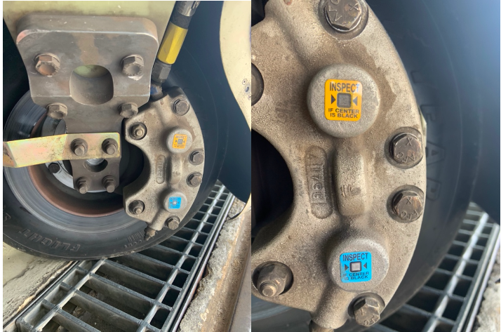
Notice the Top Yellow sticker is far darker than the Bottom. The Yellow temperature indicator turns at 300 Degrees, while the bottom Blue indicator turns at 330 Degrees. This is an indication to the pilot that if the bottom sticker has turned colors, that the braking system has exceeded 330 degrees and is in need of servicing.
Above is a photograph of an SR22 G1 braking system with turned brake temp stickers. The first things you may notice is that there are in fact two brake temperature stickers. We can only see the bottom blue sticker from the inspection port on the wheel pants. The other is higher on the caliper; in order to see it, the wheel pant must be removed. This isn’t common knowledge because there is no mention of this additional indicator in the POH.
Now you may be asking yourself, what can I do to extend the service life of my factory equipped Cirrus brakes? Here are some tips. First, always taxi at 1000 RPM and use the rudder as much as you can while only tapping the brakes. This is not fool proof, since sometimes, depending on the grade, you will have no choice but to utilize brake tapping to keep the aircraft going straight. Taxiing is not typically where the brakes get overheated, though, but this is still a good practice to follow.
What we tend to see is that the Cleveland brakes are generally overheated on landing. We always recommend to make sure your final approach speed is not excessive, land in the first 1/3 of the runway, and let the aircraft rollout to a smooth stop. What tends to happen is that the aircraft is too fast, and the pilot tries to exit at a certain taxi way, or brakes hard and continues to ride the brakes after landing during taxi. If you do your best to avoid these habits, it will serve you well.
This braking system remained unchanged all the way until the 2016 G5 Cirrus SR series. Starting in 2016, the factory equipped G5 and G6 Cirrus SR series all now come standard with a single piston hydraulic braking system from Beringer. The Cirrus Beringer brakes far exceed the braking power and durability of the old system. The new system is more robust, withstands heat better, and is is very well built. There is also an option for an upgraded dual caliper system to increase durability and stopping power. A braking system STC for the older Cirrus G1 through early G5 models was created to upgrade those airplanes to the better stopping power and cooling of the Cirrus Beringer brakes.
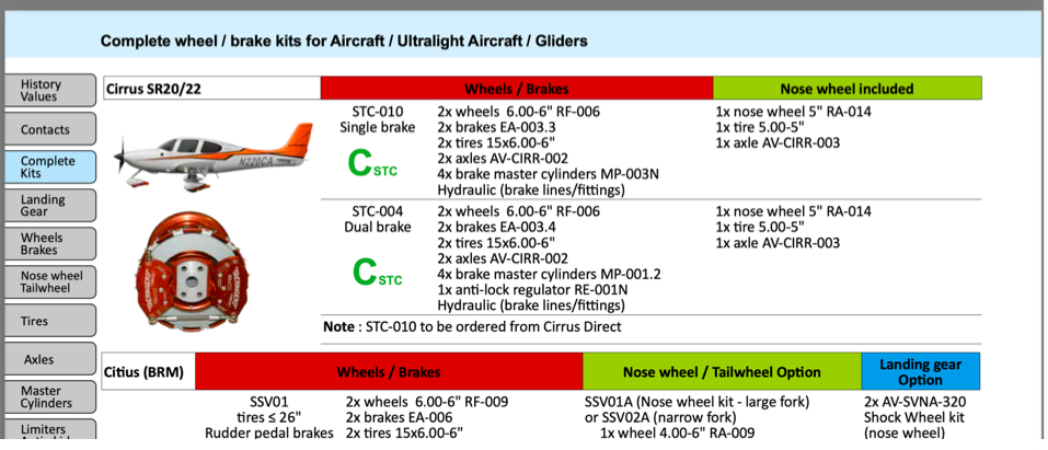
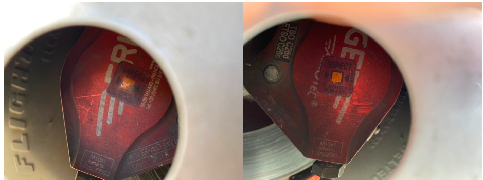
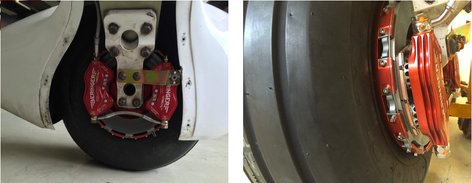
Seen above is a page from a Beringer catalog highlighting the Cirrus SR series STC kits. Your local Cirrus service center will be able to quote prices for the kits. We have over 1000Hrs spent behind Beringer equipped Cirrus aircraft and the difference is quite apparent. The pilot has better control of the aircraft, no spongy pedal, and the confidence to get the plane stopped without possibly overheating the braking system. This, in our opinion, is one of the best upgrades you can do to your Cirrus.Above is what an STC upgraded braking kit from Beringer looks like, as well as the new temperature indicator for the pre/post flight inspection. Notice the black spot on the left hand picture. These brakes have been overheated.
One other difference for a pilot to note is that once upgraded to the Cirrus Beringer brakes, there is only one temperature indicator and it changes color at a whopping 450 Degrees Fahrenheit! Needless to say, it can handle some heat! The new temperature indicator is now Orange in color and turns grey/black when overheated.
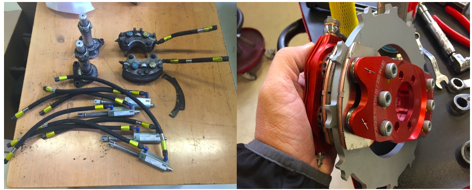
On the left are the original Cirrus factory brakes. On the right is the caliper to the new Beringer brakes for a Cirrus.Dual Caliper Cirrus Beringer Brakes
The Cirrus Beringer brakes upgrade is quite a step up in the world of slowing down. However, this doesn’t mean that they are completely issue free. There is one little-known problem with Beringer brakes that is not that big of a deal and can be fixed with relative ease.
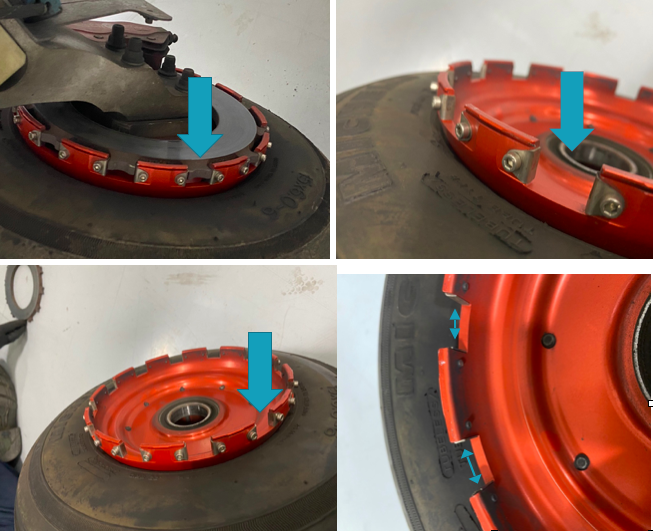
The rotor on the Beringer braking systems is “free floating,” meaning it is not necessarily “fixed” in position when secured down to the spindle. It is “keyed” into the wheel rim with the male and female side interlocking.
The brakes occasionally will get noisy, causing a “knocking” noise when brakes are applied. This noise is caused by the small metal tabs that tighten up the space between the wheel and the brake rotor. This is so the small tabs wear with use instead of the aluminum rim that they are fixed to. So, if your Beringers are making a knocking noise when brakes applied, this is most likely your culprit.
These gaps above are the “keyed” position where the rotor finds home in the rim. Without these tabs that wear with use, we would be replacing the rim more often than the much cheaper replaceable tabs.
It is highly recommended to upgrade your original Cirrus factory brakes to the new Beringer braking system. You will deal with less maintenance, less chance of a brake overheat, and less confusion on whether or not your brakes are airworthy. For more info, you can check out the Cirrus website for the single or dual caliper Beringer brakes.
Zach Anderson is a Cirrus Standardized Instructor Pilot (CSIP) for Texas Top Aviation. Zach comes from a auto mechanic background and is very familiar with the ins and outs of maintenance. He started working for Texas Top Aviation in December 2020.
You just bought your Cirrus SR22. You do some flying, and soon find yourself with a brake temp sticker that isn’t white anymore. You remember from your transition training that any color other than white is a no go. You now ponder…. I don’t remember getting on the brakes hard, or riding the brakes while…
Ever wanted to be a Cirrus owner, but the economics of being a single owner just don’t make sense for you? If you’re in the Houston area, you now have a chance to join a Cirrus SR22 partnership at the West Houston Airport, KIWS.
The group, CirrusShare, is a 4 member group, but one of the members is looking to sell his share. The airplane is a 2007 G3 SR22. It is in excellent condition, with dual WAAS 430s and air conditioning.
Ever wanted to be a Cirrus owner, but the economics of being a single owner just don’t make sense for you? If you’re in the Houston area, you now have a chance to join a Cirrus SR22 partnership at the West Houston Airport, KIWS. The group, CirrusShare, is a 4 member group, but one of the members…
He’s very sneaky, creeping unexpectedly and attacking after the propeller begins to turn.
He’s very cunning, veiling his intentions until, BOOM, he attacks.
Beware of the Lunch Monster!
Whenever I am doing a full day of training (which is usually how transition training courses are planned out, in full day sessions), I always plan a lunch stop. My metabolism has the speed of a rocket ship, so I get hungry and need some sustenance in the middle of the day. I have a running list of airports to stop at that have good lunch spots at them or nearby, so my customers and I usually end up at one of those airports.
Almost without fail, if a customer is having an excellent flying morning, nailing all the procedures, picking up all the techniques, and overall, flying pretty well, then eats lunch, the afternoon doesn’t go quite as well. Doing some of the same things we did that morning, but the customer’s performance isn’t quite as good. Most of the time, it’s just a brain lockup or landings aren’t quite as squeaky as they were in the morning.
Part of it is fatigue after flying for 2-3 hours in the morning. The other part is what I call the Lunch Monster. Eating a big lunch can sap away brain power and cause a person to lose energy around 2-3pm, leading to an afternoon lull (or the Lunch Monster attacking!).
Diet contributes to energy levels too. “Eating a lunch that is too big is the most common reason for feeling sleepy in the afternoon,” says Rebecca Solomon a nutritionist at Mount Sinai Hospital in Manhattan. “All your energy goes into digesting the enormous meal.”
The goal is to keep the body’s Cortical and Cortisone levels even since they’re the hormones released by the body in reaction to stress–they produce the fight or flight response. Their levels are elevated when you have sugar, caffeine and processed food, so you feel awake and energetic. But a few hours later, when those levels drop, you’re sluggish.
Solomon recommends eating a meal that’s balanced with healthy fats (from olive oil or avocados, for instance) with protein and healthy carbohydrates (whole wheat bread or pasta). The portion will vary for people of different sizes, but a general rule is you should be hungry about four hours after the meal.
Another healthy eating habit: Consume small portions of foods throughout the day, including almonds, carrots and hummus and fruit. Enjoy lunch around 1:30 or 2 p.m., just before the time you normally feel fatigued.
Now, most of the stops on my list of restaurants don’t fit the bill of healthy fats and healthy carbohydrates (plenty of protein, though, especially the BBQ joints). For those days, bringing along a snack like almonds or dried fruit is a great idea to munch on mid-afternoon. Trimming down the amount eaten at lunch helps a lot too.
So, the next time you have a long day of flying or training, beware the lunch monster and prep some good snacks when your flight instructor says you’re stopping for BBQ!
He prowls around, preying on innocent pilots. He’s very sneaky, creeping unexpectedly and attacking after the propeller begins to turn. He’s very cunning, veiling his intentions until, BOOM, he attacks. Beware of the Lunch Monster! Whenever I am doing a full day of training (which is usually how transition training courses are planned out, in…
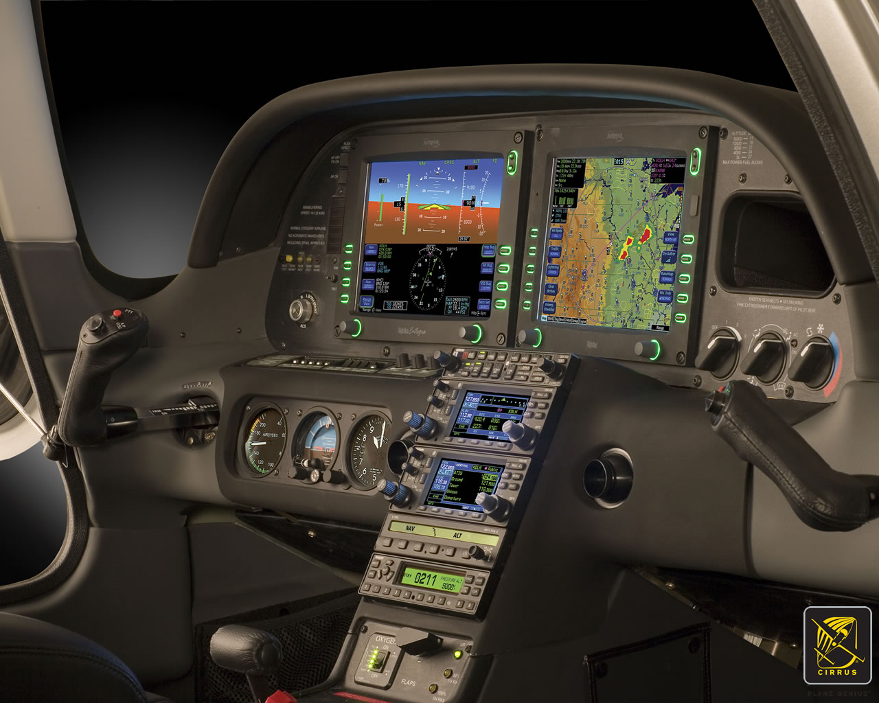
There are a number of airplanes out there equipped with the Avidyne Entegra PFD and MFD system, most notably the Cirrus SR20 and SR22 models from the early 2000s and the Columbia 350 and 400 from the same era. The Entegra is pretty simple and easy to learn, but doesn’t have the capability that it’s Garmin glass panel counterparts do (I have not, however, tried the R9, which could prove much more capable than it’s predecessor). I have found that pilots master the Entegra a lot quicker because of the reduced functionality.
One of the nice features of the Avidyne Entegra is the CMAX Chartview option. With a yearly subscription, you can get all the Jeppesen approach plates and airport diagrams for the entire US on your MFD. Just like your GPS, though, you have to update the charts monthly to keep them legal. After a period of time when you don’t keep up with the updates (I believe it is 90 days), then the charts disappear.
The update process is a little tricky if you don’t have someone to explain it to you. Once you go through it a few times, you’ll have it down pat. Here’s the process for the Avidyne Entegra Chart Updates.
Jeppesen Subscription
The first step in performing your Avidyne Entegra Chart Updates is to create an account with Jeppesen, who handles all the GPS NavData and MFD Chart updates for both Garmin and Avidyne. If you already have a Jeppesen subscription, you can skip down to the next section. To do that, simply go to jeppdirect.jeppesen.com, and then do the following:
Click on Avionics Data on the upper left hand side
Click “Purchase Avionics Subscription”
Then, click on “Create Account” in the new users section
Once you’ve created an account, login, then put in your aircraft information and select 1 update for the Avidyne Entegra EX500 EX 5000
Click Continue at the bottom and you can put in your payment information
Software Needed
There are two different programs depending on if you have a PC or a Mac. If you have a PC, you need the Jeppesen Services Update Manager (JSUM). If you have a Mac, you need the Jeppesen Distribution Manager (JDM). Download whichever one you need, then login, and your updates will show up.
Downloading the Avidyne Entegra Chart Updates
First, we’ll go through the process of performing the Avidyne Entegra Chart Updates process for a Windows computer, using JSUM. You’ll need two 2 GB USB drives formatted to FAT 16. Here’s how to format to FAT 16.
Go to My Computer after inserting the USB drive
Right click on the drive
Click on Format, then select FAT and press OK
Once the USB drive is formatted to FAT16, open up the JSUM program. Login and your updates will be displayed on the screen
You’ll need to set the Avidyne CMAX Key Code
Right click the Avidyne Electronic Charts Service and click Set Avidyne Key
To get the key code, visit MyAvidyne.com and create an account using your JeppView subscription number and your serial number for your Avidyne MFD (found on the AUX page) and your PFD serial number (displayed on startup when the PFD is warming up)
Once you get the Key Code, copy and paste it in the window and click OK
Click on the service and click Start
The program should automatically detect the drive (if it doesn’t, click browse and select the drive)
Click Continue and the charts will start downloading and automatically programmed to the USB drive
If you are updating NavData on the MFD as well, follow the same steps as listed above in order to update the NavData
Next, we’ll go through the Avidyne Entegra Chart Updates process on a Mac, using the JDM program. You’ll need two 2 GB USB flash drives formatted to FAT 16 (the easiest way to format to FAT 16 is on a Windows computer, using the process above).
Open the JDM program and login
Insert the first USB drive
You’ll need to set your Avidyne CMAX Key Code
Click Service Details under the Electronic Charts Service
Click Set Avidyne CMAX Key Code
Program automatically detects the USB drive
Click and drag the Electronic Charts service over to the USB and release
The service is downloaded and copied to the USB drive automatically
Eject the USB drive
Insert the second USB drive (or plug the USB drive in to your MFD, do the update, then reformat the drive) and follow the same steps for the NavData
Updated the MFD with the Avidyne Entegra Chart Updates
Once everything is programmed the your USB drives, the rest of the process is simple. Just go out to your airplane, plug in the first USB drive with the Electronic Charts on it, turn your battery on and the avionics master, and the system will upload the information automatically. Once it’s finished, turn everything off, pull the USB drive out, then insert the second USB drive and do the same thing.
Now, you’re all updated!
If you’d like to see a video on the process, Jeppesen has some very good videos on the updating procedure. The links are below. If you have questions, please contact Texas Top Aviation and an expert will help you through the process.
There are a number of airplanes out there equipped with the Avidyne Entegra PFD and MFD system, most notably the Cirrus SR20 and SR22 models from the early 2000s and the Columbia 350 and 400 from the same era. The Entegra is pretty simple and easy to learn, but doesn’t have the capability that it’s…