This is the second part in a series on drones and Unmammed Aerial Systems (UAS). To read Part 1, Drones: A Brief History, please click here.
I’m surprised how often I’ve been asked about drones by concerned passengers as they load up for a charter flight. Most commonly I’m asked how many drones I’ve seen while I’m flying, or how many drones I’ve hit/ almost hit. Sadly, the media has made this drone crisis into something that it isn’t. I’ve never seen a drone while I was operating a full scale aircraft, and I’ve certainly never been put into a situation where I felt that a drone was a threat to my safety or the safety of the flight. In fact, I only personally know one pilot who has reportedly seen one around an airport and that was an isolated incident (and a non-event).
The reality is that while Unmanned Aerial Vehicles can be a real danger to full scale aircraft, incidents aren’t actually all that common and detailed information is often lacking or missing altogether. It is likely that some of the reported drone incidents were actually a case of a pilot confusing a loose balloon or a bird for a drone. This, combined with the media’s sensationalizing of every “close” encounter nationwide has led the public to believe that the problem is much bigger than it actually is.
In actuality, when the AMA (Academy of Model Aeronautics, the USA’s governing body for model aircraft) analyzed the data from the FAA’s 764 recorded Drone sightings, only 27 of them (3.5%) were actually recorded as “near misses” or “near collisions.” Additionally, only 10 of the records (1.3%) indicate that pilot was required to take evasive action.
The records also include reports of drone sightings at altitudes which would be impossible for civilian models to attain (19,000-24,000′). Finally, some of the sightings took place in areas which are specifically set aside for model aircraft and drones to operate. In those cases, the person flying the drone when it was reported was actually doing so in a safe and legal manner in an area designated for that specific purpose. If you’re interested, the whole article is available here and has a lot of great information.
As pilots, it is important that we do our part in helping reduce the risk of drone strikes. The biggest thing that we can do to help is to report any activity that we see so that it can be investigated and hopefully the drone operator can be found and dealt with. Try to get as much detail as possible about the incident, such as the size, color, location, direction and altitude of any sighted UAVs and report it to the closest tower or controlling agency.
Recently, the people in Washington have come up with a bunch of new rules to regulate the operation of model aircraft. As of this year, every unmanned aerial vehicle between 0.5 and 55 lbs must be registered with the FAA and have an FAA issued registration number located on the model itself. The logic here is that if someone crashes a drone where it shouldn’t have been operated, the officials will be able to identify the owner of the model and take action.
Model manufacturers and vendors have also agreed to start providing information about a program called “Know Before You Fly” (KBYF) in the packaging of the drones. This program seeks to help educate new hobbyists to the rules and responsibilities associated with model aviation. For more information on KBYF, here is a link to their website.
In the end, the sad reality is that it’s a combination of many factors: new technology making models cheaper and easier to fly, GPS navigation and automation, the media blowing the incidents out of proportion, and inexperienced and foolish operators which have caused the growing concern and required the FAA’s action. I think that it is important to understand that thousands of people have been flying radio controlled models for many years responsibly and this has never been a problem. The AMA has rules (which are the same ones now adopted by the FAA) regarding flying location, altitudes, speeds, and more which have kept both the modelers on the ground and the pilots in the air safe until now. Its a classic case of a few foolish individuals who have caused all modelers to be cast in a bad light.
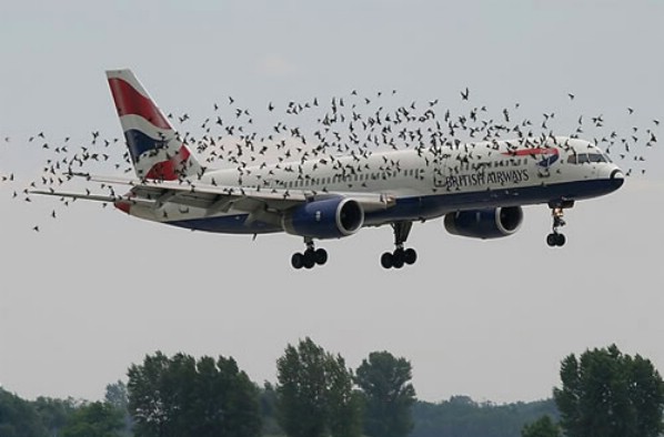
There is no reason to fly in fear, though. A pilot should always be watching for hazards as he or she is flying, regardless of the variety. In fact, according to the FAA’s website, there were 142,000 wild life STRIKES with civil aircraft in the USA between 1990 and 2013. That seems like a much bigger concern to me than the 764 reported drone SIGHTINGS. As with any new technology, drones are suffering from growing pains. As the rules fall into place and new operators become better experienced, hopefully we will hear about fewer incidents on the evening news. Anyway, I’ll stop “droning” on. Fly safe.
Andrew Robinson is a 135 Charter Pilot and flight instructor who lives with his wife and 2 daughters in Pennsylvania. He flies Pilatus PC-12s and instructs in Beechcraft Bonanzas.
The first task I give my new instrument students before we start training is to find a view limiting device that they like. There’s the hood that everyone hates (which has been used since the beginning of instrument training,though it isn’t that uncomfortable) or foggles, which usually end up becoming very uncomfortable very quickly. The headset ends up pressing the sides of the foggles into the side of your head, leaving lumps and scars that hurt for days.
Well, there is finally another solution that combines the hood and foggles. Meet the ViBAN.
ViBAN brags that it is the most comfortable IFR view limiting device out there. I have a customer who has one and he loves it. It’s easy to put reading glasses on underneath while still blocking the view of the exterior of the plane. It doesn’t leave bruises against the side of your head, either.
If you’re looking for something different for your IFR training, give ViBAN a try.
Many people ask, which set of charts is better? Should I use the FAA Aeroservices charts on Foreflight or pay extra for the Jeppesen charts? Since you have to pay for Jeppesen, they are probably better, right?
I am not here to say which one is better as a chart preference is just that, a preference for one over the other or for certain features. After a while, muscle memory and routine take over and you probably wont even notice the difference.
History
In 1934, Elroy Jeppesen began making his own charts and sold them to other pilots. His little company grew into the giant Boeing chart company we know today. Jeppesen charts are used internationally and therefore include information that might otherwise seem common knowledge, like transition altitudes. The key is, you cannot get FAA Aeroservices charts for international destinations. Jeppesen is the only option for outside the US.
National Aerospace Charting Office (NACO), or the new(er) name “Aeroservices” or FAA chart, whatever you decide to call them, are United States government issued charts. In addition to civilian use, Aeroservices charts are used by the military so there will be some terminology that does not apply to civilians. The best part about FAA Aeroservices charts are… they’re free!
If you are in the middle of a transition or trying to decide which charts to use, you have come to the right place. Here are a few key differences.
Obstacle Departure Procedure Chart KAXX (Angel Fire, New Mexico) ODP
Frequencies: FAA Chart provides the AWOS so you have all departure frequencies in once place.
Airport: Jeppesen highlight the airport, which is a nice feature so you can easily see the flow from the airport.
Notes and Remarks: Jeppesen bolds the speed restriction all over the chart so you won’t miss it. All other requirements are in the top right corner. Note the transition altitude 18,000′. Since Jeppesen is used internationally, it is published on the chart since other countries have different transition altitudes. It takes up a chunk of chart real estate, but it’s clear, easy to read, and always in the same place. The FAA charts post all the requirements and restrictions as notes off to the side. Since it’s in the same space as the chart graphic, it’s easy for the eyes to catch while studying the plate.
Take off Minimums: NOT APPLICABLE for PART 91 – however, it’s wise for all pilots to look and abide by them. Jeppesen displays the standard take off minimums table, as well as the rate of climb table, which is nice to have all in one place. The FAA chart gives the non standard information but you need to know/look up the rest in the Digital Terminal Procedures Supplemental document. (Hint: It’s in the Documents section of Foreflight)
Take Off Obstacles: About the same on both charts
Route Description: Similar on both charts, but larger font and clearer description on the FAA chart. When there are different routes from different runways, the FAA chart layout is really helpful.
Graphic Layout: Jeppesen and FAA use the same graphics for all their different charts and plates which makes it easy to read once you are familiar with the respective charts. FAA charts are easy to read and distractions are kept to a minimum. Jeppesen charts make things bold and enlarge pertinent information so you won’t miss it.
Airport altitude: This is only on the Jeppesen chart (the FAA chart doesn’t include it), but it is very helpful for situational awareness. As you brief the arrival altitudes, I think it’s important to have an idea what AGL you are at.
Approach Charts
One thing pilots love about Jeppesen approach charts is the clear set up for an approach brief. The top section is created as a “briefing strip” starting with the frequencies, then navigation frequencies, minimums, airport elevation and the missed approach. It’s very natural and user friendly.
FAA charts have a slightly bigger picture of the approach planview, but the profile view and minimums section can get a bit cluttered. It can feel a little discontinuous when briefing the approach to bounce all over the page. However, some pilots really like the small airport diagram in the corner, which I find really helpful for situational awareness (particularly for students learning circle approaches). Non- standard alternate and takeoff minimums are also clearly noted, but unfortunately we must hunt elsewhere to find them. The Jeppesen alternate minimums and takeoff minimums will both be on the airport diagram
Frequencies: Getting weather and tuning radios is easy on the Jeppesen charts – just follow the briefing strip. The frequency section on the FAA charts is still easy to read, but closer to the center of the page. It’s split up from the nav frequencies and other important briefing information. a. FAA charts are created by the government and have military specific information, which are the odd looking frequencies and channels on the chart.
Approach Navigation: On a Jeppesen chart, you will continue to the next line to verify your frequency, course and set minimums (assuming you are straight in on the ILS). On the FAA chart, you will then have to skip to the top of the chart to get the frequency and course, and then scan to the bottom of the page to input your minimums. However, since you could be flying a localizer approach or a circle to land, it’s a good reminder that not everyone using this approach chart will be using the same Decision Altitude (DA). The FAA chart also includes runway distance information so pilots can make determinations of approach speeds and stopping distance if the runway is wet or icy.
Missed Approach – Textual
Approach Lighting
Missed Approach- Graphical: The missed approach information is the same on both charts. The lighting information is key for determining a missed approach and is next to the missed approach text on the FAA chart. It’s found next to the missed approach graphic on the Jeppesen chart. Personally, I find it easier to find and read the lighting information on the Jeppesen chart. Remember, on both charts, the placement of the PAPI on the chart indicates the physical location of the lights (left or right of the runway).
Notes: Both charts have a notes box, but they use them a little differently. Once again, remember that Jeppesen charts are used internationally and include the transition altitudes and altimeter setting info. On both charts, the notes section will be where other critical information will be shared which isn’t really applicable for this airport. On the FAA chart, the tower frequency is starred to note that there are operating hours (you’ll have to check the chart supplement AF/D to find out what those hours are). There is also an L next to the frequency to indicate it is the pilot controlled lighting frequency. You will also find the note about the VGSI and the Approach Glide path next to the profile view on the FAA chart, whereas the Jeppesen chart has that note in the notes section at the top. The FAA chart also has the T and an A in black triangles to note that this airport has non- standard alternate and take off minimums. Again, those are found in separate documents when using FAA charts and on the Airport Diagram when using Jeppesen charts.
Minimum Sector Altitude: Similar on both charts, but in different locations (reminder: ATC vector altitudes may be lower. It is the pilot’s responsibility for safety of flight to maintain safe obstacle clearance, so if you are ever concerned about going below the MSA – just ask ATC).
Planview: Other then differences in size, visuals, and text, the information displayed on both is very similar.
Profile View: Again, the displays look different and pilots will have their preference, but the information is the same.
Minimums: Jeppesen charts not only note the category for each approach with its designated letter, but also displays it in knots. It is recommended that if you increase your approach speed (based on flaps or gusty winds or perhaps a faster speed for a circle to land approach) that you should use the higher category minimums. The reference guide makes that easy to look up. The other benefit of the Jeppesen charts is right the table that contains the time from the final approach fix to the missed approach point for a localizer approach, it also shows the rate of descent with the associated ground speed to maintain a 3 degree glideslope. Now there is no excuse not to set pitch and power! The minimums posted in parenthesis are for the military, but RVR in statute miles is also included.
Airport diagram: Only on the FAA charts, this particular feature is particularly useful for situational awareness. The arrow pointing to the runway shows the direction the approach is arriving from so planning a circle to land is a cinch. There is also a lot of other information that can be gathered from the airport diagram for quick reference or to help a disoriented pilot: lighting, displaced thresholds, closed taxiways, and runway placement and lengths. This is easily one of the best perks of an FAA chart.
Arrival/ Departure Charts: Sewzy 5 Arrival KAUS
The Jeppesen lay out is very attractive and draws the pilots eye in a clear way to all the important information. The colors pop out, so the required altitudes and speeds are easy to read and remember. The chart, which is the proper scale, shows MORAs , easy to find airports (and runway layouts) and is over all easy to follow. However, the texts, while very clearly laid out, are small and difficult to read and pushed to the very edges of the chart. FAA charts are simple and fairly easy to read, but the airports are not as obvious and the flow to the airport requires a good look. The table on the Jeppesen chart is a really nice format, but the text and Notes for arrivals on the FAA chart are easy to find and much easier to read quickly.
Frequency: FAA charts include the approach frequency on the arrival, which is helpful for having radios tuned. During a busy time when the controller changes your frequency, all you have to do is verify the frequency you already set, rather then totally stop what you’re doing to switch it. The Jeppesen charts add the airport elevation next to the ATIS, which really aids situational awareness.
Notes: Jeppesen notes are clearly numbered and tucked away nicely in a box, but the FAA chart notes pop out in the middle of the page and are easy to skim for pertinent information.
Planview: I think Jeppesen is the clear winner here- it is so easy to read, it only takes one glance to know where the primary airport is and how the arrival flows. The chart being at the proper scale offers the pilot important geographical information and over all is a clean look. Notice the small series of arrows after SMRFF on the the Jeppesen chart; those indicate the pilot should expect radar vectors. The FAA charts include those instructions in the text, but I find the visual reference on the chart helpful. The FAA charts are equally clean, with altitude and speed restrictions easy to read even if they don’t jump out. When there are multiple airports that the arrival serves, the airports are clearly marked, though, I think it would be nice to have a little more information surrounding the primary airport for better situational awareness.
MSA: only on the Jeppesen chart
Primary airport: The runway alignment and grey highlight on the Jeppesen chart stands out very clearly, while the FAA airports are a little more obscure.
Arrival route description: The table on the Jeppesen chart is easy to follow but the text is very small and pushed to the bottom. The route description is much easier to find and read on the FAA chart.
Airport Diagram
The Jeppesen Airport Diagram page has it all: frequencies, airport diagram, runway info, take-off minimums, departure procedures and alternate minimums. It’s a one-stop shop. It makes preflight planning easy when its all at your fingertips.
The FAA charts usually require a little more searching for different pieces of airport information. The Airport Diagram itself is just the airport layout. Above, you will see a simple FAA Airport diagram. It’s clean and simple, perfect for a knee board print out.
In the flight planning process, as you look at what approaches you will be using for the airport, you might see an A or T inside a triangle. Those indicate that you will need to look in the Alternate Minimum or Take off minimum documents for more information. The Takeoff Minimums document (see below) is also where you will find any obstacle departure procedures for that airport. Apps like Foreflight help you out by posting the take off minimums under the departure tab. Even though it’s a little more difficult to read, I didn’t crop out the airport information so you can see what it looks like in context.
FAA Alternate Minimums on the Left and Takeoff Minimums and Obstacle Departure Procedures on the Right
We’ve all heard it said…”reduce the throttle by no more than 1-inch every minutes to ensure you don’t shock-cool your engine”. Does this advice apply to a PA46 engine? Can a PA46 engine (Lycoming 540 or Continental 520/550) really be shock-cooled? How should the engine temperature be managed?
Metals expand and contract with temperature, and the various metals in an air-cooled aviation engine expand and contract at a different rates. Shock-cooling supposedly occurs when the engine changes temperature quickly and the different metals in the engine cool (and therefore change shape) at different rates. When the change occurs dramatically supposed scoring, rubbing, and marking of the metal can occur, which can cause catastrophic results.
So, let’s back to the original question…can a PA46 engine suffer shock-cooling and should a pilot operate the engine so as to avoid shock cooling? Simply put, I’ve never seen nor heard of any piston PA46 engine suffer shock-cooling. In 5000+ hours flying the piston PA46 and 16 years of flying/managing/training in the Malibu/Mirage/Matrix, it simply has not happened to me nor anyone I know. Does it mean that it cannot happen or has never happened? No. But, it is certainly not a prolific threat to our fleet.
Should the owner/pilot operate the engine with a cautious eye cast toward the potential of shock cooling? Well, sort of…but, let’s flesh this out. My suggestion is that a pilot should operate the engine with conservatism in movement of temperature, but only because this is a good operating practice with any machine, and any flying machine is (by definition) not “overbuilt”. And, there are many ways to change the temperature of the engine…not just by reducing power. Here’s a partial list of ways to cool your PA46 engine:
Reduce power: Obvious…yes. When the engine produces less power, less heat is generated. Reducing power in a piston engine will almost always result in less temperature.
Lower the nose: By descending (and leaving power in a cruise setting) the airspeed will increase and cool the engine.
Enrichen the mixture: Fuel has a cooling effect on the engine, so the richer the mixture the cooler the engine.
Lower the landing gear: Yes…you read that right…engine cooling will occur when you lower the landing gear because more air will flow over the cylinders. Notice the landing gear doors on the PA46 have air louvers. Air flows into the engine nacelle on the front, passes down through the cylinders (along with the oil cooler, intercoolers, and other components) and then out the louvers of the closed gear doors. When the landing gear is lowered the “back door is opened” and a LOT more airflows over the cylinders.
My suggestion is that a pilot only perform ONE of these actions at a time when beginning a descent. This suggestion was presented to me by Chad Menne (Owner, Malibu Aerospace) some time ago and I’ve operated engines this way ever since. If you are at a higher altitude and simultaneously reduced the power, lowered the landing gear, started a big descent, and enrichened the mixture in one flail swoop, I think there’s a chance that your engine would suffer some negative effects that could be called “shock cooling”. So, when you do start a descent, pick one “cooling action” to accomplish at a time. I’m sure you’ll not hurt your engine.
Simply put, shock cooling is not a huge factor in the PA46 community, and a PA46 pilot does not need to be overly cautious. The “one inch per minute” rule may apply in some other airframes, but in the PA46 world it is not applicable.
Joe Casey’s aviation story began in 1990 with his first flight near Nacogdoches, TX in a Cessna 172. From lift-off, Joe knew he would have a lifetime passion flying just about anything that will leave the ground…He was completely hooked.
Along with being an FAA Designated Pilot Examiner (DPE), Joe is an ATP/CFI-AHMG and Commercial Rotorcraft/Glider Pilot in the civilian world and also a UH-60/AH-64 Pilot-in-Command/Instructor/Examiner Pilot in the US Army Reserves. His passion for the last 19 years, however, has been the PA-46 Malibu/Mirage/Matrix/Jetprop/Meridian. Has has amassed over 6,500 hours in various PA-46 airframes and believe it to be one of the finest flying machines available for the serious cross-country pilot with an eye for efficiency.
Now, Joe has flown more than 12,200 hours in just about every imaginable environment. Whether providing initial/recurrent training in the PA-46’s, TBM’s, instructing in NVG’s in a UH-60 Blackhawk, flying the King Air series of airplanes, giving tailwheel endorsements, or taking kids flying for the first time, he simply loves flying machines and the people who fly them.
Let’s say you’re flying in the mountains of Colorado on a cloudy day. There’s a solid layer from the surface all the way up to 14,000 feet. You’re inbound to Eagle (KEGE) on the RNAV (GPS) D approach. There are mountains next to you and below you, but you aren’t concerned since you can see them all. The base of the last reported overcast layer was 3,000 feet, so you know you’ll break out before the MDA and land no problem.
At 11,100 over AWACC, you clearly see the top of the mountain below you. You are comfortably above it. You already have the runway in sight as well. You pop out of the clouds on the approach at 9,700 feet, spot the airport and follow the tower’s instructions to circle north of the runway for a left base for runway 7.
How could you see the mountains inside the clouds? You have Synthetic Vision installed on your glass panel, that’s how.
Aspen Synthetic Vision
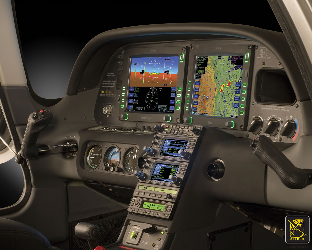
Synthetic Vision, which has actually been around since the ’70s when NASA and the US Military first developed it, was first FAA certified for the Gulfstream PlaneView flight deck in 2009. Garmin, Avidyne, and Aspen are the main general aviation manufacturers of synthetic vision these days. All Garmin PFDs are now equipped with Synthetic Vision while Aspen gives you the option to upgrade to Synthetic Vision when you get one of their PFDs installed. Avidyne gives you Synthetic Vision in their R9 upgrade for the Cirrus.
What is Synthetic Vision? Basically, it’s a 3-D picture on the primary flight display showing terrain, obstacles, traffic, and runways. It greatly enhances situation awareness in areas of terrain or high obstacles during IFR conditions or at night.
The goal behind the development of Synthetic Vision was to decrease the amount of controlled flight into terrain (CFIT) accidents. A CFIT accident consists of a perfectly airworthy airplane flown by a pilot (or autopilot) unintentionally into terrain. These accidents can happen in low visibility conditions or at night, but the reason is mainly due to the pilot losing track of his position in relation to obstacles or terrain (or water as was the case with JFK Jr.).
With Synthetic Vision, the goal is to enhance pilot knowledge of what is around the airplane at all times. When you’re at altitude, the terrain below you looks flat. When you start descending down amongst the rocks, the hills or mountains start to rise up on your screen. For those used to the coloration with the 2-D terrain feature on a GPS unit, it translates very easily to the terrain coloration on a Synthetic Vision equipped PFD. Terrain that is between 100 and 500 feet below the aircraft is shown as yellow, while terrain closer than 100 feet is depicted as red.
Garmin Synthetic Vision
One neat feature on Garmin units is the Highway in the Sky. When a pilot puts a course or a flight plan in the GPS, the PFD displays magenta boxes at the altitude selected displaying the route. It’s handy when hand flying to just “fly through the boxes.” They also display descent angles on approaches.
Synthetic Vision is still optional on Garmin and Aspen units, but I highly recommend springing for it. It will give you a higher level of safety and keep you out of the rocks.
Avidyne’s plug and play replacement for the Garmin 430, the Avidyne IFD 440, finally received certification from the FAA last week. The touch screen GPS unit is being marketed as a simple swap out for the Garmin 430. This release follows up Avidyne’s release last year of the IFD 540, also a plug and play replacement, but for the Garmin 530.
The features and touch screen of the GPS units sound quite nifty, but it will be hard for Avidyne to compete with the GTN 750 and 650 from Garmin. The unit prices for the IFD 540 and 440 will be less (and installation is simpler), but we will see how the company does.
The STC allows for installation in 1,000 makes and models of aircraft, according to the company, so there are a lot of possibilities for installs.
In conjunction, Avidyne also released a new version of it’s software for both GPS units. According to Avidyne, this will unlock multiple features that enhances the capabilities of both units.
To read more on the IFD 440 and it’s bigger brother, the IFD 540, check out Avidyne’s website.