Flight Training

Cirrus Simulator Training

0 Comments

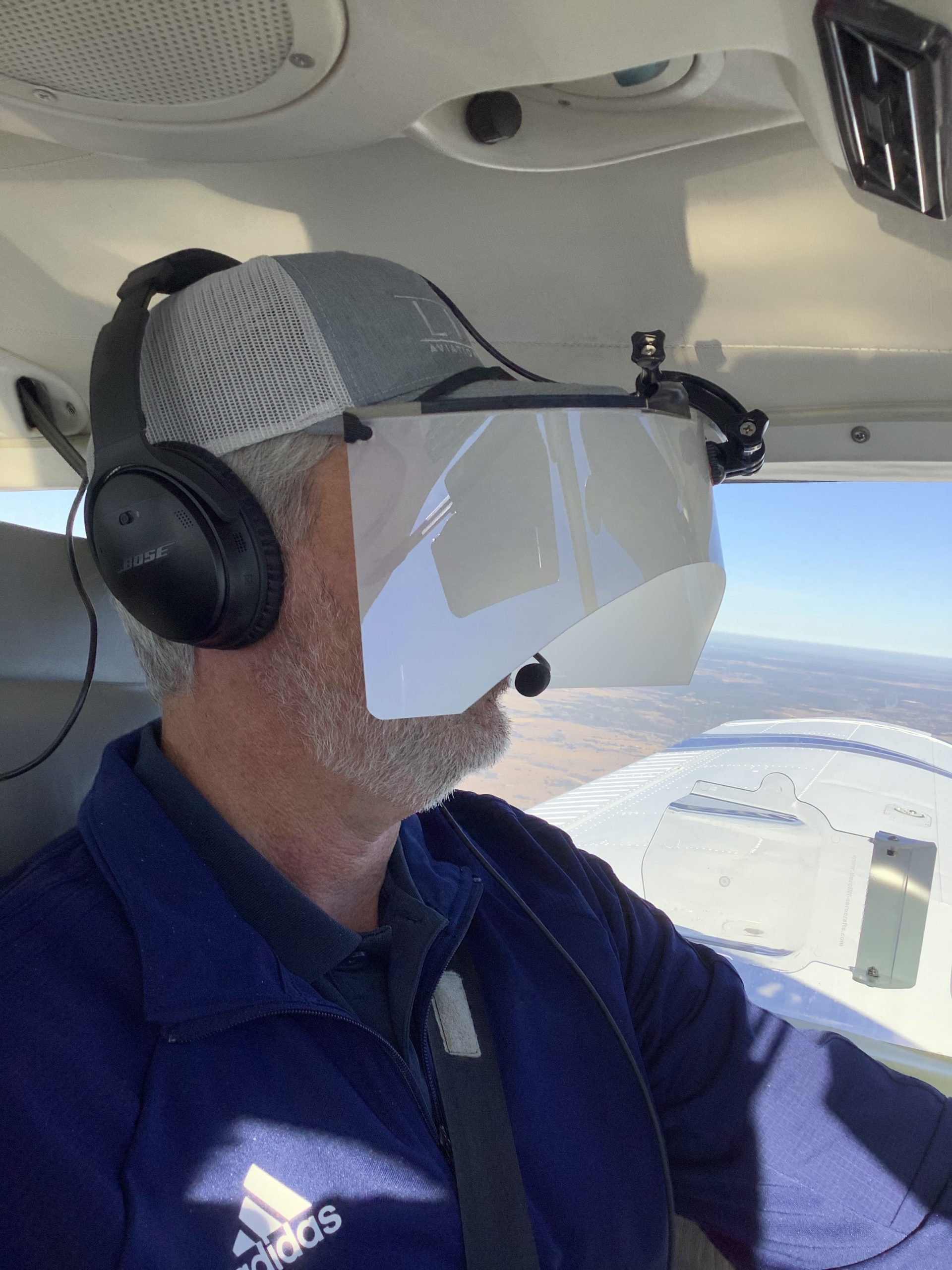
Let’s face it: airplanes are not the best classrooms. The propeller is running, the engine is making lots of noise, the pilot is attempting to multi-task and the instructor is barking orders. That’s almost as much overstimulation as being a parent to 4 kids under 10 (I have experience in that arena!). That’s even before takeoff!

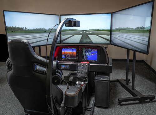
At Texas Top Aviation, we have observed many situations where a simulator would be an excellent way to introduce different concepts and supplement training. Now, in our Austin Executive (KEDC) office, we finally have a really good simulator.

Meet the Noble Flight Simulator, the next best thing to a Cirrus cockpit. With the Noble Flight Simulator, we can duplicate 6 different types of Cirrus aircraft (G3 SR22, G3 SR22T, G5 SR22, G5 SR22T, G6 SR22, and G6 SR22T). The Garmin Perspective panel easily swaps between the G3 and G5 configuration to the G6 configuration, so the buttons are all in the proper places.

Having button pushing problems? The simulator is the place to practice.

Want to experience actual emergencies? An engine failure is a lot less stressful in a simulator.

Want to pull CAPS (Cirrus Airframe Parachute System)? The Noble Flight Simulator has a realistic CAPS handle with the same amount of pull pressure that the CAPS handle in the airplane has.

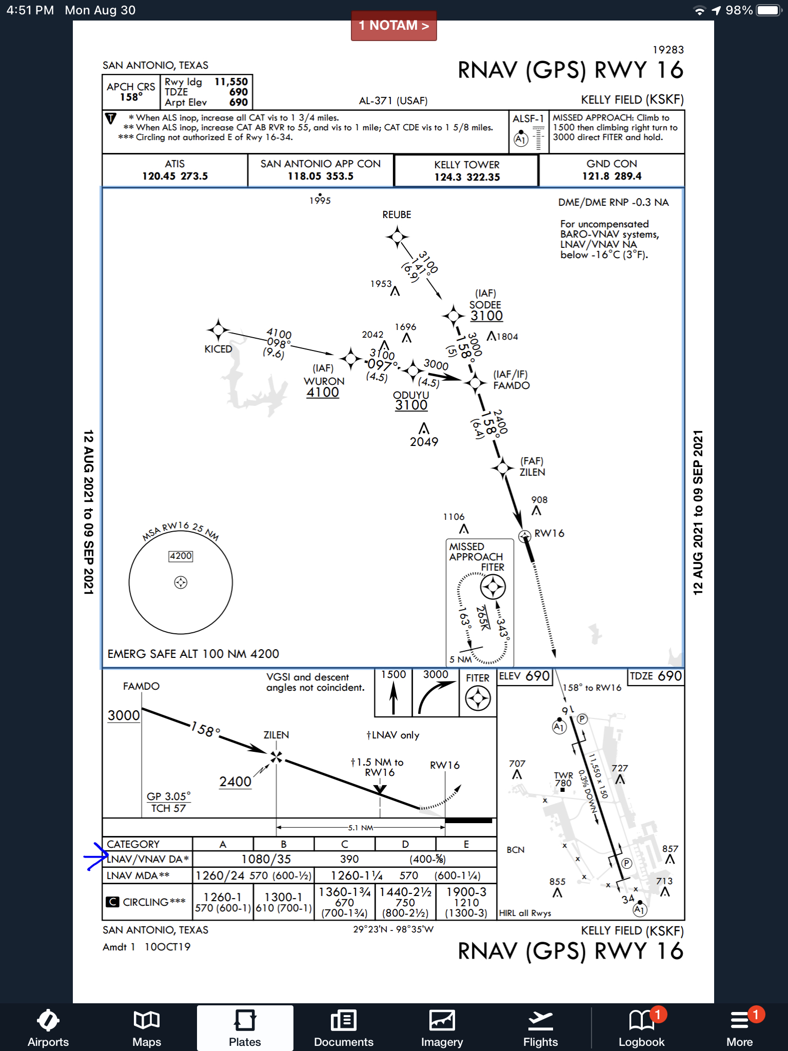
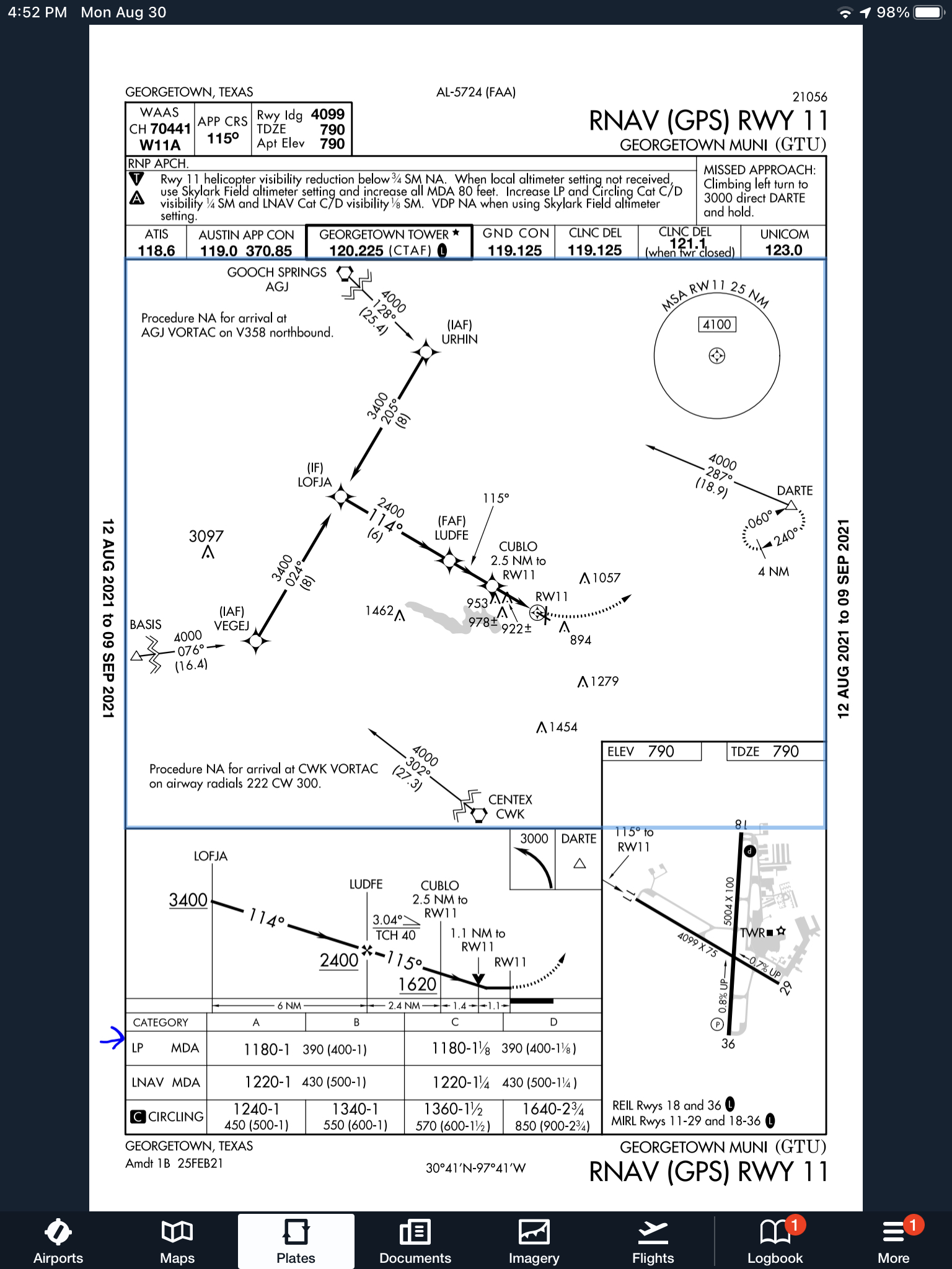
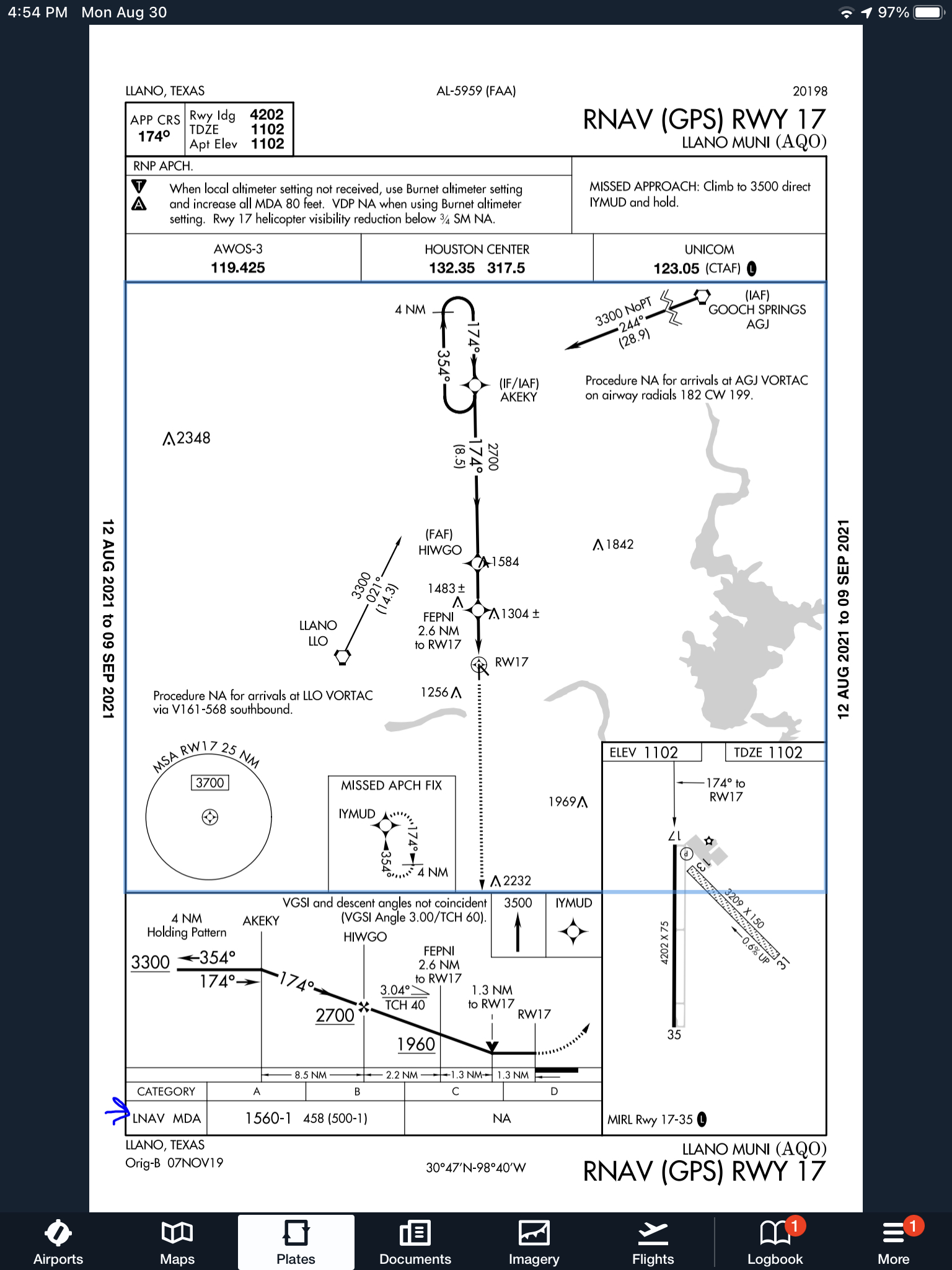
Need an IPC or want to practice approaches? All approaches done on a Noble Flight Simulator are luggable, plus a full IPC can be accomplished.

Want to save fuel? The Noble Flight Simulator is for you!

To top it all off, the Noble Flight Simulator that Texas Top Aviation has is classified as an Advanced Aircraft Training Device. It is certified to the highest standards of non-motion simulators, allowing pilots working toward their private and instrument ratings to log a significant amount of time toward that certificate or rating. Up to 20 hours of IFR training is allowed to be logged in an AATD toward an instrument rating. That’s huge!

Texas Top Aviation is also developing a CAPS specific course to expose Cirrus pilots to the many different scenarios where pulling CAPS would be necessary. This teaches Aeronautical Decision Making to Cirrus pilots who struggle with the decision of whether or not to pull CAPS. Look for CAPS course information under our Aircraft Training page later this summer.

Interested in checking the simulator out? Contact us today!

Flying WAAS GPS Approaches

1 Comment

When flying a WAAS GPS approach, there are several different levels of WAAS signal that a GPS receiver can get. The most precise is an LPV signal. LPV stands for Localizer Performance with Vertical guidance. An LPV approach has the lowest minimums of all the WAAS GPS approaches, typically in the range of 200-300 feet AGL. A GPS glide path (GP) is guaranteed with an LPV approach and the minimum altitude is a decision altitude (DA).

Just like a localizer, an LPV course width get’s tighter and the CDI becomes more sensitive the closer the plane get’s to the runway. Even though the LPV approach minimums are so low and the approach is down to a DA, they still aren’t considered precision approaches by the FAA (which leads to some extra planning when selecting an airport as an alternate that only has GPS approaches, since the AIM specifies only the LNAV minimum are to be considered if an alternate airport only has GPS approaches, bringing the 800 foot ceiling requirement to bear)

An LNAV/VNAV approach is still a WAAS approach that has a GPS glidepath, but is slightly different than an LPV approach. An LNAV/VNAV final approach course does not get more sensitive the closer the plane gets to the runway. The smallest course width on an LNAV/VNAV approach is 0.3 miles either side of center. LNAV/VNAV approaches will, most of the time, have higher minimums than LPV approaches and can have minimums no lower than 250′ AGL.

The third type of WAAS approach is strictly a non-precision approach with a Minimum Descent Altitude (MDA). These are designated LP approaches, which stands for Localizer Performance. These are like old school Localizer only approaches that, similar to the lateral portion of an LPV approach, the course width tightens the closer to the runway that a pilot is. There is no glide path by definition of an LP approach, though there is a caveat.

Now, by looking at an approach plate that is a WAAS approach, but only has LP minimums listed, a pilot would assume there would be no glide path. Depending on what type of GPS unit the airplane has, that pilot could be wrong. Garmin Perspective units (Cirrus G1000), all GTN 750s and GTN 650s, All G1000 NXi units, most Garmin 430W and 530W, and all Avidyne IFD 550/540 and 440 units will display an advisory glide path on an LP approach, designated LP+V.

What does LP+V indicate? An advisory glide path is just advisory, but it is totally legal to follow down on a non-precision LP approach. The kicker is obstacle clearance is not guaranteed and the pilot needs to keep an eye on minimum altitudes at the different waypoints on the approach. The big thing I tell people is, when you arrive at the MDA and the runway is in sight, following the advisory glide path below the MDA could get you in trouble with obstacles. Don’t just hone in on your instruments when you break out of the clouds. Look out the windscreen and make sure you won’t hit anything.

If you arrive at the MDA on the advisory glide path and the runway isn’t in sight, DON’T GO BELOW THE MDA! Most autopilots won’t level off at the MDA, even if that altitude is set in the altitude pre-select, so this will involve turning off the autopilot before the MDA and manually leveling off, or engaging the altitude mode of your autopilot at the MDA.

One other type of GPS approach that you will encounter is an LNAV approach. This is a non-WAAS approach down to an MDA, but your GPS unit may still give you a +V. Most modern ones will.

Casey Aviation Makes Piper PA46 Systems Videos Free

0 Comments

The safest pilots are the ones who attempt to gain as much knowledge and learning about their airplane and environment as possible. These pilots are the ones who enjoy learning, going to seminars and conventions, and soak up all the MMOPA magazine articles in each issue. These pilots are the ones who get as much training as they can, above and beyond what the minimum requirements are.

If you are one of these pilots and you own a Piper PA46, then this blog is for you.

Casey Aviation, one of the best Piper PA46 training companies out there, recently released all of their Malibu, Mirage, Matrix, Meridian, and JetProp systems training videos for free. These are some fantastic videos that Casey Aviation created which go much more in depth than any power point presentation could.

The great thing about the videos is they give the viewer an all access “inside look” to the specific airplane. Joe Casey, owner of Casey Aviation, takes off cowlings, crawls under the nose gear compartment, and even shows an airplane with the interior out so all the flap cables and environmental systems can be seen.

I have started referring all of my PA46 customers to the Casey Aviation videos as part of the prep work for our training sessions.

To access the videos, check out the Casey Aviation website.

Jeppesen vs. Aeroservices Charts

0 Comments

Many people ask, which set of charts is better? Should I use the FAA Aeroservices charts on Foreflight or pay extra for the Jeppesen charts? Since you have to pay for Jeppesen, they are probably better, right?

I am not here to say which one is better as a chart preference is just that, a preference for one over the other or for certain features. After a while, muscle memory and routine take over and you probably wont even notice the difference.

History

In 1934, Elroy Jeppesen began making his own charts and sold them to other pilots. His little company grew into the giant Boeing chart company we know today. Jeppesen charts are used internationally and therefore include information that might otherwise seem common knowledge, like transition altitudes. The key is, you cannot get FAA Aeroservices charts for international destinations. Jeppesen is the only option for outside the US.

National Aerospace Charting Office (NACO), or the new(er) name “Aeroservices” or FAA chart, whatever you decide to call them, are United States government issued charts. In addition to civilian use, Aeroservices charts are used by the military so there will be some terminology that does not apply to civilians. The best part about FAA Aeroservices charts are… they’re free!

If you are in the middle of a transition or trying to decide which charts to use, you have come to the right place. Here are a few key differences.

Obstacle Departure Procedure Chart
KAXX (Angel Fire, New Mexico) ODP

  1. Frequencies: FAA Chart provides the AWOS so you have all departure frequencies in once place.
  2. Airport: Jeppesen highlight the airport, which is a nice feature so you can easily see the flow from the airport.
  3. Notes and Remarks: Jeppesen bolds the speed restriction all over the chart so you won’t miss it. All other requirements are in the top right corner. Note the transition altitude 18,000′. Since Jeppesen is used internationally, it is published on the chart since other countries have different transition altitudes. It takes up a chunk of chart real estate, but it’s clear, easy to read, and always in the same place. The FAA charts post all the requirements and restrictions as notes off to the side. Since it’s in the same space as the chart graphic, it’s easy for the eyes to catch while studying the plate.
  4. Take off Minimums: NOT APPLICABLE for PART 91 – however, it’s wise for all pilots to look and abide by them. Jeppesen displays the standard take off minimums table, as well as the rate of climb table, which is nice to have all in one place. The FAA chart gives the non standard information but you need to know/look up the rest in the Digital Terminal Procedures Supplemental document. (Hint: It’s in the Documents section of Foreflight)
  5. Take Off Obstacles: About the same on both charts
  6. Route Description: Similar on both charts, but larger font and clearer description on the FAA chart. When there are different routes from different runways, the FAA chart layout is really helpful.
  7. Graphic Layout: Jeppesen and FAA use the same graphics for all their different charts and plates which makes it easy to read once you are familiar with the respective charts. FAA charts are easy to read and distractions are kept to a minimum. Jeppesen charts make things bold and enlarge pertinent information so you won’t miss it.
  8. Airport altitude: This is only on the Jeppesen chart (the FAA chart doesn’t include it), but it is very helpful for situational awareness. As you brief the arrival altitudes, I think it’s important to have an idea what AGL you are at.

Approach Charts

One thing pilots love about Jeppesen approach charts is the clear set up for an approach brief. The top section is created as a “briefing strip” starting with the frequencies, then navigation frequencies, minimums, airport elevation and the missed approach. It’s very natural and user friendly.

FAA charts have a slightly bigger picture of the approach planview, but the profile view and minimums section can get a bit cluttered. It can feel a little discontinuous when briefing the approach to bounce all over the page. However, some pilots really like the small airport diagram in the corner, which I find really helpful for situational awareness (particularly for students learning circle approaches). Non- standard alternate and takeoff minimums are also clearly noted, but unfortunately we must hunt elsewhere to find them. The Jeppesen alternate minimums and takeoff minimums will both be on the airport diagram

  1. Frequencies: Getting weather and tuning radios is easy on the Jeppesen charts – just follow the briefing strip. The frequency section on the FAA charts is still easy to read, but closer to the center of the page. It’s split up from the nav frequencies and other important briefing information.
    a. FAA charts are created by the government and have military specific information, which are the odd looking frequencies and channels on the chart.
  2. Approach Navigation: On a Jeppesen chart, you will continue to the next line to verify your frequency, course and set minimums (assuming you are straight in on the ILS). On the FAA chart, you will then have to skip to the top of the chart to get the frequency and course, and then scan to the bottom of the page to input your minimums. However, since you could be flying a localizer approach or a circle to land, it’s a good reminder that not everyone using this approach chart will be using the same Decision Altitude (DA). The FAA chart also includes runway distance information so pilots can make determinations of approach speeds and stopping distance if the runway is wet or icy.
  3. Missed Approach – Textual
  4. Approach Lighting
  5. Missed Approach- Graphical: The missed approach information is the same on both charts. The lighting information is key for determining a missed approach and is next to the missed approach text on the FAA chart. It’s found next to the missed approach graphic on the Jeppesen chart. Personally, I find it easier to find and read the lighting information on the Jeppesen chart. Remember, on both charts, the placement of the PAPI on the chart indicates the physical location of the lights (left or right of the runway).
  6. Notes: Both charts have a notes box, but they use them a little differently. Once again, remember that Jeppesen charts are used internationally and include the transition altitudes and altimeter setting info. On both charts, the notes section will be where other critical information will be shared which isn’t really applicable for this airport. On the FAA chart, the tower frequency is starred to note that there are operating hours (you’ll have to check the chart supplement AF/D to find out what those hours are). There is also an L next to the frequency to indicate it is the pilot controlled lighting frequency. You will also find the note about the VGSI and the Approach Glide path next to the profile view on the FAA chart, whereas the Jeppesen chart has that note in the notes section at the top. The FAA chart also has the T and an A in black triangles to note that this airport has non- standard alternate and take off minimums. Again, those are found in separate documents when using FAA charts and on the Airport Diagram when using Jeppesen charts.
  7. Minimum Sector Altitude: Similar on both charts, but in different locations (reminder: ATC vector altitudes may be lower. It is the pilot’s responsibility for safety of flight to maintain safe obstacle clearance, so if you are ever concerned about going below the MSA – just ask ATC).
  8. Planview: Other then differences in size, visuals, and text, the information displayed on both is very similar.
  9. Profile View: Again, the displays look different and pilots will have their preference, but the information is the same.
  10. Minimums: Jeppesen charts not only note the category for each approach with its designated letter, but also displays it in knots. It is recommended that if you increase your approach speed (based on flaps or gusty winds or perhaps a faster speed for a circle to land approach) that you should use the higher category minimums. The reference guide makes that easy to look up. The other benefit of the Jeppesen charts is right the table that contains the time from the final approach fix to the missed approach point for a localizer approach, it also shows the rate of descent with the associated ground speed to maintain a 3 degree glideslope. Now there is no excuse not to set pitch and power! The minimums posted in parenthesis are for the military, but RVR in statute miles is also included.
  11. Airport diagram: Only on the FAA charts, this particular feature is particularly useful for situational awareness. The arrow pointing to the runway shows the direction the approach is arriving from so planning a circle to land is a cinch. There is also a lot of other information that can be gathered from the airport diagram for quick reference or to help a disoriented pilot: lighting, displaced thresholds, closed taxiways, and runway placement and lengths. This is easily one of the best perks of an FAA chart.

Arrival/ Departure Charts: Sewzy 5 Arrival KAUS

The Jeppesen lay out is very attractive and draws the pilots eye in a clear way to all the important information. The colors pop out, so the required altitudes and speeds are easy to read and remember. The chart, which is the proper scale, shows MORAs , easy to find airports (and runway layouts) and is over all easy to follow. However, the texts, while very clearly laid out, are small and difficult to read and pushed to the very edges of the chart. FAA charts are simple and fairly easy to read, but the airports are not as obvious and the flow to the airport requires a good look. The table on the Jeppesen chart is a really nice format, but the text and Notes for arrivals on the FAA chart are easy to find and much easier to read quickly.

  1. Frequency: FAA charts include the approach frequency on the arrival, which is helpful for having radios tuned. During a busy time when the controller changes your frequency, all you have to do is verify the frequency you already set, rather then totally stop what you’re doing to switch it. The Jeppesen charts add the airport elevation next to the ATIS, which really aids situational awareness.
  2. Notes: Jeppesen notes are clearly numbered and tucked away nicely in a box, but the FAA chart notes pop out in the middle of the page and are easy to skim for pertinent information.
  3. Planview: I think Jeppesen is the clear winner here- it is so easy to read, it only takes one glance to know where the primary airport is and how the arrival flows. The chart being at the proper scale offers the pilot important geographical information and over all is a clean look. Notice the small series of arrows after SMRFF on the the Jeppesen chart; those indicate the pilot should expect radar vectors. The FAA charts include those instructions in the text, but I find the visual reference on the chart helpful. The FAA charts are equally clean, with altitude and speed restrictions easy to read even if they don’t jump out. When there are multiple airports that the arrival serves, the airports are clearly marked, though, I think it would be nice to have a little more information surrounding the primary airport for better situational awareness.
  4. MSA: only on the Jeppesen chart
  5. Primary airport: The runway alignment and grey highlight on the Jeppesen chart stands out very clearly, while the FAA airports are a little more obscure.
  6. Arrival route description: The table on the Jeppesen chart is easy to follow but the text is very small and pushed to the bottom. The route description is much easier to find and read on the FAA chart.

Airport Diagram

The Jeppesen Airport Diagram page has it all: frequencies, airport diagram, runway info, take-off minimums, departure procedures and alternate minimums. It’s a one-stop shop. It makes preflight planning easy when its all at your fingertips.

The FAA charts usually require a little more searching for different pieces of airport information. The Airport Diagram itself is just the airport layout. Above, you will see a simple FAA Airport diagram. It’s clean and simple, perfect for a knee board print out.

In the flight planning process, as you look at what approaches you will be using for the airport, you might see an A or T inside a triangle. Those indicate that you will need to look in the Alternate Minimum or Take off minimum documents for more information. The Takeoff Minimums document (see below) is also where you will find any obstacle departure procedures for that airport. Apps like Foreflight help you out by posting the take off minimums under the departure tab. Even though it’s a little more difficult to read, I didn’t crop out the airport information so you can see what it looks like in context.

FAA Alternate Minimums on the Left and Takeoff Minimums and Obstacle Departure Procedures on the Right

Using the ICARUS Device to Simulate IFR Conditions

0 Comments

Most of us who have been through instrument training are familiar with the traditional view limiting devices. There is the original hood, which does a decent job of blocking a pilot’s view of outside, but there are still gaps that allow “peeking”, though that peeking doesn’t really help a pilot fly an approach. It does help them figure out which way is up, so it’s not a true simulation.

The other problem with a hood is the process of putting it on to begin simulating IFR conditions, then taking it off when it’s time to land. This process takes time and the instructor has to take the controls (or the autopilot flies), losing some of the realism of the simulation.

Overall, an IFR hood is relatively comfortable. The elastic band sits under your headset, doesn’t squeeze your heard, and doesn’t press underneath your ear cups of the headset, giving you a headache. Hoods are large and somewhat unwieldy.

Foggles are another way to simulate IFR conditions for training. Most of the time, these are safety glasses that have most of the lens blacked out or fogged out, leaving little slits at the bottom for the pilot’s eyes to see the instruments.

Foggles aren’t quite as good as an IFR hood at blocking the outside. Due to their shape, there are often cracks that allow more “peeking” then a hood. The process of beginning to simulate IFR conditions and ending the simulated IFR conditions is easier though, since all the pilot has to do is put the foggles on or slip them off, which can often be done one handed (putting them on can be more difficult one handed since they have to fit underneath your headset). Wearing them for a long period of time can get painful as your headset is probably going to start crushing them against the side of your head.

The best comfort and view limiting combination I have found, so far, is called the ViBAN. It’s very comfortable and does a really good job of simulating IFR by blocking a view of the outside.

What’s the whole goal behind a view limiting device? When a pilot starts instrument training, ideally, all the training would take place in the clouds, since that is why someone get’s an instrument rating. As we all know, this isn’t possible, hence the need to simulate IFR conditions. The problem with simulating IFR is, it’s not true IFR. True IFR conditions are different then what a hood or a set of foggles can simulate. This can lead to spatial disorientation if a fresh instrument pilot enters the clouds for the first time, having done all his training in simulated conditions.

I’ve even heard a story of a pilot who did all his IFR training with a hood, passed his check ride, went into the clouds the first time, and put the hood on because he was getting disoriented since he hadn’t ever experienced true IFR.

What about full motion simulators? How I wish every airport had a full motion simulator for instrument training. Full motion sims are truly the best way to simulate IFR conditions. A pilot can easily get spatially disoriented in a sim if he or she isn’t careful. It’s a great way to simulate IFR conditions, but, alas, this just isn’t possible.

Are we doomed to just do an okay job of training instrument pilots in simulated IFR conditions with a hood or foggles?

Nope, at least not anymore.

Enter the ICARUS Device. The ICARUS Device, which stands for Instrument Conditions Awareness Recognition and Understanding System, is an amazing piece of equipment which truly simulates IFR conditions in the training environment. The ICARUS is a plastic shield that uses a Polymer Dispersed Liquid Crystal film that allows the degradation of a pilot’s visibility. It clips on to a baseball cap and is attached to a battery. That battery is then bluetoothed to an iPad or iPhone App that allows the instructor to put the pilot into and take him out of simulated IFR conditions.

Originally designed for helicopter training, it’s an excellent tool for fixed wing IFR training too. I’ve been using it for the last month and a half and I am hooked. The customer’s that I have used it with truly say that they cannot see a thing outside. Because the plastic shield turns white, it really does give the view that the pilot is in the clouds. The inner ear certainly believes it. The curve of it fits the glare shield in most planes nicely (there is some custom cutting that would have to take place for specifically rounded glare shields, but it fits Cirrus and Piper Saratogas nicely, the two planes I have used it in), and it sits away from the pilot’s face, blocking out all windows, which is what clouds do.

The greatest thing from an instructor’s standpoint is the ICARUS Device app. The pilot puts the device on before taxi and I set the app to VMC. This completely clears the ICARUS Device so the pilot can see just fine for taxi and takeoff. Then, at about 400 AGL, I tap the <1/2 VIS button on the app, and boom, the pilot is in the clouds. I even have a time delay to slowly make the ICARUS Device opaque to simulate slowly entering the clouds. I do the same thing on an approach, except in the reverse order, simulating we are slowly exiting the clouds.

The ICARUS Device is a game changer for IFR training. It’s comfortable, easy to use, the battery lasts for a long time (though bring a standard USB charging cord with you in the plane because the battery failure mode makes the ICARUS Device opaque instead of transparent. You don’t want that to happen at 200 AGL!), and, most important, it truly simulates IFR conditions.

After using it, I believe all flight schools and CFII should get one of these, both in the fixed wing and helicopter world. It’s the best option for simulating IFR conditions.

Checkout the ICARUS Device website for more information and to hear the story of the company.


Texas Top Aviation, LLC was given an ICARUS Device by the ICARUS Device company to test. Texas Top Aviation, LLC was not paid for our above opinion on the ICARUS Device (trust me, if it was terrible, I would have told you!).