|

Jeppesen vs. Aeroservices Charts

Many people ask, which set of charts is better? Should I use the FAA Aeroservices charts on Foreflight or pay extra for the Jeppesen charts? Since you have to pay for Jeppesen, they are probably better, right?

I am not here to say which one is better as a chart preference is just that, a preference for one over the other or for certain features. After a while, muscle memory and routine take over and you probably wont even notice the difference.

History

In 1934, Elroy Jeppesen began making his own charts and sold them to other pilots. His little company grew into the giant Boeing chart company we know today. Jeppesen charts are used internationally and therefore include information that might otherwise seem common knowledge, like transition altitudes. The key is, you cannot get FAA Aeroservices charts for international destinations. Jeppesen is the only option for outside the US.

National Aerospace Charting Office (NACO), or the new(er) name “Aeroservices” or FAA chart, whatever you decide to call them, are United States government issued charts. In addition to civilian use, Aeroservices charts are used by the military so there will be some terminology that does not apply to civilians. The best part about FAA Aeroservices charts are… they’re free!

If you are in the middle of a transition or trying to decide which charts to use, you have come to the right place. Here are a few key differences.

Obstacle Departure Procedure Chart
KAXX (Angel Fire, New Mexico) ODP
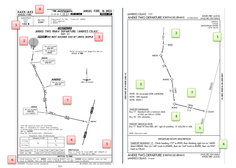
  1. Frequencies: FAA Chart provides the AWOS so you have all departure frequencies in once place.
  2. Airport: Jeppesen highlight the airport, which is a nice feature so you can easily see the flow from the airport.
  3. Notes and Remarks: Jeppesen bolds the speed restriction all over the chart so you won’t miss it. All other requirements are in the top right corner. Note the transition altitude 18,000′. Since Jeppesen is used internationally, it is published on the chart since other countries have different transition altitudes. It takes up a chunk of chart real estate, but it’s clear, easy to read, and always in the same place. The FAA charts post all the requirements and restrictions as notes off to the side. Since it’s in the same space as the chart graphic, it’s easy for the eyes to catch while studying the plate.
  4. Take off Minimums: NOT APPLICABLE for PART 91 – however, it’s wise for all pilots to look and abide by them. Jeppesen displays the standard take off minimums table, as well as the rate of climb table, which is nice to have all in one place. The FAA chart gives the non standard information but you need to know/look up the rest in the Digital Terminal Procedures Supplemental document. (Hint: It’s in the Documents section of Foreflight)
  5. Take Off Obstacles: About the same on both charts
  6. Route Description: Similar on both charts, but larger font and clearer description on the FAA chart. When there are different routes from different runways, the FAA chart layout is really helpful.
  7. Graphic Layout: Jeppesen and FAA use the same graphics for all their different charts and plates which makes it easy to read once you are familiar with the respective charts. FAA charts are easy to read and distractions are kept to a minimum. Jeppesen charts make things bold and enlarge pertinent information so you won’t miss it.
  8. Airport altitude: This is only on the Jeppesen chart (the FAA chart doesn’t include it), but it is very helpful for situational awareness. As you brief the arrival altitudes, I think it’s important to have an idea what AGL you are at.

Approach Charts

One thing pilots love about Jeppesen approach charts is the clear set up for an approach brief. The top section is created as a “briefing strip” starting with the frequencies, then navigation frequencies, minimums, airport elevation and the missed approach. It’s very natural and user friendly.
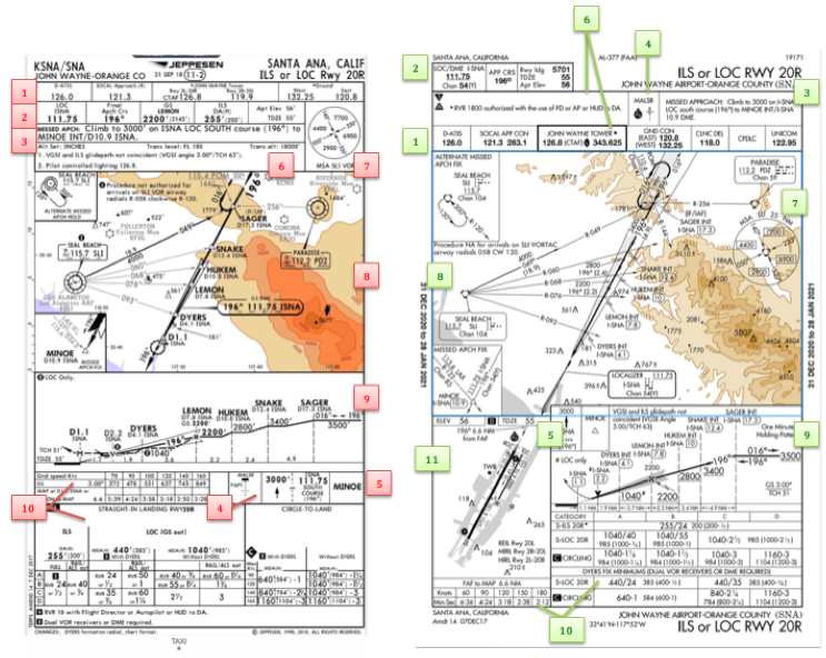
FAA charts have a slightly bigger picture of the approach planview, but the profile view and minimums section can get a bit cluttered. It can feel a little discontinuous when briefing the approach to bounce all over the page. However, some pilots really like the small airport diagram in the corner, which I find really helpful for situational awareness (particularly for students learning circle approaches). Non- standard alternate and takeoff minimums are also clearly noted, but unfortunately we must hunt elsewhere to find them. The Jeppesen alternate minimums and takeoff minimums will both be on the airport diagram

  1. Frequencies: Getting weather and tuning radios is easy on the Jeppesen charts – just follow the briefing strip. The frequency section on the FAA charts is still easy to read, but closer to the center of the page. It’s split up from the nav frequencies and other important briefing information.
    a. FAA charts are created by the government and have military specific information, which are the odd looking frequencies and channels on the chart.
  2. Approach Navigation: On a Jeppesen chart, you will continue to the next line to verify your frequency, course and set minimums (assuming you are straight in on the ILS). On the FAA chart, you will then have to skip to the top of the chart to get the frequency and course, and then scan to the bottom of the page to input your minimums. However, since you could be flying a localizer approach or a circle to land, it’s a good reminder that not everyone using this approach chart will be using the same Decision Altitude (DA). The FAA chart also includes runway distance information so pilots can make determinations of approach speeds and stopping distance if the runway is wet or icy.
  3. Missed Approach – Textual
  4. Approach Lighting
  5. Missed Approach- Graphical: The missed approach information is the same on both charts. The lighting information is key for determining a missed approach and is next to the missed approach text on the FAA chart. It’s found next to the missed approach graphic on the Jeppesen chart. Personally, I find it easier to find and read the lighting information on the Jeppesen chart. Remember, on both charts, the placement of the PAPI on the chart indicates the physical location of the lights (left or right of the runway).
  6. Notes: Both charts have a notes box, but they use them a little differently. Once again, remember that Jeppesen charts are used internationally and include the transition altitudes and altimeter setting info. On both charts, the notes section will be where other critical information will be shared which isn’t really applicable for this airport. On the FAA chart, the tower frequency is starred to note that there are operating hours (you’ll have to check the chart supplement AF/D to find out what those hours are). There is also an L next to the frequency to indicate it is the pilot controlled lighting frequency. You will also find the note about the VGSI and the Approach Glide path next to the profile view on the FAA chart, whereas the Jeppesen chart has that note in the notes section at the top. The FAA chart also has the T and an A in black triangles to note that this airport has non- standard alternate and take off minimums. Again, those are found in separate documents when using FAA charts and on the Airport Diagram when using Jeppesen charts.
  7. Minimum Sector Altitude: Similar on both charts, but in different locations (reminder: ATC vector altitudes may be lower. It is the pilot’s responsibility for safety of flight to maintain safe obstacle clearance, so if you are ever concerned about going below the MSA – just ask ATC).
  8. Planview: Other then differences in size, visuals, and text, the information displayed on both is very similar.
  9. Profile View: Again, the displays look different and pilots will have their preference, but the information is the same.
  10. Minimums: Jeppesen charts not only note the category for each approach with its designated letter, but also displays it in knots. It is recommended that if you increase your approach speed (based on flaps or gusty winds or perhaps a faster speed for a circle to land approach) that you should use the higher category minimums. The reference guide makes that easy to look up. The other benefit of the Jeppesen charts is right the table that contains the time from the final approach fix to the missed approach point for a localizer approach, it also shows the rate of descent with the associated ground speed to maintain a 3 degree glideslope. Now there is no excuse not to set pitch and power! The minimums posted in parenthesis are for the military, but RVR in statute miles is also included.
  11. Airport diagram: Only on the FAA charts, this particular feature is particularly useful for situational awareness. The arrow pointing to the runway shows the direction the approach is arriving from so planning a circle to land is a cinch. There is also a lot of other information that can be gathered from the airport diagram for quick reference or to help a disoriented pilot: lighting, displaced thresholds, closed taxiways, and runway placement and lengths. This is easily one of the best perks of an FAA chart.

Arrival/ Departure Charts: Sewzy 5 Arrival KAUS
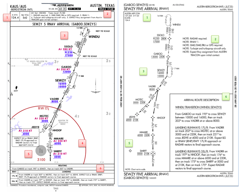
The Jeppesen lay out is very attractive and draws the pilots eye in a clear way to all the important information. The colors pop out, so the required altitudes and speeds are easy to read and remember. The chart, which is the proper scale, shows MORAs , easy to find airports (and runway layouts) and is over all easy to follow. However, the texts, while very clearly laid out, are small and difficult to read and pushed to the very edges of the chart. FAA charts are simple and fairly easy to read, but the airports are not as obvious and the flow to the airport requires a good look. The table on the Jeppesen chart is a really nice format, but the text and Notes for arrivals on the FAA chart are easy to find and much easier to read quickly.

  1. Frequency: FAA charts include the approach frequency on the arrival, which is helpful for having radios tuned. During a busy time when the controller changes your frequency, all you have to do is verify the frequency you already set, rather then totally stop what you’re doing to switch it. The Jeppesen charts add the airport elevation next to the ATIS, which really aids situational awareness.
  2. Notes: Jeppesen notes are clearly numbered and tucked away nicely in a box, but the FAA chart notes pop out in the middle of the page and are easy to skim for pertinent information.
  3. Planview: I think Jeppesen is the clear winner here- it is so easy to read, it only takes one glance to know where the primary airport is and how the arrival flows. The chart being at the proper scale offers the pilot important geographical information and over all is a clean look. Notice the small series of arrows after SMRFF on the the Jeppesen chart; those indicate the pilot should expect radar vectors. The FAA charts include those instructions in the text, but I find the visual reference on the chart helpful. The FAA charts are equally clean, with altitude and speed restrictions easy to read even if they don’t jump out. When there are multiple airports that the arrival serves, the airports are clearly marked, though, I think it would be nice to have a little more information surrounding the primary airport for better situational awareness.
  4. MSA: only on the Jeppesen chart
  5. Primary airport: The runway alignment and grey highlight on the Jeppesen chart stands out very clearly, while the FAA airports are a little more obscure.
  6. Arrival route description: The table on the Jeppesen chart is easy to follow but the text is very small and pushed to the bottom. The route description is much easier to find and read on the FAA chart.

Airport Diagram
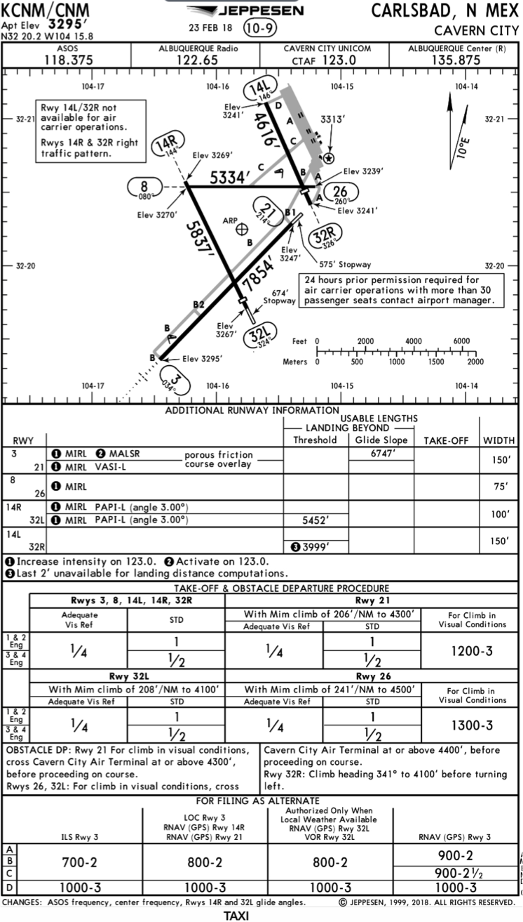
The Jeppesen Airport Diagram page has it all: frequencies, airport diagram, runway info, take-off minimums, departure procedures and alternate minimums. It’s a one-stop shop. It makes preflight planning easy when its all at your fingertips.
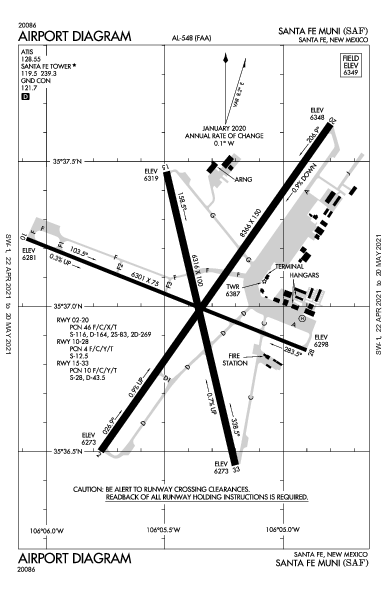
The FAA charts usually require a little more searching for different pieces of airport information. The Airport Diagram itself is just the airport layout. Above, you will see a simple FAA Airport diagram. It’s clean and simple, perfect for a knee board print out.

In the flight planning process, as you look at what approaches you will be using for the airport, you might see an A or T inside a triangle. Those indicate that you will need to look in the Alternate Minimum or Take off minimum documents for more information. The Takeoff Minimums document (see below) is also where you will find any obstacle departure procedures for that airport. Apps like Foreflight help you out by posting the take off minimums under the departure tab. Even though it’s a little more difficult to read, I didn’t crop out the airport information so you can see what it looks like in context.

FAA Alternate Minimums on the Left and Takeoff Minimums and Obstacle Departure Procedures on the Right

Similar Posts

  • Thunderstorm Avoidance

    Thunderstorms are not to be taken lightly. I know you have probably heard that many times in your flying career. Weather related accidents account for approximately 25% of airline and GA accidents.

    The Airman’s Information Manual suggests giving a 20 mile berth around thunderstorms. If you are an experienced aviator or a newbie please take this piece of advice seriously. At one flight school where I taught, we had the policy of maintaining a 25 mile buffer around isolated thunderstorms. A bit excessive you think? Maybe, but safety is a good thing!

    On this particular day, I was operating a Bell Jet Ranger helicopter during a power line patrol. Power line patrol by itself offers numerous challenges. The job consists of flying along electric power transmission lines at approximately 40 feet above the ground at 40 knots. The crew consisted of me (the pilot) and an observer. The observer is an employee of the power company and it is his job to determine which line(s) will be patrolled during the given day. As I fly along the lines, the observer is checking for anything out of the ordinary such as broken, cracked, or even shot out insulators, excessively large bird nests at the top of structures, or woodpecker holes in wooden poles. The observer knows the lines and he is also a great help in letting me know there is a crossing, and potentially higher, line in our flight path. That makes him a true safety asset!
    Power line thunderstormIt was late afternoon during the summer and we were about to finish up for the day. We only had about another 10 miles of line to follow before calling it a day. Up ahead, I noticed an isolated thunderstorm near our power line. I could see the heavy rain falling below the anvil shaped leading clouds. It appeared to be well beyond the end of our day’s work so we pressed on.

    As we drew closer to the thunderstorm, we were suddenly tossed up on our left side like a dog toy in mid-flight! It seemed like we were 90 degrees to our normal cruise attitude and, to make it worse, we had the doors off on that hot summer day. I was able to recover and we did an immediate about face and high tailed it home. Forget the rest of that line, tomorrow is another day.

    The destructive force of thunderstorms cannot be overstated. In addition to extremely heavy rain, they can contain strong wind shear, large hail, and severe turbulence, each of which can damage or destroy an aircraft. Take care when one of these bad boys is near your flight path. Give it plenty of respect and a lots of room, for safety’s sake.

    Alan VanDoren is a 7000 hour ATP pilot.  He has flown both fixed wing and helicopters as a police pilot, missionary pilot, flight instructor, and most recently as an EMS pilot.  He has flown in five countries around the world and also teaches university level aviation courses in his spare time.

  • The Aunt Betty Directive: PFD Failures

    Glass panel displays, ballistic parachute aircraft recovery systems, portable tablet computers enabling paperless cockpits, and widely available three axis autopilot systems have changed the way we fly, the way we train, and the way we are expected to perform on check rides. Our training and testing paradigms have tried to stay in synch, yet always seem to be catching up to the latest levels of technology.

    This is very apparent when we instructors are preparing a student for an FAA practical test. When training aircraft had no autopilots, no GPS, and certainly no parachutes, the general philosophy was that during training, the student should have the lowest level of technology available. This was also the expectation on the check ride. This theory has changed over the years and now the Practical Test Standards require that an applicant integrate all available technology while demonstrating mastery of his or her aircraft. This raises numerous questions from instructors and students about what technology will be available for each task.

    One example of this dilemma is found when contemplating an instrument airplane practical test in a Cirrus SR20/SR22. The test requires the task “Instrument Approach without Primary Flight Display”, which has taken the place of what was the partial panel approach, accomplished without use of gyroscopic heading and attitude indicators. In the Cirrus, the standby attitude indicator, standby airspeed, and standby altimeter are available, as is the Multi-Function Display. Guidance from the FAA has us shooting a GPS approach using the moving map display on the MFD after disabling the PFD. Those of us who trained and tested in steam gauge aircraft think that this task should be fairly easy. With a fully functional Attitude Indicator and a nice big moving map display showing our course, a reasonably competent instrument pilot should have little trouble adapting to this setup and flying a good approach.

    But, in the Cirrus specifically, and perhaps in other aircraft as well, another question comes up. Can the applicant use the autopilot (which still works just fine after a display failure) during the approach without the PFD? A rather famous DPE who writes for a national magazine says “yes”, opining that not to allow its use would be introducing simultaneous multiple systems failures, which is strictly forbidden in the minds of some. If we follow this logic, we would not test simulated engine failure emergencies in these aircraft either, because to do so would imply failure of not only the engine, but the CAPS parachute system as well. In my former role as a pilot examiner, I always said no, that the approach should be hand flown. Here is my logic.

    I was amazed that flight instructors and examiners would accept the substitution of autopilot technology for the skill required to fly an approach without the PFD. I would argue that the intent and the well described emphasis of the PTS is that the applicant must demonstrate the ability to control the airplane after a loss of the primary flight display, not observe and monitor the autopilot controlling the airplane! This argument was generally unpersuasive, so I approached from a different point of view, that of a concerned family member.

    “Aunt Betty” represents a future passenger flying with the soon to be rated instrument pilot. Here is the question posed to Aunt Betty: “When we train and test pilots for instrument proficiency, we require them to demonstrate the ability to safely and skillfully fly the airplane without their primary instruments. Now, Betty, in this airplane, we can test this task in one of two ways. We would like your input on which way you would prefer, seeing as you will be a frequent passenger with your nephew. We can either have the pilot (might be your son, brother, husband, or nephew) demonstrate that he can fly the airplane by hand without the PFD, which does require a little more skill and a slightly different technique, or, we can require the pilot to perform this task using the autopilot so that the pilot basically monitors the airplane flying itself on the approach.

    “Now, Aunt Betty, a pilot allowed to use the autopilot system on this approach may not have the skill or technique to fly the approach by hand in the clouds should the autopilot shut down due to turbulence or mechanical failure. Should this happen to a pilot without the skill and practice normally required, the odds of a fatal accident occurring would be quite high.

    “So what do you think, Aunt Betty? Would you feel more comfortable flying with this fellow if he has demonstrated mastery of the aircraft (sans PFD) without the autopilot or only with its assistance?”

    This leads us to a larger discussion about the use of other technology, iPad, GPS moving map, and more. If technology is used as a replacement for pilot proficiency during training and testing, we end up with less skillful, less competent and ultimately less safe pilots. But, if we require that our students demonstrate mastery with the lowest available level of automation and technology (which, by the way, implies excellent fundamental aircraft control skills) then, when technology is added into the equation, we have a safer pilot.

    Technology can be a value added safety multiplier, or it can be a crutch needed to make up for lack of fundamental and advanced skills. Crutch or Safety Multiplier, which one will you choose? I know which one Aunt Betty prefers.

    Charles McDougal is a flight instructor, corporate pilot, and former DPE ‎who offers basic and advanced flight instruction in the San Antonio area.  To find out more information about Charles or to contact him, visit his website, www.flighttrainingcoalition.com.

  • 2022 MMOPA Convention

    MMOPA announced the location for the 2022 MMOPA Convention. The 2022 Convention will be in Tucson, Arizona and will take place September 29th-October 2nd, 2022. The JW Marriott Starr Pass will be the host resort.

    Thursday, September 29th will kick off the convention with a safety event for pilots and companions, lunch with exhibitors, and the return of the charity golf tournament.

    Friday, September 30th and Saturday, October 1st will be when all the classes and seminars that make the MMOPA convention great are held. The Friday dinner will be at an aviation themed spot in Tucson while the annual auction and black tie affair will be Saturday night.

    Stay tuned to the event details page on the MMOPA website to see when registration is opened.

  • Mooney Enters the Training Market with the Mooney M10

    Earlier this week, Mooney announced they would be following competitors Piper (with their Archer DX) and Redbird (with their retrofitted 172 known as the Redhawk) into the training market with the Mooney M10 T and Mooney M10 J.  Mooney, which hasn’t manufactured a primary trainer since the Mooney M10 Cadet in 1970, is planning on putting Jet A burning Continental Engines in the new aircraft.  The mockup was unveiled at Airshow China.

    The Mooney M10 T is a 3 seat, fixed gear trainer sporting a Continental CD-135 engine.  At 135 HP, the initial design data claims the Mooney M10 T will be able to cruise at 140 KTAS at 75% power, allowing the Jet A engine to burn between 4-5 gallons per hour while holding 42 gallons of fuel.  As with other Jet A piston powered airplanes, the Mooney M10 T will have a Fully Automated Digital Engine Control (or FADEC) system.  This leaves just a single power lever in the cockpit, allowing the pilot to set a percent power and the FADEC computer will set the manifold pressure, prop speed, and mixture.

    The Mooney M10 J has a slightly bigger engine, the 155 HP Continental CD-155.  It also is equipped with retractable gear.  Initially, Mooney is predicting 160 KTAS at 75% power for the Mooney  M10 J.  The airplane will come as a two-seater, but will have a third seat as an option.  Mooney says that the Mooney M10 J will allow pilots to make an easy transition to the bigger and faster M20J that has been popular for many years amongst “Mooniacs.”

    Mooney M10 Interior

    In a new direction for Mooney, the Mooney M10 T Mooney M10 J will both be composite airplanes with side sticks, instead of the traditional sheet metal exterior with a yoke as Mooney aircraft have been in the past. Also venturing from the more powerful Mooney aircraft is the fact that the Mooney M10 T and Mooney M10 J will have two doors.  Remaining, though, is the swept tail that Mooney aircraft are known for.  Both airplanes will be equipped with Garmin G1000 panels, while the Mooney M10 J will also have the GFC 700 autopilot, marketing more toward aircraft owners rather than students.

    The only downside that I read about was the time between replacements for the engines.  For the CD-135 engine in the Mooney M10 T, time between replacement is 1,500 hours, whereas the CD-155 only has a 1,200 hour replacement time.

    Mooney expects certification and deliveries to begin for the Mooney M10 T and Mooney M10 J in 2017.

    Mooney M10T and M10J

    Information courtesy of AOPA and Mooney International.  Images courtesy of Mooney International.

  • Oh, Deer (Part 2)

    Read Part 1 Here

    Only now did I begin to realize the severity of the situation. The deer had completely broken the left main gear off of the airplane. Obviously, landing in this condition would not be ideal. Landing without a nose wheel is one thing, but landing without one of the mains would be a very dangerous and undesirable proposition.

    The company’s maintenance guys arrived on the scene while I executed a few more low passes so that they could take a look. We all came to the same conclusion that the best situation for landing would be to retract the other two wheels so I could land on the belly. Unfortunately, the landing gear wouldn’t retract. Cranking the emergency gear handle didn’t work either as it is not designed to bring the wheels up, only to put them down.

    I flew circles around the airport for a while as different options were all discussed. I owe a lot to the guys on the ground who were digging through the manuals coming up with solutions. Eventually, it was decided that I would try cranking the gear up by hand, even though the checklist in the airplane said that it could only be used to lower the gear. Even if we damaged the hand cranking mechanism, it would be worthwhile…plus, I’d already torn off the left main entirely, surely a little damage to the retraction mechanism wouldn’t be the end of the world!

    Following the checklist, I pulled the CB for the gear motor and started cranking. To my great relief, the “in transit” light illuminated and the three green indication went away. It was difficult work to crank the gear up manually. The handle is in a very poor location in Barons and Bonanzas, plus I was working against gravity. It is also possible that there was some debris from the missing wheel causing friction or binding. While I was cranking, the rescue crews were being coordinated while extra vehicles and people had been called in from the city for support.

    After some time had passed, enough to get a slightly sore arm from cranking, the lights indicated that the gear was up and locked. I lined up for one more pass hoping to verify that the landing gear was up and the landing gear doors were closed. After the final go ahead from everyone on the ground, all that was left was the landing.

    I had been doing my best to keep the passengers informed of what was happening throughout the whole flight, but I felt bad for them as the news changed from the beginning of the flight: “precautionary landing” was quite different than the briefing I ended up giving them before we landed. I informed them that I was going to be “… killing the engines and landing with the gear up….” They did an impressive job of staying calm and being responsive. Before we landed, I made sure that they were all briefed on what to expect, how to unbuckle, and how to evacuate from the airplane. It is difficult to convince someone that everything is going to be fine when there are hordes of emergency vehicles (including ambulances) waiting next to the runway in anticipation of your landing.

    Shortly before landing, I went through my flows and callouts, then verified by use of the checklist to ensure I hadn’t missed anything. I distinctly remember sitting in the airplane preparing for the landing, all the while being in complete disbelief that this was a real situation. I never imagined that I could be flying an airplane that was missing a wheel strut. Previously, my assumption had been that if there was an event serious enough to shear off one of my mains, the airplane wouldn’t continue flying. It all seemed like a bad dream.

    I elected to use runway 26 since it was the longest. I wanted to be able to carry extra speed in order to give myself extra time between pulling the mixtures and landing so that I could feather the props and turn the fuel shut off valves to the off position (never thought I’d have to do that!) without being rushed. As I made my final approach with the engines shut off, I went through my final memory items and couldn’t help but laugh about just how backwards everything was from normal arrival procedure. GUMPS: Gas- Off (normally on the fullest tank), Under carriage- Up (Definitely not normal), Mixtures- Idle cut off (I normally save this for when I’m parked on the ramp), Props- Feathered (Again, never thought I’d have to do that in real life), Seatbelts- On (the only one that stayed the same!).

    On final approach for runway 26 with the gear up and the props feathered.
    Photo Credit: www.lancasteronline.com

    I’ve had several remarks about how quiet the airplane must have been during the final un-powered glide to the runway, and while that is absolutely true, I must confess that I never noticed. I was so focused on the task at hand that the silence in the airplane simply wasn’t something that stuck out to me. What did make an impression on me, however, was the acceleration the airplane experienced when the props were feathered. I’ve heard it preached many times the importance of feathering the propeller on a dead engine, but never truly appreciated the importance of it until I did it myself. I remember the airplane accelerating noticeably as though I had hit a boost button which was hidden somewhere in the cockpit for just such an occasion.

    Although I didn’t notice the lack of noise upon killing the engines, the sickening, deafening noise which was produced during the touchdown and deceleration is something which I will never forget. Another thing that surprised me was the smoke which filled the cockpit and cabin as we slowed down. This was produced by the friction between the belly and the runway, although nothing was burning.

    I don’t know how long the airplane actually slid for after touching down, but it felt like an eternity. However, when the noise subsided and the motion stopped everything returned to real time. I unfastened my seat belt, opened the door and climbed out onto the wing. I helped the passengers evacuate and we retreated to a safe distance on the side of the runway while the firefighters rushed in to do their job.

    It was 8:35 am. So, from the time we took off to the time we landed was almost exactly an hour and a half. Not surprisingly, the passengers elected not to continue on to Pittsburgh and instead accepted a ride home in a car. The rest of my day was a blur of paperwork, reports, and phone calls.

    To Be Continued…

    Read Part 3 Here

    Andrew Robinson is an airline pilot for Piedmont Airlines.  He is a former 135 Charter Pilot and flight instructor who lives with his wife and 2 daughters in Pennsylvania.  He instructs in Beechcraft Bonanzas.

  • PIREP: Austin Bergstrom Recovering After Flood Damage

    The massive storms that rolled through the Austin Bergstrom and San Antonio areas last Friday not only put a dent in the landscape, they put a dent in the skies too.

    The Austin Bergstrom (KAUS) control tower suffered significant flood damage Friday.  6 inches of rainfall in an hour caused water to come pouring into the first floor of the tower, flooding the radar room and knocking out the power.  This led to transmission outages for the tower, ground control, clearance delivery and the ATIS.  Similar to the Chicago Center fire last year (though this was a much smaller section of airspace), the area normally controlled by Austin Approach was replaced by a big, gaping radar hole.

    By 8:45am on Friday morning, the Austin Bergstrom airport actually closed.  One runway eventually opened back up Friday afternoon, but massive delays and cancellations had already taken place.  All the ILS approaches were down and Houston Center had taken over the airspace normally occupied by Austin Approach control.

    Austin Temprorary Tower

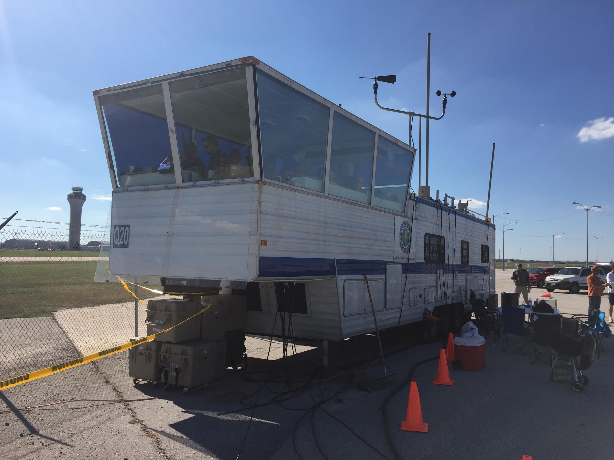
    A temporary, emergency tower vehicle was brought in by the FAA (it’s essentially an RV with communications and a giant window) by the end of the weekend.  All arrivals and departures were restricted to 17L and 35R.

    Due to the radar outage, I heard there was as much as a 4 hour delay even for planes coming into Austin Bergstrom from Dallas, and that was in VMC conditions on Sunday and Monday.  Tuesday and Wednesday brought IMC conditions which only enhanced the delays.

    The latest news is that Austin Approach will be opening back up, but in a satellite base in San Antonio.  The Austin controllers will be using the SAT radar room and will be receiving their radar picture via satellite.  The approach frequencies should be up and running today or tomorrow.  The Austin Bergstrom tower is up and running and most of the ILS approaches are operational at this point.

    In the meantime, expect delays going in and out of Austin.  If you don’t have to get to AUS, EDC, or GTU, you’re better off delaying a day or two until Austin Approach is back up and running.

Leave a Reply

Your email address will not be published. Required fields are marked *