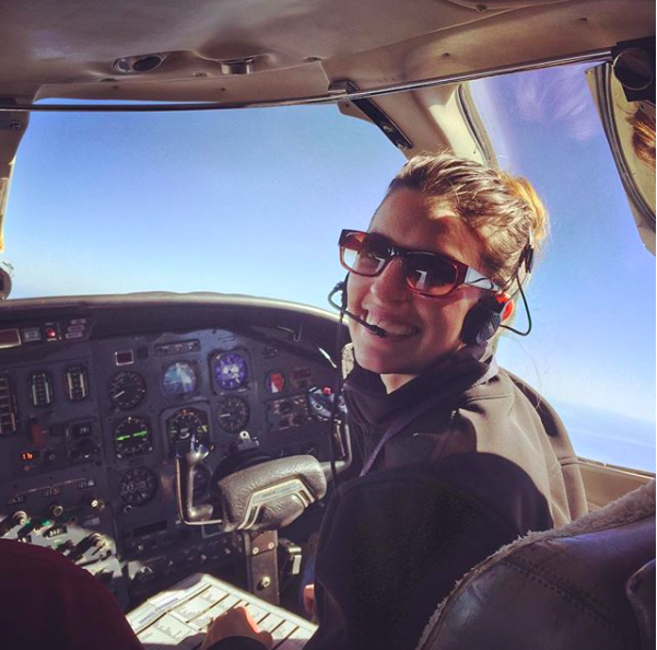
Texas Top Aviation has added a new member to our instructing team. Stephanie Mertz was hired in March 2019 and will be specializing in G1000 & Instrument instruction.
Stephanie graduated from LeTourneau University in Longview, Texas with a degree in Aeronautical Science, earning her commercial single and multi ratings while there. She began her aviation career in Ontario, California flying a Pilatus PC-12 for charter and medical trips. While operating the PC-12, she gained valuable experience flying all over the US and Mexico.
In 2013, Stephanie moved back to East Texas with her husband where she worked as a contract pilot flying a variety of Citations as well as a Falcon 10. A few years later, she became involved in her local Ninety-Nines chapter and joined their mentorship program.
After earning her CFI, CFII, and MEI, Stephanie returned to her alma mater to pass on her flying passions to college students through flight instructing. After a year of teaching at LeTourneau, she and her husband, with their first baby in tow, moved to the Austin area. Now she is instructing with Texas Top Aviation while acting as a mentor for other women working on achieving their flying dreams.
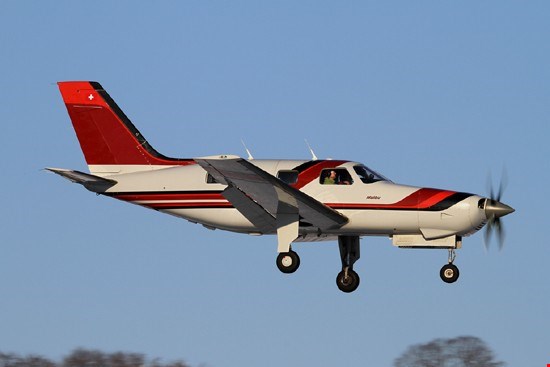
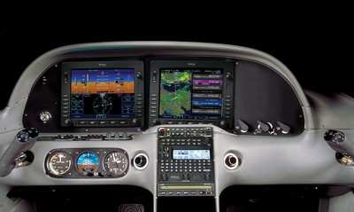
A lot of my customers ask me which airplane that I train in is my favorite. The Cirrus and the Columbia both are very good airplanes, but if I had my pick, I’d go with a Piper PA46, specifically an ’86-’88 Malibu.
I love the Piper PA46. 6 seat, cabin class, pressurization, air conditioning, great ramp appeal, 17 GPH (in the Continental TSIO 520 or 550; Piper changed to the Lycoming TIO 540 in ’89, which you run rich of peak and burn 22 GPH, decreasing a little bit of the awesomeness). What more can you ask for? The interior is roomy, there is plenty of baggage space in the nose and in the rear of the cabin. They are downright fabulous airplanes. Plus, you can get into a nice one that has had some panel upgrades and a mid time engine for around $300,000. That’s not bad.
Cessna tried to make a pressurized single with the P210, but it just doesn’t match up with the Piper PA46. The Piper has more room, more baggage space, a higher max differential pressure and service ceiling, and better air conditioning to boot!
Don’t know much about the Piper PA46? It’s been called several things. Originally, it was the Malibu, with a Continental engine. Now the TSIO 520 was not one of Continental’s better motors. However, most of the original Malibus have been upgraded to the much better TSIO 550C engine, which is a great product. Cruise around at almost 200 knots at FL200 and burn only 17 GPH. It’s beautiful.
Piper changed to the Lycoming engine in 1989 and changed the name to the Malibu Mirage, later shortened to just Mirage.
Then, in 2016, Piper upgraded a lot of the avionics, cleaned up the panel, and dubbed it the M350.
Piper made the ill fated decision in the mid 2000s to quit making the Saratoga and instead make an unpressurized version of the PA46 called the Matrix. It didn’t last long, only about 10 years or so, and hasn’t been very popular (see: don’t buy one). Piper took the best part about the PA46, the pressurization, and took it away, leaving an airplane that you still have to wear oxygen in to get the advertised high speeds in the upper teens and flight levels. Who wants to be cruising around in a cabin class airplane with oxygen on? Piper needs to bring the Saratoga back to give folks a low level, high performance option.
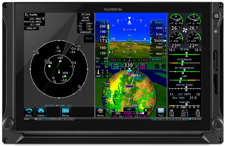
What would be my dream Piper PA46? As stated above, an ’86-’88 model Malibu (Piper started off with hydraulic flaps in the ’84-’85 models and it wasn’t a very good system. They changed to electric flaps in ’86) with a Continental TSIO 550C upgrade. The Garmin autopilot isn’t out yet, so I’d go with the STEC 3100 Autopilot w/ a Yaw Damper (the airplane originally came with a King KFC 150, which is a really good autopilot, but most of them are getting old and are getting difficult to fix. King’s replacement KFC 325 is still slogging through certification. Garmin’s GFC 600 would be ideal, but that isn’t expected to be certified for the PA46 fleet till late this year). A single Garmin 10.6″ G500 TXi with EIS tied to a Garmin GTN 750 GPS with a Garmin GTR 225 Nav/Comm as the number 2 radio.
Then I just put gas in it and go. That would be my kind of airplane.
For years, there has been clamoring for airplanes to get rid of lead in piston engine Avgas. In the early 2000s, Thielert created a Jet A burning piston engine for Diamond Aircraft that gained some traction, but Thielert had internal issues and ended up declaring bankruptcy. Several other Jet A piston engines have come down the line since then to some success (Diamond is currently using 2 Austro manufactured Jet A piston engines on it’s DA62 and a Continental manufactured Jet piston on the new DA50).
The problem with a Jet A burning piston engine, though, is that those engines would be very expensive to put on existing airplanes, not to mention the cost of the STC alone.
Insert GAMI (General Aviation Modifications, Inc.), the famed Ada, Oklahoma company that championed turbo normalization, balanced injectors, and lean of peak operations. For those that have been to GAMI’s engine class, you know that these guys are at the very top of their game in engine knowledge.
In 2010, GAMI started the process of creating an Unleaded form of Avgas, terming it G100UL (the irony of traditional Avgas, 100LL, is the LL starts for low lead, but the lead levels in 100LL are actually quite high. UL stands for UnLeaded). Just before Osh Kosh in 2021, GAMI revealed that it’s work has come to fruition, gaining an STC for G100UL for Lycoming powered Cessna 172s.
The amazing thing about GAMI’s product is that it is able to mix with 100LL and not cause any issues. This means fuel trucks, fuel lines, fuel pumps, and aircraft fuel tanks don’t have to have any modifications to them to use G100UL. Plus, pilots will see longer engine life using G100UL because of the simple elimination of the lead. In tests, combustion chambers in cylinders burned cleaner, so theoretically, cylinders and engines will last a lot longer.
According to the company, GAMI has a few more tests to run and, assuming those go well, G100UL will be available for a whole lot more airplanes. An STC will still be required for the use of G100UL in a specific airplane, but the hope is, eventually, 100LL will be completely replaced by G100UL. The only downside is that G100UL is expected to cost about $1/gallon more than 100LL.
GAMI has partnered with Avfuel, so expect to see 100UL showing up at all Avfuel FBOs in the next year or two.
To read more, check out the press release on AOPA’s website.
11 years ago, in April of 2009, the Avidyne Corporation unveiled the much bally-hooed Release 9, or R9 as it is commonly known, as a hardware replacement for the Avidyne EX5000 Entegra system in Cirrus Aircraft. The Entegra system was way outdated by that point. Even though Avidyne was the first company to put together a glass PFD in a single engine piston airplane, the company had quickly fallen behind Garmin in keeping up with the ever changing technology landscape.
Rewind to 2008. Cirrus had been going strong with the Avidyne Entegra since the SR20 and SR22 went to full glass in 2003 (a PFD and an MFD; prior to that, Cirrus aircraft only had an MFD with steam gauges and a Sandel Electronic HSI). Cessna, on the other hand, vaulted past the Avidyne Entegra and went straight to the Garmin G1000 in it’s aircraft, starting in 2004 with the 182 G1000 and 2005 with the 172 G1000. Beechcraft and Columbia went to the G1000 (Columbia started with the Avidyne as well) in 2005.
Garmin’s technology in 2007 was so much better than Avidyne’s technology that Cirrus decided to switch. I’m sure there were many promises made by Avidyne to Cirrus about what Avidyne was working on (the R9), but the G1000 was out there, available, and being used in a lot of different airplanes with very good results.
So, in 2008, Cirrus made the switch from the Avidyne Entegra to the Garmin G1000, dubbing it the Cirrus Perspective by Garmin avionics package. Avidyne finally got the R9 to market in 2009, but by that time, Piper was the only airplane manufacturer left putting factory Avidyne panels in their airplanes, and they switched to G1000 later that year.
The R9 is a fabulous product. It’s fully integrated, has great graphics, has fully redundant displays, a QWERTY keypad (which, by the way, Garmin didn’t do for another 8 years), and a lot of other neat features. There’s a bit of a learning curve, but it’s a really good product for what it is.
Avidyne, though, was late to the game with their technology. By the time it debuted in 2009, all the GA aircraft manufacturers had long since switched to the Garmin G1000 and weren’t looking back. That left Avidyne with the retrofit market for the many different Avidyne Entegra Cirrus aircraft out there. The only problem was, the retrofit was $80,000 ($95,000 if you wanted to throw in the DFC 100 Autopilot, which is a must have) and not many owners were up for paying that much money, then or now.
To sum up our brief history lesson, Avidyne knew the Entegra needed to go, but couldn’t get the R9 out quickly enough to convince anyone to stick with Avidyne products. The retrofit market didn’t amount to many sales, so Avidyne doesn’t even make the R9 anymore.
As a side note, I really, really like the Avidyne R9 and am sad that it didn’t make it into more airplanes.
So, when the Avidyne Entegra starts to have issues, what’s an owner to do? Keep reading!
There is Hope
There are thousands of Cirrus aircraft out there flying with the Avidyne Entegra instrumentation, which is basically 20 year old technology (I’ve had a computer engineer tell me the programming in an Entegra is Windows 98 tech). These things are going to start having problems at some point (many already have), but what solution do owners have that is cost effective and get’s them new technology?
Remember that little company named Garmin? Well, they have come through again. Announced this summer, the Garmin G500 TXi is now certified as a replacement in the Cirrus Avidyne Entegra equipped aircraft. This means pulling out both the PFD and MFD and replacing them with the G500 TXi on both sides. Engine data is also displayed on the G500TXi MFD, including the percent power and TIT indications, if equipped.
Cirrus SR22 Equipped with Dual G500 TXi Screens and Dual Garmin GTN 650Xi GPS Units
The cost for the panel? Two 10.6″ G500 TXi’s run about $16,000 apiece for the units, not including labor. $32,000 for a brand new panel isn’t terrible. Plus, the G500 TXi’s work with the DFC90 autopilot if the Cirrus is already equipped with it. If not, the Garmin GFC 500 autopilot is now approved for the Cirrus at a relatively low price of $7,000, including the servos.
Still have the original Garmin 430s in your Cirrus? Upgraded to the Avidyne IFD 540/440 stack? Put in dual GTN 650Xi’s? Put in a GTN 750Xi? All are compatible with the G500 TXi panel.
Want to upgrade everything? It does get kind of pricey at that point, but for just equipment, the cost for a complete panel conversion is somewhere in the area of $65,000 plus labor, still below what the R9 cost, but not cheap either. That would include 2 G500 TXi’s, 2 GTN 650Xi’s, a GFC 500 Autopilot, and all the engine monitoring equipment that the G500 TXi would need.
Cirrus SR22 Equipped with Dual G500 TXi Screens, a GTN 750Xi, and a GTN 650Xi
Thankfully, some new technology has finally come to the Generation 1-3 Cirrus. Oh, and by the way, your steam gauge Cirrus is fully upgradable as well.
Takeoff briefings are one of those things that most pilots are taught when they first learn how to fly, but once they get into flying themselves around, quickly fall by the wayside. There is a reason student pilots are instructed to perform a takeoff briefing before departure. It gets them thinking about what the plan is after they get off the ground and what to do if something goes wrong.
Takeoff briefings are a good habit to get into. Airline crews do a takeoff briefing before every departure, even though they have performed a takeoff in that particular airplane thousands of times. It enhances safety and provides repetition, keeping that knowledge at the forefront of the crew’s minds.
In general aviation, a takeoff briefing should cover what the takeoff procedure is, what the abort plan is, and what the plan after takeoff is.
Takeoff Procedure
Most pilots fly the same airplane all the time, so the familiarity with what goes into a takeoff is there. But, habits should be formed to brief the takeoff procedure as part of the takeoff briefing. It doesn’t need to be extensive, just covering the basics of how the airplane is getting off the ground. Something like this:
Throttle setting (if turbo charged, will full throttle cause an overboost?)
Rotate speed
Expected takeoff roll
That’s it. Nothing fancy for the takeoff procedure.
Abort Plan
What is the plan if something goes wrong? It doesn’t have to be an engine failure, maybe the engine coughs when full power is added or maybe the engine doesn’t produce peak RPM. Maybe the takeoff roll is longer than anticipated and something doesn’t seem right. Maybe on climb out a door pops open. Maybe the engine fails at 1,000 feet. It’s good to keep the plan in the foreground for what to do if an abnormal or emergency situation takes place.
Brief the aborted takeoff procedure
Pick an abort point on the runway based on the expected ground roll
What is the procedure if the airplane isn’t off the ground by then?
What is the procedure if the engine quits on the runway?
Brief the engine failure procedure at low altitude
If the engine fails over the runway, will you try to land on the runway?
What altitude would you elect to turn back as opposed to landing straight ahead?
If the plane is too low to turn back, would you land straight ahead or aim left or right?
What airspeed will you aim to hold if the engine fails?
In a Cirrus, what is your minimum parachute deployment altitude?
After Takeoff Plan
After the airplane is off the ground, what’s the plan then? Are you staying in the pattern or departing the area? Do you need to adjust your power at a certain altitude? What altitude are you climbing to? What heading are you going to fly? Is your flight plan in your GPS? This is an excellent time to set up altitude and heading bugs if your airplane is so equipped.
Get in the habit of doing a takeoff briefing before you call the tower or announce your departure. It get’s your mind focused on the task at hand and then what is going to be happening next.
Flying a missed approach can be stressful enough. When you haven’t done one in a while and your GPS isn’t showing you how to get to the missed approach point and you can’t remember which button to press, that adds a lot more stress. Recipe for disaster? Quite possibly!
No need to fear, we are here to help. The procedure for getting a Garmin 530 or 430 to give you missed approach guidance is actually simple and straightforward, if you know what to do!
Note:Because of the variety of different autopilot configurations in different airplanes, this article will focus solely on the GPS.
What the GPS is Thinking
The way Garmin designed the Garmin 530 and Garmin 430 is to be as helpful to pilots as possible. Their thinking was, 95% of the time, a pilot will make a landing on an instrument approach. This is pretty accurate as most of the time, this is what happens. Most general aviation pilots don’t fly approaches to minimums all that often, thus negating the need for a missed approach.
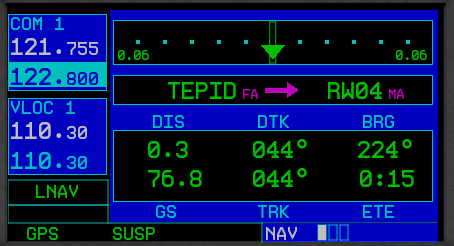
Garmin designed their software with this in mind. When an airplane crosses the missed approach point, the GPS will go into what’s called suspend mode (a SUSP annunciation appears above the OBS key). It will keep the missed approach point as the active waypoint because it assumes the pilot is going to land.
This can be confusing to pilots. This is what happens when software engineers and pilots come together. Engineers often believe they are smarter than pilots! (See the Airbus fly by wire roll out)
The Procedure
In the case of a missed approach, the button pushing on the GPS is actually relatively simple. There is no SUSP key to take the GPS out of SUSP mode (thanks Garmin!). Instead, you press the OBS key. This will take the GPS out of SUSP mode, making the first waypoint on the missed approach procedure the active waypoint. Your GPS will now give you guidance on the missed approach procedure.
If you are going missed off an ILS, LOC, or VOR approach, then there is one more key you’ll have to press. Your CDI needle (whether it is digital or analog, an HSI or just a CDI gauge) will be reading off the NAV radio and your CDI indication on the GPS will be VLOC. After you press the OBS key, press the CDI key on the GPS so you will start getting course guidance from the GPS again.
That’s it. Button pressing on the different autopilots will vary, but if you are familiar with yours, you’ll be able to tell it to follow the GPS and climb to the proper altitude.
This is Part 2 of the Proper Cross Country Flight Checklist article. To read Part 1, click here.
Airplane Covers
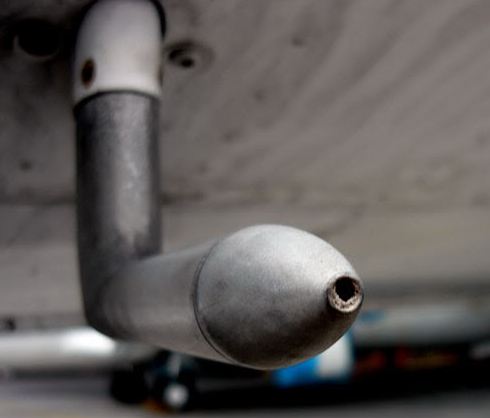
If you’re going to be leaving your airplane outside at your destination, make sure you have proper covers and plugs to protect it while you are gone. A friend of mine forgot to put his pitot cover on his airplane while it was parked outside and had his departure delayed because of a mud dauber which had moved in while the airplane sat on the ramp.
An example of a pitot tube blockage taken from www.student-pilots.com
Tie-Down Ropes
Depending on your destination airport/FBO, there may or may not be tie down ropes available on the ramp. It isn’t uncommon for there to be tie down loops, but no ropes. I generally try to carry a set of ropes in the airplane and even my own set of chocks. If you are going to a fly-in or landing at a private strip, steaks with tie down ropes can be very useful as well. Don’t forget to take your ropes and chocks with you when you leave, though. Ropes and chocks which are left unattended can cause problems for airport machinery (plows) and other airplanes.
Paper and a Pen
Back to basics! Don’t forget to bring a pen/ pencil and something to write on to keep track of clearances and frequencies.
EAPIS/ Boarder Crossing Procedures
If you are planning to fly across the U.S. Border, you will need to have filed the proper paperwork and make sure to bring along your passport/greencard. If you want to fly into Canada everyone on board the airplane is required to have a passport.
Basic Tools
You never know when you may need a screwdriver or some pliers. Having a small toolbox which you can throw in the airplane could be a life saver.
GPS
If you have a GPS, make sure that your data base is up to date.
Camera
Pretty self explanatory…but, don’t forget the camera charger!
Currency
Look through your pilot logbook and the airplane logbook and make sure that everything is up to date. If you need to get an IPC or a BFR done before you leave, give yourself some buffer time in case you have to reschedule.
Other Considerations
Sometimes it makes sense to go to a larger airport despite having to pay additional fees and higher gas prices. Often, if I am traveling at night or after regular business hours, it is worth the extra expense to know that there will be assistance available should I need it. It also isn’t always necessary to get a hotel…there are airports such as Noble County, Ohio (I10) that have beautiful campsites available on the airport. If you like camping, it can be a fun alternative to shelling out the cash for a hotel and rental car.
Camping out next to the airplane can be a fun way to spend the night.
Finally, I like to take the airplane out for a short flight and make sure that everything is working properly before I bring the family and get everything loaded up. (Plus, it’s a perfect excuse to go for a little joyride.) I’d much rather find out that the battery is dead or the plugs are fouled when I have time to fix the issues. If possible, do your test flight on a day when your maintenance shop is open so you can get any problems addressed immediately. If you haven’t done much cross country flying or if you are a little rusty, ask a flight instructor or another pilot to look over your planning. There is also nothing wrong with having an instructor or experienced friend come along on the first few trips until you become more comfortable doing it on your own.
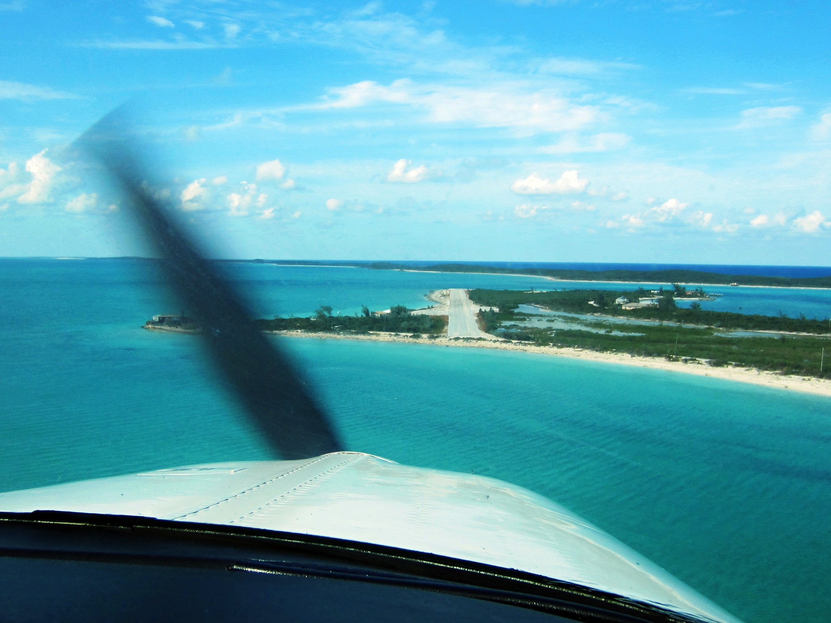
An approach into Farmer’s Cay in the Bahamas.
In my opinion, cross country flying is one of the most rewarding things a pilot can do with their certificate. The view available from the window of a general aviation airplane is so different than the one you get out the window of a car or a commercial airliner. If you’re willing to invest the time and money, you’ll get a lot more out of your trip than a few hours in your logbook. So, what are you waiting for….haven’t you always wanted to go to Oshkosh?
Andrew Robinson is a 135 Charter Pilot and flight instructor who lives with his wife and 2 daughters in Pennsylvania. He flies Pilatus PC-12s and instructs in Beechcraft Bonanzas.