Thank you to everyone who made the 2022 Texas Top Aviation Fly In at the Hilton Santa Fe Buffalo Thunder Resort a success!
We had 22 attendees and 12 airplanes make it out to beautiful Santa Fe, New Mexico for the week.
After 2 days of very competitive golf, Chris Travland was our 2022 Texas Top Aviation Fly In Golf Tournament Champion.
While you are out in Santa Fe on your next trip, go check out the Rancho de Chimaya restaurant. It was excellent and a true New Mexican experience.
Mark your calendars for the 2023 Texas Top Aviation Dallas Fly In at the Westin Stonebriar Resort in Frisco, TX. McKinney National Airport (KTKI) will be our host airport. The event will be April 12th-April 14th, 2023. Hope to see you all there!
Earlier this month, Cirrus announced the new Cirrus G6 SR20 and SR22. To the naked eye, they look like incredible airplanes. There is new lighting and the updated Cirrus Perspective+ avionics in both models, plus the SR20 is now a Lycoming powered airplane.
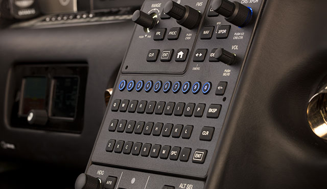
The Perspective+ in the Cirrus G6 is based on Garmin’s G1000 NXi platform. The keypad is updated to a QWERTY keypad, allowing for quicker inputting of data since our fingers are already used to the setup. A home button was added to the center stack to get back to the map page without having to hold down the CLR key. The bug knobs were moved down to the autopilot, while the display of the GFC 700 was altered slightly to match the Vision Jet setup.
The Perspective+ also boasts a 10-fold increase in processor speed, allowing the system to move quicker than the standard Perspective. The ability to wirelessly update databases has also been included.
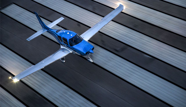
The exterior of the Cirrus G6 SR22 and SR20 models has changed as well. Cirrus has added the Spectra wing tip lighting system to the Cirrus G6. It incorporates an entire light panel that runs the length of the wing tip. The LED dual strobe setup helps with aircraft visibility and ramp appeal.
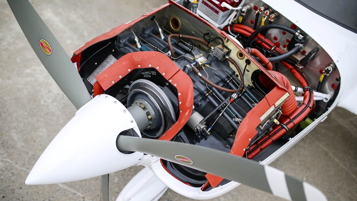
The SR20 engine has been changed to the Lycoming IO-390, 215 HP engine. The Continental IO-360-ES 6 cylinder engine comes out of the SR20 and the 4 cylinder Lycoming goes in. 2 less cylinders will help with useful load and the extra 15 HP will help with takeoff and climb performance.
The new Cirrus G6 is available for order and delivery immediately. To read all the details and specs on the Cirrus G6, you can check out Cirrus’ website.
Earlier this month, Cirrus announced the new Cirrus G6 SR20 and SR22. To the naked eye, they look like incredible airplanes. There is new lighting and the updated Cirrus Perspective+ avionics in both models, plus the SR20 is now a Lycoming powered airplane. The Perspective+ in the Cirrus G6 is based on Garmin’s G1000 NXi…
It’s that time of year again! Yes, it’s the New Year, but it’s also time to register for the 2024 Texas Top Aviation Fly In. The Aviator’s Academy’s sister company, Texas Top Aviation, is hosting it’s 4th annual fly in event on March 19th-22nd, 2024 at the Shangri-La Resort in Grand Lake, OK.
For those not familiar with the annual Texas Top Aviation Fly In, we’ve been hosting this event since 2019 and it is always well attended and fills up fast. Geared around aviation education, golf, community, and a whole lot of fun, the fly in is always very popular.
This year, we are adding a Par 3 Shootout for early arrivals on Tuesday, March 19th at the Shangri-La’s Battlefield Par 3 Course. The 4th Annual 2 Round Golf Tournament begins on the afternoon of Wednesday, March 20th and finishes up on the afternoon of Thursday, March 21st.
The biggest hit of the week is always the safety seminars on Thursday morning. This year, Texas Top Aviation has secured the talents of Paul New, expert Cirrus, Columbia, and Cessna mechanic, and owner of Tennessee Aircraft services. If you listen to Mike Busch’s podcast, Paul is a regular. Scott Williams, owner of The General Aviation Law Firm, will be presenting on LLC’s and Illegal Charters, while Hank Gibson, owner of Texas Top Aviation and The Aviator’s Academy, will present a study on several different accidents and what can be learned from other’s mistakes.
It’s guaranteed to be a fun week. The Grove Regional Airport in Grove, OK will be our host airport (KGMJ) this year. Sign up soon as space is limited. Registration is only open till February 23rd, 2024. For more information and to register, simply Click Here. We hope to see you there!
It’s that time of year again! Yes, it’s the New Year, but it’s also time to register for the 2024 Texas Top Aviation Fly In. The Aviator’s Academy’s sister company, Texas Top Aviation, is hosting it’s 4th annual fly in event on March 19th-22nd, 2024 at the Shangri-La Resort in Grand Lake, OK. For those…
You are hand-flying an in-the-weather descent, power back, heading for the FAF. You start a 30 degree banked turn at your lead point to cross the FAF, when your passenger behind you gasps. Looking over your shoulder, you see he has spilled his drink into his lap…too bad for him! However, when you turn your head back to your panel, your inner ear tumbles and you see 45 degrees of bank, 15 degrees nose low, airspeed increasing.
Congratulations! You have managed to get distracted and sucked into an unusual attitude recovery. By the book, you should roll wings level, pull to the horizon, and adjust power as necessary to keep the airspeed within limits. In this scenario, if you had not experienced vertigo, you might have been able to roll to less than 30 degrees of bank, recover your turn, pull the nose up to less than the original descent attitude, pulled a bit of power to slow back to your desired penetration speed and then resumed your desired ground track. However, this would only be appropriate if you had full situational awareness as to the deviations caused by the look over your shoulder, plus full confidence that the moderate corrective actions would put you back on your desired flight path.
As a military aviator, I learned unusual attitude recoveries based upon hard maneuvering at extreme pitch and bank angles. In the hard-maneuvering environment, an unusual attitude could be 90 degrees straight up, airspeed decreasing below 120 kts…or 80 degrees nose low, 135 degrees of bank, airspeed increasing through 500 kts… etc. In these cases, understanding angle of attack, or AOA, is critical to maintaining controlled flight and returning to a normal attitude.
In an extreme nose-high attitude, a military aviator is trained to roll the aircraft to 90 degrees of bank, ease off the back-stick pressure to reduce AOA, add power as required, and allow the nose to slice back towards level, rolling to wings level as the nose approaches the horizon. If nose low, the recovery procedure is to roll rapidly, within asymmetric g limits, until wings level, then to pull at optimum g loading to recover to level flight. For the nose-low recovery, power was normally reduced until airspeed could be assessed and brought under control. However, when doing the nose-low pullout at 7-9 gs, pulling the power for too long would leave you much to slow to resume combat.
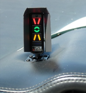
The AOA gauge on a fighter’s glare shield is a primary reference during hard maneuvering and for landing. The AOA for optimum maneuvering is 13 degrees, displayed as the green circle or “green donut” on the gauge. The red chevron on top represents a slow condition of 15 degrees or more and the yellow lower chevron represents 11 degrees or less.
For normal landing in the F-16C, the pilot slows to 220 kts and configures abeam the touchdown point while mentally computing the final approach airspeed of 136 kts plus 4 additional knots for each 1000 lbs of fuel. When rolling off the perch and flying the final turn, the pilot would usually only glance once at the airspeed once to ensure final turn airspeed of 180 kts while using the AOA sight gauge as the primary indicator of a best performance turn. As long as the AOA was green donut (13 degrees) or less, you would not stall. If on speed and 13 degrees wasn’t going to get you around the turn to line up with the runway, you knew you were going to overshoot. You never wanted to see the red chevron of 15 degrees or more as that meant you were too slow, pulling too hard, and in danger of building an un-recoverable sink rate!
Few GA aircraft are currently equipped with AOA indicators, though there are several after market devices available for retrofit. However, knowing the impact of AOA and how to manage it is vital to safe aviating, even without an AOA gauge. The bottom line is, as long as you don’t ask the wing to produce more angle of attack than it can handle, you won’t stall.
Practicing final turn stalls, to know what the wing feels like as you get too slow or pull too much on the controls, increasing AOA past the critical point, will keep you safe when you encounter that unexpected overshooting wind or you find yourself inadvertently on too tight of a downwind leg. Better to overshoot or take it around to try again, than to pull too hard and exceed critical AOA.
Mike Hostage is a retired USAF pilot with 37 years of experience, flying a wide variety of aircraft. An instructor pilot for more than half of his 4800 flight hours, Mike is currently qualified in a Cirrus SR-22T and regularly flies his two homebuilt sailplanes.
You are hand-flying an in-the-weather descent, power back, heading for the FAF. You start a 30 degree banked turn at your lead point to cross the FAF, when your passenger behind you gasps. Looking over your shoulder, you see he has spilled his drink into his lap…too bad for him! However, when you turn your…
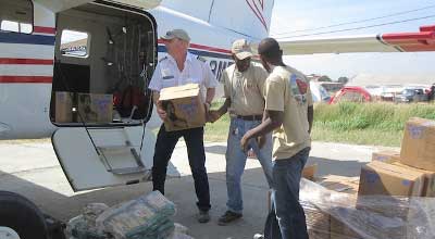
Hurricane Matthew rolled through the Caribbean last week and dumped vast amounts of rain across several of the island nations. Haiti was one of them. Haiti has been hard hit by disasters over the last 10 years. Hurricane Ike in 2008, he devastating earthquake in 2010, Tropical Storm Isaac in 2012 and now Hurricane Matthew.
MAF (Missionary Aviation Fellowship) has provided relief through all those disasters in Haiti. Their disaster response team is preparing to provide relief yet again to the island nation in the form of relief supplies and personnel as well as damage assessment flights.
MAF-US is based in Nampa, Idaho. The organization uses aviation and technology to gain access to isolated people groups in order to allow those people to experience the love of Jesus Christ. MAF-US serves in 6 countries around the world spread out amongst 15 bases. MAF International works in 33 countries around the world.
In addition, MAF works with multiple non-profits and human aid organizations to provide transportation to doctors and aid workers to those remote parts of the world where automobile transportation is impossible.
In Haiti, MAF has 3 airplanes based in the country that serve 13 remote airstrips. To read more about MAF, visit their website.
Hurricane Matthew rolled through the Caribbean last week and dumped vast amounts of rain across several of the island nations. Haiti was one of them. Haiti has been hard hit by disasters over the last 10 years. Hurricane Ike in 2008, he devastating earthquake in 2010, Tropical Storm Isaac in 2012 and now Hurricane Matthew….
Are you still trying to master the Garmin 430 in your airplane? Is it giving you fits because you keep twisting the big knob instead of the small knob? Would you like a step-by-step guide to each and every part of the Garmin 430?
Pilot proficiency website PilotWorkshops.com has published a very thorough, step-by-step manual on how to use the Garmin 430. Want to load a flight plan? There’s a section for that. Want to load an approach? There is a section for that as well.
The Pilot-friendly Garmin 430 manual is a great reference to have for Garmin pilots. Pilot Workshops offers a guide for the Garmin 430 and the Garmin 430W, depending on if you have WAAS or not.
The hard copy guides are $44.95, but you can also download the PDF version of each for $19.95.
To get more information on the guide or to order one, you can visit the Pilot Workshops website. (Have another Garmin or King GPS unit? Pilot Workshops has guides for a variety of different GPS units)
Are you still trying to master the Garmin 430 in your airplane? Is it giving you fits because you keep twisting the big knob instead of the small knob? Would you like a step-by-step guide to each and every part of the Garmin 430? Pilot proficiency website PilotWorkshops.com has published a very thorough, step-by-step manual on…
I am on a mission in flying for my head to be as comfortable as possible. I’m currently going through the process of experimenting with different ANR headsets to see which ones squeeze my head the least (which I’ll be writing a future article about). In the meantime, I decided to focus on sunglasses.
I wear glasses (can’t do contacts anymore since they irritate my eyes), so anytime I have a headset on, I have frames running underneath my ear cups. I had a pair of prescription sunglasses for years that were okay, but still caused soreness above my ears after more than 3 hours of flying. I routinely fly 4-5 hours a day in training folks, so I had to find a better solution.
I saw an ad in Flying Magazine one month for Flying Eyes sunglasses. It was a relatively new company with a cool concept. A pilot started the company with the goal to create as thin a pair of sunglasses frames as possible to increase the comfort and decrease the ANR loss when wearing sunglasses. What the company came up with is pretty cool.
The ultra-thin frames on the all the different Flying Eyes models are made out of Resilamide. The material is so strong that the frames can be bent back and forth while not breaking. The company even brags that the frames are virtually unbreakable. I had to try these out.
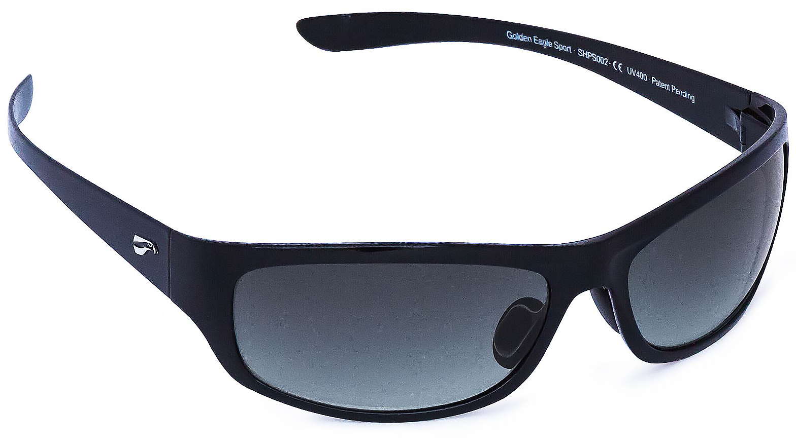
I ordered a pair of the Golden Eagle Sport sunglasses. The process of getting prescription lenses in them was no big deal and took about a week. The eyeglasses shop initially thought the shape of the lens could be an issue, but it proved no problem at all. The lens manufacturer even managed to chip the frames, but Flying Eyes sent a new set of frames for free, even though it was not at all their fault.
In about a month and a half of flying with them, they are very comfortable. Some squeeze on the side of my head after extended periods of wear underneath a headset, but I’m exploring headset options currently (see above). Much improved over my last set of sunglasses.
Flying Eyes offers several different frame models, some of which are prescription compatible and some which aren’t. The Golden Eagle Sport frames run about $180. Orders can be placed on the Flying Eyes website.
Ordering new sunglasses from Flying Eyes? Use this link to receive 10% off your order.
I am on a mission in flying for my head to be as comfortable as possible. I’m currently going through the process of experimenting with different ANR headsets to see which ones squeeze my head the least (which I’ll be writing a future article about). In the meantime, I decided to focus on sunglasses. I…