Hurricane Harvey

Texas Top Aviation wants to express our heartfelt concerns and prayers for those affected by Hurricane Harvey along the Texas Gulf Coast and in Houston.  We have several customers in Houston and hope and pray that they are all safe.

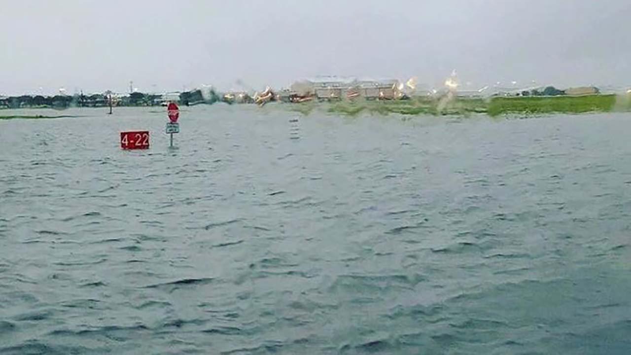
The Houston Hobby Airport after Hurricane Harvey’s Torrential downpour

If you would like to donate to the relief effort, there are several organizations that are accepting support.  A few are below.

Samaritan’s Purse

American Red Cross

Similar Posts

  • MMOPA Spring Safety Standdown

    MMOPA will be hosting it’s second Safety Standdown event at many locations across the country for Piper PA46 owners and pilots. The first iteration of MMOPA Safety Standdown in the fall of 2019 was a big hit. Each event was very well attended by MMOPA members.

    What is Safety Standdown you ask? Safety Standdown was put together as a mid-year training event as part of the MMOPA Master Aviator program. It’s goal is to allow PA46 owners and pilots to fly in to a location at a reasonable time (the event starts at 10am local time), received some good quality ground training over relevant safety topics by highly experienced PA46 instructors, have a free lunch, then depart mid-afternoon to arrive back home before dark.

    The event is free to all attendees. Lunch will be provided at each location. This event is not exclusive to MMOPA members, either. Any PA46 owner or pilot, or just anyone interested in the PA46 world, are invited to attend.

    Texas Top Aviation is hosting the South Central Region Spring Safety Standdown at the Henrickson Jet Center at the Austin Executive Airport (KEDC). Hank Gibson and Pedro Vargas-Lebron will be presenting on the following topics:

    • MMOPA Operational Practices review and importance of stabilized approaches
    • Crosswind Takeoffs and Landings
    • High Density Altitude Operations
    • A discussion of thunderstorms, resources in the cockpit for weather avoidance, and accidents that have occurred involving thunderstorms

    The MMOPA Spring Safety Standdown will take place on Saturday, April 18th, 2020. Registration is required for the event. The link for registration can be found here.

    Come on out for some high quality training and free BBQ with 50 of your closest PA46 buddies!

  • Jeppesen vs. Aeroservices Charts

    Many people ask, which set of charts is better? Should I use the FAA Aeroservices charts on Foreflight or pay extra for the Jeppesen charts? Since you have to pay for Jeppesen, they are probably better, right?

    I am not here to say which one is better as a chart preference is just that, a preference for one over the other or for certain features. After a while, muscle memory and routine take over and you probably wont even notice the difference.

    History

    In 1934, Elroy Jeppesen began making his own charts and sold them to other pilots. His little company grew into the giant Boeing chart company we know today. Jeppesen charts are used internationally and therefore include information that might otherwise seem common knowledge, like transition altitudes. The key is, you cannot get FAA Aeroservices charts for international destinations. Jeppesen is the only option for outside the US.

    National Aerospace Charting Office (NACO), or the new(er) name “Aeroservices” or FAA chart, whatever you decide to call them, are United States government issued charts. In addition to civilian use, Aeroservices charts are used by the military so there will be some terminology that does not apply to civilians. The best part about FAA Aeroservices charts are… they’re free!

    If you are in the middle of a transition or trying to decide which charts to use, you have come to the right place. Here are a few key differences.

    Obstacle Departure Procedure Chart
    KAXX (Angel Fire, New Mexico) ODP

    1. Frequencies: FAA Chart provides the AWOS so you have all departure frequencies in once place.
    2. Airport: Jeppesen highlight the airport, which is a nice feature so you can easily see the flow from the airport.
    3. Notes and Remarks: Jeppesen bolds the speed restriction all over the chart so you won’t miss it. All other requirements are in the top right corner. Note the transition altitude 18,000′. Since Jeppesen is used internationally, it is published on the chart since other countries have different transition altitudes. It takes up a chunk of chart real estate, but it’s clear, easy to read, and always in the same place. The FAA charts post all the requirements and restrictions as notes off to the side. Since it’s in the same space as the chart graphic, it’s easy for the eyes to catch while studying the plate.
    4. Take off Minimums: NOT APPLICABLE for PART 91 – however, it’s wise for all pilots to look and abide by them. Jeppesen displays the standard take off minimums table, as well as the rate of climb table, which is nice to have all in one place. The FAA chart gives the non standard information but you need to know/look up the rest in the Digital Terminal Procedures Supplemental document. (Hint: It’s in the Documents section of Foreflight)
    5. Take Off Obstacles: About the same on both charts
    6. Route Description: Similar on both charts, but larger font and clearer description on the FAA chart. When there are different routes from different runways, the FAA chart layout is really helpful.
    7. Graphic Layout: Jeppesen and FAA use the same graphics for all their different charts and plates which makes it easy to read once you are familiar with the respective charts. FAA charts are easy to read and distractions are kept to a minimum. Jeppesen charts make things bold and enlarge pertinent information so you won’t miss it.
    8. Airport altitude: This is only on the Jeppesen chart (the FAA chart doesn’t include it), but it is very helpful for situational awareness. As you brief the arrival altitudes, I think it’s important to have an idea what AGL you are at.

    Approach Charts

    One thing pilots love about Jeppesen approach charts is the clear set up for an approach brief. The top section is created as a “briefing strip” starting with the frequencies, then navigation frequencies, minimums, airport elevation and the missed approach. It’s very natural and user friendly.

    FAA charts have a slightly bigger picture of the approach planview, but the profile view and minimums section can get a bit cluttered. It can feel a little discontinuous when briefing the approach to bounce all over the page. However, some pilots really like the small airport diagram in the corner, which I find really helpful for situational awareness (particularly for students learning circle approaches). Non- standard alternate and takeoff minimums are also clearly noted, but unfortunately we must hunt elsewhere to find them. The Jeppesen alternate minimums and takeoff minimums will both be on the airport diagram

    1. Frequencies: Getting weather and tuning radios is easy on the Jeppesen charts – just follow the briefing strip. The frequency section on the FAA charts is still easy to read, but closer to the center of the page. It’s split up from the nav frequencies and other important briefing information.
      a. FAA charts are created by the government and have military specific information, which are the odd looking frequencies and channels on the chart.
    2. Approach Navigation: On a Jeppesen chart, you will continue to the next line to verify your frequency, course and set minimums (assuming you are straight in on the ILS). On the FAA chart, you will then have to skip to the top of the chart to get the frequency and course, and then scan to the bottom of the page to input your minimums. However, since you could be flying a localizer approach or a circle to land, it’s a good reminder that not everyone using this approach chart will be using the same Decision Altitude (DA). The FAA chart also includes runway distance information so pilots can make determinations of approach speeds and stopping distance if the runway is wet or icy.
    3. Missed Approach – Textual
    4. Approach Lighting
    5. Missed Approach- Graphical: The missed approach information is the same on both charts. The lighting information is key for determining a missed approach and is next to the missed approach text on the FAA chart. It’s found next to the missed approach graphic on the Jeppesen chart. Personally, I find it easier to find and read the lighting information on the Jeppesen chart. Remember, on both charts, the placement of the PAPI on the chart indicates the physical location of the lights (left or right of the runway).
    6. Notes: Both charts have a notes box, but they use them a little differently. Once again, remember that Jeppesen charts are used internationally and include the transition altitudes and altimeter setting info. On both charts, the notes section will be where other critical information will be shared which isn’t really applicable for this airport. On the FAA chart, the tower frequency is starred to note that there are operating hours (you’ll have to check the chart supplement AF/D to find out what those hours are). There is also an L next to the frequency to indicate it is the pilot controlled lighting frequency. You will also find the note about the VGSI and the Approach Glide path next to the profile view on the FAA chart, whereas the Jeppesen chart has that note in the notes section at the top. The FAA chart also has the T and an A in black triangles to note that this airport has non- standard alternate and take off minimums. Again, those are found in separate documents when using FAA charts and on the Airport Diagram when using Jeppesen charts.
    7. Minimum Sector Altitude: Similar on both charts, but in different locations (reminder: ATC vector altitudes may be lower. It is the pilot’s responsibility for safety of flight to maintain safe obstacle clearance, so if you are ever concerned about going below the MSA – just ask ATC).
    8. Planview: Other then differences in size, visuals, and text, the information displayed on both is very similar.
    9. Profile View: Again, the displays look different and pilots will have their preference, but the information is the same.
    10. Minimums: Jeppesen charts not only note the category for each approach with its designated letter, but also displays it in knots. It is recommended that if you increase your approach speed (based on flaps or gusty winds or perhaps a faster speed for a circle to land approach) that you should use the higher category minimums. The reference guide makes that easy to look up. The other benefit of the Jeppesen charts is right the table that contains the time from the final approach fix to the missed approach point for a localizer approach, it also shows the rate of descent with the associated ground speed to maintain a 3 degree glideslope. Now there is no excuse not to set pitch and power! The minimums posted in parenthesis are for the military, but RVR in statute miles is also included.
    11. Airport diagram: Only on the FAA charts, this particular feature is particularly useful for situational awareness. The arrow pointing to the runway shows the direction the approach is arriving from so planning a circle to land is a cinch. There is also a lot of other information that can be gathered from the airport diagram for quick reference or to help a disoriented pilot: lighting, displaced thresholds, closed taxiways, and runway placement and lengths. This is easily one of the best perks of an FAA chart.

    Arrival/ Departure Charts: Sewzy 5 Arrival KAUS

    The Jeppesen lay out is very attractive and draws the pilots eye in a clear way to all the important information. The colors pop out, so the required altitudes and speeds are easy to read and remember. The chart, which is the proper scale, shows MORAs , easy to find airports (and runway layouts) and is over all easy to follow. However, the texts, while very clearly laid out, are small and difficult to read and pushed to the very edges of the chart. FAA charts are simple and fairly easy to read, but the airports are not as obvious and the flow to the airport requires a good look. The table on the Jeppesen chart is a really nice format, but the text and Notes for arrivals on the FAA chart are easy to find and much easier to read quickly.

    1. Frequency: FAA charts include the approach frequency on the arrival, which is helpful for having radios tuned. During a busy time when the controller changes your frequency, all you have to do is verify the frequency you already set, rather then totally stop what you’re doing to switch it. The Jeppesen charts add the airport elevation next to the ATIS, which really aids situational awareness.
    2. Notes: Jeppesen notes are clearly numbered and tucked away nicely in a box, but the FAA chart notes pop out in the middle of the page and are easy to skim for pertinent information.
    3. Planview: I think Jeppesen is the clear winner here- it is so easy to read, it only takes one glance to know where the primary airport is and how the arrival flows. The chart being at the proper scale offers the pilot important geographical information and over all is a clean look. Notice the small series of arrows after SMRFF on the the Jeppesen chart; those indicate the pilot should expect radar vectors. The FAA charts include those instructions in the text, but I find the visual reference on the chart helpful. The FAA charts are equally clean, with altitude and speed restrictions easy to read even if they don’t jump out. When there are multiple airports that the arrival serves, the airports are clearly marked, though, I think it would be nice to have a little more information surrounding the primary airport for better situational awareness.
    4. MSA: only on the Jeppesen chart
    5. Primary airport: The runway alignment and grey highlight on the Jeppesen chart stands out very clearly, while the FAA airports are a little more obscure.
    6. Arrival route description: The table on the Jeppesen chart is easy to follow but the text is very small and pushed to the bottom. The route description is much easier to find and read on the FAA chart.

    Airport Diagram

    The Jeppesen Airport Diagram page has it all: frequencies, airport diagram, runway info, take-off minimums, departure procedures and alternate minimums. It’s a one-stop shop. It makes preflight planning easy when its all at your fingertips.

    The FAA charts usually require a little more searching for different pieces of airport information. The Airport Diagram itself is just the airport layout. Above, you will see a simple FAA Airport diagram. It’s clean and simple, perfect for a knee board print out.

    In the flight planning process, as you look at what approaches you will be using for the airport, you might see an A or T inside a triangle. Those indicate that you will need to look in the Alternate Minimum or Take off minimum documents for more information. The Takeoff Minimums document (see below) is also where you will find any obstacle departure procedures for that airport. Apps like Foreflight help you out by posting the take off minimums under the departure tab. Even though it’s a little more difficult to read, I didn’t crop out the airport information so you can see what it looks like in context.

    FAA Alternate Minimums on the Left and Takeoff Minimums and Obstacle Departure Procedures on the Right
  • The Importance of Density Altitude

    Density Altitude:  Pressure Altitude corrected for non-standard temperature.

    That’s the book definition of density altitude.  The problem is, that definition leaves a lot of general aviation pilots scratching their heads.  What really is density altitude?

    All airplane engines rely on air and fuel mixing together, then that mixture is ignited to create combustion. Normally aspirated piston engine airplanes get their best performance at sea level, where the air is nice and thick, allowing plenty of air molecules to get sucked in the engine intake.  As a normally-aspirated airplane climbs, the ambient air pressure drops with an increase in altitude (the air gets thinner, less dense), thereby reducing airplane takeoff, climb, and landing performance.  There just isn’t as much air at higher altitudes, to put it simply.

    Turbo charged piston engines assist with this air density problem.  A turbo charger boosts the air coming into the engine and fools the engine into thinking it is at sea level pressure all the time.  The higher the altitude, the faster the turbo charger spins, spinning the compressor faster, which compresses more air to continue to give the engine sea level pressure air.  This gets faster cruise speeds the higher you go.

    Both normally aspirated & turbo charged engines do experience longer takeoff rolls and reduced climb rates at higher airport elevations & higher altitudes.

    How does this all relate to density altitude?

    When the outside air temperature rises, the air becomes thinner, less dense.  This means that when an airport elevation is 1,000 feet, but the density altitude is reported as 3,000 feet, the airplane engine thinks it is at 3,000 feet.  It won’t accelerate as fast.  The airplane’s climb rate will also be reduced.  That means that the normal climb pitch attitude a pilot is used to seeing won’t be accurate at higher density altitudes. It will lead to slower indicated airspeeds, slow enough to potentially lead to a stall if a pilot isn’t paying attention.

    Where does this get dangerous?  High elevation airports.  Whenever the OAT creeps above 85 or 90 at an airport that is higher elevation (I would classify higher elevation as 2,500 feet or higher), the corresponding density altitude sky rockets.  If a pilot isn’t paying attention to airspeed or angle of attack (if the airplane is equipped with an AOA), a stall can come very quickly on climb out.

    What to take home from this?  Monitor your climb speed and angle of attack, especially right after takeoff, when you hear density altitude on the ATIS or AWOS.

  • Scud Running

    I was speaking with a pilot a few months back who was not instrument rated.  He was telling me of his flying experience while continually speaking fondly of scud running.  He told me several stories, most of the time with a smile on his face, about scud running to his destination while staying clear of clouds.  While he was talking, my mind was cycling through the numerous accident reports I’ve seen where a scud running VFR pilot has crashed into terrain or an obstacle.  Needless to say, scud running is not a very good idea.

    This pilot’s stories got me to thinking, how common is the practice of scud running amongst VFR only pilots?  As an instructor, I always teach my private students about personal minimums and making that no-go decision when clouds are below those personal minimums.  The act of scud running falls under several of those dangerous pilot mindsets, get-there-itis, invincibility, and macho-ism, to name a few.

    To bring everyone on the same page, let’s define scud running.  Wikipedia has a very good definition:

    Scud running is a practice in which pilots lower their altitude to avoid clouds or instrument meteorological conditions (IMC). The goal of scud running is to stay clear of weather to continue flying with visual, rather than instrument, references. This practice is widely accepted to be dangerous, and has led to death in many cases from pilots flying into radio towers and high tension wires; however, even instrument-rated pilots sometimes elect to take the risk to avoid icing or embedded thunderstorms in cloud, or in situations where the minimum instrument altitudes are too high for their aircraft.

    To put some numbers with that definition, a scud running VFR pilot would takeoff with a 1200-1500 foot ceiling and stay 700-1000 feet above the ground, right in the area where towers, hills, and rapidly rising terrain reside.

    Scud Running

    How do we change this mindset?  Well, if someone has been scud running for years without incident, the practice becomes normal, like the pilot I mentioned above.  The mindset of invincibility sets in and the practice continues.  This particular pilot can also lead other pilots to adopt the same practice, encouraging them that nothing will happen to them, since we all know that our pilot peers know better than our flight instructors (insert heavy sarcasm here).

    In order to change this mindset, instructors need to emphasize personal minimums from day one.  This includes ceilings, visibility, and winds.  For a seasoned pilot, a review of accident statistics might help the process.

    Scud running is not a safe practice.  If you’re a scud runner, you need to rethink your attitude.  Is getting there really worth it?

    Still not convinced?  Read this pilot’s experience from AOPA.

  • Avidyne Entegra Chart Updates

    Columbia 400 Avidyne Entegra

    There are a number of airplanes out there equipped with the Avidyne Entegra PFD and MFD system, most notably the Cirrus SR20 and SR22 models from the early 2000s and the Columbia 350 and 400 from the same era.  The Entegra is pretty simple and easy to learn, but doesn’t have the capability that it’s Garmin glass panel counterparts do (I have not, however, tried the R9, which could prove much more capable than it’s predecessor).  I have found that pilots master the Entegra a lot quicker because of the reduced functionality.

    One of the nice features of the Avidyne Entegra is the CMAX Chartview option.  With a yearly subscription, you can get all the Jeppesen approach plates and airport diagrams for the entire US on your MFD.  Just like your GPS, though, you have to update the charts monthly to keep them legal.  After a period of time when you don’t keep up with the updates (I believe it is 90 days), then the charts disappear.

    The update process is a little tricky if you don’t have someone to explain it to you.  Once you go through it a few times, you’ll have it down pat.  Here’s the process for the Avidyne Entegra Chart Updates.

    Jeppesen Subscription

    The first step in performing your Avidyne Entegra Chart Updates is to create an account with Jeppesen, who handles all the GPS NavData and MFD Chart updates for both Garmin and Avidyne.  If you already have a Jeppesen subscription, you can skip down to the next section.  To do that, simply go to jeppdirect.jeppesen.com, and then do the following:

    • Click on Avionics Data on the upper left hand side
    • Click “Purchase Avionics Subscription”
    • Then, click on “Create Account” in the new users section
    • Once you’ve created an account, login, then put in your aircraft information and select 1 update for the Avidyne Entegra EX500 EX 5000
    • Click Continue at the bottom and you can put in your payment information

    Software Needed

    There are two different programs depending on if you have a PC or a Mac.  If you have a PC, you need the Jeppesen Services Update Manager (JSUM).  If you have a Mac, you need the Jeppesen Distribution Manager (JDM).  Download whichever one you need, then login, and your updates will show up.

    Downloading the Avidyne Entegra Chart Updates

    First, we’ll go through the process of performing the Avidyne Entegra Chart Updates process for a Windows computer, using JSUM.    You’ll need two 2 GB USB drives formatted to FAT 16.  Here’s how to format to FAT 16.

    • Go to My Computer after inserting the USB drive
    • Right click on the drive
    • Click on Format, then select FAT and press OK

    Once the USB drive is formatted to FAT16, open up the JSUM program.  Login and your updates will be displayed on the screen

    • You’ll need to set the Avidyne CMAX Key Code
      • Right click the Avidyne Electronic Charts Service and click Set Avidyne Key
      • To get the key code, visit MyAvidyne.com and create an account using your JeppView subscription number and your serial number for your Avidyne MFD (found on the AUX page) and your PFD serial number (displayed on startup when the PFD is warming up)
      • Once you get the Key Code, copy and paste it in the window and click OK
    • Click on the service and click Start
    • The program should automatically detect the drive (if it doesn’t, click browse and select the drive)
    • Click Continue and the charts will start downloading and automatically programmed to the USB drive
    • If you are updating NavData on the MFD as well, follow the same steps as listed above in order to update the NavData

    Next, we’ll go through the Avidyne Entegra Chart Updates process on a Mac, using the JDM program.  You’ll need two 2 GB USB flash drives formatted to FAT 16 (the easiest way to format to FAT 16 is on a Windows computer, using the process above).

    • Open the JDM program and login
    • Insert the first USB drive
    • You’ll need to set your Avidyne CMAX Key Code
      • Click Service Details under the Electronic Charts Service
      • Click Set Avidyne CMAX Key Code
      • Program automatically detects the USB drive
    • Click and drag the Electronic Charts service over to the USB and release
    • The service is downloaded and copied to the USB drive automatically
    • Eject the USB drive
    • Insert the second USB drive (or plug the USB drive in to your MFD, do the update, then reformat the drive) and follow the same steps for the NavData

    Updated the MFD with the Avidyne Entegra Chart Updates

    Avidyne Cirrus

    Once everything is programmed the your USB drives, the rest of the process is simple.  Just go out to your airplane, plug in the first USB drive with the Electronic Charts on it, turn your battery on and the avionics master, and the system will upload the information automatically.  Once it’s finished, turn everything off, pull the USB drive out, then insert the second USB drive and do the same thing.

    Now, you’re all updated!

    If you’d like to see a video on the process, Jeppesen has some very good videos on the updating procedure.  The links are below.  If you have questions, please contact Texas Top Aviation and an expert will help you through the process.

    JSUM USB Programming Procedure

    JDM USB Programming Procedure

    Avidyne Entegra Chart Updates Upload

  • GAMI Gains STC for G100UL, Unleaded Avgas

    For years, there has been clamoring for airplanes to get rid of lead in piston engine Avgas. In the early 2000s, Thielert created a Jet A burning piston engine for Diamond Aircraft that gained some traction, but Thielert had internal issues and ended up declaring bankruptcy. Several other Jet A piston engines have come down the line since then to some success (Diamond is currently using 2 Austro manufactured Jet A piston engines on it’s DA62 and a Continental manufactured Jet piston on the new DA50).

    The problem with a Jet A burning piston engine, though, is that those engines would be very expensive to put on existing airplanes, not to mention the cost of the STC alone.

    Insert GAMI (General Aviation Modifications, Inc.), the famed Ada, Oklahoma company that championed turbo normalization, balanced injectors, and lean of peak operations. For those that have been to GAMI’s engine class, you know that these guys are at the very top of their game in engine knowledge.

    In 2010, GAMI started the process of creating an Unleaded form of Avgas, terming it G100UL (the irony of traditional Avgas, 100LL, is the LL starts for low lead, but the lead levels in 100LL are actually quite high. UL stands for UnLeaded). Just before Osh Kosh in 2021, GAMI revealed that it’s work has come to fruition, gaining an STC for G100UL for Lycoming powered Cessna 172s.

    The amazing thing about GAMI’s product is that it is able to mix with 100LL and not cause any issues. This means fuel trucks, fuel lines, fuel pumps, and aircraft fuel tanks don’t have to have any modifications to them to use G100UL. Plus, pilots will see longer engine life using G100UL because of the simple elimination of the lead. In tests, combustion chambers in cylinders burned cleaner, so theoretically, cylinders and engines will last a lot longer.

    According to the company, GAMI has a few more tests to run and, assuming those go well, G100UL will be available for a whole lot more airplanes. An STC will still be required for the use of G100UL in a specific airplane, but the hope is, eventually, 100LL will be completely replaced by G100UL. The only downside is that G100UL is expected to cost about $1/gallon more than 100LL.

    GAMI has partnered with Avfuel, so expect to see 100UL showing up at all Avfuel FBOs in the next year or two.

    To read more, check out the press release on AOPA’s website.

Leave a Reply

Your email address will not be published. Required fields are marked *