The first task I give my new instrument students before we start training is to find a view limiting device that they like. There’s the hood that everyone hates (which has been used since the beginning of instrument training,though it isn’t that uncomfortable) or foggles, which usually end up becoming very uncomfortable very quickly. The headset ends up pressing the sides of the foggles into the side of your head, leaving lumps and scars that hurt for days.
Well, there is finally another solution that combines the hood and foggles. Meet the ViBAN.
ViBAN brags that it is the most comfortable IFR view limiting device out there. I have a customer who has one and he loves it. It’s easy to put reading glasses on underneath while still blocking the view of the exterior of the plane. It doesn’t leave bruises against the side of your head, either.
If you’re looking for something different for your IFR training, give ViBAN a try.
I’m a big fan of having my Foreflight map always match up exactly with the way I am flying. Having a Flight Stream in the airplane helps a lot with that as it always prompts me to load the new flight plan from the GPS into my Foreflight map. When I load an approach in the GPS flight plan, Foreflight will put it into my Foreflight flight plan via the Flight Stream.
The problem I run into on Foreflight is when there is a published hold at the Initial Approach Fix (IAF), but ATC has told me to fly the straight in approach and skip the hold. Up until recently, I didn’t think there was a way to set up a straight in approach on Foreflight, so I just settled for the hold staying on there.
Not anymore! There is a simple trick that I discovered that allows you to remove the hold from the Foreflight flight plan. Here’s how to do it.
Load the Approach
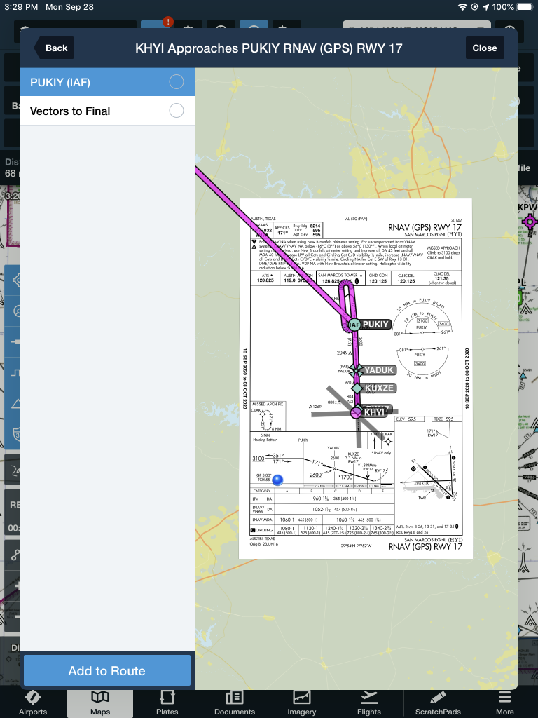
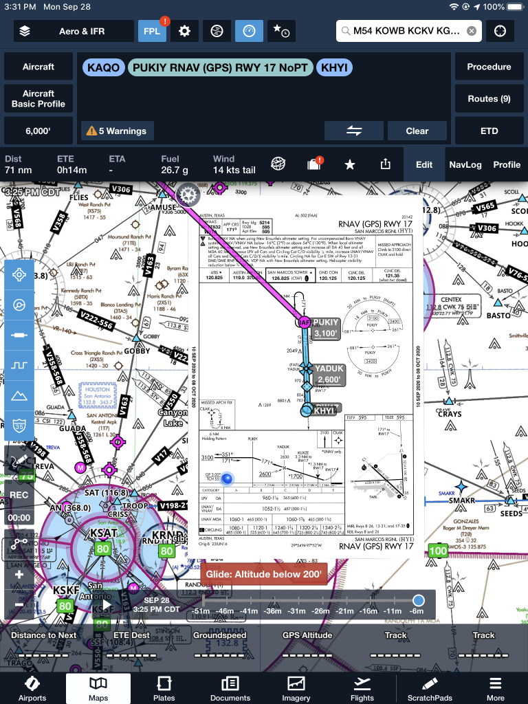
The first step is still to load the approach into your Foreflight flight plan on the Map page. In this scenario, we are flying from KAQO, the Llano Airport, to KHYI, the San Marcos Airport. Austin Approach has told us to expect the straight in RNAV 17 KHYI via PUKIY. So, on Foreflight, we have KAQO and KHYI in our flight plan. Then, I tap the Procedures button on the upper right hand corner of the screen. I then tap Approach, then RNAV 17 KHYI. Then I select my transition.
The options given are either PUKIY with the hold, seen below;
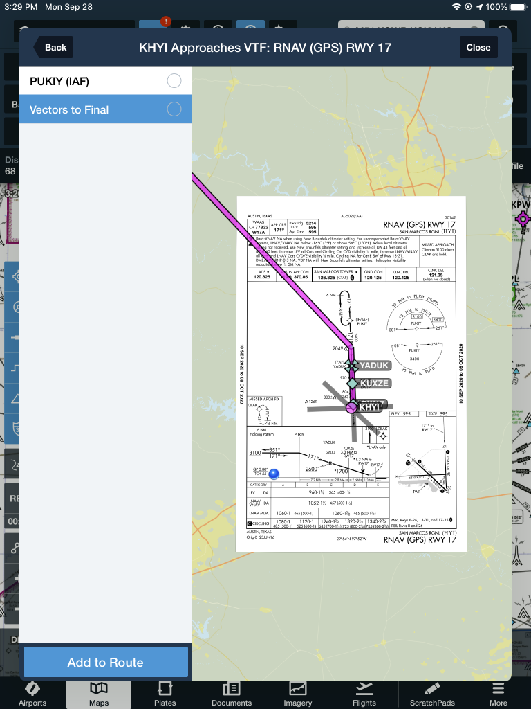
Or Vectors to Final, which lines me up inside of PUKIY. Neither of these are what I want.
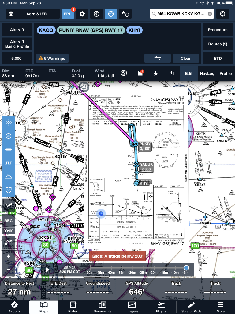
But, to get this to work, I select PUKIY, then tap add to route. Now we have our approach loaded into our flight plan.
Removing the Hold
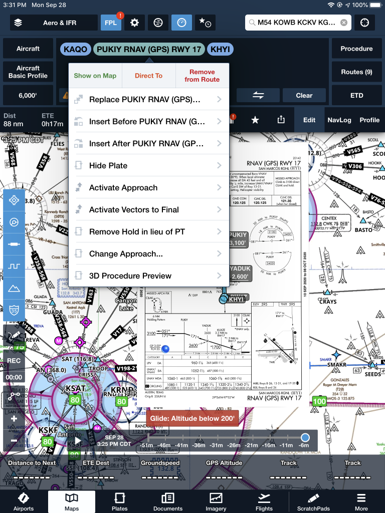
The RNAV 17 is now in the Foreflight flight plan, but the hold is displayed at PUKIY. To remove the hold, the first step is to tap the approach in green and a menu pops up.
The 7th option down is “Remove Hold in lieu of PT.” Eureka! Tap that, then the approach is displayed without the hold. Houston, we have success! It even says “NoPT” in the flight plan.
Looking for something different to do this Spring Break week?
Consider checking out the First Annual MODAERO NextGen Aviation Festival in Conroe, TX. It’s a fly in event, complete with camping opportunities, at the Lone Star Executive Airport, KCXO. The festival itself is being held right next door to the airport at the Lone Star Convention Center.
What’s the draw, do you ask? Not only are there going to be representatives from all the major aircraft manufacturer’s (along with tons of airplanes), there will be a multitude of speakers and live music. There are even drone races! The live music sets the event apart from the well known national fly in events like Osh Kosh and Sun N Fun. It’s a different type of Festival, geared toward the younger generation of pilots.
For more information or to register, check out MODAERO’s website. The festival runs from Wednesday through Saturday, March 16-19.
Let’s say you’re flying in the mountains of Colorado on a cloudy day. There’s a solid layer from the surface all the way up to 14,000 feet. You’re inbound to Eagle (KEGE) on the RNAV (GPS) D approach. There are mountains next to you and below you, but you aren’t concerned since you can see them all. The base of the last reported overcast layer was 3,000 feet, so you know you’ll break out before the MDA and land no problem.
At 11,100 over AWACC, you clearly see the top of the mountain below you. You are comfortably above it. You already have the runway in sight as well. You pop out of the clouds on the approach at 9,700 feet, spot the airport and follow the tower’s instructions to circle north of the runway for a left base for runway 7.
How could you see the mountains inside the clouds? You have Synthetic Vision installed on your glass panel, that’s how.
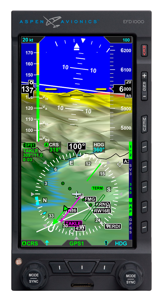
Aspen Synthetic Vision
Synthetic Vision, which has actually been around since the ’70s when NASA and the US Military first developed it, was first FAA certified for the Gulfstream PlaneView flight deck in 2009. Garmin, Avidyne, and Aspen are the main general aviation manufacturers of synthetic vision these days. All Garmin PFDs are now equipped with Synthetic Vision while Aspen gives you the option to upgrade to Synthetic Vision when you get one of their PFDs installed. Avidyne gives you Synthetic Vision in their R9 upgrade for the Cirrus.
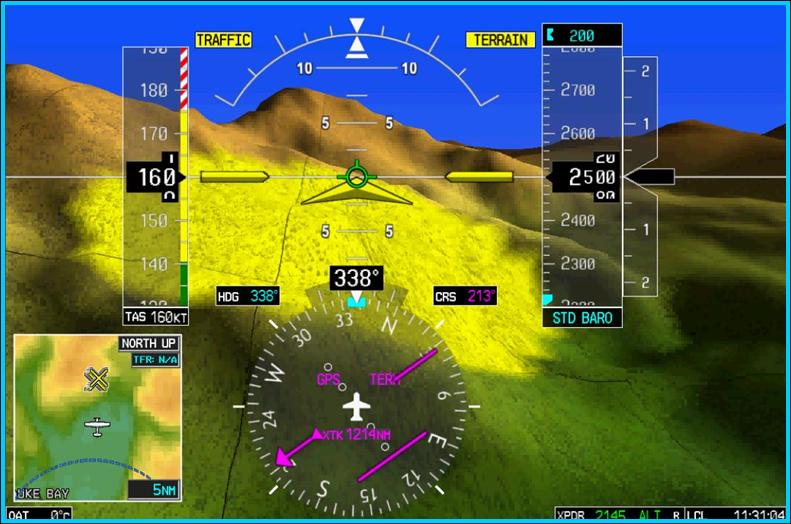
What is Synthetic Vision? Basically, it’s a 3-D picture on the primary flight display showing terrain, obstacles, traffic, and runways. It greatly enhances situation awareness in areas of terrain or high obstacles during IFR conditions or at night.
The goal behind the development of Synthetic Vision was to decrease the amount of controlled flight into terrain (CFIT) accidents. A CFIT accident consists of a perfectly airworthy airplane flown by a pilot (or autopilot) unintentionally into terrain. These accidents can happen in low visibility conditions or at night, but the reason is mainly due to the pilot losing track of his position in relation to obstacles or terrain (or water as was the case with JFK Jr.).
With Synthetic Vision, the goal is to enhance pilot knowledge of what is around the airplane at all times. When you’re at altitude, the terrain below you looks flat. When you start descending down amongst the rocks, the hills or mountains start to rise up on your screen. For those used to the coloration with the 2-D terrain feature on a GPS unit, it translates very easily to the terrain coloration on a Synthetic Vision equipped PFD. Terrain that is between 100 and 500 feet below the aircraft is shown as yellow, while terrain closer than 100 feet is depicted as red.
Garmin Synthetic Vision
One neat feature on Garmin units is the Highway in the Sky. When a pilot puts a course or a flight plan in the GPS, the PFD displays magenta boxes at the altitude selected displaying the route. It’s handy when hand flying to just “fly through the boxes.” They also display descent angles on approaches.
Synthetic Vision is still optional on Garmin and Aspen units, but I highly recommend springing for it. It will give you a higher level of safety and keep you out of the rocks.
The closer we get to 2020, the more innovative companies are getting with ADS-B out solutions. There are a myriad of transponders out there that have been released in to meet the ADS-B out requirement and to offer ADS-B in options. L3 has the Lynx transponder line (and hardware to upgrade an already installed GTX 327 or GTX 330), Garmin has the GTX 345 and offers upgrades to the GTX 330, Appareo has it’s Stratus ESGi ADS-B out transponder, and Avidyne offers it’s AXP340 transponder, among others.
Most of the ADS-B solutions require some kind of panel work, whether it’s pulling out the Garmin GTX 330 to send off, or making panel modifications to fit the L3 Lynx in. Very few are actual slide in replacements, so there is some labor involved in swapping transponders.
Want a simpler and more innovative solution? uAvionix, a Montana based company that makes the recently released Scout portable ADS-B In solution, has a product for you. Meet the SkyBeacon.
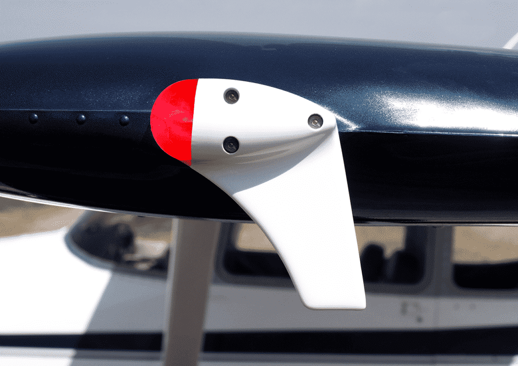
What is it? The uAvionix SkyBeacon is simply a navigation light replacement that bolts on your wing with a fin that hangs down. All the ADS-B out transmitting equipment is placed behind the nav light on the device. It has an integrated WAAS GPS unit, can work with any Mode C or Mode S transponder wirelessly, and it mounts directly in to where the original nav light was, same screws and everything. No additional hardware needed. uAvionix claims installation should take 10 minutes.
Configuration is super easy too, as it is all done on a smart phone on the uAvionix app.
Right now, the uAvionix SkyBeacon is only approved for experimental aircraft, but, according to their website, uAvionix expects FAA certification in early spring. With a price tag of only $1,500 and a strobe light to be added as well, this is your simplest and easiest ADS-B compliance solution.
Ever since I moved out to the Philadelphia area, the Hudson River corridor in New York City has become one my favorite places to fly. It’s hard to overstate the beauty of the city from low over the river. Every time I have a family member or friend come to visit, I try and take them over to see the city from the air.
Each time I fly up the river I can’t believe that we are actually allowed to do so, flying below the tops of the buildings and close enough that you feel that you could reach and out touch them. The draw back to the Hudson River Corridor is that it can be busy, intimidating, and confusing. However, with some reading and preparation, the Skyline flight is easy to do and extremely rewarding.
Having the right weather is an important first step. The second step is try to arrive during ideal lighting conditions. If possible, select a smooth, calm day to make it easier to maintain a track down the correct side of the river. I always try and target arrival at the city around sunset. The view is spectacular any time of day, but having the lights from the city while the sun is just setting gives the best viewing. I’ve also flown over and done the whole flight after dark, which is always spectacular.
View of the World Trade Center
The first method of flying the river is to utilize VFR flight following. If the controllers aren’t too busy, they will provide advisories to aircraft that request the Skyline. The nice thing about doing it this way is that the controller will clear you into the NY bravo airspace and keep you above the traffic flying the Skyline in the VFR corridor below. This is the method that I have always preferred as I enjoy the added benefit of the traffic advisories and it’s nice not to worry about position reporting on the radio.
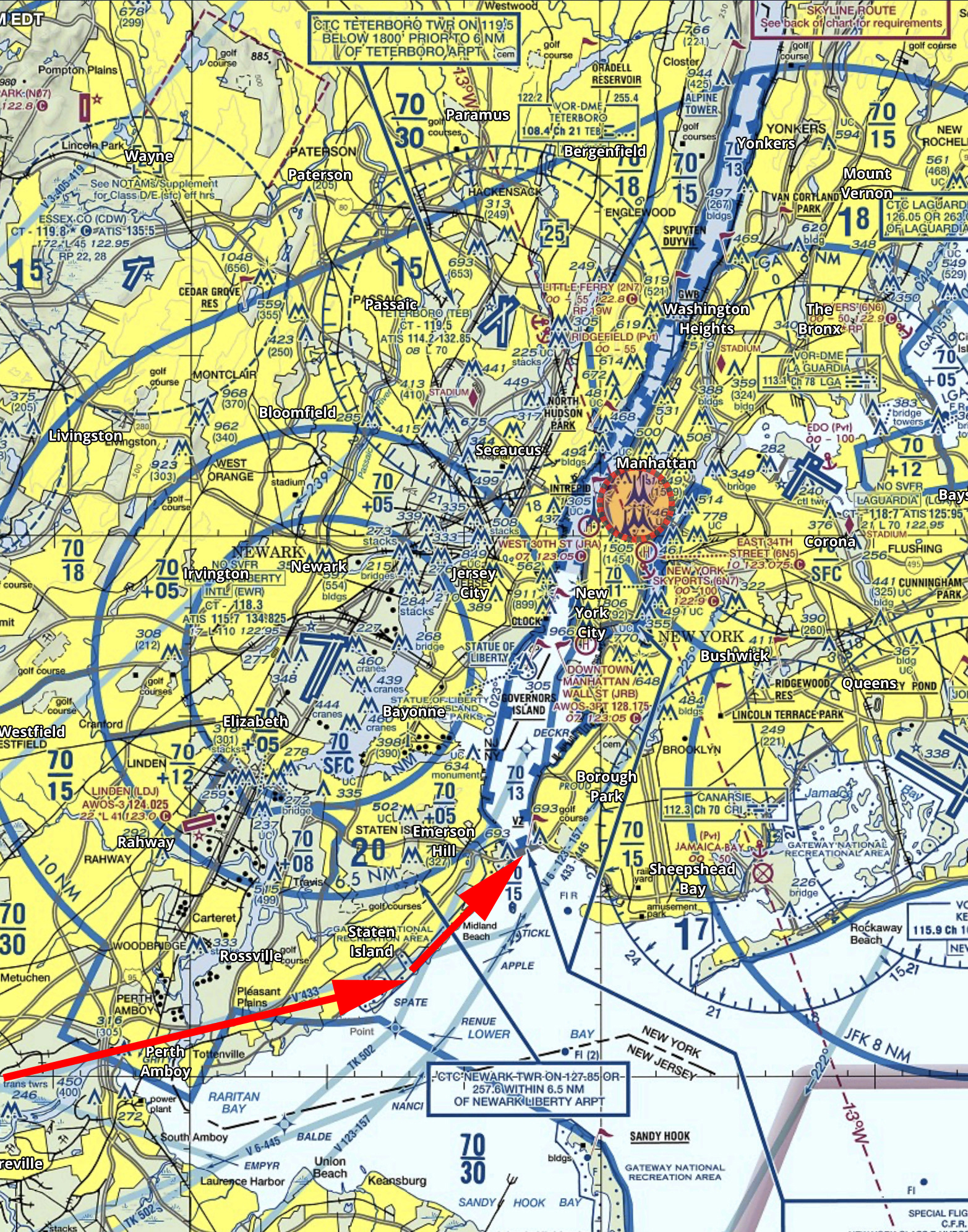
If you want to get flight following, head toward the corridor and request the Skyline route with NY Approach. (Remember to stay clear of the Bravo until you’re cleared in!) Once you’re cleared into the Bravo and approaching the corridor, they will hand you off to Newark/ LaGuardia Tower for traffic advisories over the river. I like to approach from the south and ask for a 180 over the George Washington Bridge. This allows me to fly past the city a second time before exiting the corridor over the VZ (Verrazano Bridge) and heading back toward home.
In red is the path I typically fly. I descend to 1400’ and fly toward the APPLE intersection picking up the shoreline around Staten Island and hugging it until crossing the middle of the VZ. Newark normally clears me into the Bravo at 1400’ or 1500’ to fly up the corridor.
Pros:
Better traffic Awareness
No position reports
Cons:
Flying slightly higher reduces the view
If the controllers are busy, they may deny your request for advisories
Can be intimidating to talk to NY Approach/ Newark/ LaGuardia
The other option is to fly in the VFR corridor. If you want to do it via this method there are just a few things you need to make sure you’re familiar with before you go. When in the VFR corridor you’ll need to make required position reports on a CTAF frequency. Make sure that you have the proper charts and have studied pictures of the landmarks so that you know what you’re looking for. I tend to plan on this as a backup in the event that the controllers won’t give me advisories.
Pros:
Doesn’t require talking to controllers/ class B clearance
More freedom to select altitude and routing as desired
Cons:
Less traffic awareness
Required position reporting
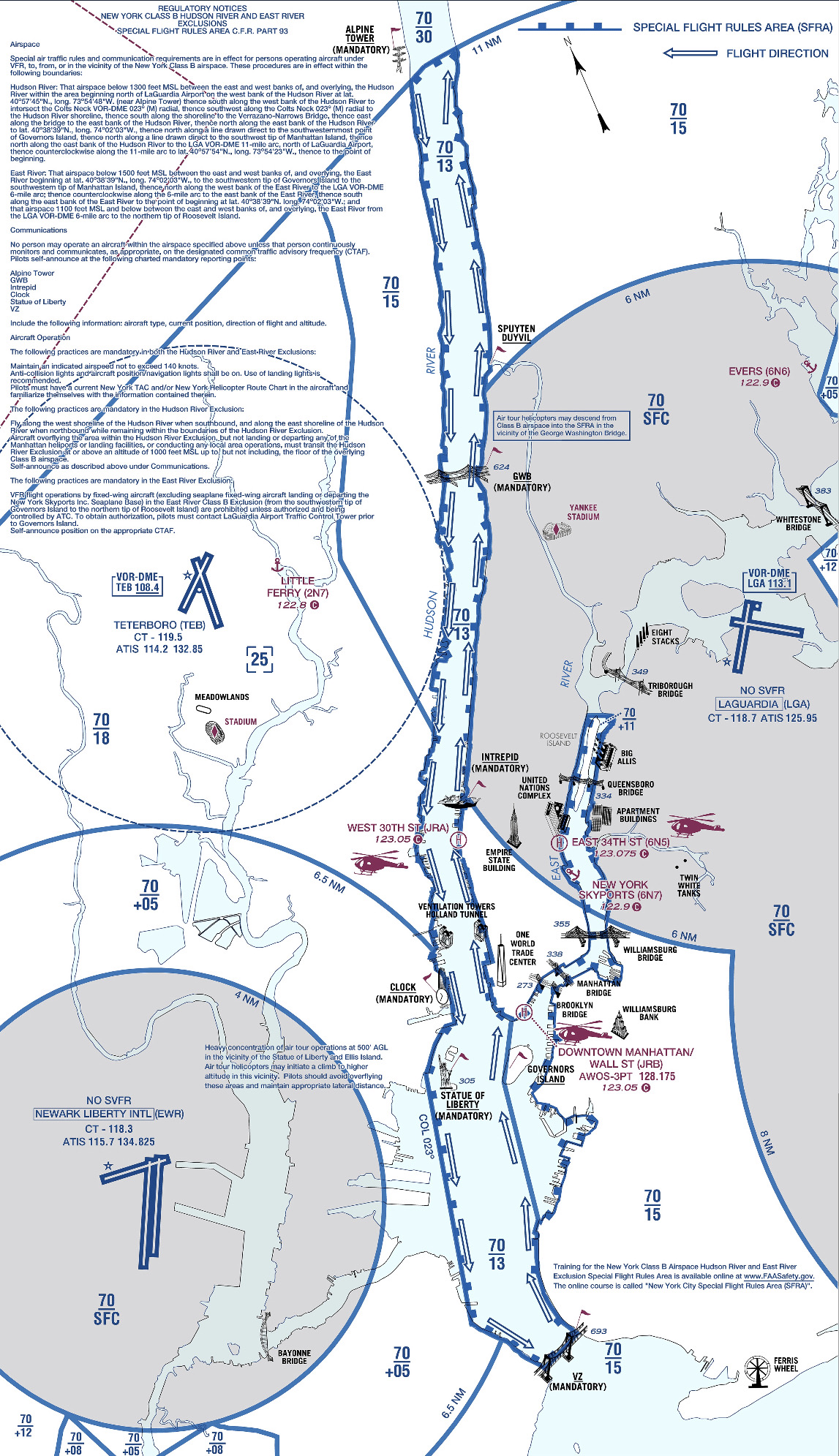
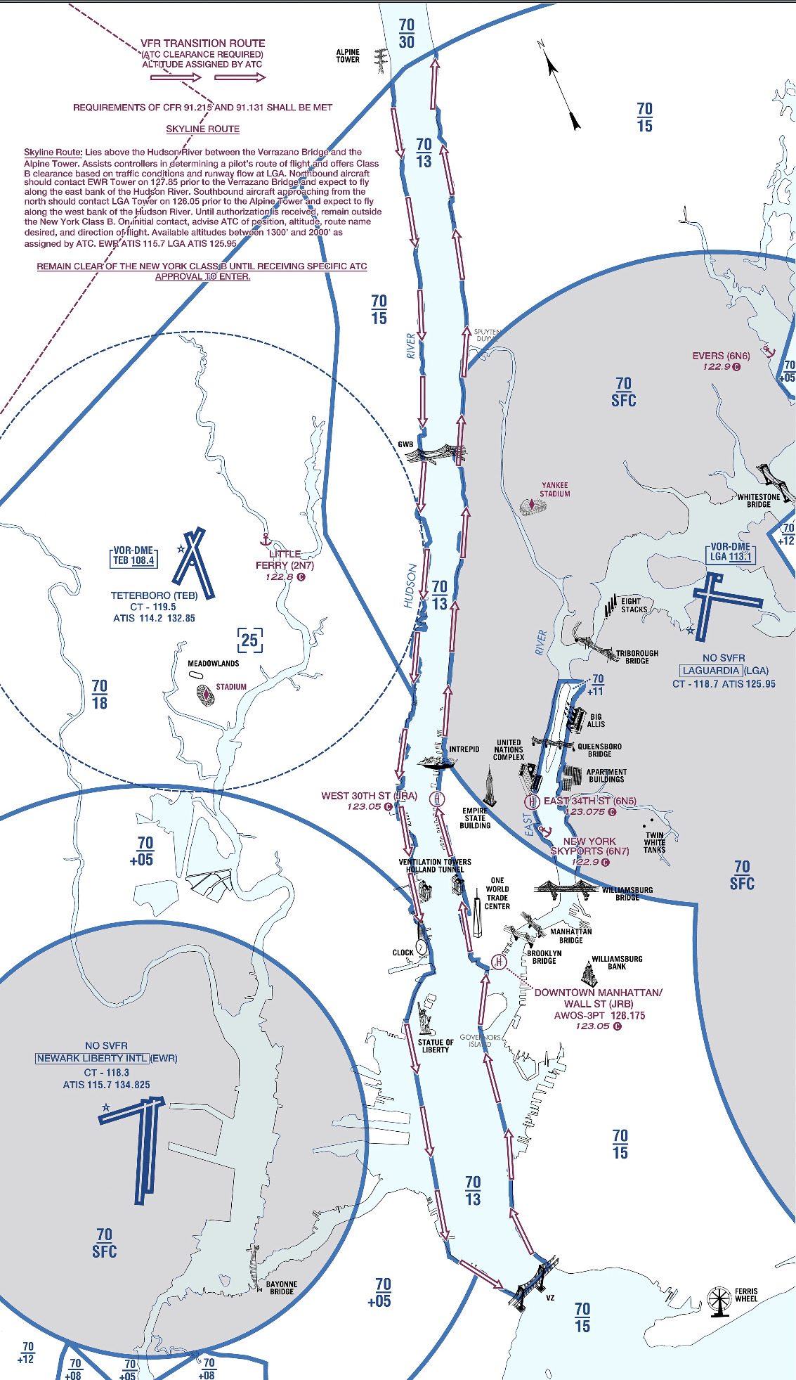
All the requirements and guidelines for flying the corridor can be found on the back of the NYC TAC chart. Any pilot flying the river is required to have one of these or a NYC helicopter route chart on board. If you’re using Foreflight, look in the Documents section under FAA Fly Charts and select the NYC TAC chart in order to read the back of page.
Below you’ll find examples of the diagrams/ instructions printed on the back of the NYC TAC charts.
You can see the traffic flow requires northbound airplanes to hug the east side of the river, while the southbound traffic stays on the west side. The VFR reporting positions (listed from North to South) are: Alpine Tower, George Washington Bridge, Intrepid aircraft carrier, Goldman Sachs (clock), Statue of Liberty, VZ (Verrazano Bridge). Each position report should include aircraft type, position, direction, and altitude.
Other things to be aware of: NYC is always a hotspot for TFR’s. There are often TFR’s for baseball games or presidential movements so make sure to check before you head that way. Additionally, there is a speed restriction in place of 140 kts, though I’m not sure why anyone sightseeing would want to go that fast anyhow.
I realize that all of the procedures and restrictions can be overwhelming, but with the proper preparation, the Hudson Skyline is one of the most incredible places in the world to operate an airplane. There are a lot of things that are easy to get excited about that don’t live up to expectation, but this isn’t one of them. I’ve never taken anyone to the river that wasn’t impressed by what they saw and that’s why I plan to keep going back.
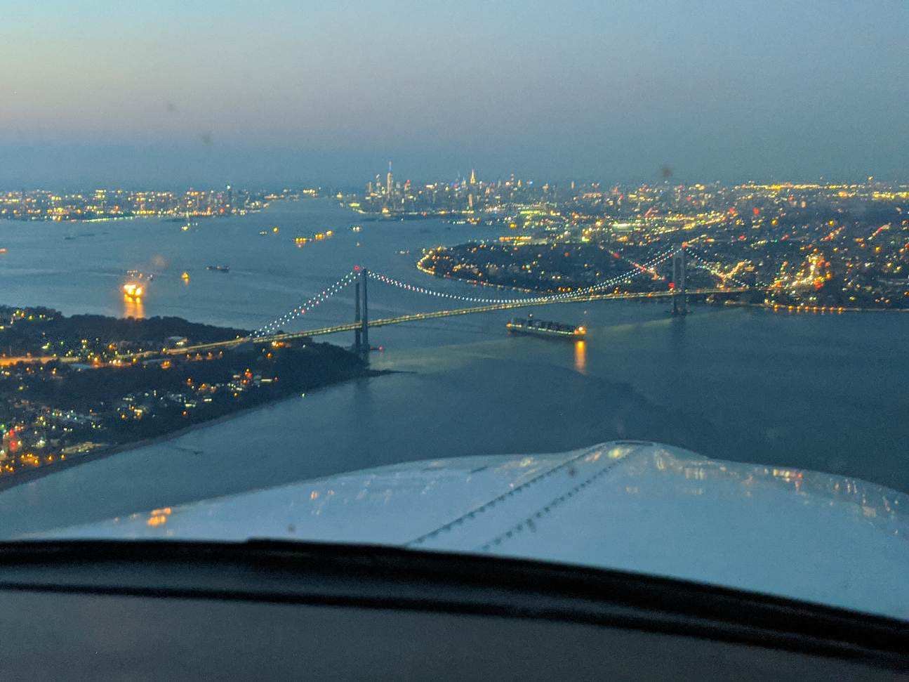
About to cross the VZ looking north toward the city
Many people ask, which set of charts is better? Should I use the FAA Aeroservices charts on Foreflight or pay extra for the Jeppesen charts? Since you have to pay for Jeppesen, they are probably better, right?
I am not here to say which one is better as a chart preference is just that, a preference for one over the other or for certain features. After a while, muscle memory and routine take over and you probably wont even notice the difference.
History
In 1934, Elroy Jeppesen began making his own charts and sold them to other pilots. His little company grew into the giant Boeing chart company we know today. Jeppesen charts are used internationally and therefore include information that might otherwise seem common knowledge, like transition altitudes. The key is, you cannot get FAA Aeroservices charts for international destinations. Jeppesen is the only option for outside the US.
National Aerospace Charting Office (NACO), or the new(er) name “Aeroservices” or FAA chart, whatever you decide to call them, are United States government issued charts. In addition to civilian use, Aeroservices charts are used by the military so there will be some terminology that does not apply to civilians. The best part about FAA Aeroservices charts are… they’re free!
If you are in the middle of a transition or trying to decide which charts to use, you have come to the right place. Here are a few key differences.
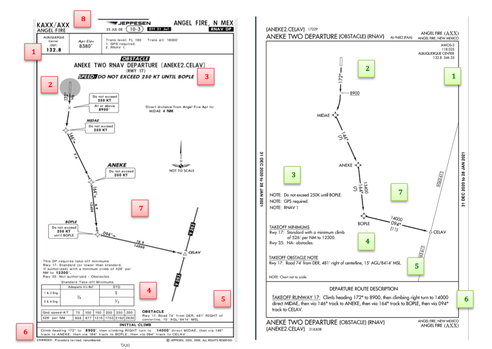
Obstacle Departure Procedure Chart KAXX (Angel Fire, New Mexico) ODP
Frequencies: FAA Chart provides the AWOS so you have all departure frequencies in once place.
Airport: Jeppesen highlight the airport, which is a nice feature so you can easily see the flow from the airport.
Notes and Remarks: Jeppesen bolds the speed restriction all over the chart so you won’t miss it. All other requirements are in the top right corner. Note the transition altitude 18,000′. Since Jeppesen is used internationally, it is published on the chart since other countries have different transition altitudes. It takes up a chunk of chart real estate, but it’s clear, easy to read, and always in the same place. The FAA charts post all the requirements and restrictions as notes off to the side. Since it’s in the same space as the chart graphic, it’s easy for the eyes to catch while studying the plate.
Take off Minimums: NOT APPLICABLE for PART 91 – however, it’s wise for all pilots to look and abide by them. Jeppesen displays the standard take off minimums table, as well as the rate of climb table, which is nice to have all in one place. The FAA chart gives the non standard information but you need to know/look up the rest in the Digital Terminal Procedures Supplemental document. (Hint: It’s in the Documents section of Foreflight)
Take Off Obstacles: About the same on both charts
Route Description: Similar on both charts, but larger font and clearer description on the FAA chart. When there are different routes from different runways, the FAA chart layout is really helpful.
Graphic Layout: Jeppesen and FAA use the same graphics for all their different charts and plates which makes it easy to read once you are familiar with the respective charts. FAA charts are easy to read and distractions are kept to a minimum. Jeppesen charts make things bold and enlarge pertinent information so you won’t miss it.
Airport altitude: This is only on the Jeppesen chart (the FAA chart doesn’t include it), but it is very helpful for situational awareness. As you brief the arrival altitudes, I think it’s important to have an idea what AGL you are at.
Approach Charts
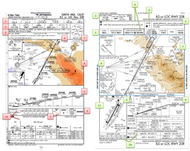
One thing pilots love about Jeppesen approach charts is the clear set up for an approach brief. The top section is created as a “briefing strip” starting with the frequencies, then navigation frequencies, minimums, airport elevation and the missed approach. It’s very natural and user friendly.
FAA charts have a slightly bigger picture of the approach planview, but the profile view and minimums section can get a bit cluttered. It can feel a little discontinuous when briefing the approach to bounce all over the page. However, some pilots really like the small airport diagram in the corner, which I find really helpful for situational awareness (particularly for students learning circle approaches). Non- standard alternate and takeoff minimums are also clearly noted, but unfortunately we must hunt elsewhere to find them. The Jeppesen alternate minimums and takeoff minimums will both be on the airport diagram
Frequencies: Getting weather and tuning radios is easy on the Jeppesen charts – just follow the briefing strip. The frequency section on the FAA charts is still easy to read, but closer to the center of the page. It’s split up from the nav frequencies and other important briefing information. a. FAA charts are created by the government and have military specific information, which are the odd looking frequencies and channels on the chart.
Approach Navigation: On a Jeppesen chart, you will continue to the next line to verify your frequency, course and set minimums (assuming you are straight in on the ILS). On the FAA chart, you will then have to skip to the top of the chart to get the frequency and course, and then scan to the bottom of the page to input your minimums. However, since you could be flying a localizer approach or a circle to land, it’s a good reminder that not everyone using this approach chart will be using the same Decision Altitude (DA). The FAA chart also includes runway distance information so pilots can make determinations of approach speeds and stopping distance if the runway is wet or icy.
Missed Approach – Textual
Approach Lighting
Missed Approach- Graphical: The missed approach information is the same on both charts. The lighting information is key for determining a missed approach and is next to the missed approach text on the FAA chart. It’s found next to the missed approach graphic on the Jeppesen chart. Personally, I find it easier to find and read the lighting information on the Jeppesen chart. Remember, on both charts, the placement of the PAPI on the chart indicates the physical location of the lights (left or right of the runway).
Notes: Both charts have a notes box, but they use them a little differently. Once again, remember that Jeppesen charts are used internationally and include the transition altitudes and altimeter setting info. On both charts, the notes section will be where other critical information will be shared which isn’t really applicable for this airport. On the FAA chart, the tower frequency is starred to note that there are operating hours (you’ll have to check the chart supplement AF/D to find out what those hours are). There is also an L next to the frequency to indicate it is the pilot controlled lighting frequency. You will also find the note about the VGSI and the Approach Glide path next to the profile view on the FAA chart, whereas the Jeppesen chart has that note in the notes section at the top. The FAA chart also has the T and an A in black triangles to note that this airport has non- standard alternate and take off minimums. Again, those are found in separate documents when using FAA charts and on the Airport Diagram when using Jeppesen charts.
Minimum Sector Altitude: Similar on both charts, but in different locations (reminder: ATC vector altitudes may be lower. It is the pilot’s responsibility for safety of flight to maintain safe obstacle clearance, so if you are ever concerned about going below the MSA – just ask ATC).
Planview: Other then differences in size, visuals, and text, the information displayed on both is very similar.
Profile View: Again, the displays look different and pilots will have their preference, but the information is the same.
Minimums: Jeppesen charts not only note the category for each approach with its designated letter, but also displays it in knots. It is recommended that if you increase your approach speed (based on flaps or gusty winds or perhaps a faster speed for a circle to land approach) that you should use the higher category minimums. The reference guide makes that easy to look up. The other benefit of the Jeppesen charts is right the table that contains the time from the final approach fix to the missed approach point for a localizer approach, it also shows the rate of descent with the associated ground speed to maintain a 3 degree glideslope. Now there is no excuse not to set pitch and power! The minimums posted in parenthesis are for the military, but RVR in statute miles is also included.
Airport diagram: Only on the FAA charts, this particular feature is particularly useful for situational awareness. The arrow pointing to the runway shows the direction the approach is arriving from so planning a circle to land is a cinch. There is also a lot of other information that can be gathered from the airport diagram for quick reference or to help a disoriented pilot: lighting, displaced thresholds, closed taxiways, and runway placement and lengths. This is easily one of the best perks of an FAA chart.
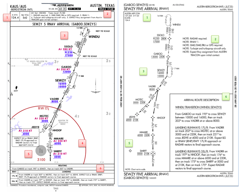
Arrival/ Departure Charts: Sewzy 5 Arrival KAUS
The Jeppesen lay out is very attractive and draws the pilots eye in a clear way to all the important information. The colors pop out, so the required altitudes and speeds are easy to read and remember. The chart, which is the proper scale, shows MORAs , easy to find airports (and runway layouts) and is over all easy to follow. However, the texts, while very clearly laid out, are small and difficult to read and pushed to the very edges of the chart. FAA charts are simple and fairly easy to read, but the airports are not as obvious and the flow to the airport requires a good look. The table on the Jeppesen chart is a really nice format, but the text and Notes for arrivals on the FAA chart are easy to find and much easier to read quickly.
Frequency: FAA charts include the approach frequency on the arrival, which is helpful for having radios tuned. During a busy time when the controller changes your frequency, all you have to do is verify the frequency you already set, rather then totally stop what you’re doing to switch it. The Jeppesen charts add the airport elevation next to the ATIS, which really aids situational awareness.
Notes: Jeppesen notes are clearly numbered and tucked away nicely in a box, but the FAA chart notes pop out in the middle of the page and are easy to skim for pertinent information.
Planview: I think Jeppesen is the clear winner here- it is so easy to read, it only takes one glance to know where the primary airport is and how the arrival flows. The chart being at the proper scale offers the pilot important geographical information and over all is a clean look. Notice the small series of arrows after SMRFF on the the Jeppesen chart; those indicate the pilot should expect radar vectors. The FAA charts include those instructions in the text, but I find the visual reference on the chart helpful. The FAA charts are equally clean, with altitude and speed restrictions easy to read even if they don’t jump out. When there are multiple airports that the arrival serves, the airports are clearly marked, though, I think it would be nice to have a little more information surrounding the primary airport for better situational awareness.
MSA: only on the Jeppesen chart
Primary airport: The runway alignment and grey highlight on the Jeppesen chart stands out very clearly, while the FAA airports are a little more obscure.
Arrival route description: The table on the Jeppesen chart is easy to follow but the text is very small and pushed to the bottom. The route description is much easier to find and read on the FAA chart.
Airport Diagram
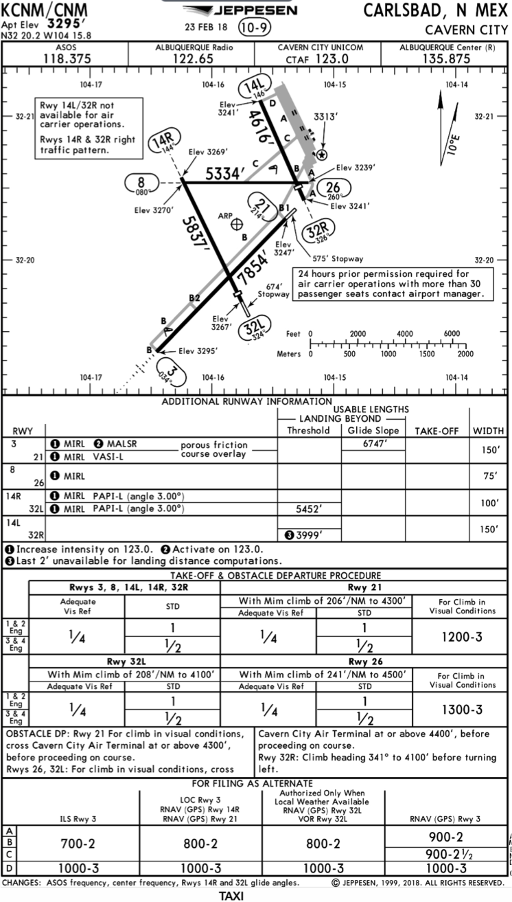
The Jeppesen Airport Diagram page has it all: frequencies, airport diagram, runway info, take-off minimums, departure procedures and alternate minimums. It’s a one-stop shop. It makes preflight planning easy when its all at your fingertips.
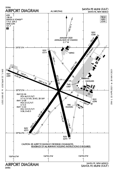
The FAA charts usually require a little more searching for different pieces of airport information. The Airport Diagram itself is just the airport layout. Above, you will see a simple FAA Airport diagram. It’s clean and simple, perfect for a knee board print out.
In the flight planning process, as you look at what approaches you will be using for the airport, you might see an A or T inside a triangle. Those indicate that you will need to look in the Alternate Minimum or Take off minimum documents for more information. The Takeoff Minimums document (see below) is also where you will find any obstacle departure procedures for that airport. Apps like Foreflight help you out by posting the take off minimums under the departure tab. Even though it’s a little more difficult to read, I didn’t crop out the airport information so you can see what it looks like in context.
FAA Alternate Minimums on the Left and Takeoff Minimums and Obstacle Departure Procedures on the Right








One Comment