Cirrus Partner Wanted in San Antonio


Many people ask, which set of charts is better? Should I use the FAA Aeroservices charts on Foreflight or pay extra for the Jeppesen charts? Since you have to pay for Jeppesen, they are probably better, right?
I am not here to say which one is better as a chart preference is just that, a preference for one over the other or for certain features. After a while, muscle memory and routine take over and you probably wont even notice the difference.
History
In 1934, Elroy Jeppesen began making his own charts and sold them to other pilots. His little company grew into the giant Boeing chart company we know today. Jeppesen charts are used internationally and therefore include information that might otherwise seem common knowledge, like transition altitudes. The key is, you cannot get FAA Aeroservices charts for international destinations. Jeppesen is the only option for outside the US.
National Aerospace Charting Office (NACO), or the new(er) name “Aeroservices” or FAA chart, whatever you decide to call them, are United States government issued charts. In addition to civilian use, Aeroservices charts are used by the military so there will be some terminology that does not apply to civilians. The best part about FAA Aeroservices charts are… they’re free!
If you are in the middle of a transition or trying to decide which charts to use, you have come to the right place. Here are a few key differences.
Obstacle Departure Procedure Chart
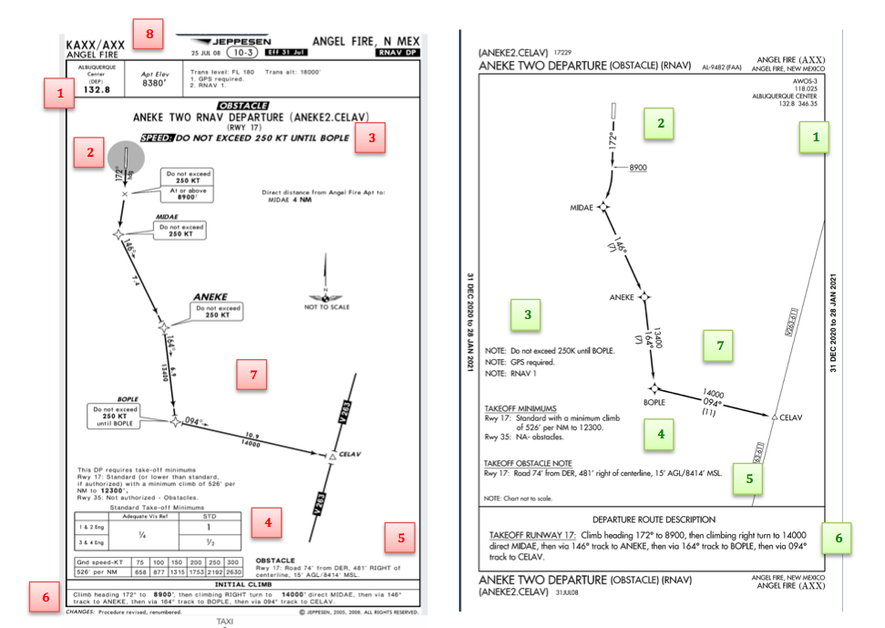
KAXX (Angel Fire, New Mexico) ODP
Approach Charts
One thing pilots love about Jeppesen approach charts is the clear set up for an approach brief. The top section is created as a “briefing strip” starting with the frequencies, then navigation frequencies, minimums, airport elevation and the missed approach. It’s very natural and user friendly.
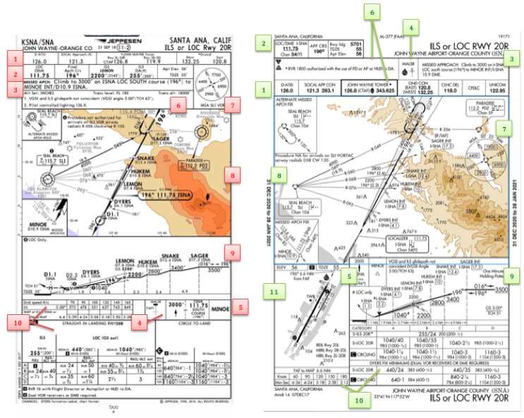
FAA charts have a slightly bigger picture of the approach planview, but the profile view and minimums section can get a bit cluttered. It can feel a little discontinuous when briefing the approach to bounce all over the page. However, some pilots really like the small airport diagram in the corner, which I find really helpful for situational awareness (particularly for students learning circle approaches). Non- standard alternate and takeoff minimums are also clearly noted, but unfortunately we must hunt elsewhere to find them. The Jeppesen alternate minimums and takeoff minimums will both be on the airport diagram
Arrival/ Departure Charts: Sewzy 5 Arrival KAUS
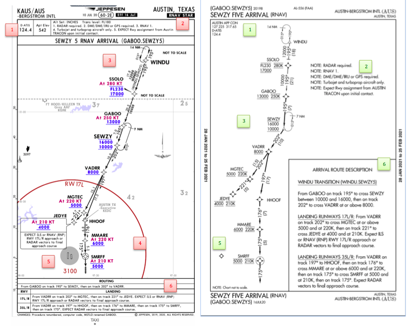
The Jeppesen lay out is very attractive and draws the pilots eye in a clear way to all the important information. The colors pop out, so the required altitudes and speeds are easy to read and remember. The chart, which is the proper scale, shows MORAs , easy to find airports (and runway layouts) and is over all easy to follow. However, the texts, while very clearly laid out, are small and difficult to read and pushed to the very edges of the chart. FAA charts are simple and fairly easy to read, but the airports are not as obvious and the flow to the airport requires a good look. The table on the Jeppesen chart is a really nice format, but the text and Notes for arrivals on the FAA chart are easy to find and much easier to read quickly.
Airport Diagram
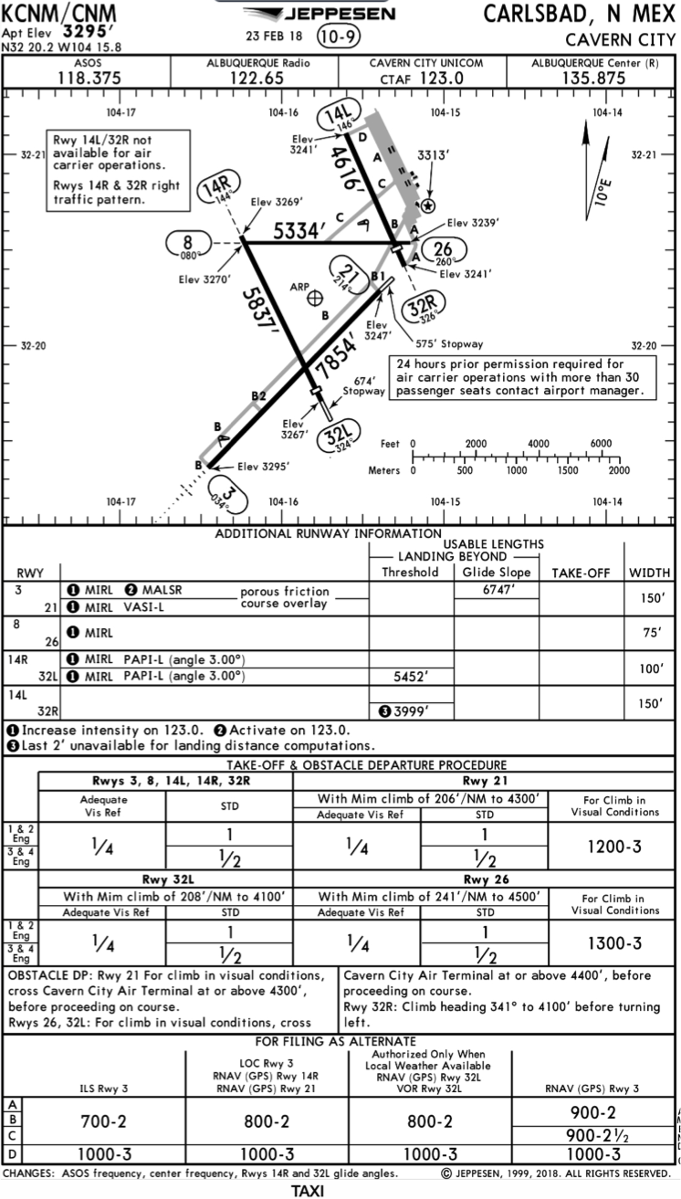
The Jeppesen Airport Diagram page has it all: frequencies, airport diagram, runway info, take-off minimums, departure procedures and alternate minimums. It’s a one-stop shop. It makes preflight planning easy when its all at your fingertips.
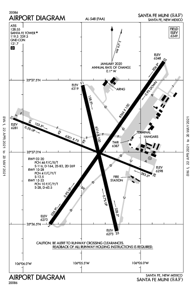
The FAA charts usually require a little more searching for different pieces of airport information. The Airport Diagram itself is just the airport layout. Above, you will see a simple FAA Airport diagram. It’s clean and simple, perfect for a knee board print out.
In the flight planning process, as you look at what approaches you will be using for the airport, you might see an A or T inside a triangle. Those indicate that you will need to look in the Alternate Minimum or Take off minimum documents for more information. The Takeoff Minimums document (see below) is also where you will find any obstacle departure procedures for that airport. Apps like Foreflight help you out by posting the take off minimums under the departure tab. Even though it’s a little more difficult to read, I didn’t crop out the airport information so you can see what it looks like in context.

The FAA started their Pilot Proficiency Award Program (commonly known as FAA WINGS) in 1996. It is run by the FAA Safety Team, or the FAASTeam. The intent of the program was, and is, to “improve the nation’s accident rate by conveying safety principles and practices through training, outreach, and education” (taken from faasafety.gov). The FAA WINGS program, free of charge, encourages pilots to pursue recurrent training to enhance their overall knowledge of all the aspects of aviation.

The FAA WINGS program has evolved over the years, but with the current structure, pilot’s accomplish tasks, both knowledge and flying, for credit that adds up to the equivalent of a flight review. Pilot’s must accrue three knowledge credits and three flight credits to complete a phase, and each phase acts as a flight review.
FAA WINGS has three levels, the basic, advanced, and master level. Under each level, you accomplish different phases. The basic level is “designed for pilot’s [desiring] a higher level of proficiency than … a normal flight review” (faasafety.gov). The flying tasks in the basic phase are based on the private or commercial pilot PTS, depending on the airman’s certificate level. The knowledge courses revolve around many different areas, all of which can be viewed on the FAASafety Team’s website. Most are free, but there are some courses that have a cost associated with them. In the advanced and master phases of the FAA WINGS program, the tasks have higher standards, challenging pilots to hold themselves to those higher standards.
One unique aspect of the FAA WINGS program is the opportunity to attend a safety seminar for credit. Throughout the year, there are many different safety seminars that take place in the different FSDO areas. The FAA WINGS seminars range from a study of accidents, to GPS usage and anything in between. You can even get FAA WINGS credit for attending the Bonanza BPPP or the Cirrus CPPP programs.
As an instructor, I highly recommend to all my customers to enroll in the FAA WINGS program and use it. This keeps pilot proficiency at a high level, which in turn keeps safety at a high level as well. Plus, you get to learn a lot too!
If you’d like to enroll in the FAA WINGS program, visit faasafety.gov to create an account. Then, find a good instructor and start working on those phases!
Let’s face it: airplanes are not the best classrooms. The propeller is running, the engine is making lots of noise, the pilot is attempting to multi-task and the instructor is barking orders. That’s almost as much overstimulation as being a parent to 4 kids under 10 (I have experience in that arena!). That’s even before takeoff!
At Texas Top Aviation, we have observed many situations where a simulator would be an excellent way to introduce different concepts and supplement training. Now, in our Austin Executive (KEDC) office, we finally have a really good simulator.
Meet the Noble Flight Simulator, the next best thing to a Cirrus cockpit. With the Noble Flight Simulator, we can duplicate 6 different types of Cirrus aircraft (G3 SR22, G3 SR22T, G5 SR22, G5 SR22T, G6 SR22, and G6 SR22T). The Garmin Perspective panel easily swaps between the G3 and G5 configuration to the G6 configuration, so the buttons are all in the proper places.

Having button pushing problems? The simulator is the place to practice.
Want to experience actual emergencies? An engine failure is a lot less stressful in a simulator.
Want to pull CAPS (Cirrus Airframe Parachute System)? The Noble Flight Simulator has a realistic CAPS handle with the same amount of pull pressure that the CAPS handle in the airplane has.
Need an IPC or want to practice approaches? All approaches done on a Noble Flight Simulator are luggable, plus a full IPC can be accomplished.
Want to save fuel? The Noble Flight Simulator is for you!
To top it all off, the Noble Flight Simulator that Texas Top Aviation has is classified as an Advanced Aircraft Training Device. It is certified to the highest standards of non-motion simulators, allowing pilots working toward their private and instrument ratings to log a significant amount of time toward that certificate or rating. Up to 20 hours of IFR training is allowed to be logged in an AATD toward an instrument rating. That’s huge!
Texas Top Aviation is also developing a CAPS specific course to expose Cirrus pilots to the many different scenarios where pulling CAPS would be necessary. This teaches Aeronautical Decision Making to Cirrus pilots who struggle with the decision of whether or not to pull CAPS. Look for CAPS course information under our Aircraft Training page later this summer.
Interested in checking the simulator out? Contact us today!
When a pilot thinks of an engine runup in a single engine piston airplane, typically it is let’s find out if the engine is running rough or not, meaning a spark plug is fouled. Believe it or not, there is a little more to learn from a runup than just checking the spark plugs.
A distinct advantage to having an engine monitor that monitors all EGTs and CHTs is you get a better idea of engine health. When switching to one magneto or the other during the runup, all the EGTs should rise, showing that the temperature of the exhaust gas is going up from each cylinder. This occurs because when running on only one magneto and one set of spark plugs in each cylinder, the mixture takes longer to burn, so, when the exhaust valve in the cylinder opens, the burn is still on going and this hits the EGT probe, causing a temperature rise. An indication of a magneto failure in flight would be a rise in all the cylinders EGT without a change in mixture setting.
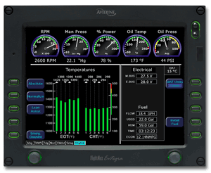 Now that we know what to look for when checking each magneto, what would one look for to show that there is a problem? The basic that each student pilot is taught still applies. The engine manufacturer puts a limit on RPM drop during the runup. When checking one magneto or the other, watch for an excessive RPM drop. If the RPM drops past the limit, this usually will be accompanied by engine roughness.
Why is that? Let’s look at the cause for the excessive RPM drop. For this, we need to go back to our EGT indicators. Let’s say we have a 6 cylinder engine. When the key is turned to the right magneto, the RPM drops 250 RPM and the engine gets very rough. Look at the EGT gauge. The cylinders where the spark plugs are firing normally will all show a temperature. The cylinder (or cylinders) where there is no combustion, meaning a bad plug, will show no temperature. This is because the mixture is just sitting in the cylinder and not igniting, therefore, no exhaust gases will be pushed out so there will be no EGT indication for that cylinder. This is also how you tell a mechanic which cylinder to check for the bad plug.
It could also be a bad magneto. If multiple cylinders EGT all drop, or the engine wants to quit entirely, you have a bad magneto or bad ignition harness.
What else can you learn during the runup? Electrical system health is key, especially in all electric airplanes (meaning no vacuum system). It’s a very good idea to turn on all the lights and pitot heat to ensure that a rise is indicated on the ammeter. This means the alternator is carrying the load and working properly.
The next time you do your runup, keep an eye on your EGT to see the rise during a magneto check.
The AOPA Air Safety Institute is making it’s annual loop through Texas this January. The topic for this Safety Seminar is “More Difficult Decisions: Choices & Consequences.”
The seminar is geared our the decision making process that we as pilots face on each flight. Some decisions are easy (what altitude should I pick?) while some have much greater consequences and should be taken very seriously.
This event will be interactive for the participants as several scenarios will be presented. The goal is to help pilots learn to think through each decision, weighing the consequences along the weigh to arrive at the safest outcome of the flight.
The first area seminar will be held on Tuesday, January 21st at the Stinson Field Airport (KSSF, 8535 Mission Road, San Antonio, TX 78214). The second area seminar will be held on Wednesday, January 22nd at the TXDOT office in Austin (200 E. Riverside Dr., Austin, TX 78704). WINGs credit is available for all attendees.
Learn more here.
In instrument flying, I am all about keeping things simple. There is a ton of detail that an instrument pilot can get bogged down in. When an instrument pilot gets bogged down, he gets distracted from flying the airplane. When he gets distracted from flying the airplane, dangerous circumstances can happen.
I like to keep things simple. When I first started instructing, I developed a very simple instrument approach briefing that captures everything that is necessary on an approach plate, but prevents getting bogged down in the details.
I call it the BBC instrument approach briefing. Here it is:
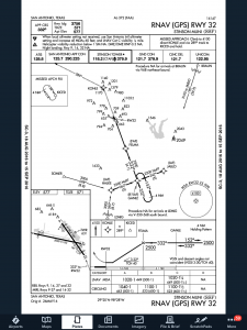 First things first. The first step of an instrument approach briefing is to brief the approach plate. There are a bunch of acronyms out there that instructors tell their students to memorize that only cause confusion instead of helping get the plate briefed. To keep it simple, just work your way across the plate and you’ll get all the information you need.
Start in the top left hand corner of the plate, with the approach course, then work your way right and down, as follows:
Simple enough, right?
Now that you know what you are planning on doing, you can now take the second step in the instrument approach briefing and build the approach in your GPS. You know your approach type, you know your transition, and you know what your minimums are. Taking all that information, you can now build it in to your system.
Once everything else is done, don’t forget the checklists. The descent and before landing checklists still need to be done as part of an approach. The best time to do these is before joining the approach so that you don’t have to worry about flying the approach and looking at a checklist at the same time. Even better, memorize the checklist and you don’t have to look at anything!
Most importantly, you want to be configured properly for the approach by the final approach fix. Gear, flaps set, power set, so all you have to worry about at that point is following the needles and trusting your instruments.