What’s the most cost effective glass panel retrofit? There are several options out there (and it seems like more coming each Sun ‘N’ Fun or Osh Kosh event), but the consensus is the Aspen EFD 1000 or 1500, right? At $12,000 installed, it’s about $8,000-$10,000 cheaper than the Garmin G500 (though you can make the argument that when you add a second screen and SVT to the Aspen, the price is about the same).
I am here to blow your mind. What if you could get a glass panel retrofit that is a complete AHRS system with airspeed and altitude, plus a slaved HSI that auto slews to your GPS and a 4 hour backup battery so you can throw your steam attitude indicator away, for only $4,600, plus installation?
I am not crazy.
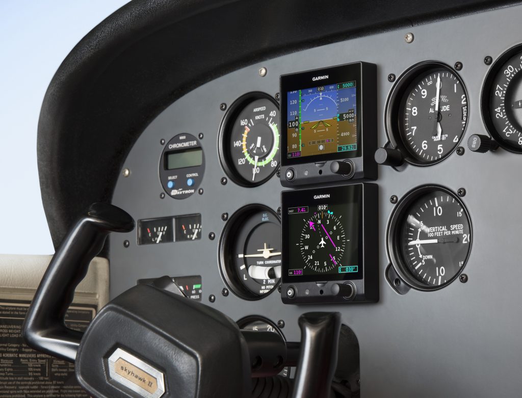
The Garmin G5 debuted last year when the FAA relaxed it’s regulations to allow more experimental avionics into certified airplanes. The single G5 was a big hit. The 3.5 inch screen fit nicely into the hole that the traditional attitude indicator left, giving pilots a glass attitude, airspeed and altimeter options for less than $2,500.
In March, Garmin brought out the HSI version of the G5. Equipped with a low cost magnetometer, the DG/HSI version is a complete replacement for the traditional DG/HSI. The unit also displays ground speed and distance (received from the GPS information), while auto-slewing to the GPS flight plan, so the CDI needle will move on it’s own, eliminating the annoying need for the pilot to set the course on the HSI (and ridding the GPS of the message that pops up reminding the pilot to set the course).
The dual units provide a complete backup Attitude in the case of a display failure. The reversionary mode you get with the Garmin G1000 and the Garmin G500 is also present in the dual G5s. This eliminates the need for a backup steam gauge attitude indicator, freeing up panel space for an engine monitor or some other toy. The G5 units can also be equipped with 4 hour backup batteries in case of electrical failure.
The price for the dual G5 setup is very reasonable at just under $4,600 plus installation (which, according to Garmin, should be pretty simple as the units act as plug and play instruments). The AHRS unit is available stand alone for under $2,200 while the DG/HSI unit standalone runs just under $2,600.
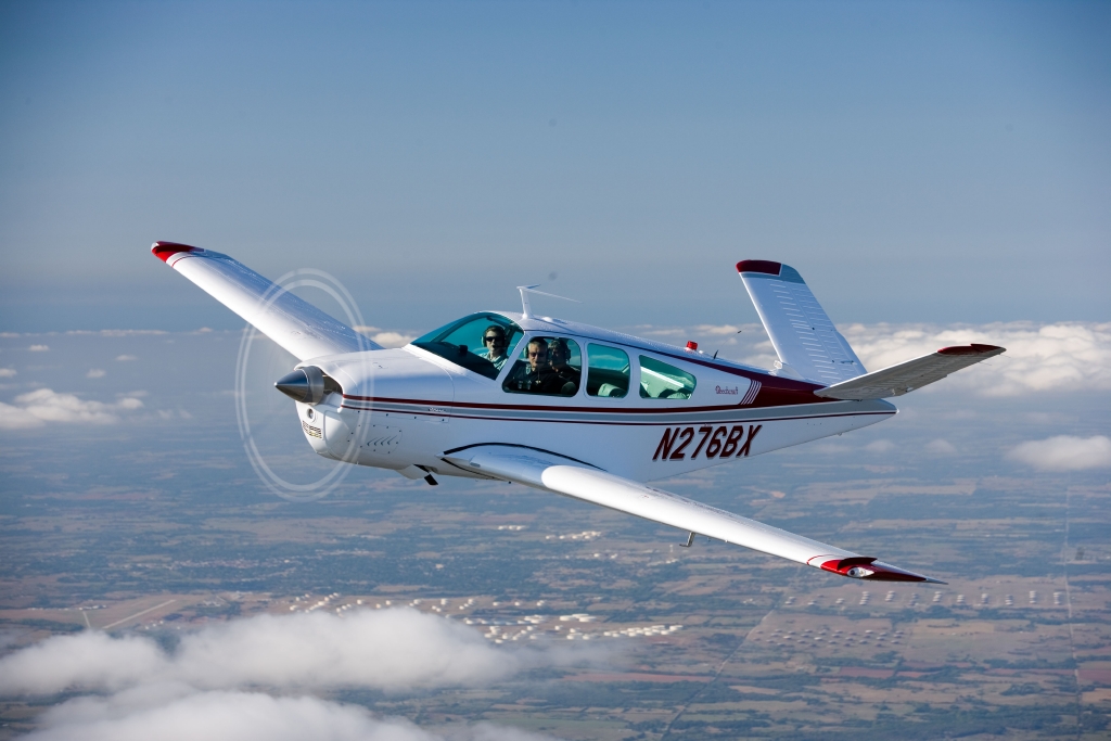
If you walk up to any Beechcraft Bonanza sitting on the ramp at an airport and ask the owner, “How do you like your Bonanza?” be prepared to stand there and listen for 15-20 minutes while he brags about his airplane.
The thing about Beechcraft Bonanza owners is that they are almost a part of a cult. They will tell you up and down why the Bonanza is the best airplane out there. They’ll tell you why all the others don’t even come close. They’ll tell you about the payload, the six seats, the variety of configurations you can select from, the ability to land pretty much anywhere. By the time you walk away, you will probably be convinced to buy one yourself.
Bonanza’s are great airplanes. For those of you new to the single engine piston market, a good comparison for a Beechcraft Bonanza would be a Suburban. Not the flashiest ride out there, but extremely capable, comfortable, and family conscious. If you’re hauling a load, you’ll take a Bonanza over a Cirrus or Mooney any day. Have six people? No problem!
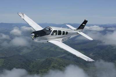
One of the best things about a Beechcraft Bonanza is the variety of designs. Four seats, six seats, long range tanks, tip tanks, turbo charged, normally aspirated, steam gauge, G1000, Aspen or G500 retrofitted, dual yoke, single yoke, leather, cloth, and a variety of different colors out there on the market make finding a Bonanza that fits your need pretty easy.
When it comes to picking out an airplane, the first question is always the mission. If you’re thinking about a Beechcraft Bonanza, you’ve already determined you need something with a good useful load. Do you need four seats or six? Depends on how often you’ll be carrying someone or how new of an airplane you want. Older Bonanzas have four seats, but a lot have had significant updating. Newer A36 and B36 Bonanzas have six seats, but are going to cost you more.
Do you need a turbo charged Bonanza? If you’re in a high elevation area or expect to visit the mountains a lot, then absolutely. If you want a better cruise speed and don’t mind a little less useful load, then go for it. If you’re more concerned about being able to load it up and you aren’t going to cross the Rockies often, then normally aspirated is what you want. You’re probably looking at about 160-170 KTAS with the normally aspirated whereas you get between 180-190 KTAS at altitude with the turbo.
Do you need tip tanks? Tip tanks have two advantages. One is the most obvious: you get to carry more fuel, therefore you get to go farther without having to stop (or when you stop for the bathroom, you don’t have to fill up with gas). The other advantage is you get a bump up in useful load. I talked to a Beechcraft Bonanza owner a few weeks ago who had tip tanks on his. He told me max gross on his Bonanza was 3,800 pounds and was eligible for an upgrade of up to 4,000 pounds and all it took was paper work for the STC. That’s quite a bit of load!
Are Bonanzas hard to fly? When moving up from a typical 172 or Cherokee that most people learn to fly in, it does take some adjustment. But, with good Bonanza training from a qualified Bonanza training instructor, then the transition is no problem. There are tons of resources out there to aid all future and present Bonanza owners in their foray into the Bonanza nation. With the American Bonanza Society and Bonanza Pilot Training, there is no lack of training, thoughts and opinions.
In need of an airplane that can pretty much do whatever you need? Then a Bonanza may be right for you.
Most in the aviation industry are familiar with John and Martha King, the faces of the myriad of Kings Schools aviation training courses. Thousands of pilots have gone through their ground school courses for a variety of certificates or ratings, taking in the videos on original VHS, DVD, or streaming online depending on what the current technology is.
With the advent of the Airmen Certification Standards (ACS) replacing the Practical Test Standards (PTS) for the private and instrument certificates, King Schools didn’t take long to update their material.
To help private students prepping for their check ride (and their instructors who aren’t familiar with an ACS check ride yet), John King plays the student pilot in the latest King Schools prep video. The streaming online video is about 5 hours long, includes the oral portion and the flight portion of the check ride, and runs $139 (you can still get the DVD, too!).
I have recommended King Schools and their courses to all of my customers. They have always put out a great product as they reduce the fear felt for a check ride applicant. If you are prepping for your private pilot check ride, checkout the King Schools video today.
On March 30th, Texas Governor Greg Abbott issued an Executive Order mandating that all travelers (including Texas air travelers operating or traveling in private aircraft) from the following designated areas were to self-quarantine for 14 days (or the extent of their stay in Texas, whichever was shorter) upon entering the State:
California
Louisiana
Washington State
Atlanta, Georgia
Chicago, Illinois
Detroit, Michigan
Miami, Florida
If you traveled to Texas by air from any of the above designated areas, you are required to fill out the Arrivals from Areas Designated for Mandatory Self-Quarantine Form. Failure to do so could lead to a $1,000 fine or 180 days in jail, or both. For private aircraft owners/operators, put your Tail Number in for Flight Number and “Private” for Airline.
Aircraft owners, stay away from the designated areas listed above and you won’t have any worries. A lot of you reading this are from Texas, so make Louisiana a fly over state for now and don’t make any landings in Cajun country.
A couple of months ago, I had a life-threatening experience while flying. Thankfully, with my flight training, along with a lot of luck, I am here to talk about it.
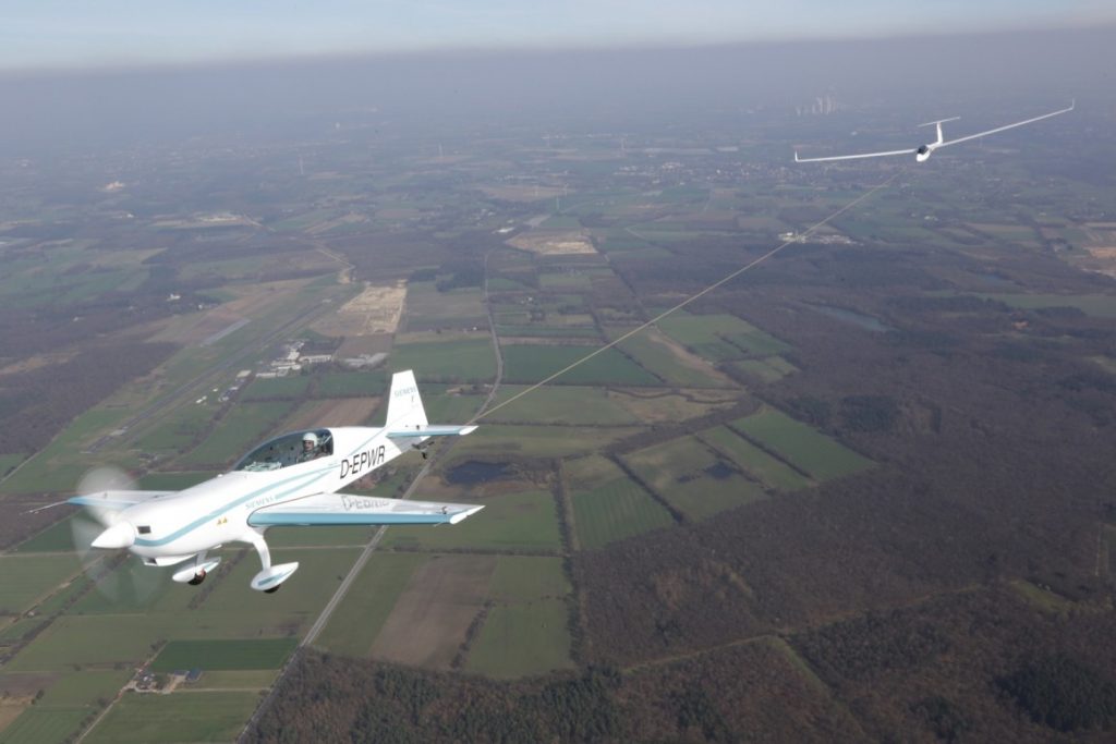
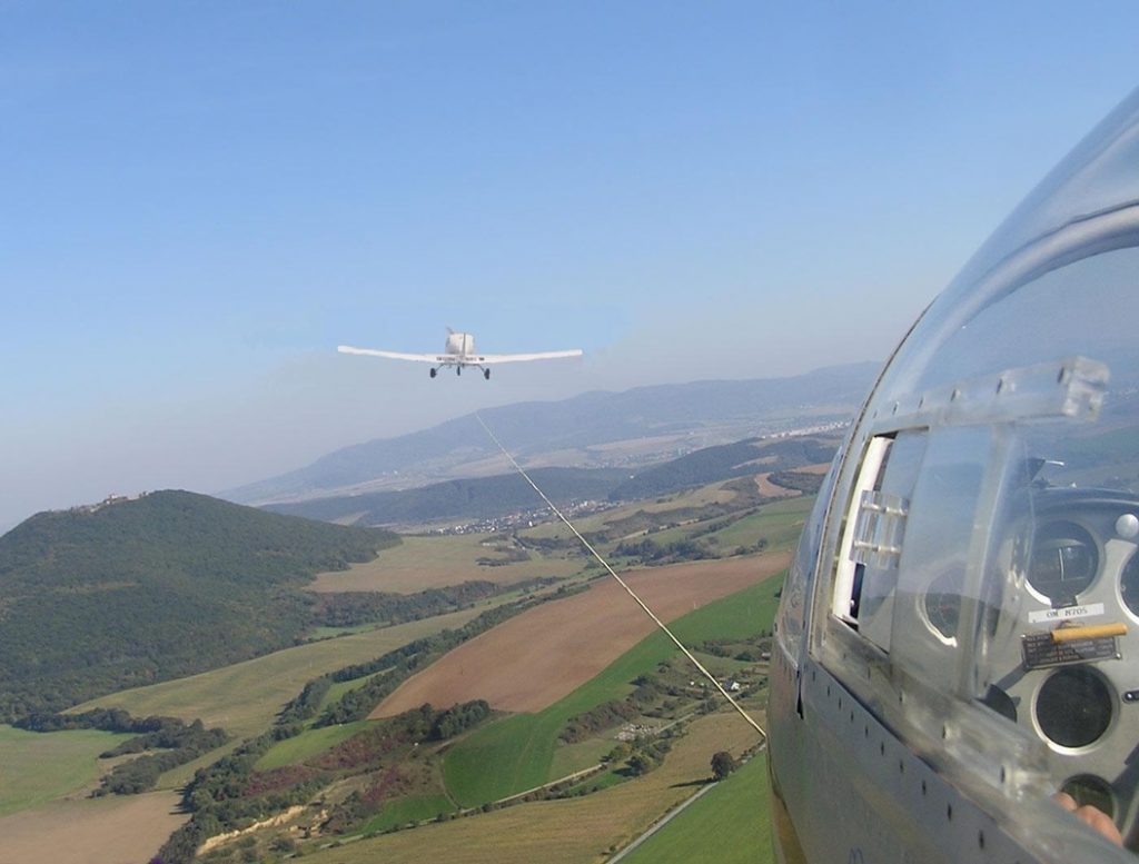
One of my many piloting jobs is as a glider tow pilot. For those not familiar with gliding, since a glider doesn’t have an engine, every time a glider pilot goes and flies, it’s a team effort. A powered airplane (anything from a Super Cub to a turbine powered Air Tractor) is attached to the glider via a tow rope, which is about 200 feet long. Once the glider pilot gives the go ahead over the airport’s CTAF, then the tow plane begins it’s takeoff roll, pulling the glider along behind it.
The glider becomes airborne prior to the tow plane, then the tow plane will circle the airport environment till it get’s to the pre-determined altitude to release the glider. Some tows are pattern tows and some are higher (not usually above 3,000 AGL), depending on the request from the glider pilot. Once the altitude is reached, the glider pilot pulls a handle in the glider to release the tow rope, then begins his glide. The rope stays attached to the tail of the tow plane, which in turn descends back down to the runway and lands. The tow plane also has a tow rope release handle in case of emergency.
On this particular tow, the plan was to tow the glider up to 3,000 AGL. Upon reaching 2,500 AGL, the glider pilot called me on the radio and stated that his rear canopy had opened up. I looked over my shoulder and sure enough, the rear canopy was fully opened while he was still in level flight behind me. I asked him if he wanted me to tow him closer to the field, but he didn’t reply.
Now, as an experienced tow pilot, I know a glider canopy popping open should not be an emergency situation. It’s definitely abnormal, but would be similar to a door or window popping open in a powered airplane. Not a big deal. If too much force from the relative wind is applied to the canopy, it would snap off; however, a glider can easily land without a rear canopy.
About 5 seconds after I radioed the pilot (and received no reply), I felt my tail instantaneously lift up into a completely vertical position, which caused my nose to go straight down. The next thing I knew, a whole lot of earth suddenly filled my windscreen and I was in what’s known as a graveyard spiral.
A graveyard spiral (as defined from the Airplane Flying Handbook pg 4-23), “is a descending turn during which airspeed and G-load can increase rapidly….the airplane is flying very tight circles, in a nearly vertical attitude and will be accelerating since it isn’t stalled.” It’s also known as a spiral dive.
Back to the story. At this point, I tried to reach for the glider release handle. Unfortunately, due to the shoulder straps holding me against the seat, plus the g’s, and also the quart of oil and tow bar that flew forward and hit me in the back of the head, I couldn’t reach it. I was semi-upside down at a certain point, which dislodged the oil and tow bar from the floor of the baggage compartment. They sailed over the seat and nearly gave me a concussion.
At this point, 2,500 feet above the ground, I had a choice to either fight for my life at a very low altitude or to sit back and become part of a big explosion.
I decided to fight for my life.
As I was spiraling to the ground, I felt the tow rope snap. Up to this point, I had still been attached to the glider. The rope snapping was a good thing, as my airplane was now under my control, not attached to, and being affected by, a glider (more on that later). I now had a lifeline, no pun intended.
After I felt the rope snap, my instincts and training kicked in. I initiated the spin recovery procedure using the PARE acronym. This task was difficult to do as I had a lot of debris flying from the rear of the plane to the front, blocking my view out of the windshield. There was also debris around my feet, hampering my ability to use the rudder pedals. The spiral finally stopped and I recovered approximately 500 feet above the tree tops. It took my heart a lot longer to stop spinning.
After barely regaining my emotions, I tried to evaluate the condition of the plane. Were all the pieces of the plane still there, was the engine damaged, did my control surfaces still work?
Once I advanced the throttle and saw an increase in my engine RPM, I started an immediate climb to give me altitude to get back to the airport. I had engine power but I wasn’t sure how long it would last if I had damage. Now, what they don’t teach you during spin training is that when this happens unexpectedly, you will become very disorientated. You have just been spiraling unexpectedly and your equilibrium will be out of whack. As I leveled out just over the tree tops, I was too low to visually see any landmarks, nor could I see the airport. Once I was able to climb, I was able to orient myself and figure out where the airport was.
I had to be very careful getting back to the airport and landing without radio communication, since my radio was knocked out with all of the FOD from the baggage area. Thankfully, the landing was uneventful. After I landed, I saw the glider limp in over the trees. The rear canopy was totally gone, while the front canopy and other parts of the glider had suffered major damage. Miraculously, my airplane wasn’t damaged, except for the wire from the radio which came loose during the spiral.
So, how did all this happen, you ask? Well, the glider pilot made 2 huge mistakes. First, in gliding, the moment the glider pilot loses visual sight of the tow plane, you are supposed to release the tow rope. He did not do that and almost killed both of us.
Second, as pilots we are taught to always fly the airplane first. Everything else, no matter what it is, always comes after flying the airplane. As I stated previously, the loose canopy is not an emergency situation, but since the glider pilot did not aviate first and was distracted, it was almost a fatal day for 2 people and 2 airframes.
So, what caused this chain of events? By getting distracted by the open canopy, the glider pilot inadvertently pulled back on the stick while trying to close the canopy. Then, by not releasing the glider from the tow plane, the glider pilot climbed rapidly with an excessive rate of climb while still being attached to me. The rapid climb is what pulled my tail up, causing my nose to drop and put me into the spiral. The tow rope snapping set into motion my recovery, since up till that point, I literally had no control. An extremely high lift wing was attached to my tail, pulling it up, and there was absolutely nothing I could do about it.
We all spend time practicing and demonstrating emergency maneuvers during our flight training and during flight reviews. Many times you might think, I’ll never need to use this stuff. Thankfully, some of the procedures I learned in the past kicked in at a time of need, even though my heart was beating out of my chest.
At some point in every pilot’s career, some type of spin training or Upset Recovery Training would be highly recommended. Then, when things go wrong, remember to always aviate first, then handle all the other things that need to be handled.
Interested in spin training or Upset Recovery Training (UPRT)? Check out the list of Malibu & M-Class Owner’s and Pilot’s Association (MMOPA) approved UPRT vendors and schedule UPRT training today.
The Cirrus Pilot Proficiency Program (CPPP) will be coming to the Galaxy FBO at the Lone Star Executive Airport in Conroe, TX again this year. The dates of the event will be October 14th-16th.
Wondering what the CPPP program is?
“CPPP offers a weekend event for Cirrus owners and their partners that focuses on Cirrus-specific knowledge and flying proficiency. We bring some of the most experienced flight instructors who regularly teach in all kinds of Cirrus airplanes flown for all kinds of missions. We have prepared an extensive syllabus of ground courses that complement the transition training and delve into areas of greatest need for Cirrus pilots.” (from CirrusPilots.org)
The weekend starts off with a group dinner on Friday night. The Saturday morning ground session focuses on General Aviation Safety with special focus on the Cirrus accident statistics. Normal and emergency procedures are also reviewed.
In the afternoon on Saturday, the attendees are split into two groups. The first group has a myriad of options for ground sessions covering all topics related to Cirrus aircraft and operations. The second group flies, then they switch for the second 3 hour session. Sunday brings the same split, with more courses offered and more flying.
While the Cirrus pilots are flying and learning more about their airplanes, CPPP offers a Partner in Command course for flying partners on Saturday. This allows flying partners to be more comfortable in the airplane and teaches them what to do if something were to happen to the pilot.
All in all, attending a CPPP will improve both Cirrus knowledge and Cirrus flying skills. It’s highly recommended for all Cirrus pilots.
To register for the CPPP event in Conroe, check out the CPPP website.
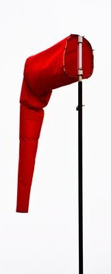
Some of a pilot’s favorite words are heard on the ATIS: “Winds, Calm.” These words set off all sorts of happy bells and hallelujah choruses. Most pilots spend their lives fighting the winds. On those rare days when the winds are calm, great happiness ensues.
But, are calm wind landings more complicated then everyone thinks? Well, they can be if the proper planning doesn’t go into them.
Let’s think about wind. We have surface wind and we have winds aloft. Sometimes the surface winds are calm. When this happens, certain airports have preferred calm wind runways which are supposed to be used in these conditions. Winds aloft are almost never calm. 95% of the time, there is some kind of wind even 100-200 feet above the surface.
Here is the question pilot’s face when coming into an airport with calm winds: which runway do I use? Do I use the calm wind runway? Do I use the runway that is easiest to enter the pattern for? Do I use the one with the shortest taxi?
A lot of technologically advanced aircraft have a wind indicator on the PFD. This tool is often forgotten in calm surface wind conditions. On the contrary, this is probably the most important tool a pilot can have when figuring out which runway to use when the winds are reported calm.
Here’s why. That wind indicator is showing the pilot what the winds aloft are. The winds aloft should determine what runway is going to be used. If the wind indicator is depicting a south wind, then a south runway should be used. Even if it is a 5 knot wind at pattern altitude, it’ll still be a headwind coming in on final approach. If the north facing runway is used, that same 5 knot headwind can blow an airplane halfway down the runway before the ground speed drops off enough for it to land.
So, the next time you are coming into an airport and the winds are reported calm, take a look at your wind indicator on your PFD when deciding which runway to use. It’ll probably save a few go arounds!