| |

Avidyne Vantage

For years, Cirrus owners who have the Avidyne Entegra PFD and MFD have been clamoring for Avidyne to come up with some sort of upgrade. The Entegra, or EX 5000 system, is late ’90s technology and, though it still works, there will be a certain point in the future when it gives up the ghost. Avidyne still supports the Entegra system, but it’s hard for a Cirrus owner to see all this new technology coming on the market while not being able to upgrade the original Avidyne screens.

Avidyne gave it a go in the late 2000s with a panel upgrade known as the R9. The R9 was a good system, but Avidyne was very slow on the release (rumors were the company wanted it to be absolutely perfect before releasing it, which frustrated Cirrus, who then switched to the Garmin Perspective panel, leaving Avidyne behind) which led to the R9 only being available as a very expensive retrofit to the Entegra system ($80,000-$90,000 for the system and install). Needless to say, there weren’t that many takers.

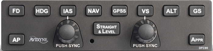
Late in 2020, Garmin announced it had received certification to retrofit Avidyne Entegra equipped Cirrus Aircraft with the company’s G500 TXi displays, which gave new hope to G1, G2, and G3 Cirrus owners. The price tag wasn’t outrageous, coming in at $16,000 apiece for each display. The G500 TXi works with any possible GPS that can be installed in a Cirrus (GNS 430Ws, GTN 650s, GTN750, or the Avidyne IFD 540/440) and with the DFC 90 Autopilot (if the Cirrus is still equipped with an STEC 55x, the Autopilot would need to be changed to either a DFC 90 or a Garmin GFC 500).

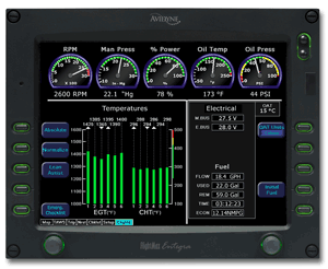
Fast forward to June of 2021 and Avidyne re-enters the game with the Avidyne Vantage. After the R9 debacle, Avidyne has opted this time to go for a more simple approach. The Avidyne Vantage system changes out the Entegra PFD and MFD with bigger screens (12″; Garmin’s TXi units are only 10.6″) with high quality pixelation, synthetic vision, engine gauges, checklists, charts, a hybrid touch interface, and all the other information that was offered on the Entegra system, just all more modern and updated. The best news is that the system provides redundant reversionary mode, which was one of the biggest complaints about the Entegra system.
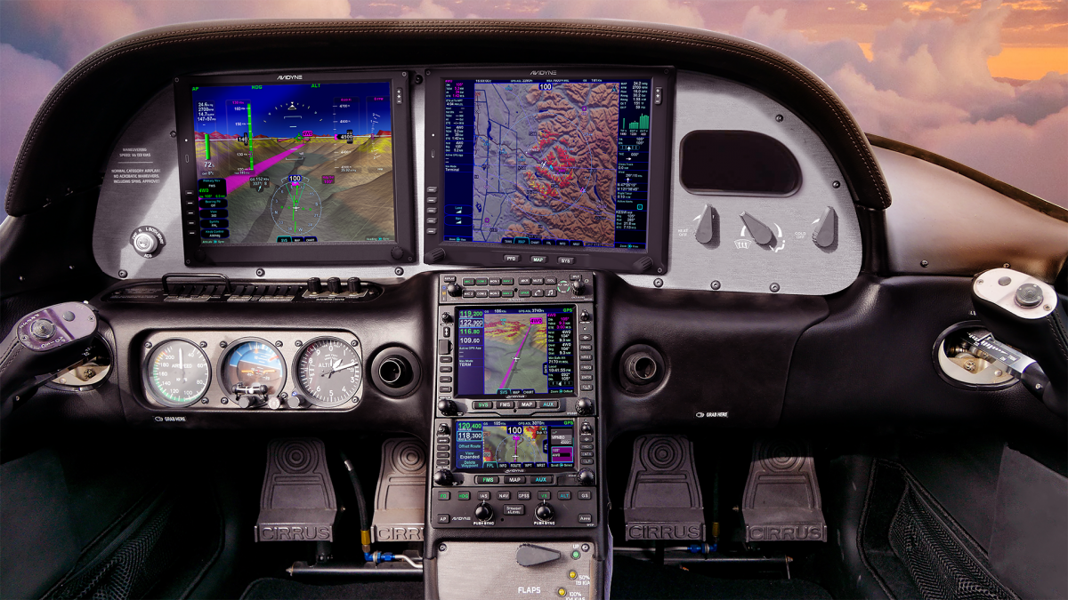
The price tag comes in lower than Garmin, with each screen being priced at $12,500. The units will work seamlessly with the Avidyne IFD Series GPS units, though, as of this writing, it isn’t clear if the Avidyne Vantage will work with Garmin GTN 430Ws or the GTN 750/650. I would assume that the integration would be there, but I haven’t found any documentation stating that yet. DFC 90 Autopilot integration would be seamless, but not sure the integration with the STEC 55x or Garmin GFC 500.

Avidyne says the Vantage will be fully certified in early 2022, but the company is taking orders now. Visit the Avidyne Website for more information.

Similar Posts

  • MMOPA Safety Foundation Training Videos

    The Malibu and M-Class Owner’s and Pilot’s Association (MMOPA) announced new Safety Foundation Training videos in September. The videos are aimed at both new Piper PA46 pilots and existing Piper PA46 pilots, all in the effort to fly the Piper PA46 to the highest and safest standards.

    Six videos have been released thus far, with the promise of more to come. The topics of the first videos are:

    • Instrument Approach
    • Visual Approach
    • Manual Gear Extension
    • Emergency Descent
    • Descent Planning
    • Takeoff and Climb

    Eventually, the goal is to release high quality training videos encompassing all aspects of Piper PA46 flying.

    To view the videos, you will need an MMOPA membership. The link to the MMOPA Safety and Education Foundation video page is: https://www.mmopasafety.org/education/

  • AOPA Air Safety Foundation Survival Seminar

    The AOPA’s Air Safety Foundation will be returning to Texas this coming week with their After the Crash:  Surviving An Aircraft Accident seminar.  Though aircraft accidents are rare to most pilots, they still happen.  It is best to be prepared with the proper knowledge and supplies in case you are stranded in a remote area while awaiting help to arrive.

    The seminar will cover the following items:

    • How and what to pack in a survival kit
    • Ways to help search parties find you
    • What to do first immediately after the off airport landing
    • How to survive will awaiting rescue

    The seminar will be put on in Houston, San Antonio, and Austin on three consecutive nights, the 20th-22nd, so everyone will get a chance to attend.  The location and times are below.

    No signup is necessary, just show up and be ready to learn.  The seminar does count for WINGs credit and there will be a sign in sheet at each event.

    The AOPA Air Safety Foundation puts on numerous seminars throughout the country during the year covering a wide variety of topics relevant to general aviation pilots.  The content is always interesting and the presenter always knowledgeable and entertaining.  Hope to see you there!

    Tuesday, January 20th

    Wyndham Hotel, Houston West
    14703 Park Row Blvd.
    Houston, TX 77079
    7:00pm-9:00pm

    Wednesday, January 21st

    Doubletree Hotel, San Antonio Airport
    37 NE Loop 410
    San Antonio, TX 78216
    7:00pm-9:00pm

    Thursday, January 22nd

    Omni Hotel, Southpark
    4140 Governor’s Row
    Austin, TX 78744
    7:00pm-9:00pm

    For more information on the event and the locations, please click here.

  • 2022 MMOPA Convention

    MMOPA announced the location for the 2022 MMOPA Convention. The 2022 Convention will be in Tucson, Arizona and will take place September 29th-October 2nd, 2022. The JW Marriott Starr Pass will be the host resort.

    Thursday, September 29th will kick off the convention with a safety event for pilots and companions, lunch with exhibitors, and the return of the charity golf tournament.

    Friday, September 30th and Saturday, October 1st will be when all the classes and seminars that make the MMOPA convention great are held. The Friday dinner will be at an aviation themed spot in Tucson while the annual auction and black tie affair will be Saturday night.

    Stay tuned to the event details page on the MMOPA website to see when registration is opened.

  • Picking Up an IFR Clearance

    Picking up an IFR clearance at first can seem very simple.  But, when taking off from an untowered field, especially if a pilot is based at a towered airport, it can be a little more complex.  Based at an untowered field?  The towered procedures are a little more streamlined, but still different.

    Towered Airports

    Class B or Class C

    At Class B or Class C airports, there is a dedicated frequency to get an IFR clearance and VFR departure instructions called Clearance Delivery.  It is published in the airport facilities directory as well as most approach plates.  Before you call Clearance Delivery, get the ATIS and tell the controller you have it as well as where you are located on the airport.

    CRAFT

    Class D

    Some Class D airports have a Clearance Delivery frequency (see KADS, Addison, TX), but for the most part, you’ll get your IFR clearance on the Ground frequency.  If there is a dedicated Clearance Delivery frequency, the ATIS will specify whether or not to get your clearance on it or on ground control.

    Class D towers are only part time towers, usually closing between 7pm and 10pm local time, depending on how busy the airspace is.  These airports usually have published Clearance Delivery frequencies to contact either the local approach control or center to pick up an IFR clearance on the ground.  They will be published on approach plates and in the A/FD.

    Untowered Airports

    Class E

    There are a number of Class E airports that are Class E all the way down to the surface (see KLFK, Angelina County).  At these airports, there will either be a Clearance Delivery frequency or you call on the Center or Approach frequency to get your clearance (at KLFK, you call Center as there is no Clearance Delivery frequency.  At Temple, KTPL, there is a published Clearance Delivery frequency which you would be talking to Grey Approach).

    Class G

    There are two ways to pick up an IFR clearance at a Class G airport, one typically a little safer than the other.

    The first option is to take off and maintain VFR while calling Center or Approach control.  They will give you your clearance making you IFR and allowing you to enter the clouds.  This option can be unsafe depending on the terrain surrounding the airport and how low the ceiling is.  If the ceiling is overcast at 1,000, you can legally remain VFR in Class G airspace at 500 AGL, but that isn’t the safest option and you might not be able to raise ATC at that altitude.

    The second, and safer option, is to call on the phone.  Flight Service has a nationwide Clearance Delivery phone number that every pilot should have saved in their contacts (888-766-8267).  Typically, you want to wait to call them until after you are done with your runup because they only give you a five or ten minute window to get off the ground.  With bluetooth equipped headsets, this usually isn’t a problem.

    Be prepared when calling Clearance Delivery on the phone to wait a few minutes.  Us pilots aren’t good at being patient sometimes, but the FSS has to call Center on the phone to get your clearance and release and this can take a few minutes.  Be prepared for that going in and just be patient.  Remember, this is the safer option!

    There are a handful of Class G airports around the US that have a GCO, a Ground Communications Outlet. With a GCO, you tune up the frequency, then click the mic 4 times to talk to ATC or 6 times to talk to FSS.  Each mic click must be at least one second, so if you click the mic too quickly, it won’t work.

    At certain airports that are underlying an approach control’s airspace, you can actually call the TRACON directly and get your clearance from them (5C1, the Boerne Stage Airport, for example.  San Antonio approach is the controlling agency and you can call them directly to pick up your clearance).  It’s a good practice to get the TRACON phone number and save that in your contacts as well.

  • Jeppesen vs. Aeroservices Charts

    Many people ask, which set of charts is better? Should I use the FAA Aeroservices charts on Foreflight or pay extra for the Jeppesen charts? Since you have to pay for Jeppesen, they are probably better, right?

    I am not here to say which one is better as a chart preference is just that, a preference for one over the other or for certain features. After a while, muscle memory and routine take over and you probably wont even notice the difference.

    History

    In 1934, Elroy Jeppesen began making his own charts and sold them to other pilots. His little company grew into the giant Boeing chart company we know today. Jeppesen charts are used internationally and therefore include information that might otherwise seem common knowledge, like transition altitudes. The key is, you cannot get FAA Aeroservices charts for international destinations. Jeppesen is the only option for outside the US.

    National Aerospace Charting Office (NACO), or the new(er) name “Aeroservices” or FAA chart, whatever you decide to call them, are United States government issued charts. In addition to civilian use, Aeroservices charts are used by the military so there will be some terminology that does not apply to civilians. The best part about FAA Aeroservices charts are… they’re free!

    If you are in the middle of a transition or trying to decide which charts to use, you have come to the right place. Here are a few key differences.

    Obstacle Departure Procedure Chart
    KAXX (Angel Fire, New Mexico) ODP

    1. Frequencies: FAA Chart provides the AWOS so you have all departure frequencies in once place.
    2. Airport: Jeppesen highlight the airport, which is a nice feature so you can easily see the flow from the airport.
    3. Notes and Remarks: Jeppesen bolds the speed restriction all over the chart so you won’t miss it. All other requirements are in the top right corner. Note the transition altitude 18,000′. Since Jeppesen is used internationally, it is published on the chart since other countries have different transition altitudes. It takes up a chunk of chart real estate, but it’s clear, easy to read, and always in the same place. The FAA charts post all the requirements and restrictions as notes off to the side. Since it’s in the same space as the chart graphic, it’s easy for the eyes to catch while studying the plate.
    4. Take off Minimums: NOT APPLICABLE for PART 91 – however, it’s wise for all pilots to look and abide by them. Jeppesen displays the standard take off minimums table, as well as the rate of climb table, which is nice to have all in one place. The FAA chart gives the non standard information but you need to know/look up the rest in the Digital Terminal Procedures Supplemental document. (Hint: It’s in the Documents section of Foreflight)
    5. Take Off Obstacles: About the same on both charts
    6. Route Description: Similar on both charts, but larger font and clearer description on the FAA chart. When there are different routes from different runways, the FAA chart layout is really helpful.
    7. Graphic Layout: Jeppesen and FAA use the same graphics for all their different charts and plates which makes it easy to read once you are familiar with the respective charts. FAA charts are easy to read and distractions are kept to a minimum. Jeppesen charts make things bold and enlarge pertinent information so you won’t miss it.
    8. Airport altitude: This is only on the Jeppesen chart (the FAA chart doesn’t include it), but it is very helpful for situational awareness. As you brief the arrival altitudes, I think it’s important to have an idea what AGL you are at.

    Approach Charts

    One thing pilots love about Jeppesen approach charts is the clear set up for an approach brief. The top section is created as a “briefing strip” starting with the frequencies, then navigation frequencies, minimums, airport elevation and the missed approach. It’s very natural and user friendly.

    FAA charts have a slightly bigger picture of the approach planview, but the profile view and minimums section can get a bit cluttered. It can feel a little discontinuous when briefing the approach to bounce all over the page. However, some pilots really like the small airport diagram in the corner, which I find really helpful for situational awareness (particularly for students learning circle approaches). Non- standard alternate and takeoff minimums are also clearly noted, but unfortunately we must hunt elsewhere to find them. The Jeppesen alternate minimums and takeoff minimums will both be on the airport diagram

    1. Frequencies: Getting weather and tuning radios is easy on the Jeppesen charts – just follow the briefing strip. The frequency section on the FAA charts is still easy to read, but closer to the center of the page. It’s split up from the nav frequencies and other important briefing information.
      a. FAA charts are created by the government and have military specific information, which are the odd looking frequencies and channels on the chart.
    2. Approach Navigation: On a Jeppesen chart, you will continue to the next line to verify your frequency, course and set minimums (assuming you are straight in on the ILS). On the FAA chart, you will then have to skip to the top of the chart to get the frequency and course, and then scan to the bottom of the page to input your minimums. However, since you could be flying a localizer approach or a circle to land, it’s a good reminder that not everyone using this approach chart will be using the same Decision Altitude (DA). The FAA chart also includes runway distance information so pilots can make determinations of approach speeds and stopping distance if the runway is wet or icy.
    3. Missed Approach – Textual
    4. Approach Lighting
    5. Missed Approach- Graphical: The missed approach information is the same on both charts. The lighting information is key for determining a missed approach and is next to the missed approach text on the FAA chart. It’s found next to the missed approach graphic on the Jeppesen chart. Personally, I find it easier to find and read the lighting information on the Jeppesen chart. Remember, on both charts, the placement of the PAPI on the chart indicates the physical location of the lights (left or right of the runway).
    6. Notes: Both charts have a notes box, but they use them a little differently. Once again, remember that Jeppesen charts are used internationally and include the transition altitudes and altimeter setting info. On both charts, the notes section will be where other critical information will be shared which isn’t really applicable for this airport. On the FAA chart, the tower frequency is starred to note that there are operating hours (you’ll have to check the chart supplement AF/D to find out what those hours are). There is also an L next to the frequency to indicate it is the pilot controlled lighting frequency. You will also find the note about the VGSI and the Approach Glide path next to the profile view on the FAA chart, whereas the Jeppesen chart has that note in the notes section at the top. The FAA chart also has the T and an A in black triangles to note that this airport has non- standard alternate and take off minimums. Again, those are found in separate documents when using FAA charts and on the Airport Diagram when using Jeppesen charts.
    7. Minimum Sector Altitude: Similar on both charts, but in different locations (reminder: ATC vector altitudes may be lower. It is the pilot’s responsibility for safety of flight to maintain safe obstacle clearance, so if you are ever concerned about going below the MSA – just ask ATC).
    8. Planview: Other then differences in size, visuals, and text, the information displayed on both is very similar.
    9. Profile View: Again, the displays look different and pilots will have their preference, but the information is the same.
    10. Minimums: Jeppesen charts not only note the category for each approach with its designated letter, but also displays it in knots. It is recommended that if you increase your approach speed (based on flaps or gusty winds or perhaps a faster speed for a circle to land approach) that you should use the higher category minimums. The reference guide makes that easy to look up. The other benefit of the Jeppesen charts is right the table that contains the time from the final approach fix to the missed approach point for a localizer approach, it also shows the rate of descent with the associated ground speed to maintain a 3 degree glideslope. Now there is no excuse not to set pitch and power! The minimums posted in parenthesis are for the military, but RVR in statute miles is also included.
    11. Airport diagram: Only on the FAA charts, this particular feature is particularly useful for situational awareness. The arrow pointing to the runway shows the direction the approach is arriving from so planning a circle to land is a cinch. There is also a lot of other information that can be gathered from the airport diagram for quick reference or to help a disoriented pilot: lighting, displaced thresholds, closed taxiways, and runway placement and lengths. This is easily one of the best perks of an FAA chart.

    Arrival/ Departure Charts: Sewzy 5 Arrival KAUS

    The Jeppesen lay out is very attractive and draws the pilots eye in a clear way to all the important information. The colors pop out, so the required altitudes and speeds are easy to read and remember. The chart, which is the proper scale, shows MORAs , easy to find airports (and runway layouts) and is over all easy to follow. However, the texts, while very clearly laid out, are small and difficult to read and pushed to the very edges of the chart. FAA charts are simple and fairly easy to read, but the airports are not as obvious and the flow to the airport requires a good look. The table on the Jeppesen chart is a really nice format, but the text and Notes for arrivals on the FAA chart are easy to find and much easier to read quickly.

    1. Frequency: FAA charts include the approach frequency on the arrival, which is helpful for having radios tuned. During a busy time when the controller changes your frequency, all you have to do is verify the frequency you already set, rather then totally stop what you’re doing to switch it. The Jeppesen charts add the airport elevation next to the ATIS, which really aids situational awareness.
    2. Notes: Jeppesen notes are clearly numbered and tucked away nicely in a box, but the FAA chart notes pop out in the middle of the page and are easy to skim for pertinent information.
    3. Planview: I think Jeppesen is the clear winner here- it is so easy to read, it only takes one glance to know where the primary airport is and how the arrival flows. The chart being at the proper scale offers the pilot important geographical information and over all is a clean look. Notice the small series of arrows after SMRFF on the the Jeppesen chart; those indicate the pilot should expect radar vectors. The FAA charts include those instructions in the text, but I find the visual reference on the chart helpful. The FAA charts are equally clean, with altitude and speed restrictions easy to read even if they don’t jump out. When there are multiple airports that the arrival serves, the airports are clearly marked, though, I think it would be nice to have a little more information surrounding the primary airport for better situational awareness.
    4. MSA: only on the Jeppesen chart
    5. Primary airport: The runway alignment and grey highlight on the Jeppesen chart stands out very clearly, while the FAA airports are a little more obscure.
    6. Arrival route description: The table on the Jeppesen chart is easy to follow but the text is very small and pushed to the bottom. The route description is much easier to find and read on the FAA chart.

    Airport Diagram

    The Jeppesen Airport Diagram page has it all: frequencies, airport diagram, runway info, take-off minimums, departure procedures and alternate minimums. It’s a one-stop shop. It makes preflight planning easy when its all at your fingertips.

    The FAA charts usually require a little more searching for different pieces of airport information. The Airport Diagram itself is just the airport layout. Above, you will see a simple FAA Airport diagram. It’s clean and simple, perfect for a knee board print out.

    In the flight planning process, as you look at what approaches you will be using for the airport, you might see an A or T inside a triangle. Those indicate that you will need to look in the Alternate Minimum or Take off minimum documents for more information. The Takeoff Minimums document (see below) is also where you will find any obstacle departure procedures for that airport. Apps like Foreflight help you out by posting the take off minimums under the departure tab. Even though it’s a little more difficult to read, I didn’t crop out the airport information so you can see what it looks like in context.

    FAA Alternate Minimums on the Left and Takeoff Minimums and Obstacle Departure Procedures on the Right
  • Present Position Hold

    When I was working on my instrument rating back in 2007, my instructor and I did a lot of unpublished holds.  In ground school, I heard a lot about holding for weather or holding due to a traffic delay.  At my first job, my chief flight instructor was also a Continental (now United) captain and he told me a lot about having to hold for weather going into different places.

    I heard all this, but I figured it would never happen to me when I’m flying GA airplanes.

    Boy was I wrong!

    I was flying a Piper Malibu into Phoenix with two passengers for Super Bowl weekend and the weather was awful.  No thunderstorms, but moderate precipitation and low ceilings.  We were coming into Deer Valley (KDVT) on the north side of Phoenix and about an hour out, ATC advised me that arrivals into DVT were having to hold and to expect a delay.  The controller said the delay would be about 30 minutes, so by doing a quick calculation, I determined the delay would probably be all cleared up by the time I got in the area.  At the time, I didn’t know if the delay was due to weather or traffic congestion.

    Twenty minutes later, the controller advised me that there was still a delay.  I queried what it was for and he informed me it was due to weather.  He asked me if I wanted to hold or divert.  I listened to the ATIS and heard the ceilings were variable from just below the minimums to just above.  I told him I would hold as the TAF I saw predicted the ceilings to go up.

    “Malibu, hold present position, hold east, expect further clearance 2140 Zulu.”  Gulp.

    At this point, my autopilot had gone out, it was turbulent and I was definitely in the soup.  This was going to be fun.

    After recovering my wits, I read back the clearance, then set about setting up this hold without getting too far from my present position.  The Malibu I was flying had a Garmin 530 which I was using as my primary means of navigation.  I was on V190, but I didn’t have all the fixes in my flight plan.  What to do?  And what to do fast?

    The 530 has a rarely used function called a User Waypoint.  It comes in handy in situations like these.  On the moving map, you can turn the cursor on, move the cursor to any point on the map, and, by pressing enter, create a User Waypoint.  This is what I did on V190.  After I created it, I had to go to my flight plan, find the right spot, and input the User Waypoint just like I would any fix.  Just a note here, when you create a User Waypoint, make sure you remember what you named it so you can find it again.

    After I input the User Waypoint in the flight plan, I had to go back and activate the leg that the User Waypoint was the end point on.  Then, to make sure the flight plan didn’t go to the next waypoint once I crossed my User Waypoint, I had to press the OBS button on the 530 in order to put the GPS in suspend mode.

    Keep in mind, my autopilot wasn’t working, so this involved a lot of multi-tasking!

    That’s how to do a present position hold using the Garmin 530.  Got all that?  Here’s a concise review:

    • Create a User Waypoint
      • Turn the cursor on by pressing the FMS knob
      • Move the cursor to the point where you want your User Waypoint
      • Press enter and name the User Waypoint
    • Press the Flight Plan button
    • Input the User Waypoint into your flight plan at the proper point
    • Activate the leg that the User Waypoint is the end point on
    • Finally, press the OBS button to put the GPS in suspend mode
    • After you’re cleared onward, just press the OBS button again to take the GPS out of suspend mode

Leave a Reply

Your email address will not be published. Required fields are marked *