The 2022 Fly In Season kicks off March 4th-5th with the US Aircraft Expo at the Addison, TX Airport (KADS). Cutter Aviation at KADS will be the host for the event. All the major and minor aviation manufacturers will have static aircraft displays. Come see all the new Cirrus innovations, the Piper M600, and the Diamond DA62. All the latest and greatest technology will be available for your viewing enjoyment.
If you are planning on flying in, the FBOs at ADS are Million Air and Atlantic.
The event will run from 10am-3pm on both days, March 4th and March 5th.
The FAA started their Pilot Proficiency Award Program (commonly known as FAA WINGS) in 1996. It is run by the FAA Safety Team, or the FAASTeam. The intent of the program was, and is, to “improve the nation’s accident rate by conveying safety principles and practices through training, outreach, and education” (taken from faasafety.gov). The FAA WINGS program, free of charge, encourages pilots to pursue recurrent training to enhance their overall knowledge of all the aspects of aviation.
The FAA WINGS program has evolved over the years, but with the current structure, pilot’s accomplish tasks, both knowledge and flying, for credit that adds up to the equivalent of a flight review. Pilot’s must accrue three knowledge credits and three flight credits to complete a phase, and each phase acts as a flight review.
FAA WINGS has three levels, the basic, advanced, and master level. Under each level, you accomplish different phases. The basic level is “designed for pilot’s [desiring] a higher level of proficiency than … a normal flight review” (faasafety.gov). The flying tasks in the basic phase are based on the private or commercial pilot PTS, depending on the airman’s certificate level. The knowledge courses revolve around many different areas, all of which can be viewed on the FAASafety Team’s website. Most are free, but there are some courses that have a cost associated with them. In the advanced and master phases of the FAA WINGS program, the tasks have higher standards, challenging pilots to hold themselves to those higher standards.
One unique aspect of the FAA WINGS program is the opportunity to attend a safety seminar for credit. Throughout the year, there are many different safety seminars that take place in the different FSDO areas. The FAA WINGS seminars range from a study of accidents, to GPS usage and anything in between. You can even get FAA WINGS credit for attending the Bonanza BPPP or the Cirrus CPPP programs.
As an instructor, I highly recommend to all my customers to enroll in the FAA WINGS program and use it. This keeps pilot proficiency at a high level, which in turn keeps safety at a high level as well. Plus, you get to learn a lot too!
If you’d like to enroll in the FAA WINGS program, visit faasafety.gov to create an account. Then, find a good instructor and start working on those phases!
The FAA started their Pilot Proficiency Award Program (commonly known as FAA WINGS) in 1996. It is run by the FAA Safety Team, or the FAASTeam. The intent of the program was, and is, to “improve the nation’s accident rate by conveying safety principles and practices through training, outreach, and education” (taken from faasafety.gov). The FAA…
As all pilots know, the Federal Aviation Regulations require licensed pilots to go through recurrent flight training in the form of a Flight Review every 24 months. The regulations require 1 hour of ground review and a 1 hour flight. This is all that a pilot has to do to legally maintain his or her VFR currency to fly alone in an airplane. Of course, when passengers are aboard, the pilot has to have done 3 takeoffs and landings in the previous 90 days.
What if the pilot in question hasn’t flown in 20 years? All the regulations require is 1 hour of ground review and a 1 hour flight. Kind of scary, isn’t it? (Any instructor worth his salt would not, however, turn a pilot loose with just those flight review minimums if they haven’t flown in 20 years without an extensive amount of recurrent flight training)
Now, a lot can happen in 2 years in between those flight reviews. Regulations change, airspace is modified, and skills change (for the better or worse, most often for the worse over a period of not flying). For a current pilot who flies once or twice a week, those minimums are no problem. Here’s the thing, though. Even those current pilots typically don’t do a lot of stall practice or emergency procedure practice on their own. These are the most critical areas of flight and to only do them every two years leads to a lot of rust building up, sometimes even causing safety concerns in some instances.
How to remedy this? Scheduling recurrent flight training as often as possible with a good instructor who puts you through your paces. Do this often enough and stalls will become second nature. The stall warning horn goes off? Well, lower the nose and add power. Engine failure? Switch tanks and set best glide. Recurrent flight training allows you to become as familiar as possible with your airplane, allowing you to know what to do in every circumstance.
What’s a good recurrent flight training schedule? There are several options out there. The WINGs program is a pretty good option, though you will only have 3 flight training sessions in those two years instead of 1, but it’s a good start. In recent years, the FAA has put out Advisory Circular 61-98B encouraging pilots to begin personal currency programs for themselves. The suggested schedule for VFR recurrent flight training is every 4-6 weeks.
Texas Top Aviation highly recommends this suggested schedule, for both VFR and IFR. The AC doesn’t have a specific recommendation for IFR recurrent flight training, but flying 2-3 approaches a month with an instructor helps keep pilots as proficient as possible in the IFR environment. This way, the instructor can introduce circumstances in a controlled environment that simulate abnormal conditions that might possibly be encountered in flight. If those abnormal conditions are encountered, then it will be second nature on how to handle them, leading to less accidents and safer flying habits.
Try to schedule your recurrent flight training every 4-6 weeks and your piloting skills will stay top notch, keeping you safe and proficient in every circumstance.
As all pilots know, the Federal Aviation Regulations require licensed pilots to go through recurrent flight training in the form of a Flight Review every 24 months. The regulations require 1 hour of ground review and a 1 hour flight. This is all that a pilot has to do to legally maintain his or her…
Almost all IFR pilots are familiar with visual approaches and what the requirements are in order to fly a visual approach. As a refresher, the Instrument Procedures Handbook defines a Visual Approach as “an ATC authorization for an aircraft on an IFR flight plan to proceed visually to the airport of intended landing; it is not an [Instrument Approach Procedure]” (page 4-56).
For ATC to issue a Visual Approach, the pilot must have the airport or the traffic to follow in sight. Once the pilot reports the airport or the traffic in sight, ATC can clear the aircraft for a visual approach.
A limiting factor for a visual approach is ATC’s Minimum Vectoring Altitude. “This altitude, based on terrain and obstruction clearance, provides controllers with minimum altitudes to vector aircraft in and around a particular location” (Instrument Procedures Handbook page 1-42). ATC has to restrict aircraft to these MVAs, which can sometimes be quite high due to terrain or obstacles in the vicinity of the airport.
Every pilot has been in a situation with a high MVA that ATC can’t get them below, but it’s solidly MVFR or VFR at the destination airport. The MVA keeps the pilot in the clouds, so a visual approach isn’t possible since the pilot can’t see the airport or the traffic to follow. This can lead to extra time to go out and fly an approach.
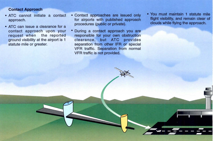
Enter a Contact Approach. A Contact Approach is different then a Visual Approach. “The main differences between a visual approach and a contact approach are: a pilot must request a contact approach, while a visual approach may be assigned by ATC or requested by the pilot; and a contact approach may be approved with 1sm visibility if the flight can remain clear of clouds, while a visual approach requires the pilot to have the airport in sight, or a preceding aircraft to be followed, and the ceiling must be at least 1,000 feet AGL with at least 3sm visibility” [Instrument Procedures Handbook page 4-57].
Here’s the simplified explanation: A pilot does not have to have the airport in sight to request a contact approach. All that is required is for the airport to be reporting at least 1sm visibility and for the pilot to remain clear of clouds.
When would this be helpful for an IFR pilot? Good question. Here’s a scenario.
Pilot Smalls is about 20 minutes from his destination, which is an uncontrolled airport with only one approach to runway 17. He is approaching from the south and the initial approach fix for the approach to 17 is about 15 miles north of the airport. The airport is under Center control. When he has arrived at this destination in the past, Center usually could only vector him down to 4,000 AGL. He is very familiar with this airport and the surrounding area as he comes to this destination at least 2-3 times a month for business.
Pilot Smalls listens to the AWOS, which is reporting a 2500 foot scattered layer and 10 miles visibility. He knows it is right traffic for 17 since there is a 2,000 foot antenna on the east side of the field. There is some hilly terrain around, but all the terrain is well below pattern altitude and doesn’t cause a safety issue.
Looking out at the clouds, Pilot Smalls observes that the cloud layer is scattered to broken, but more scattered on the west side of the airport, with several large openings that he can see the ground through. Center asks for his approach request and Pilot Smalls requests a visual approach. Center gives him a descent to 4,000 AGL, their MVA for the area. They tell him to report the airport in sight for the visual approach.
At 4,000 AGL, Pilot Smalls is going through the scattered layer of clouds, but can see the ground in between the clouds and deems he has room to maneuver safely between the clouds and stay clear of them. He can’t see the airport, so a visual approach seems unlikely. He can’t cancel IFR because then he would have to keep the VFR cloud clearance and visibility requirements in Class E airspace (1,000 feet above, 500 below and 2sm horizontally), which isn’t possible in this case.
5 miles from the airport, ATC states, “N12345, I’m going to have to send you out for the approach since you don’t have the airport in sight.” Pilot Smalls then requests a Contact Approach. ATC clears him for the Contact Approach to his destination, so Pilot Smalls descends through a break in the clouds, remaining clear of clouds, until he gets below the base of the ceiling. He maneuvers onto the right downwind, lands and cancels IFR.
Contact approaches can be useful at controlled and uncontrolled airports. The first time you request one, do so with a higher ceiling and some room to maneuver to keep your safety margins. After you’ve done a few, you can determine what your personal minimums are for a Contact Approach.
I would not recommend doing a Contact Approach at an airport you are unfamiliar with. It’s vital to know what obstacles are around since on a Contact Approach, the pilot is now responsible for traffic avoidance and terrain avoidance, whereas on a visual approach, ATC resumes that responsibility.
Almost all IFR pilots are familiar with visual approaches and what the requirements are in order to fly a visual approach. As a refresher, the Instrument Procedures Handbook defines a Visual Approach as “an ATC authorization for an aircraft on an IFR flight plan to proceed visually to the airport of intended landing; it is…
It was a rainy Thursday afternoon and I was eating lunch with my family when my phone rang. My wife and I had just been discussing how miserable the weather was, so it was only natural that about 30 minutes later I was soaking wet and sitting in one of our Aerostars getting ready to take off for Ohio. I didn’t have much information about who I would be flying, or why, but I knew that I was going to pick someone up to fly them home; something about a missing airplane. So off I went into the muck. My biggest concern at that point being whether or not my clothes would ever dry out.
I arrived uneventfully and walked happily into the FBO, but found myself quickly in a very different atmosphere. It turned out I had two passengers to pick up, a husband and wife, and they had arrived at the FBO before me. As I walked in the door, the wife received a phone call. The person on the phone told her that search teams had found her father’s airplane crashed in the woods and that he was dead. I learned the rest of the details quickly and it was hard to stomach.
She was travelling home that day to be with family until they were able to locate her father. She was pregnant with her first baby and was in her third trimester. The baby was to be her dad’s first grandchild. He’d owned a Lake Amphibian for years and had stayed at home to work while his wife was out of town. He was last seen leaving work on Tuesday of that week and was reported missing on Thursday by his co-workers. Airport security footage showed him pulling the airplane out and taking off at 20:48 (after sunset) on Tuesday night.
After a few minutes we loaded the Aerostar and took off. It was the saddest flight I’ve ever done. Understandably, my passanger sobbed on and off from the time she got off the phone until we landed a couple of hours later. The weather seemed appropriate as we flew along through the rain and were greeted at our destination by a grief stricken family and a few reporters.
I said a sad goodbye and left, but I couldn’t help but think about their situation. It really hit close to home with me as it was easy to draw parallels between my family and theirs: she was very close in age to me and pregnant with her first child. My wife and I were new parents. Her dad had owned his airplane for about the same length of time that my dad has owned his Bonanza. Additionally, it isn’t uncommon for my parents to go a couple days without being able to reach each other because they both travel.
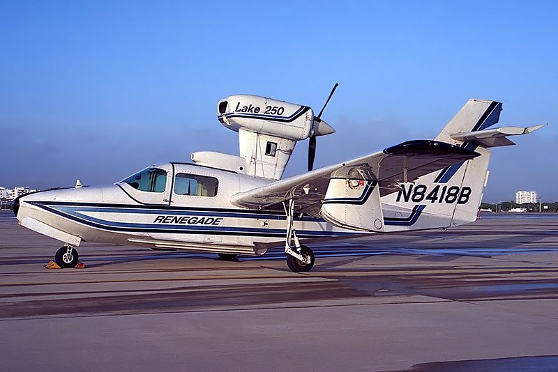
A Lake 250, the same type of aircraft involved in the accident.
But what happened..?
In the time since the accident, the NTSB has published their findings and unfortunately, it makes the situation sadder. It was completely avoidable.
Airport security cameras showed that after removing the airplane from the hangar, the pilot did not complete a preflight inspection or even a walkaround of any kind. He simply climbed in and left. The investigators were unable to find any traces or odor of fuel in the wreckage, nor any mechanical abnormalities with the airplane. In fact, according to the report, the engine was put on a test stand and ran perfectly. It would seem that the pilot simply never checked the fuel quantity and took off. The airport cameras captured the take off and a bright flash about 30 seconds after the aircraft departed.
Here is an excerpt from the report:
The National Transportation Safety Board determines the probable cause(s) of this accident as follows: The pilot’s attempted 180-degree return to the runway immediately after takeoff in dark night conditions, which resulted in collision with trees and terrain. Also causal was the pilot’s inadequate preflight inspection, which resulted in a takeoff with little-to-no fuel on board the airplane.
Interestingly, the report also details their ability to use logbook information and fuel receipts to show the airplane was taken on a long cross country on its last flight and likely not fueled again.
Another thing which stuck out in my mind upon learning the details of the crash was how important it is to let someone know when you’re going flying. Having another person know roughly when a flight is leaving, where it’s going and and when to expect it back could potentially save the lives of the people on board. In the case of this accident, the pilot didn’t alert anyone that he was going flying and therefore, no one realized he was missing for 2 days.
From reading the NTSB report I don’t get the impression that he survived the crash, but I can’t help thinking about the possibility that he, or others in similar circumstances, could survive a crash and then die from their injuries because no one knew to look for them. When I flew charter, we weren’t legally allowed to take off VFR without letting someone at the company know the details of the flight. I’ve adopted this as my personal policy as well. One text message could be the difference between being rescued or not.
Finally, every pilot should ensure that a proper walk around is completed! It’s easy to assume everything is okay with an airplane, especially one that no one else has access too. In addition to a thorough preflight, I like to walk all the way around the airplane and visual check fuel caps, doors, chocks, ropes, etc., immediately before getting in to ensure that everything is ready. I know a couple of pilots who have taken off with various panels and compartments open simply because they got distracted during their walk around and never closed them. (A good policy is to never walk away and leave something open). Perhaps even more mind boggling is that he apparently didn’t look at the fuel gauges after start up and before take off. I also have to wonder how much fuel he had remaining upon completion of the previous flight.
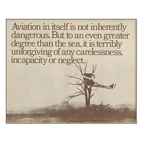
“Aviation in itself is not inherently dangerous. But to an even greater degree than the sea, it is terribly unforgiving of any carelessness, incapacity or neglect” is likely a familiar quote to just about every pilot. It is often written on a poster with a picture of an old timey bi-plane hanging out of a tree, but I think that it is absolutely on point. Carelessness in the preflight and neglecting basic pilot responsibilities (in this case fuel planning) cost this father his life and his opportunity to meet his first grandchild.
I know this article is a real downer, but it’s supposed to be. Its tragic that accidents take place which are completely avoidable. Obviously this case was beyond the normal realm of carelessness and neglect, but, we as pilots need to be extremely careful not to get so comfortable with an airplane that we stop doing the things which are so basic and important to safety. One of my professors in school used to say “aviation is fun, but it plays for keeps,” which is an effective way to remind myself how important it is to do it right.
*Out of respect to the family, I have not included any specific names, tail numbers or airports in this article.
It was a rainy Thursday afternoon and I was eating lunch with my family when my phone rang. My wife and I had just been discussing how miserable the weather was, so it was only natural that about 30 minutes later I was soaking wet and sitting in one of our Aerostars getting ready to…
Thunderstorms are not to be taken lightly. I know you have probably heard that many times in your flying career. Weather related accidents account for approximately 25% of airline and GA accidents.
The Airman’s Information Manual suggests giving a 20 mile berth around thunderstorms. If you are an experienced aviator or a newbie please take this piece of advice seriously. At one flight school where I taught, we had the policy of maintaining a 25 mile buffer around isolated thunderstorms. A bit excessive you think? Maybe, but safety is a good thing!
On this particular day, I was operating a Bell Jet Ranger helicopter during a power line patrol. Power line patrol by itself offers numerous challenges. The job consists of flying along electric power transmission lines at approximately 40 feet above the ground at 40 knots. The crew consisted of me (the pilot) and an observer. The observer is an employee of the power company and it is his job to determine which line(s) will be patrolled during the given day. As I fly along the lines, the observer is checking for anything out of the ordinary such as broken, cracked, or even shot out insulators, excessively large bird nests at the top of structures, or woodpecker holes in wooden poles. The observer knows the lines and he is also a great help in letting me know there is a crossing, and potentially higher, line in our flight path. That makes him a true safety asset! It was late afternoon during the summer and we were about to finish up for the day. We only had about another 10 miles of line to follow before calling it a day. Up ahead, I noticed an isolated thunderstorm near our power line. I could see the heavy rain falling below the anvil shaped leading clouds. It appeared to be well beyond the end of our day’s work so we pressed on.
As we drew closer to the thunderstorm, we were suddenly tossed up on our left side like a dog toy in mid-flight! It seemed like we were 90 degrees to our normal cruise attitude and, to make it worse, we had the doors off on that hot summer day. I was able to recover and we did an immediate about face and high tailed it home. Forget the rest of that line, tomorrow is another day.
The destructive force of thunderstorms cannot be overstated. In addition to extremely heavy rain, they can contain strong wind shear, large hail, and severe turbulence, each of which can damage or destroy an aircraft. Take care when one of these bad boys is near your flight path. Give it plenty of respect and a lots of room, for safety’s sake.
Alan VanDoren is a 7000 hour ATP pilot. He has flown both fixed wing and helicopters as a police pilot, missionary pilot, flight instructor, and most recently as an EMS pilot. He has flown in five countries around the world and also teaches university level aviation courses in his spare time.
Thunderstorms are not to be taken lightly. I know you have probably heard that many times in your flying career. Weather related accidents account for approximately 25% of airline and GA accidents. The Airman’s Information Manual suggests giving a 20 mile berth around thunderstorms. If you are an experienced aviator or a newbie please take…